社群/圖卡
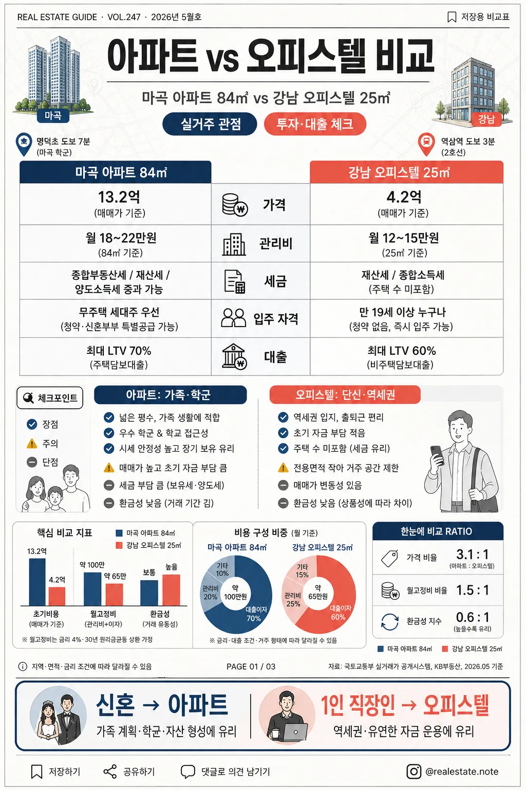
아파트 vs 오피스텔 비교 인포그래픽
아파트 vs 오피스텔 비교 카드. 가격·관리비·세금·장단점.
아파트 vs 오피스텔 비교 인포그래픽摘要
這是用來製作社群/圖卡內容的 ChatGPT 圖像提示詞,已整理主題、背景、風格與構圖,方便快速調整。
相關關鍵字: 아파트 vs 오피스텔 비교 인포그래픽, 아파트 vs 오피스텔 비교 인포그래픽 프롬프트, 社群/圖卡 프롬프트, 社群/圖卡 AI 이미지 프롬프트, ChatGPT 이미지 프롬프트, AI 이미지 생성 프롬프트, AI 프롬프트, 이미지 프롬프트
아파트 vs 오피스텔 비교 인포그래픽使用方式
保留原始結構並替換主體、背景、色彩或構圖,即可延伸出不同版本。
- 保留核心主體,並依品牌、季節或平台調整色彩與背景。
- 如果畫面太複雜,請減少背景元素並具體描述主體、構圖與光線。
- 複製後可要求 ChatGPT 配合平台、長寬比或文字需求調整。
提示詞原文
[Input]
- language: Korean
- output_size: 1024x1536

[Purpose]
Korean apartment vs officetel comparison infographic, vertical social-media editorial poster, designed for quick reading and practical real-estate decision-making.
Content-rich side-by-side analysis card with table-like structure, compact mini charts, editorial labels, realistic housing-context details, and clear recommendation cues.

[Composition]
- Vertical poster with a strong top header occupying about 15% of the frame, central comparison body taking 70%, and a compact recommendation footer around 15%.
- Main comparison split into two equal columns with a clear center divider; left side for {비교 대상} as apartment, right side for the officetel side of the comparison.
- Background should feel like a polished Korean real-estate editorial print card: warm white paper base, subtle light-gray grid texture, faint city-map contour lines, and soft paper grain while keeping all text highly readable.
- Add contextual housing visuals: small apartment tower icon on the left, compact officetel building icon on the right, tiny subway-pin and school-pin markers, simple money/tax/loan pictograms, and a small source-note strip.
- Use {비교 대상}, {비교 항목}, {장단점}, {추천}, {비주얼}, {컬러}, {비율} as the editable content fields.

[3. CORE STRUCTURE]
- Header area (top 15%): Set the title “아파트 vs 오피스텔 비교” in a bold modern Korean headline, centered, with thin divider lines beneath it.
- Add an editorial metadata row near the title: “REAL ESTATE GUIDE · VOL.247 · 2026년 5월호” on the left and “저장용 비교표” on the right in small Korean text.
- Subheader line: Place {비교 대상} directly under the title in smaller medium-weight text, acting as the main context line.
- Add two small pill labels under the subheader: “실거주 관점” and “투자·대출 체크” with navy/coral accents.
- Comparison body (middle 45%): Build a two-column table with {비교 항목} listed as row labels down the center-left, and the two property types compared across left/right cells.
- Table rows should include visible Korean row labels such as “가격”, “관리비”, “세금”, “입주 자격”, “대출”; add tiny matching icons inside each row for quick recognition.
- Pros/cons block (middle-lower 20%): Present {장단점} as concise bullet points with small check, caution, and minus icons, keeping each side visually balanced.
- Add realistic editorial side notes: a small callout tag reading “체크포인트” beside the pros/cons area, a tiny caption line “지역·면적·금리 조건에 따라 달라질 수 있음”, and a thin page-marker label “PAGE 01 / 03”.
- Mini chart cluster: Include {비주얼} as a small bar chart or donut chart cluster near the lower-middle area, using the same color family as the table accents; label chart segments with short Korean tags like “초기비용”, “월고정비”, “환금성”.
- Add a compact ratio badge using {비율}, styled like a finance dashboard indicator, with a tiny legend using {컬러}.
- Recommendation footer (bottom 15%): Display {추천} inside a highlighted rounded rectangle, with strongest contrast and slightly larger type for decision emphasis.
- Footer should also include a brief decision line: “신혼 → 아파트 / 1인 직장인 → 오피스텔”, plus tiny save/share micro icons and a small handle-style credit “@realestate.note”.
- Overall layout should feel like a structured editorial infographic, with careful alignment, equal spacing, clear hierarchy, and readable content density.

[4. STYLE RULES]
- Typography: Use Pretendard or Noto Sans KR for all Korean text; title in Bold 42–52px, section labels in SemiBold 22–28px, body text in Regular 18–22px, recommendation in Bold 24–30px.
- Color palette: White background, charcoal #2B2B2B, navy #1F4E79, coral #FF6B6B, and soft neutral gray #E9EDF2 for lines and table fill; allow warm off-white #FAFAF7 and pale blue-gray #F3F6FA for realistic paper/card depth.
- Border/shadow: Thin 1px charcoal or gray rules, subtle card shadows like 0px 4px 10px rgba(0,0,0,0.08), plus delicate divider ticks, tab labels, and chart outlines.
- Use {컬러} as the main accent family while maintaining navy/coral contrast between the apartment and officetel columns.
- Include fine editorial details such as section labels, caption rules, page indicator dots, miniature legend boxes, and small credit text without reducing legibility.

[5. VISUAL STYLE]
- Camera / lens: Flat graphic layout, top-down infographic presentation, no photographic perspective; if any rendered objects appear, keep them as clean vector-style shapes.
- Lighting: Even studio-like illumination with crisp screen-print style contrast and very soft printed-paper depth.
- Color grade: Clean white-canvas infographic grading with navy/coral accent balance, cool neutral grays, and a lightly textured editorial print finish.
- Render as a realistic Korean social-media real-estate card rather than a blank template: visible microcopy, chart numbers, grid rules, building icons, location pins, and source/caption strips should make the poster feel complete.

[6. MOOD]
Practical Korean real-estate editorial infographic — like a Naver Finance / The New York Times comparison card blended with a polished Korean property newsletter, precise, trustworthy, and easy to scan.

[7. CRITICAL]
- Korean text accuracy: 반드시 정확히 표시해야 하는 문구: “아파트 vs 오피스텔 비교”, “가격”, “관리비”, “세금”, “입주 자격”, “대출”, “아파트: 가족·학군”, “오피스텔: 단신·역세권”, “신혼 → 아파트 / 1인 직장인 → 오피스텔”.
- Additional Korean text that should appear naturally in the image: “REAL ESTATE GUIDE · VOL.247 · 2026년 5월호”, “실거주 관점”, “투자·대출 체크”, “체크포인트”, “초기비용”, “월고정비”, “환금성”, “PAGE 01 / 03”, “@realestate.note”.
- All comparison rows must remain in a clean two-column alignment; do not swap the left/right structure.
- Typography must stay crisp, fully legible, and free of broken Korean characters.

[8. 🚫 PROHIBITED]
- Fake official seals / certifications
- Broken Korean characters
- Celebrity composites / unauthorized likenesses