Social/Card News
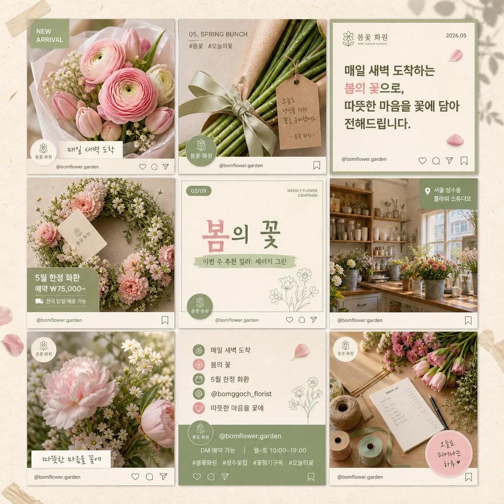
매장 인스타그램 9컷 피드
매장 인스타그램 피드 9컷 그리드 디자인 — 음식·매장·텍스트·로고 콜라주로 통일감 있는 첫 화면.
매장 인스타그램 9컷 피드 summary
Copy this ChatGPT image prompt to create Social/Card News results. Its subject, background, style, and composition are organized for quick iteration.
Related keywords: 매장 인스타그램 9컷 피드, 매장 인스타그램 9컷 피드 프롬프트, Social/Card News 프롬프트, Social/Card News AI 이미지 프롬프트, ChatGPT 이미지 프롬프트, AI 이미지 생성 프롬프트, AI 프롬프트, 이미지 프롬프트
How to use 매장 인스타그램 9컷 피드
Keep the prompt structure and swap the subject, background, palette, or composition to create new variations.
- Keep the main subject and adjust the palette and background for your brand, season, or channel.
- If the result feels busy, simplify the background and make the subject, composition, and lighting more specific.
- After copying, ask ChatGPT to adapt it for your platform, aspect ratio, or text requirements.
Original prompt
[Input]
- language: Korean
- output_size: 1024x1024

[Purpose]
Korean florist shop Instagram profile first-screen mockup, 3x3 grid feed design for social media planning and brand guide use.
A realistic, content-rich grid composition that shows how weekly posts can alternate product close-ups, copy cards, store moments, seasonal promotions, and interior shots while keeping one unified BI tone for {매장명/BI}.

[Composition]
- Center the 3x3 Instagram feed grid so it fills about 92% of the square canvas, with narrow gutters and a believable profile-planning board feel.
- Each cell should feel like a separate Instagram post tile, but all 9 tiles must share the same beige + sage green + soft pink brand palette from {컨셉 톤}.
- Use {매장명/BI} as the brand identity anchor across the grid, with repeated handle text, small logo marks, consistent typography, and coordinated color balance.
- Apply {레이아웃} as the structural framework; the mockup must read immediately as an Instagram first-screen preview in {비율/사이즈}.
- Background should be a warm off-white paper-like surface with subtle fiber texture, faint taped moodboard corners, soft botanical shadows, tiny pressed-petal details, and realistic print/post texture.
- Include small Instagram-card details inside selected tiles: @bomflower.garden, tiny save/share/comment-style micro icons, short hashtag lines, date labels, and campaign tags, all designed as part of the posts rather than phone UI chrome.

[3. CORE STRUCTURE]
1. Top-left tile: flower close-up post with ranunculus, tulips, and soft pink petals wrapped in translucent paper; add a small corner label reading “NEW ARRIVAL” and Korean caption “매일 새벽 도착”.
2. Top-middle tile: product close-up post showing stems, ribbon, water droplets, kraft wrapping paper, and a handwritten order tag; include tiny text “05. SPRING BUNCH” and hashtag line “#봄꽃 #오늘의꽃”.
3. Top-right tile: a text card tile with bold but friendly Korean copy using one phrase from {시그니처 카피 예시}; add small brand mark, date “2026.05”, and micro save/share icons at the bottom.
4. Middle-left tile: bouquet or wreath product detail tile, cropped close with premium editorial styling; include small price/info tag “5월 한정 화환 / 예약 ₩75,000~” and a tiny delivery note.
5. Middle-center tile: text-led campaign tile designed as a weekly content prompt card; include the main phrase “봄의 꽃”, subcopy “이번 주 추천 컬러: 세이지 그린”, a small slide indicator “02/09”, and a simple decorative flower-line illustration.
6. Middle-right tile: store interior tile showing shelving, counter, flower buckets, scissors, ribbon spools, order slips, ceramic vases, and warm natural daylight; add small location label “서울 성수동 플라워 스튜디오”.
7. Bottom-left tile: another flower close-up tile, different angle and bloom type for visual rhythm, with soft bokeh and a small caption strip “따뜻한 마음을 꽃에”.
8. Bottom-center tile: brand/social tile with handle-style copy from {시그니처 카피 예시}; include @bomflower.garden, “DM 예약 가능”, “월-토 10:00–19:00”, hashtag-like text, and tiny interaction icons.
9. Bottom-right tile: interior or counter-detail tile showing hands-free workspace with flower shears, twine, wrapping sheets, order notebook, ribbon rolls, and fresh flowers arranged for operational authenticity; include a small thank-you sticker “오늘도 피어나는 하루”.
10. Across all 9 tiles: maintain a unified tone, matched contrast, consistent crop style, recurring BI mark, and coherent monthly feed system based on {9컷 컨셉}.

[4. STYLE RULES]
- Typography: Pretendard and Noto Sans KR, medium to bold weights, 18–44px equivalent depending on tile type; use clean sans-serif for readability and a slightly warmer handwritten accent only for labels, tags, and small captions.
- Color palette: beige #F3EBDD, sage green #B7C4A4, blush pink #E8C3C8, muted olive #8A9B7A, warm brown #6F5B4B, ivory #FAF7F0.
- Border/shadow: thin 1px separators between tiles, soft drop shadow 4px y-offset, 12px blur, 12% opacity, refined printed-card depth.
- Text layout should stay within grid-safe margins; Korean copy must be sharp, readable, and integrated with floral subjects through caption strips, stickers, labels, and cards.
- Add realistic florist-shop details such as wrapping tissue, handwritten order tags, ribbon, twine, small ceramic vases, flower buckets, delivery memo cards, and subtle paper grain where they naturally support the feed design.

[5. VISUAL STYLE]
- Camera / lens: full-frame editorial photography look, 50mm f/1.8 for close-ups and 35mm f/2.8 for interior shots, crisp but soft-focus edges where appropriate.
- Lighting: soft window light from upper-left at 45°, slight fill from right using a white reflector, interior tiles with gentle ambient daylight and no harsh flash.
- Color grade: warm cream + sage + dusty pink with low-contrast tonal compression, like a Kinfolk-style florist editorial, with realistic petals, paper fibers, ceramic texture, and soft natural shadows.

[6. MOOD]
Premium boutique florist social feed — Kinfolk magazine spread meets quiet Aesop-style retail branding, warm neighborhood flower studio, seasonal May bouquet campaign, soft but commercially believable Instagram content planning board.

[7. CRITICAL]
- Korean text accuracy: the following verbatim Korean strings must appear correctly in the rendered image:
  - 봄꽃 화원 / 베이지+세이지 그린
  - 꽃 클로즈업 4 + 텍스트 카피 3 + 매장 인테리어 2 (균형있게)
  - 매일 새벽 도착
  - 봄의 꽃
  - 5월 한정 화환
  - 따뜻한 마음을 꽃에
  - @bomflower.garden
  - #봄꽃 #오늘의꽃
  - DM 예약 가능
  - 서울 성수동 플라워 스튜디오
- The 9 tiles must clearly read as a 3x3 Instagram grid mockup.
- All tiles must feel like one coherent BI system with the same palette and tone.
- Keep Korean typography sharp and fully legible.

[8. 🚫 PROHIBITED]
- Fake official seals / certifications
- Broken Korean characters