社群/圖卡
온·오프라인 클래스 안내 카드
원데이 클래스·강의·워크숍 안내 카드. 강사·일정·장소·신청 정보 박힌 인스타·블로그 공유용.
온·오프라인 클래스 안내 카드摘要
這是用來製作社群/圖卡內容的 ChatGPT 圖像提示詞,已整理主題、背景、風格與構圖,方便快速調整。
相關關鍵字: 온·오프라인 클래스 안내 카드, 온·오프라인 클래스 안내 카드 프롬프트, 社群/圖卡 프롬프트, 社群/圖卡 AI 이미지 프롬프트, ChatGPT 이미지 프롬프트, AI 이미지 생성 프롬프트, AI 프롬프트, 이미지 프롬프트
온·오프라인 클래스 안내 카드使用方式
保留原始結構並替換主體、背景、色彩或構圖,即可延伸出不同版本。
- 保留核心主體,並依品牌、季節或平台調整色彩與背景。
- 如果畫面太複雜,請減少背景元素並具體描述主體、構圖與光線。
- 複製後可要求 ChatGPT 配合平台、長寬比或文字需求調整。
提示詞原文
[Input]
- language: Korean
- output_size: {비율/사이즈}

[Purpose]
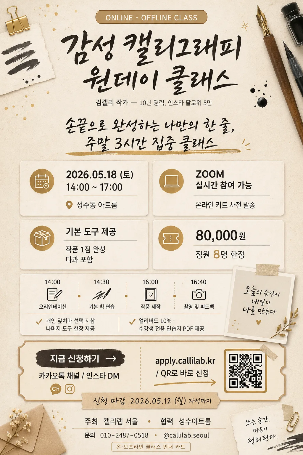
한국어 온·오프라인 클래스 안내 카드 for social sharing, 세로형 홍보 포스터 with clear hierarchy and realistic class-registration information.
한국 클래스 플랫폼 스타일의 마케팅 카드 레이아웃을 참고해, 감성적인 손그림 포인트, 촉감 있는 종이 질감, 티켓형 신청 정보, 정돈된 안내 블록이 균형 있게 보이도록 제작한다.

[Composition]
- Top area (about 24%): 작은 카테고리 pill {카테고리배지}를 상단에 배치하고, 중앙에 {클래스명}을 메인 타이틀로 크게 넣으며, 바로 아래에 {강사명/소개}를 작은 글씨로 배치한다. 강한 오프닝을 위해 굵은 후킹 문구 {대표문구}를 함께 넣는다.
- Middle area (about 48%): {일정·장소}, {온라인안내}, {구성/포함}, {수강료·인원}을 위한 4개의 분리된 정보 박스를 만들고, {세부일정}을 보여주는 compact schedule strip을 추가한다. 아이콘 라벨, 구분선, 따뜻한 카드 표면을 활용한다.
- Lower area (about 18%): {CTA}, {신청링크}, {신청마감}, 작은 mock QR-code box가 포함된 CTA zone을 구성한다. 티켓/예약 스타일 microcopy와 명확한 신청 안내를 넣는다.
- Footer band (about 10%): {주최/협력}, contact micro text {문의번호}를 넣고, brush stroke samples, washi tape, ink dots, pen nibs, 작은 완성 작품 썸네일 같은 클래스 관련 장식 그래픽을 배치한다.
- Background: warm beige paper texture with visible subtle grain, layered off-white panels, muted gold accents, soft brown dividers, and handmade stationery motifs supporting the class theme.
- Spacing: polished editorial spacing with consistent 24–32px internal padding, readable grouping, layered but balanced visual rhythm, and strong hierarchy for mobile scanning.
- Size direction: 전체 카드 비율과 제작 크기는 {비율/사이즈}에 맞추며, 인스타그램·블로그 공유용으로 정보가 잘 읽히는 세로형 구성을 유지한다.

[3. CORE STRUCTURE]
1. Header block: {카테고리배지}를 최상단 rounded label로 배치한 뒤, {클래스명}을 가장 큰 타입으로 설정하고, {강사명/소개}를 그 아래 lighter weight로 배치한다. {대표문구}는 hand-brush underline이 있는 굵은 promotional line으로 표현한다.
2. Information grid: 중앙 섹션에 2x2 card grid를 만들고, 각 박스는 명확한 라벨과 함께 {일정·장소}, {온라인안내}, {구성/포함}, {수강료·인원}의 정확한 클래스 정보를 담는다. calendar, pin, laptop, kit, ticket 아이콘을 작게 사용한다.
3. Schedule and preparation strip: grid 아래에 {세부일정}, {준비물}, {혜택태그}가 들어간 horizontal strip을 추가한다. 클래스 시간표 또는 checklist처럼 tiny check marks를 곁들인다.
4. Visual motif accents: pen nibs, brush strokes, ink swatches, paper tape, envelope corners, gold flecks, spark-like decorative icons 등 현실감 있는 작은 손그림 일러스트 요소를 header와 boxes 주변에 배치하되 모든 정보는 완전히 읽히게 유지한다.
5. CTA and ticket block: 하단에는 {CTA}를 button-like rectangle 또는 highlighted strip으로 강조하고, {신청링크}를 mock QR-code box 옆에 배치한다. {신청마감}은 deadline badge로 표시하며, practical booking feel을 위해 ticket stub edge 또는 perforation line을 넣는다.
6. Footer sponsor area: {주최/협력}와 {문의번호}를 작지만 legible type으로 넣고 thin dividers로 구분한다. footer identifier로 “온·오프라인 클래스 안내 카드” 문구를 포함한다.

[4. STYLE RULES]
- Typography: main information에는 Pretendard 또는 Noto Sans KR를 사용하고, header는 bold weight, body는 medium/regular를 사용한다. 손그림 brush/script accent는 emphasis phrases, labels, underline details에만 제한적으로 사용한다.
- Color palette: {컨셉 톤}을 기본 방향으로 삼고, beige #F4EBDD, warm ivory #FBF7F1, charcoal ink #2E2A27, muted gold #C8A45D, soft brown #8A6E56, pale apricot #E9C9A7을 조합한다.
- Border/shadow: thin 1px warm-gray borders, soft drop shadow 0px 8px 24px rgba(46,42,39,0.10), lightly rounded 20px corners on info boxes, dotted ticket perforation on CTA area.
- Graphic details: “D-7”, “정원 마감 임박”, “온라인 참여 가능”, “키트 제공” 같은 small realistic UI-like labels는 카드 정보와 어울릴 때만 보조적으로 사용한다.
- Text hierarchy: title must be immediately readable, feature details must be scannable, and the CTA must appear as the strongest action element near the bottom.

[5. VISUAL STYLE]
- Camera / lens: flat graphic poster composition, top-down editorial layout inspired by clean social-card design rather than photography. Texture가 필요할 경우 subtle paper fiber detail이 있는 scanned paper at 300dpi 느낌으로 표현한다.
- Lighting: diffuse studio-style illumination with no harsh highlights, even tonal distribution, soft shadowing only around cards and motif elements.
- Color grade: warm beige + muted gold + charcoal ink, with restrained contrast and paper-friendly tones.

[6. MOOD]
한국 클래스 마케팅 카드 — polished Taling / Class101 promotional visual처럼 따뜻한 editorial layout, 실용적인 booking details, handmade stationery texture, gentle hand-drawn charm이 느껴지게 한다.

[7. CRITICAL]
- Korean text accuracy: 반드시 아래 문구가 정확히 보여야 함
  - {카테고리배지}
  - {클래스명}
  - {강사명/소개}
  - {대표문구}
  - {일정·장소}
  - {온라인안내}
  - {구성/포함}
  - {수강료·인원}
  - {세부일정}
  - {준비물}
  - {혜택태그}
  - {신청마감}
  - {CTA}
  - {신청링크}
  - {주최/협력}
  - {문의번호}
  - {비율/사이즈}
  - 온·오프라인 클래스 안내 카드
- Layout invariants: top header contains category badge + class name + instructor + large headline; middle contains schedule/location, online information, inclusions, and price/capacity boxes; lower section contains schedule strip, QR-style application area, deadline badge, and CTA; footer contains organizer/sponsor information.
- Render realistic Korean poster microcopy such as “온라인 동시 진행”, “현장 수강 가능”, “준비물 안내”, “신청 마감”, “문의”, “주최/협력” as clean legible Korean text.
- 전체 결과물의 비율과 해상도 감각은 {비율/사이즈}에 맞추고, 모바일 화면에서 타이틀과 신청 정보가 선명하게 보이도록 한다.
- All Korean text must be cleanly rendered with no broken characters.

[8. 🚫 PROHIBITED]
- Fake official seals / certifications
- Broken Korean characters
- False government or institutional certification marks
- Celebrity composites or unauthorized celebrity likenesses