広告・ポスター
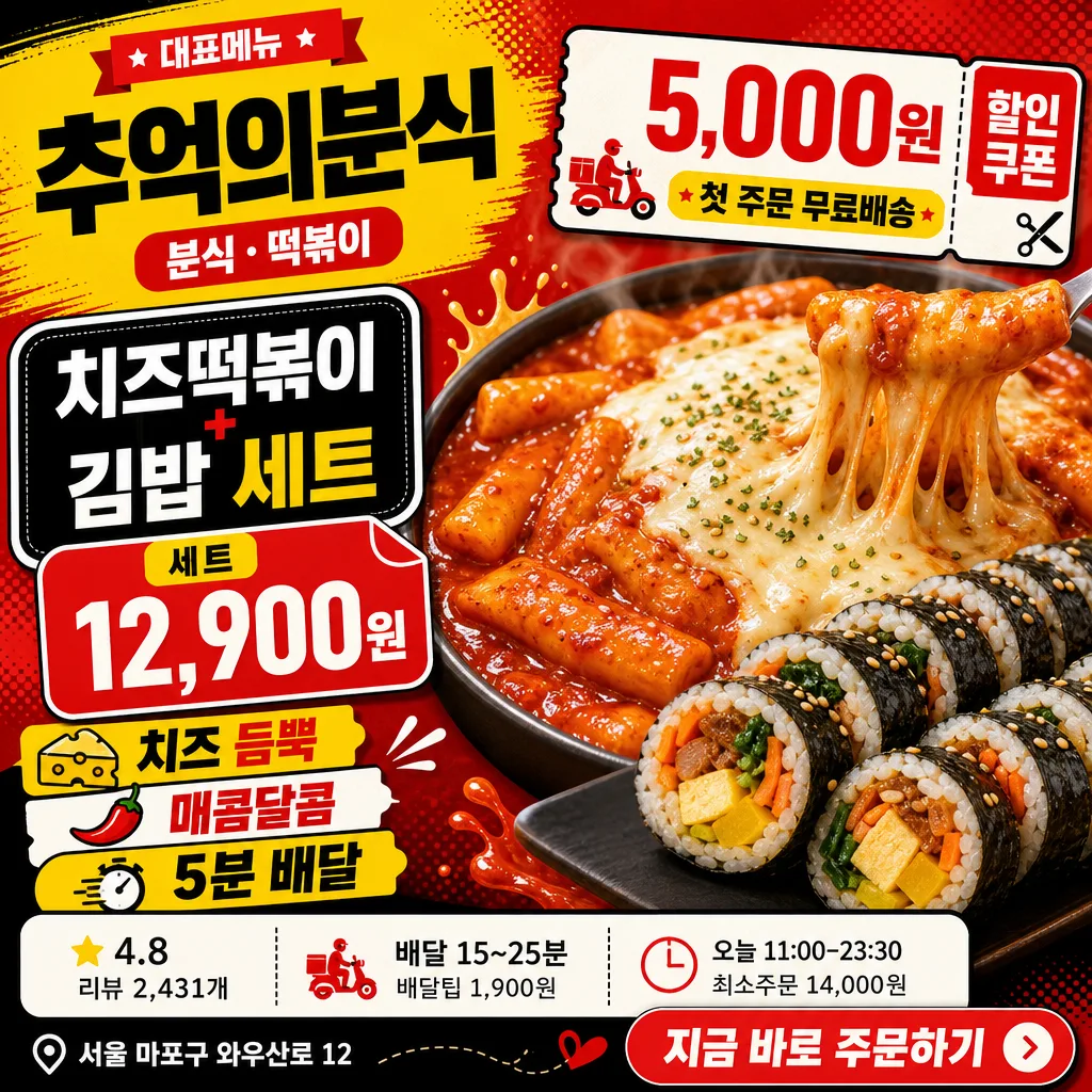
배달앱 매장 메인 썸네일
배민·요기요·쿠팡이츠 매장 메인 썸네일. 가게 시그니처 메뉴 + 클릭 유도 톤.
배달앱 매장 메인 썸네일の概要
広告・ポスター画像を作るためのChatGPT画像プロンプトです。主題、背景、スタイル、構図を整理し、すぐに試せるよう構成しています。
関連キーワード: 배달앱 매장 메인 썸네일, 배달앱 매장 메인 썸네일 프롬프트, 広告・ポスター 프롬프트, 広告・ポスター AI 이미지 프롬프트, ChatGPT 이미지 프롬프트, AI 이미지 생성 프롬프트, AI 프롬프트, 이미지 프롬프트
배달앱 매장 메인 썸네일の活用方法
元の構造を保ちながら、被写体、背景、色、構図を変更して別案に展開できます。
- 主題を維持し、ブランドや季節、媒体に合わせて色と背景を変更してください。
- 結果が複雑な場合は背景要素を減らし、被写体、構図、照明を具体化してください。
- コピー後、ChatGPTに媒体、アスペクト比、文字の有無を追加で指定できます。
プロンプト原文
[Input]
- language: Korean
- output_size: 1024x1024

[Purpose]
Korean food delivery app store main thumbnail, square promotional tile for app listing and search results.
Strong, scroll-stopping merchant hero image with clear food focus, coupon callout, price information, delivery metadata, and app-style CTA details for a realistic marketplace thumbnail.

[Composition]
- Main subject placement: the {시그니처메뉴} hero occupies about 56-60% of the frame, slightly lower-right, with glossy close-up food detail and a strong cropped hero-photo feeling.
- Merchant identity placement: place {매장명} and {업종} in the upper-left title block, paired with a small “대표메뉴” ribbon and a compact app-card label.
- Promotional structure: combine {할인쿠폰}, {메뉴가격}, {포인트카피}, and {주문CTA} as bold sticker, price tag, and button-like elements that feel native to a Korean delivery app.
- Information strip: show {평점리뷰}, {배달정보}, {영업정보}, and {매장주소} as realistic store metadata chips with thin dividers, small icons, and app UI hierarchy.
- Background treatment: vivid delivery-app promotional background with layered red, yellow, and black panels, halftone texture, diagonal delivery-ticket accents, sauce-splash shapes, and rounded app-card modules.
- Use {매장명}, {업종}, {시그니처메뉴}, {메뉴가격}, {할인쿠폰}, {포인트카피}, {평점리뷰}, {배달정보}, {영업정보}, {매장주소}, {주문CTA}, {컨셉톤} as the customizable content elements.

[3. CORE STRUCTURE]
1. Hero food area (center-right, 56-60%): render {시그니처메뉴} as a high-detail commercial food close-up with glossy sauce, melted cheese stretch, visible rice-roll texture, steam-like freshness cues, sesame garnish, and shallow depth-of-field compression.
2. Merchant header area (top-left, 18%): place {매장명} in large bold Korean sans-serif, with {업종} below it in a smaller pill label; include a small “대표메뉴” ribbon and a warm yellow highlight bar behind the title.
3. Menu and price tag area (left-mid, 14%): display {시그니처메뉴} as the main menu label and {메뉴가격} as a price tag attached to the food photo, using thick black outline and a rounded rectangular sticker shape.
4. Discount badge area (upper-right or left-mid overlap, 12%): show {할인쿠폰} inside a compact coupon sticker with perforation marks, tiny scissors icon, strong contrast, and a bold red/yellow treatment.
5. Delivery app metadata strip (bottom band, 12%): arrange {평점리뷰}, {배달정보}, and {영업정보} as three app UI chips with star, clock, and bag icons; add thin divider lines between chips for a realistic store-card interface.
6. Point-copy area (bottom-left or bottom-center, 12%): display {포인트카피} as 2-3 short stacked lines, emphasizing key benefit words with alternating red, yellow, black, and white blocks.
7. Store footer and CTA (bottom-right, 8%): include {매장주소} in a small but readable caption line and render {주문CTA} as a rounded button-like callout, similar to an in-app order prompt.
8. Background graphic layer: reinforce {컨셉톤} through bold color blocks, diagonal accents, halftone dots, delivery-ticket motifs, sauce-splash graphics, and subtle paper-sticker shadows while keeping the food hero as the main focal point.

[4. STYLE RULES]
- Typography: use Pretendard ExtraBold or Noto Sans KR Black for major headings, 48-76px equivalent sizing; use 28-42px equivalent for secondary copy, and 18-24px equivalent for metadata chips with crisp Korean letterforms.
- Color palette: apply vivid delivery-app tones from {컨셉톤}; prioritize strong red #E53935, bright yellow #FFD400, deep black #111111, clean white #FFFFFF, and small warm-orange accents for coupon highlights.
- UI details: use rounded app-card modules, coupon perforation marks, price-tag corners, tiny star/clock/bag/location icons, thin divider lines, and sticker-style overlays with a realistic mobile commerce layout.
- Border/shadow: use crisp poster-style borders, 2-4px black outlines on headline boxes, and a soft drop shadow with 4px y-offset, 12px blur, 15% opacity for the hero food, badges, price tags, and CTA button.

[5. VISUAL STYLE]
- Camera / lens: commercial food photography look, 85mm f/2.8 close-up with crisp detail and slight background compression, studio-grade sharpness.
- Lighting: bright key light from upper-left at 45°, gentle fill from right, subtle specular highlights on sauce and cheese, controlled reflections on glossy food surfaces, and readable text zones.
- Color grade: punchy red-yellow-black delivery promo grade with high saturation, clean whites, rich warm highlights on the food hero, and appetizing contrast in the sauce and cheese.

[6. MOOD]
Korean delivery-app bestseller thumbnail — fast-scrolling marketplace promo aesthetic with the bold readability of a mobile food-commerce ad, the energy of a snack-food campaign, and the credibility of a real restaurant listing card.

[7. CRITICAL]
- Korean text accuracy: 반드시 아래 문구가 이미지에 정확히 보여야 함.
  - {매장명}
  - {업종}
  - {시그니처메뉴}
  - {메뉴가격}
  - {할인쿠폰}
  - {포인트카피}
  - {평점리뷰}
  - {배달정보}
  - {영업정보}
  - {매장주소}
  - {주문CTA}
- Layout invariant: the food hero must remain the largest visual element, and the store name, menu price, coupon badge, delivery metadata, and CTA must be clearly separated and readable at thumbnail size.
- Required rendered Korean labels may include realistic app-style micro labels such as “대표메뉴”, “쿠폰”, “배달정보”, “최소주문”, “오늘 영업”, and “주문하기”.
- The final image should feel like a polished Korean food delivery app merchant thumbnail, not a plain food photo or generic restaurant poster.

[8. 🚫 PROHIBITED]
- Fake official seals / government certifications
- Broken Korean characters or garbled Hangul
- Illegible tiny text in required copy
- Celebrity composites or unauthorized person likeness