廣告/海報
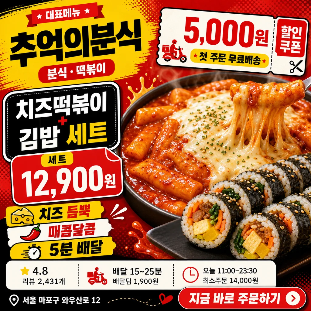
배달앱 매장 메인 썸네일
배민·요기요·쿠팡이츠 매장 메인 썸네일. 가게 시그니처 메뉴 + 클릭 유도 톤.
배달앱 매장 메인 썸네일摘要
這是用來製作廣告/海報內容的 ChatGPT 圖像提示詞,已整理主題、背景、風格與構圖,方便快速調整。
相關關鍵字: 배달앱 매장 메인 썸네일, 배달앱 매장 메인 썸네일 프롬프트, 廣告/海報 프롬프트, 廣告/海報 AI 이미지 프롬프트, ChatGPT 이미지 프롬프트, AI 이미지 생성 프롬프트, AI 프롬프트, 이미지 프롬프트
배달앱 매장 메인 썸네일使用方式
保留原始結構並替換主體、背景、色彩或構圖,即可延伸出不同版本。
- 保留核心主體,並依品牌、季節或平台調整色彩與背景。
- 如果畫面太複雜,請減少背景元素並具體描述主體、構圖與光線。
- 複製後可要求 ChatGPT 配合平台、長寬比或文字需求調整。
提示詞原文
[Input]
- language: Korean
- output_size: 1024x1024

[Purpose]
Korean food delivery app store main thumbnail, square promotional tile for app listing and search results.
Strong, scroll-stopping merchant hero image with clear food focus, coupon callout, price information, delivery metadata, and app-style CTA details for a realistic marketplace thumbnail.

[Composition]
- Main subject placement: the {시그니처메뉴} hero occupies about 56-60% of the frame, slightly lower-right, with glossy close-up food detail and a strong cropped hero-photo feeling.
- Merchant identity placement: place {매장명} and {업종} in the upper-left title block, paired with a small “대표메뉴” ribbon and a compact app-card label.
- Promotional structure: combine {할인쿠폰}, {메뉴가격}, {포인트카피}, and {주문CTA} as bold sticker, price tag, and button-like elements that feel native to a Korean delivery app.
- Information strip: show {평점리뷰}, {배달정보}, {영업정보}, and {매장주소} as realistic store metadata chips with thin dividers, small icons, and app UI hierarchy.
- Background treatment: vivid delivery-app promotional background with layered red, yellow, and black panels, halftone texture, diagonal delivery-ticket accents, sauce-splash shapes, and rounded app-card modules.
- Use {매장명}, {업종}, {시그니처메뉴}, {메뉴가격}, {할인쿠폰}, {포인트카피}, {평점리뷰}, {배달정보}, {영업정보}, {매장주소}, {주문CTA}, {컨셉톤} as the customizable content elements.

[3. CORE STRUCTURE]
1. Hero food area (center-right, 56-60%): render {시그니처메뉴} as a high-detail commercial food close-up with glossy sauce, melted cheese stretch, visible rice-roll texture, steam-like freshness cues, sesame garnish, and shallow depth-of-field compression.
2. Merchant header area (top-left, 18%): place {매장명} in large bold Korean sans-serif, with {업종} below it in a smaller pill label; include a small “대표메뉴” ribbon and a warm yellow highlight bar behind the title.
3. Menu and price tag area (left-mid, 14%): display {시그니처메뉴} as the main menu label and {메뉴가격} as a price tag attached to the food photo, using thick black outline and a rounded rectangular sticker shape.
4. Discount badge area (upper-right or left-mid overlap, 12%): show {할인쿠폰} inside a compact coupon sticker with perforation marks, tiny scissors icon, strong contrast, and a bold red/yellow treatment.
5. Delivery app metadata strip (bottom band, 12%): arrange {평점리뷰}, {배달정보}, and {영업정보} as three app UI chips with star, clock, and bag icons; add thin divider lines between chips for a realistic store-card interface.
6. Point-copy area (bottom-left or bottom-center, 12%): display {포인트카피} as 2-3 short stacked lines, emphasizing key benefit words with alternating red, yellow, black, and white blocks.
7. Store footer and CTA (bottom-right, 8%): include {매장주소} in a small but readable caption line and render {주문CTA} as a rounded button-like callout, similar to an in-app order prompt.
8. Background graphic layer: reinforce {컨셉톤} through bold color blocks, diagonal accents, halftone dots, delivery-ticket motifs, sauce-splash graphics, and subtle paper-sticker shadows while keeping the food hero as the main focal point.

[4. STYLE RULES]
- Typography: use Pretendard ExtraBold or Noto Sans KR Black for major headings, 48-76px equivalent sizing; use 28-42px equivalent for secondary copy, and 18-24px equivalent for metadata chips with crisp Korean letterforms.
- Color palette: apply vivid delivery-app tones from {컨셉톤}; prioritize strong red #E53935, bright yellow #FFD400, deep black #111111, clean white #FFFFFF, and small warm-orange accents for coupon highlights.
- UI details: use rounded app-card modules, coupon perforation marks, price-tag corners, tiny star/clock/bag/location icons, thin divider lines, and sticker-style overlays with a realistic mobile commerce layout.
- Border/shadow: use crisp poster-style borders, 2-4px black outlines on headline boxes, and a soft drop shadow with 4px y-offset, 12px blur, 15% opacity for the hero food, badges, price tags, and CTA button.

[5. VISUAL STYLE]
- Camera / lens: commercial food photography look, 85mm f/2.8 close-up with crisp detail and slight background compression, studio-grade sharpness.
- Lighting: bright key light from upper-left at 45°, gentle fill from right, subtle specular highlights on sauce and cheese, controlled reflections on glossy food surfaces, and readable text zones.
- Color grade: punchy red-yellow-black delivery promo grade with high saturation, clean whites, rich warm highlights on the food hero, and appetizing contrast in the sauce and cheese.

[6. MOOD]
Korean delivery-app bestseller thumbnail — fast-scrolling marketplace promo aesthetic with the bold readability of a mobile food-commerce ad, the energy of a snack-food campaign, and the credibility of a real restaurant listing card.

[7. CRITICAL]
- Korean text accuracy: 반드시 아래 문구가 이미지에 정확히 보여야 함.
  - {매장명}
  - {업종}
  - {시그니처메뉴}
  - {메뉴가격}
  - {할인쿠폰}
  - {포인트카피}
  - {평점리뷰}
  - {배달정보}
  - {영업정보}
  - {매장주소}
  - {주문CTA}
- Layout invariant: the food hero must remain the largest visual element, and the store name, menu price, coupon badge, delivery metadata, and CTA must be clearly separated and readable at thumbnail size.
- Required rendered Korean labels may include realistic app-style micro labels such as “대표메뉴”, “쿠폰”, “배달정보”, “최소주문”, “오늘 영업”, and “주문하기”.
- The final image should feel like a polished Korean food delivery app merchant thumbnail, not a plain food photo or generic restaurant poster.

[8. 🚫 PROHIBITED]
- Fake official seals / government certifications
- Broken Korean characters or garbled Hangul
- Illegible tiny text in required copy
- Celebrity composites or unauthorized person likeness