SNS・カードニュース
자취방 비포애프터 6컷 스토리
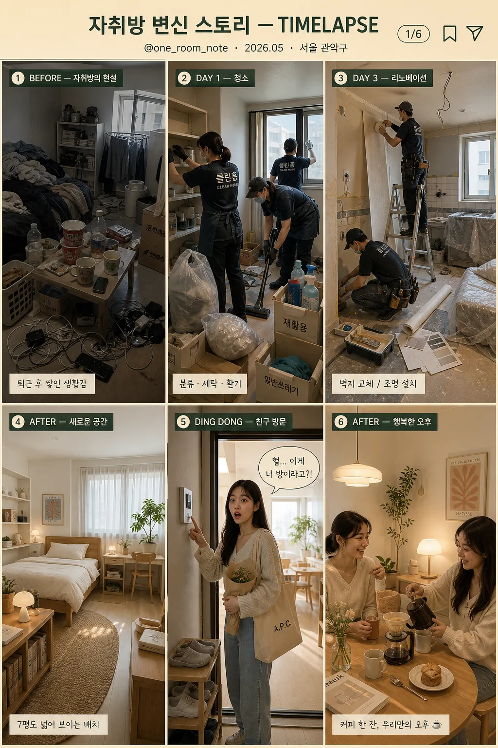
자취방 → 청소 → 리노베이션 → 새 인테리어 → 친구 방문 → 행복 6컷 타임랩스 스토리. 인스타 릴스·숏폼 트렌드 톤.
자취방 비포애프터 6컷 스토리の概要
SNS・カードニュース画像を作るためのChatGPT画像プロンプトです。主題、背景、スタイル、構図を整理し、すぐに試せるよう構成しています。
関連キーワード: 자취방 비포애프터 6컷 스토리, 자취방 비포애프터 6컷 스토리 프롬프트, SNS・カードニュース 프롬프트, SNS・カードニュース AI 이미지 프롬프트, ChatGPT 이미지 프롬프트, AI 이미지 생성 프롬프트, AI 프롬프트, 이미지 프롬프트
자취방 비포애프터 6컷 스토리の活用方法
元の構造を保ちながら、被写体、背景、色、構図を変更して別案に展開できます。
- 主題を維持し、ブランドや季節、媒体に合わせて色と背景を変更してください。
- 結果が複雑な場合は背景要素を減らし、被写体、構図、照明を具体化してください。
- コピー後、ChatGPTに媒体、アスペクト比、文字の有無を追加で指定できます。
プロンプト原文
[Input]
- language: Korean
- output_size: 1024x1536
- format: {비율/사이즈}
- tone_reference: {컨셉 톤}

[Purpose]
Korean apartment-room before/after story card, 6-cut timelapse grid, social-media-friendly vertical poster.
Cinematic transformation narrative with realistic photo base and slight stylization, designed for Instagram Reels-style grid storytelling, enriched with believable lifestyle details, captions, date/location labels, and small social-card UI elements.

[Composition]
- Top header occupies about 10% of the canvas, with {스토리 제목} centered in a warm title band, plus a small handle, date/location label, and page indicator for a real Instagram recap card.
- Main body uses a strict 3x2 grid: 6 equal panels, each panel with consistent margins, thin separators, realistic snapshot framing, and clear left-to-right / top-to-bottom story flow.
- Each cut should feel like a real phone-photo or editorial snapshot in sequence, with visible everyday details: laundry, cleaning tools, wallpaper rolls, receipts, small plants, mugs, slippers, tote bags, and lived-in apartment textures.
- Use {컷 1 BEFORE}, {컷 2 청소}, {컷 3 리노베이션}, {컷 4 AFTER}, {컷 5 친구 방문}, {컷 6 행복} as the exact panel content guides.
- Overall palette must stay in warm beige, green accent, and wood tones, with realistic apartment lighting, natural material textures, and gentle lifestyle-editorial contrast.

[3. CORE STRUCTURE]
1. Header band: centered {스토리 제목} at the top, with the main title text “자취방 변신 스토리 — TIMELAPSE”; add small supporting microcopy “@one_room_note · 2026.05 · 서울 관악구”, a tiny “1/6” page indicator, and small save/share-style icons on the right.
2. Cut 1 panel (top-left): {컷 1 BEFORE} shown as a cramped 7-pyeong studio with scattered clothes, cup noodles, delivery boxes, tangled charger cables, unwashed mugs, an old folding table, gray cast, low light, and visibly messy surfaces; include a small corner label “BEFORE — 자취방의 현실” and a tiny caption strip “퇴근 후 쌓인 생활감”.
3. Cut 2 panel (top-middle): {컷 2 청소} shown with 2–3 cleaning workers actively organizing, vacuuming, wiping shelves, separating recycling, and airing out the room; include believable cleaning props such as gloves, microfiber cloths, spray bottles, trash bags, labeled boxes, and a partially open window; add the label “DAY 1 — 청소” and small checklist text “분류 · 세탁 · 환기”.
4. Cut 3 panel (top-right): {컷 3 리노베이션} shown mid-renovation with wallpaper replacement, tile work, dust in the air, a ladder, masking tape, paint tray, utility knife, wallpaper rolls, sample swatches, and covered furniture; emphasize improvement in progress through organized tools and visible craftsmanship; add the label “DAY 3 — 리노베이션” and small note “벽지 교체 / 조명 설치”.
5. Cut 4 panel (bottom-left): {컷 4 AFTER} shown as a modern cozy studio with white walls, light wood furniture, soft bedding, woven rug, small plants, books, framed print, linen curtain, compact storage, clean desk setup, and soft daylight; this should be the most polished and calm panel; add the label “AFTER — 새로운 공간” and caption “7평도 넓어 보이는 배치”.
6. Cut 5 panel (bottom-middle): {컷 5 친구 방문} shown with a woman in her 20s pressing the doorbell and entering, wearing a surprised expression as she sees the transformed room; include hallway light, shoe rack, reusable tote bag, bouquet or small housewarming gift, doorbell panel, and a glimpse of the renovated interior behind the door; add the label “DING DONG — 친구 방문” and speech-bubble sticker “진짜 여기 맞아?”.
7. Cut 6 panel (bottom-right): {컷 6 행복} shown with two friends at a small dining table drinking hand-drip coffee and chatting in a warm afternoon setting; include ceramic mugs, dripper, dessert plate, phone, small vase, sunlit curtain texture, cozy shadows, and relaxed natural gestures; add the label “AFTER — 행복한 오후” and a small end-card CTA “저장하고 다음 집들이 보기”.
8. Bottom footer strip: very small social-card footer beneath the grid with “ROOM MAKEOVER LOG · SAVE • SHARE · #자취방꾸미기 #비포애프터”, matching the warm beige-green palette.

[4. STYLE RULES]
- Typography: use Pretendard or Noto Sans KR for the header, labels, captions, footer, and stickers; bold for panel labels, medium for the title, around 24–34px for the title and 14–18px for panel labels, with microcopy around 9–12px.
- Panel labels must be small, crisp, and fully legible in Korean, placed at each panel corner with consistent padding; captions may sit in translucent rounded rectangles so they feel like real social-media overlays.
- Color palette: warm beige #E8DDCF, muted green #8FA58B, soft wood brown #B78E66, off-white #F7F3ED, cool gray #8C8C8C, with natural highlights from window light and subtle warm shadows.
- Border/shadow: thin off-white separators with subtle shadow, 2px line weight, soft drop shadow 4px y-offset, 12px blur, 15% opacity; add small rounded sticker shapes and divider ticks that look printed rather than sterile.
- Include realistic apartment textures: painted wall grain, laminate floor seams, paper boxes, fabric wrinkles, ceramic reflections, wood grain, cleaning-tool plastic, and soft curtain translucency.

[5. VISUAL STYLE]
- Camera / lens: realistic interior photo look, 24mm wide-angle for room panels and 50mm standard lens feel for the people-focused panels, f/4 to f/5.6, clean editorial framing.
- Lighting: before panel uses dim indoor ambient light; cleaning and renovation panels use neutral overhead interior light; after panel uses soft window light from upper-left; friend and coffee panels use warm afternoon window light from the side.
- Color grade: cinematic beige-green-wood grade with slightly softened contrast, natural skin tones, and gentle highlight roll-off, similar to a premium lifestyle editorial spread.
- Rendering approach: realistic photo collage with subtle editorial polish; maintain believable Korean studio-apartment scale, real human proportions, readable overlay text, and natural depth in every panel.

[6. MOOD]
Premium home-transformation editorial — like a refined Kinfolk magazine before/after spread mixed with a polished Instagram Reels recap and a warm Korean 자취방 집들이 post.

[7. CRITICAL]
- Korean text accuracy: 반드시 정확히 렌더링되어야 하는 문자열 — “자취방 변신 스토리 — TIMELAPSE”, “BEFORE — 자취방의 현실”, “DAY 1 — 청소”, “DAY 3 — 리노베이션”, “AFTER — 새로운 공간”, “DING DONG — 친구 방문”, “AFTER — 행복한 오후”.
- Additional small Korean/social text to render clearly where space allows: “@one_room_note”, “2026.05 · 서울 관악구”, “1/6”, “퇴근 후 쌓인 생활감”, “분류 · 세탁 · 환기”, “벽지 교체 / 조명 설치”, “7평도 넓어 보이는 배치”, “진짜 여기 맞아?”, “저장하고 다음 집들이 보기”, “#자취방꾸미기 #비포애프터”.
- The layout must remain a 3x2 grid with exactly 6 evenly sized panels, plus header and small footer UI elements outside the panels.
- Keep the transformation tone positive, realistic, and non-sensational; the messy room should feel like an ordinary lived-in studio before a genuine reset.
- All hands, faces, body posture, reflections, doorbell interaction, cleaning actions, and coffee-drinking gestures should look natural and anatomically correct.

[8. 🚫 PROHIBITED]
- Fake official seals / certifications
- Broken Korean characters