社群/圖卡
자취방 비포애프터 6컷 스토리
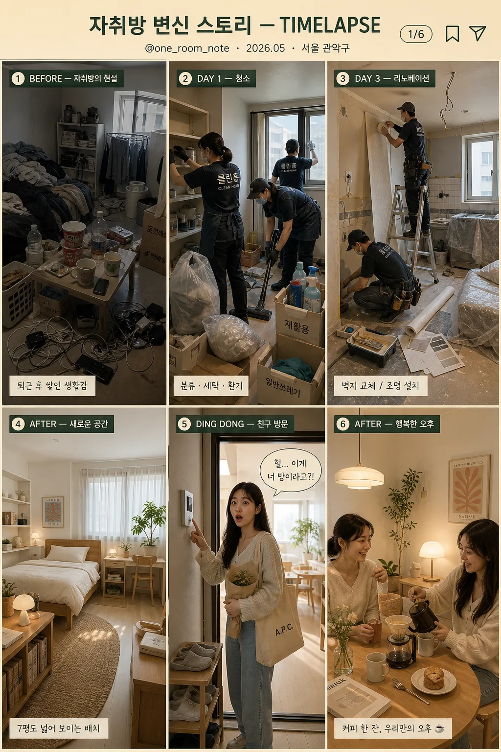
자취방 → 청소 → 리노베이션 → 새 인테리어 → 친구 방문 → 행복 6컷 타임랩스 스토리. 인스타 릴스·숏폼 트렌드 톤.
자취방 비포애프터 6컷 스토리摘要
這是用來製作社群/圖卡內容的 ChatGPT 圖像提示詞,已整理主題、背景、風格與構圖,方便快速調整。
相關關鍵字: 자취방 비포애프터 6컷 스토리, 자취방 비포애프터 6컷 스토리 프롬프트, 社群/圖卡 프롬프트, 社群/圖卡 AI 이미지 프롬프트, ChatGPT 이미지 프롬프트, AI 이미지 생성 프롬프트, AI 프롬프트, 이미지 프롬프트
자취방 비포애프터 6컷 스토리使用方式
保留原始結構並替換主體、背景、色彩或構圖,即可延伸出不同版本。
- 保留核心主體,並依品牌、季節或平台調整色彩與背景。
- 如果畫面太複雜,請減少背景元素並具體描述主體、構圖與光線。
- 複製後可要求 ChatGPT 配合平台、長寬比或文字需求調整。
提示詞原文
[Input]
- language: Korean
- output_size: 1024x1536
- format: {비율/사이즈}
- tone_reference: {컨셉 톤}

[Purpose]
Korean apartment-room before/after story card, 6-cut timelapse grid, social-media-friendly vertical poster.
Cinematic transformation narrative with realistic photo base and slight stylization, designed for Instagram Reels-style grid storytelling, enriched with believable lifestyle details, captions, date/location labels, and small social-card UI elements.

[Composition]
- Top header occupies about 10% of the canvas, with {스토리 제목} centered in a warm title band, plus a small handle, date/location label, and page indicator for a real Instagram recap card.
- Main body uses a strict 3x2 grid: 6 equal panels, each panel with consistent margins, thin separators, realistic snapshot framing, and clear left-to-right / top-to-bottom story flow.
- Each cut should feel like a real phone-photo or editorial snapshot in sequence, with visible everyday details: laundry, cleaning tools, wallpaper rolls, receipts, small plants, mugs, slippers, tote bags, and lived-in apartment textures.
- Use {컷 1 BEFORE}, {컷 2 청소}, {컷 3 리노베이션}, {컷 4 AFTER}, {컷 5 친구 방문}, {컷 6 행복} as the exact panel content guides.
- Overall palette must stay in warm beige, green accent, and wood tones, with realistic apartment lighting, natural material textures, and gentle lifestyle-editorial contrast.

[3. CORE STRUCTURE]
1. Header band: centered {스토리 제목} at the top, with the main title text “자취방 변신 스토리 — TIMELAPSE”; add small supporting microcopy “@one_room_note · 2026.05 · 서울 관악구”, a tiny “1/6” page indicator, and small save/share-style icons on the right.
2. Cut 1 panel (top-left): {컷 1 BEFORE} shown as a cramped 7-pyeong studio with scattered clothes, cup noodles, delivery boxes, tangled charger cables, unwashed mugs, an old folding table, gray cast, low light, and visibly messy surfaces; include a small corner label “BEFORE — 자취방의 현실” and a tiny caption strip “퇴근 후 쌓인 생활감”.
3. Cut 2 panel (top-middle): {컷 2 청소} shown with 2–3 cleaning workers actively organizing, vacuuming, wiping shelves, separating recycling, and airing out the room; include believable cleaning props such as gloves, microfiber cloths, spray bottles, trash bags, labeled boxes, and a partially open window; add the label “DAY 1 — 청소” and small checklist text “분류 · 세탁 · 환기”.
4. Cut 3 panel (top-right): {컷 3 리노베이션} shown mid-renovation with wallpaper replacement, tile work, dust in the air, a ladder, masking tape, paint tray, utility knife, wallpaper rolls, sample swatches, and covered furniture; emphasize improvement in progress through organized tools and visible craftsmanship; add the label “DAY 3 — 리노베이션” and small note “벽지 교체 / 조명 설치”.
5. Cut 4 panel (bottom-left): {컷 4 AFTER} shown as a modern cozy studio with white walls, light wood furniture, soft bedding, woven rug, small plants, books, framed print, linen curtain, compact storage, clean desk setup, and soft daylight; this should be the most polished and calm panel; add the label “AFTER — 새로운 공간” and caption “7평도 넓어 보이는 배치”.
6. Cut 5 panel (bottom-middle): {컷 5 친구 방문} shown with a woman in her 20s pressing the doorbell and entering, wearing a surprised expression as she sees the transformed room; include hallway light, shoe rack, reusable tote bag, bouquet or small housewarming gift, doorbell panel, and a glimpse of the renovated interior behind the door; add the label “DING DONG — 친구 방문” and speech-bubble sticker “진짜 여기 맞아?”.
7. Cut 6 panel (bottom-right): {컷 6 행복} shown with two friends at a small dining table drinking hand-drip coffee and chatting in a warm afternoon setting; include ceramic mugs, dripper, dessert plate, phone, small vase, sunlit curtain texture, cozy shadows, and relaxed natural gestures; add the label “AFTER — 행복한 오후” and a small end-card CTA “저장하고 다음 집들이 보기”.
8. Bottom footer strip: very small social-card footer beneath the grid with “ROOM MAKEOVER LOG · SAVE • SHARE · #자취방꾸미기 #비포애프터”, matching the warm beige-green palette.

[4. STYLE RULES]
- Typography: use Pretendard or Noto Sans KR for the header, labels, captions, footer, and stickers; bold for panel labels, medium for the title, around 24–34px for the title and 14–18px for panel labels, with microcopy around 9–12px.
- Panel labels must be small, crisp, and fully legible in Korean, placed at each panel corner with consistent padding; captions may sit in translucent rounded rectangles so they feel like real social-media overlays.
- Color palette: warm beige #E8DDCF, muted green #8FA58B, soft wood brown #B78E66, off-white #F7F3ED, cool gray #8C8C8C, with natural highlights from window light and subtle warm shadows.
- Border/shadow: thin off-white separators with subtle shadow, 2px line weight, soft drop shadow 4px y-offset, 12px blur, 15% opacity; add small rounded sticker shapes and divider ticks that look printed rather than sterile.
- Include realistic apartment textures: painted wall grain, laminate floor seams, paper boxes, fabric wrinkles, ceramic reflections, wood grain, cleaning-tool plastic, and soft curtain translucency.

[5. VISUAL STYLE]
- Camera / lens: realistic interior photo look, 24mm wide-angle for room panels and 50mm standard lens feel for the people-focused panels, f/4 to f/5.6, clean editorial framing.
- Lighting: before panel uses dim indoor ambient light; cleaning and renovation panels use neutral overhead interior light; after panel uses soft window light from upper-left; friend and coffee panels use warm afternoon window light from the side.
- Color grade: cinematic beige-green-wood grade with slightly softened contrast, natural skin tones, and gentle highlight roll-off, similar to a premium lifestyle editorial spread.
- Rendering approach: realistic photo collage with subtle editorial polish; maintain believable Korean studio-apartment scale, real human proportions, readable overlay text, and natural depth in every panel.

[6. MOOD]
Premium home-transformation editorial — like a refined Kinfolk magazine before/after spread mixed with a polished Instagram Reels recap and a warm Korean 자취방 집들이 post.

[7. CRITICAL]
- Korean text accuracy: 반드시 정확히 렌더링되어야 하는 문자열 — “자취방 변신 스토리 — TIMELAPSE”, “BEFORE — 자취방의 현실”, “DAY 1 — 청소”, “DAY 3 — 리노베이션”, “AFTER — 새로운 공간”, “DING DONG — 친구 방문”, “AFTER — 행복한 오후”.
- Additional small Korean/social text to render clearly where space allows: “@one_room_note”, “2026.05 · 서울 관악구”, “1/6”, “퇴근 후 쌓인 생활감”, “분류 · 세탁 · 환기”, “벽지 교체 / 조명 설치”, “7평도 넓어 보이는 배치”, “진짜 여기 맞아?”, “저장하고 다음 집들이 보기”, “#자취방꾸미기 #비포애프터”.
- The layout must remain a 3x2 grid with exactly 6 evenly sized panels, plus header and small footer UI elements outside the panels.
- Keep the transformation tone positive, realistic, and non-sensational; the messy room should feel like an ordinary lived-in studio before a genuine reset.
- All hands, faces, body posture, reflections, doorbell interaction, cleaning actions, and coffee-drinking gestures should look natural and anatomically correct.

[8. 🚫 PROHIBITED]
- Fake official seals / certifications
- Broken Korean characters