SNS/카드뉴스
여행 카드뉴스·일정표 (여행기·일정 시각화)
여행 일정·동선·맛집·숙소를 한 장에. 여행 vlog·블로그·인스타 공유용 카드뉴스/일정표.
여행 카드뉴스·일정표 (여행기·일정 시각화) 검색 요약
여행 카드뉴스·일정표 (여행기·일정 시각화)은 SNS/카드뉴스 결과물을 만들 때 바로 복사해 활용할 수 있는 ChatGPT 이미지 프롬프트입니다. 주제, 배경, 스타일, 구도 조건을 함께 담아 빠르게 시안을 만들 수 있도록 구성했습니다.
관련 키워드: 여행 카드뉴스·일정표 (여행기·일정 시각화), 여행 카드뉴스·일정표 (여행기·일정 시각화) 프롬프트, SNS/카드뉴스 프롬프트, SNS/카드뉴스 AI 이미지 프롬프트, ChatGPT 이미지 프롬프트, AI 이미지 생성 프롬프트, AI 프롬프트, 이미지 프롬프트
여행 카드뉴스·일정표 (여행기·일정 시각화) 활용 포인트
원본 구조를 유지하면서 피사체, 배경, 색감, 구도를 바꿔 다양한 시안으로 확장할 수 있습니다.
- 핵심 소재는 유지하고 브랜드, 계절, 채널 목적에 맞는 색감과 배경을 바꿔보세요.
- 결과가 산만하면 배경 요소를 줄이고 피사체, 구도, 조명 조건을 구체화하세요.
- 복사한 뒤 ChatGPT에서 플랫폼, 화면 비율, 텍스트 포함 여부를 추가로 요청할 수 있습니다.
프롬프트 원문
[Input]
- language: Korean
- output_size: 1024x1536

[Purpose]
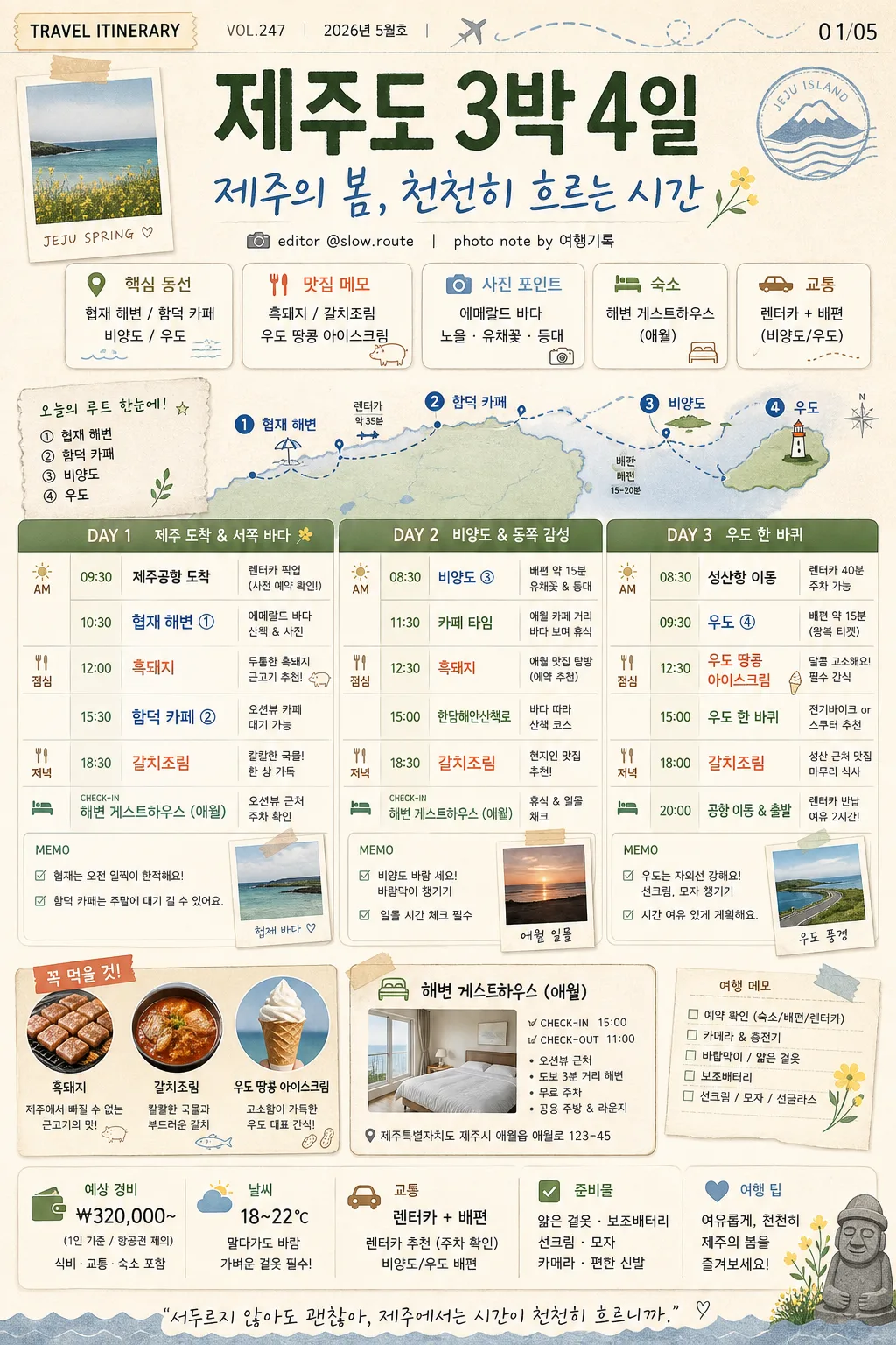
Korean travel card news / itinerary visual, vertical infographic poster for Instagram sharing.
Design a content-rich, realistic travel planning card that feels like a saved influencer itinerary: clear day-by-day schedule, editorial travel notes, small map-route cues, food highlights, accommodation info, and shareable card-news details.

[Composition]
- Overall layout: vertical 1024x1536 poster with a strong top header, a richly organized itinerary dashboard occupying the central canvas, and supporting travel elements such as route markers, mini photo-card panels, checklist notes, weather chips, and local landmark accents.
- Header area (top 18%): {여행지} as the main destination title, followed by {핵심 카피} as a large Korean headline. Add a small card-news label such as "TRAVEL ITINERARY", "VOL.247", "2026년 5월호", and a slide/page indicator "01/05" near the top edge.
- Main schedule area (middle 62%): a 3-day visual timetable using DAY 1 / DAY 2 / DAY 3 blocks, each with time, place, menu, movement, and short memo entries laid out in readable columns. Include small labels like "AM", "PM", "DINNER", "CHECK-IN" for realistic planning depth.
- Supporting details: {주요 장소}, {주요 메뉴/맛집}, and {숙소} should appear as concise itinerary items with pin markers, food icons, mini caption tags, route dots, and a small accommodation card.
- Background treatment: warm off-white paper texture with subtle scanned grain, beige base, soft sage panels, light blue route shapes, coral highlight stickers, tape-like labels, small receipt-style note fragments, and soft shadows to make the card feel printed and collectible.
- Use {여행지}, {주요 장소}, {주요 메뉴/맛집}, {숙소}, {핵심 카피}, {컨셉 톤}, {비율/사이즈} placeholders.

[3. CORE STRUCTURE]
- Header strip (top): place {여행지} in large bold Korean type, with {핵심 카피} beneath it as a prominent subtitle. Add a thin travel-route line motif in soft blue, a tiny airplane or ferry icon, and small credit text such as "editor @slow.route" and "photo note by 여행기록".
- Overview chips (upper-middle): create 4–5 rounded chips for key trip highlights using {주요 장소}, {주요 메뉴/맛집}, and {숙소}; each chip should have a tiny pictogram such as a pin, fork, wave, camera, ferry, or bed. Add small Korean labels like "핵심 동선", "맛집 메모", "숙소", "사진 포인트".
- Mini map / route cue: include a small simplified island or route-line graphic beside the chips, with numbered dots ① ② ③ and tiny place labels from {주요 장소}. Make it feel like a practical travel note, not a blank decorative shape.
- Itinerary table (center): render DAY 1, DAY 2, DAY 3 as stacked rows or three equal columns, each containing time, place, food, and memo text blocks. Use realistic example time labels such as "09:30 도착", "12:00 점심", "15:30 카페", "18:30 저녁", while integrating {주요 장소} and {주요 메뉴/맛집} visibly.
- Day detail content: enrich each DAY block with small travel-note fragments such as "렌터카 이동 35분", "일몰 체크", "카페 대기 가능", "바람막이 챙기기", "예약 확인". Keep the hierarchy clear with bold day labels, colored bullets, and compact captions.
- Detail emphasis: highlight the most photogenic spots from {주요 장소} with slightly larger text, numbered map pins, or a colored bullet. Treat {주요 메뉴/맛집} as a food callout in a coral accent box with a fork icon and a small caption like "꼭 먹을 것".
- Accommodation block (lower-middle): show {숙소} as a compact card with a bed icon, check-in/check-out notes, an address-style line, and a short overnight stay context such as "오션뷰 근처 / 주차 확인".
- Extra information row: add a small budget/weather/checklist strip near the lower area with Korean microcopy such as "예상 경비 ₩320,000~", "날씨 18–22℃", "준비물: 얇은 겉옷 · 보조배터리", and "교통: 렌터카 + 배편".
- Decorative graphics: add friendly flat illustrations of food, sea, mountain, orange, camera, ticket stub, map pin, and landmark motifs around the layout. Use them as meaningful editorial accents connected to travel planning.
- Footer area (bottom 12%): include a card-news CTA line and Instagram-style micro UI details: "저장해두고 여행 전날 다시 보기", "다음 장: 코스별 이동시간", small save/share/comment icons, hashtags like "#제주여행 #3박4일코스 #여행카드뉴스", and page indicator dots "● ○ ○ ○ ○".

[4. STYLE RULES]
- Typography: use Pretendard or Noto Sans KR for the main body in regular/medium weights; use Pretendard ExtraBold or Noto Sans KR Bold for the title; keep headline size large and body text compact but readable at mobile-card scale.
- Color palette: use the palette implied by {컨셉 톤} with specific tones such as beige #E9DDC8, sage #A8B8A6, coral #F2A38A, soft blue #AFC8E8, and deep charcoal #2B2B2B for text.
- Border/shadow: rounded cards with a 1px warm gray border, soft drop shadow 0px 6px 18px at 12% opacity, layered paper-card depth, and subtle inner spacing for a polished magazine-like structure.
- Graphic treatment: simple flat travel icons, thin divider lines, small pin markers, dotted route paths, sticker labels, tape corners, receipt-like snippets, and pastel blocks; avoid glossy 3D effects.
- Information density: make the design feel like a real saved itinerary with many useful micro-details, while preserving clear reading order from title to overview, schedule, lodging, checklist, and CTA.

[5. VISUAL STYLE]
- Camera / lens: editorial flat-lay infographic aesthetic, as if designed for a travel magazine spread and photographed as a printed card on textured paper; if adding image textures, keep them as paper-scanned details with a 35mm documentary layout sensibility.
- Lighting: simulated soft daylight from upper-left, even and diffused with gentle paper shadows, like an overcast afternoon in a travel editorial workspace.
- Color grade: beige + sage + coral + soft blue with muted saturation, airy paper-white highlights, gentle charcoal text contrast, and warm printed-paper realism.
- Surface realism: include believable paper fiber, tiny ink texture, subtle halftone dots in mini photo-card panels, and soft edge shadows so the card feels tactile and professionally produced.

[6. MOOD]
Korean travel media editorial — similar to CATCH! and influencer-style itinerary cards, with a calm, organized, warm, highly saveable planning feel. The final image should look like a polished travel card-news slide someone would screenshot before a trip.

[7. CRITICAL]
- Korean text accuracy: the following strings must appear exactly and correctly in the rendered image: "제주도 3박 4일", "협재 해변 / 함덕 카페 / 비양도 / 우도", "흑돼지 / 갈치조림 / 우도 땅콩 아이스크림", "해변 게스트하우스 (애월)", "제주의 봄, 천천히 흐르는 시간".
- Additional Korean card-news text should be crisp and realistic, including short labels such as "VOL.247", "2026년 5월호", "01/05", "저장해두고 여행 전날 다시 보기", "다음 장: 코스별 이동시간", "예상 경비 ₩320,000~", "날씨 18–22℃", "준비물: 얇은 겉옷 · 보조배터리", "#제주여행 #3박4일코스 #여행카드뉴스".
- Keep all Korean characters crisp and correctly formed; no broken Hangul, no misspellings.
- If DAY labels are shown, render them consistently as DAY 1, DAY 2, DAY 3 with matching layout and spacing.

[8. 🚫 PROHIBITED]
- Fake official seals / certifications
- Broken Korean characters