社群/圖卡
여행 카드뉴스·일정표 (여행기·일정 시각화)
여행 일정·동선·맛집·숙소를 한 장에. 여행 vlog·블로그·인스타 공유용 카드뉴스/일정표.
여행 카드뉴스·일정표 (여행기·일정 시각화)摘要
這是用來製作社群/圖卡內容的 ChatGPT 圖像提示詞,已整理主題、背景、風格與構圖,方便快速調整。
相關關鍵字: 여행 카드뉴스·일정표 (여행기·일정 시각화), 여행 카드뉴스·일정표 (여행기·일정 시각화) 프롬프트, 社群/圖卡 프롬프트, 社群/圖卡 AI 이미지 프롬프트, ChatGPT 이미지 프롬프트, AI 이미지 생성 프롬프트, AI 프롬프트, 이미지 프롬프트
여행 카드뉴스·일정표 (여행기·일정 시각화)使用方式
保留原始結構並替換主體、背景、色彩或構圖,即可延伸出不同版本。
- 保留核心主體,並依品牌、季節或平台調整色彩與背景。
- 如果畫面太複雜,請減少背景元素並具體描述主體、構圖與光線。
- 複製後可要求 ChatGPT 配合平台、長寬比或文字需求調整。
提示詞原文
[Input]
- language: Korean
- output_size: 1024x1536

[Purpose]
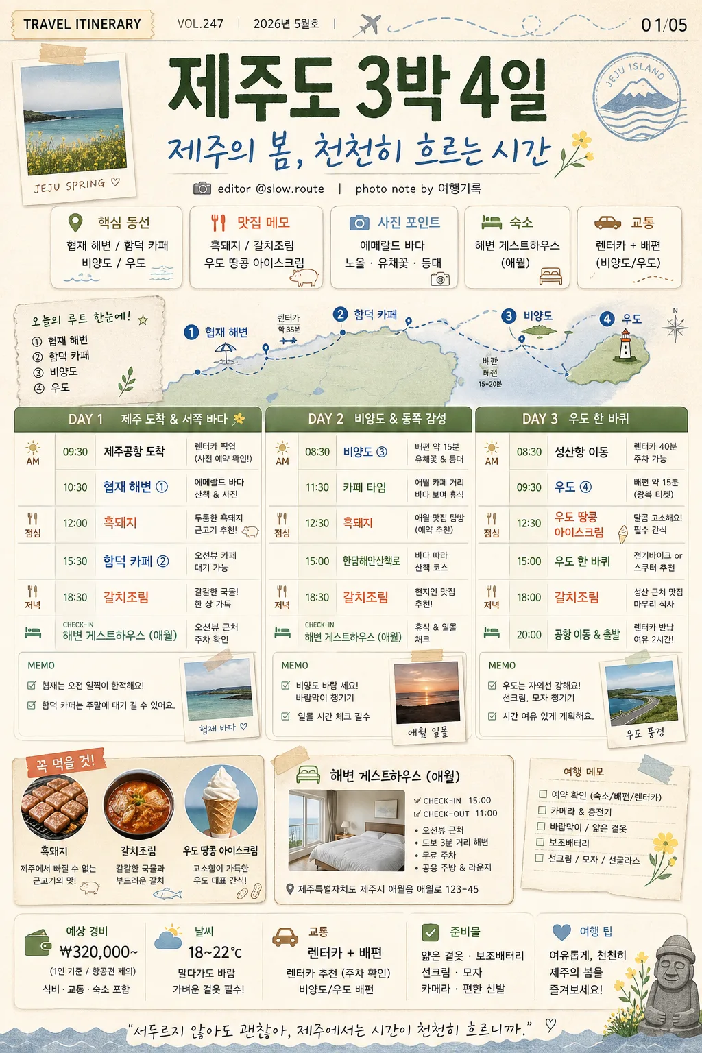
Korean travel card news / itinerary visual, vertical infographic poster for Instagram sharing.
Design a content-rich, realistic travel planning card that feels like a saved influencer itinerary: clear day-by-day schedule, editorial travel notes, small map-route cues, food highlights, accommodation info, and shareable card-news details.

[Composition]
- Overall layout: vertical 1024x1536 poster with a strong top header, a richly organized itinerary dashboard occupying the central canvas, and supporting travel elements such as route markers, mini photo-card panels, checklist notes, weather chips, and local landmark accents.
- Header area (top 18%): {여행지} as the main destination title, followed by {핵심 카피} as a large Korean headline. Add a small card-news label such as "TRAVEL ITINERARY", "VOL.247", "2026년 5월호", and a slide/page indicator "01/05" near the top edge.
- Main schedule area (middle 62%): a 3-day visual timetable using DAY 1 / DAY 2 / DAY 3 blocks, each with time, place, menu, movement, and short memo entries laid out in readable columns. Include small labels like "AM", "PM", "DINNER", "CHECK-IN" for realistic planning depth.
- Supporting details: {주요 장소}, {주요 메뉴/맛집}, and {숙소} should appear as concise itinerary items with pin markers, food icons, mini caption tags, route dots, and a small accommodation card.
- Background treatment: warm off-white paper texture with subtle scanned grain, beige base, soft sage panels, light blue route shapes, coral highlight stickers, tape-like labels, small receipt-style note fragments, and soft shadows to make the card feel printed and collectible.
- Use {여행지}, {주요 장소}, {주요 메뉴/맛집}, {숙소}, {핵심 카피}, {컨셉 톤}, {비율/사이즈} placeholders.

[3. CORE STRUCTURE]
- Header strip (top): place {여행지} in large bold Korean type, with {핵심 카피} beneath it as a prominent subtitle. Add a thin travel-route line motif in soft blue, a tiny airplane or ferry icon, and small credit text such as "editor @slow.route" and "photo note by 여행기록".
- Overview chips (upper-middle): create 4–5 rounded chips for key trip highlights using {주요 장소}, {주요 메뉴/맛집}, and {숙소}; each chip should have a tiny pictogram such as a pin, fork, wave, camera, ferry, or bed. Add small Korean labels like "핵심 동선", "맛집 메모", "숙소", "사진 포인트".
- Mini map / route cue: include a small simplified island or route-line graphic beside the chips, with numbered dots ① ② ③ and tiny place labels from {주요 장소}. Make it feel like a practical travel note, not a blank decorative shape.
- Itinerary table (center): render DAY 1, DAY 2, DAY 3 as stacked rows or three equal columns, each containing time, place, food, and memo text blocks. Use realistic example time labels such as "09:30 도착", "12:00 점심", "15:30 카페", "18:30 저녁", while integrating {주요 장소} and {주요 메뉴/맛집} visibly.
- Day detail content: enrich each DAY block with small travel-note fragments such as "렌터카 이동 35분", "일몰 체크", "카페 대기 가능", "바람막이 챙기기", "예약 확인". Keep the hierarchy clear with bold day labels, colored bullets, and compact captions.
- Detail emphasis: highlight the most photogenic spots from {주요 장소} with slightly larger text, numbered map pins, or a colored bullet. Treat {주요 메뉴/맛집} as a food callout in a coral accent box with a fork icon and a small caption like "꼭 먹을 것".
- Accommodation block (lower-middle): show {숙소} as a compact card with a bed icon, check-in/check-out notes, an address-style line, and a short overnight stay context such as "오션뷰 근처 / 주차 확인".
- Extra information row: add a small budget/weather/checklist strip near the lower area with Korean microcopy such as "예상 경비 ₩320,000~", "날씨 18–22℃", "준비물: 얇은 겉옷 · 보조배터리", and "교통: 렌터카 + 배편".
- Decorative graphics: add friendly flat illustrations of food, sea, mountain, orange, camera, ticket stub, map pin, and landmark motifs around the layout. Use them as meaningful editorial accents connected to travel planning.
- Footer area (bottom 12%): include a card-news CTA line and Instagram-style micro UI details: "저장해두고 여행 전날 다시 보기", "다음 장: 코스별 이동시간", small save/share/comment icons, hashtags like "#제주여행 #3박4일코스 #여행카드뉴스", and page indicator dots "● ○ ○ ○ ○".

[4. STYLE RULES]
- Typography: use Pretendard or Noto Sans KR for the main body in regular/medium weights; use Pretendard ExtraBold or Noto Sans KR Bold for the title; keep headline size large and body text compact but readable at mobile-card scale.
- Color palette: use the palette implied by {컨셉 톤} with specific tones such as beige #E9DDC8, sage #A8B8A6, coral #F2A38A, soft blue #AFC8E8, and deep charcoal #2B2B2B for text.
- Border/shadow: rounded cards with a 1px warm gray border, soft drop shadow 0px 6px 18px at 12% opacity, layered paper-card depth, and subtle inner spacing for a polished magazine-like structure.
- Graphic treatment: simple flat travel icons, thin divider lines, small pin markers, dotted route paths, sticker labels, tape corners, receipt-like snippets, and pastel blocks; avoid glossy 3D effects.
- Information density: make the design feel like a real saved itinerary with many useful micro-details, while preserving clear reading order from title to overview, schedule, lodging, checklist, and CTA.

[5. VISUAL STYLE]
- Camera / lens: editorial flat-lay infographic aesthetic, as if designed for a travel magazine spread and photographed as a printed card on textured paper; if adding image textures, keep them as paper-scanned details with a 35mm documentary layout sensibility.
- Lighting: simulated soft daylight from upper-left, even and diffused with gentle paper shadows, like an overcast afternoon in a travel editorial workspace.
- Color grade: beige + sage + coral + soft blue with muted saturation, airy paper-white highlights, gentle charcoal text contrast, and warm printed-paper realism.
- Surface realism: include believable paper fiber, tiny ink texture, subtle halftone dots in mini photo-card panels, and soft edge shadows so the card feels tactile and professionally produced.

[6. MOOD]
Korean travel media editorial — similar to CATCH! and influencer-style itinerary cards, with a calm, organized, warm, highly saveable planning feel. The final image should look like a polished travel card-news slide someone would screenshot before a trip.

[7. CRITICAL]
- Korean text accuracy: the following strings must appear exactly and correctly in the rendered image: "제주도 3박 4일", "협재 해변 / 함덕 카페 / 비양도 / 우도", "흑돼지 / 갈치조림 / 우도 땅콩 아이스크림", "해변 게스트하우스 (애월)", "제주의 봄, 천천히 흐르는 시간".
- Additional Korean card-news text should be crisp and realistic, including short labels such as "VOL.247", "2026년 5월호", "01/05", "저장해두고 여행 전날 다시 보기", "다음 장: 코스별 이동시간", "예상 경비 ₩320,000~", "날씨 18–22℃", "준비물: 얇은 겉옷 · 보조배터리", "#제주여행 #3박4일코스 #여행카드뉴스".
- Keep all Korean characters crisp and correctly formed; no broken Hangul, no misspellings.
- If DAY labels are shown, render them consistently as DAY 1, DAY 2, DAY 3 with matching layout and spacing.

[8. 🚫 PROHIBITED]
- Fake official seals / certifications
- Broken Korean characters