照片轉換/濾鏡
음식 오버헤드 플랫레이 사진
한식·양식·디저트를 위에서 내려다본 플랫레이 톱샷. 식기·소품·잡지 무드. 메뉴북·푸드 매거진·블로그용.
음식 오버헤드 플랫레이 사진摘要
這是用來製作照片轉換/濾鏡內容的 ChatGPT 圖像提示詞,已整理主題、背景、風格與構圖,方便快速調整。
相關關鍵字: 음식 오버헤드 플랫레이 사진, 음식 오버헤드 플랫레이 사진 프롬프트, 照片轉換/濾鏡 프롬프트, 照片轉換/濾鏡 AI 이미지 프롬프트, ChatGPT 이미지 프롬프트, AI 이미지 생성 프롬프트, AI 프롬프트, 이미지 프롬프트
음식 오버헤드 플랫레이 사진使用方式
保留原始結構並替換主體、背景、色彩或構圖,即可延伸出不同版本。
- 保留核心主體,並依品牌、季節或平台調整色彩與背景。
- 如果畫面太複雜,請減少背景元素並具體描述主體、構圖與光線。
- 複製後可要求 ChatGPT 配合平台、長寬比或文字需求調整。
提示詞原文
[Input]
- language: Korean
- output_size: 1024x1024

[Purpose]
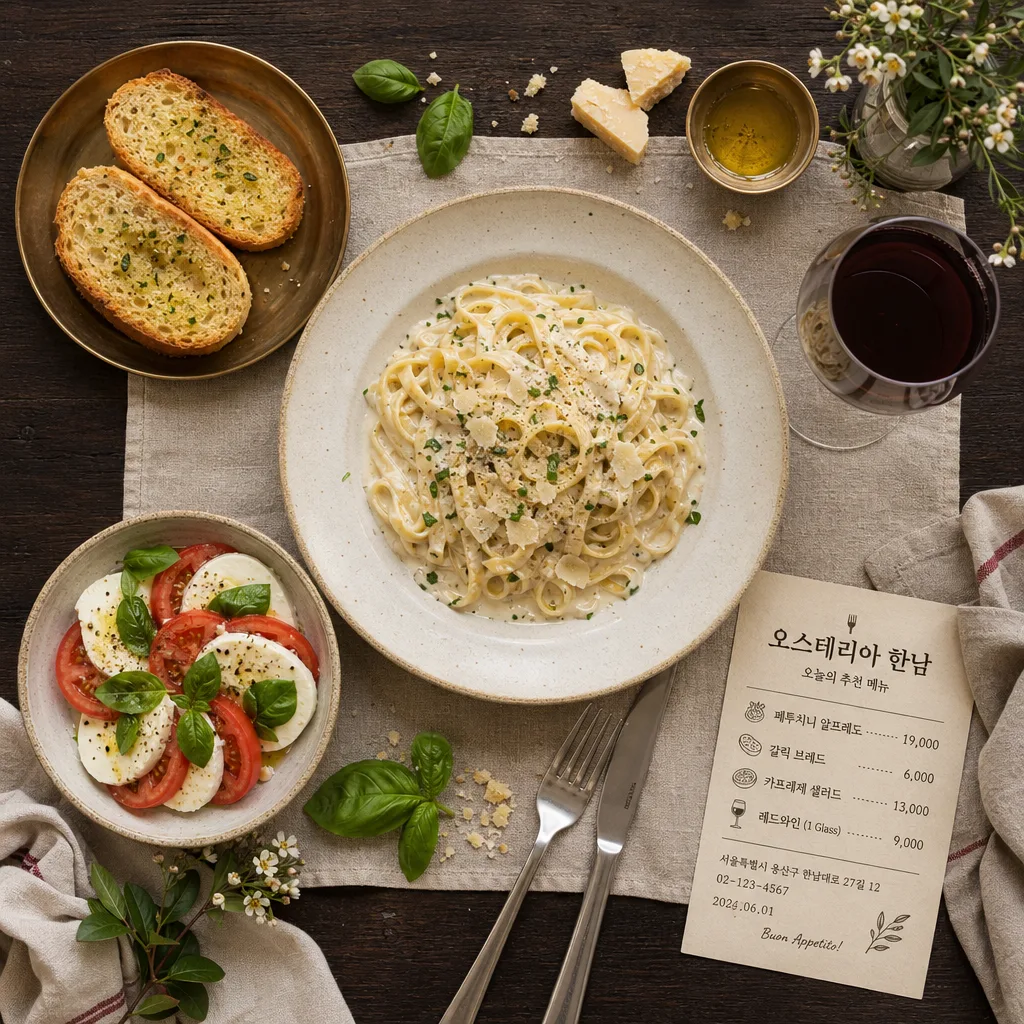
Magazine-quality overhead flat lay food photograph, square layout for menu book, restaurant Instagram feed, and editorial food feature.
Create a realistic tabletop scene where plated dishes, serving ware, small menu-card typography, and natural dining details feel like a photographed restaurant spread rather than a sterile product shot.

[Composition]
- Center the main food arrangement across about 70% of the frame, with the primary dish slightly above center and side items distributed in a stable triangular balance.
- Use {음식 컨셉} as the focal menu set, arranged to read clearly from above with no perspective tilt.
- Build the scene on {플레이팅}, allowing the table grain, ceramic glaze, folded fabric, and small dining marks to remain visible and tactile.
- Place {보조 소품} around the dishes as natural restaurant-table details: utensils, napkin folds, herb sprigs, a small flower, wine glass reflections, tiny bread crumbs, and a few ingredient accents.
- Add a small printed menu card or receipt-style placard near the lower-right quadrant, partially tucked under a utensil or napkin, using {매장명}, {메뉴카드 제목}, dish names, prices, address, contact, and date.
- Keep all dish edges, utensils, card edges, and cloth lines aligned to {카메라 시점} so the entire frame reads as a true top-down flat lay.

[3. CORE STRUCTURE]
- Hero food area (middle 55%): present {음식 컨셉} as the main editorial spread, with the largest plate acting as the visual anchor and the side dishes forming a natural dining rhythm.
- Surface layer: apply {플레이팅} with realistic wood grain, ceramic sheen, soft linen texture, faint cutlery reflections, and warm tabletop depth.
- Prop ring: place {보조 소품} as secondary accents, using one richer cluster near the lower-left and a smaller counterbalance near the upper-right, including believable small ingredients from the dishes.
- Menu-card detail: include a cream paper card with thin divider lines, small icons, prices, and contact details; it should feel like an actual restaurant menu insert photographed on the table.
- Camera read: maintain {카메라 시점} so every dish looks flattened and evenly oriented, with no dramatic depth distortion.
- Color emphasis: render {색감} through natural ingredient tones, warm neutrals, tomato red, basil green, wine burgundy, toasted bread, and subtle contrast between food, table, props, and printed paper.
- Usage framing: compose for {용도} and {비율/사이즈}, making the scene suitable as both a menu-book top shot and a polished social media food image.

[4. STYLE RULES]
- Typography: include only realistic printed typography on the menu card/receipt placard, not a floating digital overlay; use clean Korean editorial sans-serif for headings and small serif or monospaced receipt-style text for prices.
- Menu-card content: show store name, three menu lines with prices, address, contact, date, and a short editorial label; use thin dividers and tiny decorative food icons such as a fork, leaf, or wine glass.
- Color palette: warm beige, walnut brown, ceramic ivory, tomato red, basil green, wine burgundy, muted charcoal ink, and the appetizing mid-tone food colors from {색감}.
- Decorative details: allow realistic table styling such as linen folds, herb flakes, bread crumbs, olive-oil sheen, condensation on glass, ceramic rim highlights, and small shadows from raised plates.
- Border/shadow: soft natural shadows beneath plates, utensils, card, and glass, approximately 4px y-offset, 12px blur, 15% opacity, with crisp object edges and a gentle editorial contrast curve.

[5. VISUAL STYLE]
- Camera / lens: full-frame camera with a 35mm lens at f/8, perfectly perpendicular overhead setup for a flat lay editorial look.
- Lighting: diffuse natural window light from upper-left at about 45°, with gentle fill from the right and soft shadow falloff under plates, glassware, cutlery, and the paper menu card.
- Color grade: warm editorial neutrals with slightly boosted food saturation, clean white balance, realistic highlights on sauces and ceramics, and a subtle filmic contrast curve.
- Material realism: pasta sauce should look creamy and dimensional, salad tomatoes glossy, basil fresh, bread crust crisp, wine translucent burgundy, and paper typography printed into the card surface.

[6. MOOD]
Korean food magazine editorial — warm restaurant tabletop styling, appetizing but refined, like a premium menu-book top shot with lived-in dining details and polished social feed appeal.

[7. CRITICAL]
- Korean text accuracy: the printed menu card must contain clean, readable Korean text with no broken characters.
- Render the menu card text exactly as: "{매장명}" / "{메뉴카드 제목}" / "{메뉴1}  {가격1}" / "{메뉴2}  {가격2}" / "{메뉴3}  {가격3}" / "{주소}" / "{연락처}" / "{촬영 날짜}".
- Layout invariant: maintain a true 90-degree overhead view, with all plates, cutlery, paper card, glass, and props appearing evenly oriented and not skewed.
- Composition invariant: the food set must remain tidy, balanced, magazine-ready, and realistic, with believable shadows, natural tabletop textures, and appetizing ingredient detail.

[8. 🚫 PROHIBITED]
- Fake official seals / certifications
- Broken Korean characters
- Celebrity composites / unauthorized portrait likenesses