Infographics/Guides
식물 홈가드닝 케어 가이드
식물 ID 카드·홈가드닝 가이드. 식물 일러스트 + 케어 정보 + 인테리어 mockup. 식물 블로거·인테리어용.
식물 홈가드닝 케어 가이드 summary
Copy this ChatGPT image prompt to create Infographics/Guides results. Its subject, background, style, and composition are organized for quick iteration.
Related keywords: 식물 홈가드닝 케어 가이드, 식물 홈가드닝 케어 가이드 프롬프트, Infographics/Guides 프롬프트, Infographics/Guides AI 이미지 프롬프트, ChatGPT 이미지 프롬프트, AI 이미지 생성 프롬프트, AI 프롬프트, 이미지 프롬프트
How to use 식물 홈가드닝 케어 가이드
Keep the prompt structure and swap the subject, background, palette, or composition to create new variations.
- Keep the main subject and adjust the palette and background for your brand, season, or channel.
- If the result feels busy, simplify the background and make the subject, composition, and lighting more specific.
- After copying, ask ChatGPT to adapt it for your platform, aspect ratio, or text requirements.
Original prompt
[Input]
- language: Korean
- output_size: 1024x1536

[Purpose]
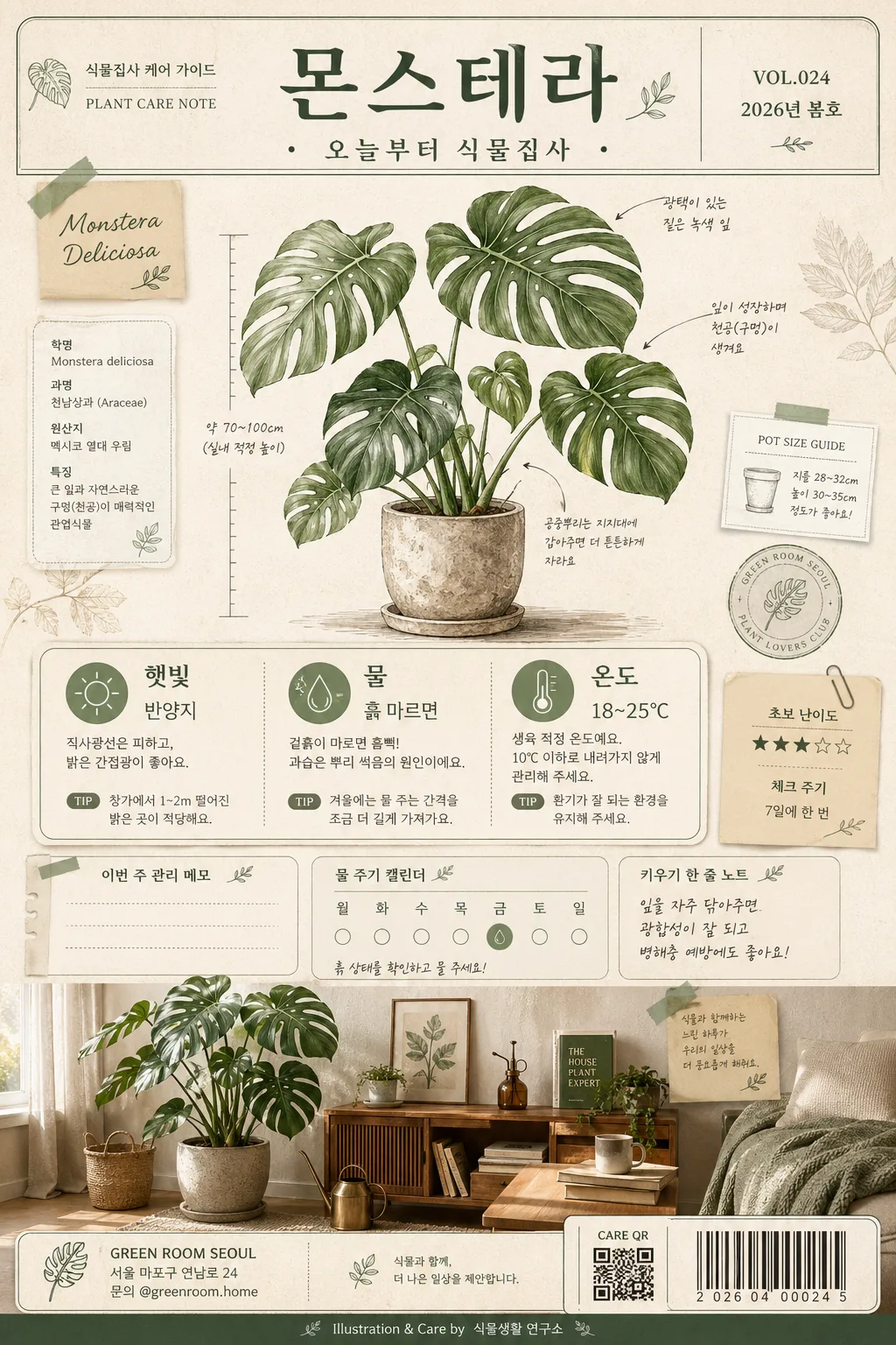
Korean plant home-gardening care guide poster, vertical editorial infographic for plant parents.
Designed like a real plant-shop care sheet that could be printed and displayed in a cozy Korean apartment or shared on social media, combining botanical illustration, practical care icons, small shop details, seasonal guide labels, and a realistic room mockup.

[Composition]
- Overall layout: a tall poster with top title band (18%), central hero plant illustration (42%), care-info card zone (20%), and bottom interior mockup strip (20%).
- Subject placement: {식물명} appears at the top as the main title; the plant illustration dominates the upper-middle area, slightly offset with layered paper tabs, botanical annotation marks, and small specimen-label details so the page feels designed and lived-in.
- Background treatment: warm off-white paper texture (#F6F1E7) with visible recycled-paper grain, faint pressed-leaf silhouettes, soft shadowed paper-card layers, subtle tape corners, and a realistic printed poster surface.
- Spacing and framing: clear hierarchy between title, illustration, care icons, and mockup; include rounded-corner info cards, thin botanical line dividers, small note stickers, a tiny QR/barcode-style contact area, and a footer credit line without overwhelming the care information.
- Use {식물명}, {케어 정보}, {일러스트 톤}, {인테리어 mockup}, {색감}, {핵심 카피}, {비율/사이즈} placeholders naturally throughout the layout.

[3. CORE STRUCTURE]
- Top header area (upper 18%): place {식물명} in large Korean lettering, with a compact subtitle-style placement for {핵심 카피} beneath it; add small editorial metadata such as “식물집사 케어 가이드”, “VOL.024”, “2026년 봄호”, and “PLANT CARE NOTE” like a premium plant-shop label.
- Hero illustration area (mid 42%): render {식물명} as the main botanical illustration in {일러스트 톤}, with clear leaf silhouettes, delicate vein detail, subtle watercolor wash, small handwritten-style Korean annotation labels, a tiny pot-size ruler mark, and faint soil/pot texture details that keep the linework readable.
- Care information area (lower-mid 20%): convert {케어 정보} into three icon-led blocks for sunlight, watering, and temperature; each block should be aligned in a neat grid with simple pictograms and short Korean labels. Add realistic micro details such as “체크 주기”, “초보 난이도 ★★★☆☆”, “이번 주 관리 메모”, and a small watering calendar strip.
- Interior mockup area (bottom 20%): show {인테리어 mockup} as a realistic home corner with the plant placed naturally in a ceramic or terracotta pot, styled like a cozy Korean apartment interior with a wood shelf, linen curtain, warm window light, a small watering can, plant mister, gardening book, and textured rug or floor detail.
- Footer and utility details: include a small shop/contact block reading “GREEN ROOM SEOUL”, “서울 마포구 연남로 24”, “문의 @greenroom.home”, a small QR/barcode area labeled “CARE QR”, and a tiny credit line “Illustration & Care by 식물생활 연구소”.
- Visual integration: use {색감} consistently across title accents, icon outlines, plant shadows, sticky-note tags, barcode/QR area, and divider lines so the whole composition feels unified, warm, and realistic.

[4. STYLE RULES]
- Typography: use Pretendard or Noto Sans KR for the care text in medium weight 500–600, and a more elegant serif-like Korean display for the title if needed; title size should feel bold and poster-like, with slightly expanded letter spacing.
- Color palette: base off-white #F6F1E7, sage #A8B69A, beige #DCCDB7, dark green #2F4A3A, and muted accent gray #7D7D73; incorporate {색감} as the main accent for labels, stickers, and botanical highlights.
- Border/shadow: use thin 1px dark-green rules, soft drop shadows with 4px y-offset, 12px blur, 15% opacity, rounded cards, paper-cut layering, subtle washi-tape shadows, and light print-registration texture.
- Graphic treatment: icons should be simple line icons with consistent stroke width; the watercolor illustration should keep edges crisp rather than painterly-blurry, while the room strip can include realistic textures such as ceramic glaze, woven fabric, plant soil, wood grain, and soft curtain folds.
- Poster content details: add short Korean callout blurbs such as “잎 끝 갈변 체크”, “흙이 마르면 듬뿍”, “빛 좋은 창가 추천”, plus a small page indicator “CARE SHEET 01 / 01” and a decorative botanical divider.

[5. VISUAL STYLE]
- Camera / lens: editorial product-poster look inspired by a Canon EOS R5 with 50mm f/1.8 standard lens for the interior strip and a flat botanical scan aesthetic for the illustration section; overall composition should feel like a professionally designed printed page with realistic paper and ink texture.
- Lighting: soft window light from upper-left with gentle fill from the right, creating faint natural shadows on the mockup area, paper cards, tape edges, pot rim, and small gardening props.
- Color grade: muted sage-beige botanical palette with deep forest green anchors, warm paper whites, natural terracotta and wood tones, and print-friendly contrast.

[6. MOOD]
A refined Korean plant-care editorial — like a Kinfolk-style houseplant spread mixed with a modern neighborhood plant-shop care poster, practical enough for beginners and visually rich enough to feel like a collectible botanical print.

[7. CRITICAL]
- Korean text accuracy: 반드시 아래 문구가 정확히 보여야 함:
  - {식물명}
  - {케어 정보}
  - {핵심 카피}
  - 햇빛
  - 물
  - 온도
- Additional readable Korean microcopy should appear naturally in the poster: “식물집사 케어 가이드”, “VOL.024”, “2026년 봄호”, “초보 난이도 ★★★☆☆”, “이번 주 관리 메모”, “빛 좋은 창가 추천”, “문의 @greenroom.home”.
- Layout invariants: the top title, center care info, and bottom mockup must all appear in one vertically stacked poster with clear hierarchy, matching {비율/사이즈}.
- Illustration requirements: the plant must look like {일러스트 톤}, with readable leaves, botanically correct proportions, and realistic home-gardening context.

[8. 🚫 PROHIBITED]
- Fake official seals / certifications
- Broken Korean characters
- Celebrity composites / unauthorized likeness