인포그래픽/안내
식물 홈가드닝 케어 가이드
식물 ID 카드·홈가드닝 가이드. 식물 일러스트 + 케어 정보 + 인테리어 mockup. 식물 블로거·인테리어용.
식물 홈가드닝 케어 가이드 검색 요약
식물 홈가드닝 케어 가이드은 인포그래픽/안내 결과물을 만들 때 바로 복사해 활용할 수 있는 ChatGPT 이미지 프롬프트입니다. 주제, 배경, 스타일, 구도 조건을 함께 담아 빠르게 시안을 만들 수 있도록 구성했습니다.
관련 키워드: 식물 홈가드닝 케어 가이드, 식물 홈가드닝 케어 가이드 프롬프트, 인포그래픽/안내 프롬프트, 인포그래픽/안내 AI 이미지 프롬프트, ChatGPT 이미지 프롬프트, AI 이미지 생성 프롬프트, AI 프롬프트, 이미지 프롬프트
식물 홈가드닝 케어 가이드 활용 포인트
원본 구조를 유지하면서 피사체, 배경, 색감, 구도를 바꿔 다양한 시안으로 확장할 수 있습니다.
- 핵심 소재는 유지하고 브랜드, 계절, 채널 목적에 맞는 색감과 배경을 바꿔보세요.
- 결과가 산만하면 배경 요소를 줄이고 피사체, 구도, 조명 조건을 구체화하세요.
- 복사한 뒤 ChatGPT에서 플랫폼, 화면 비율, 텍스트 포함 여부를 추가로 요청할 수 있습니다.
프롬프트 원문
[Input]
- language: Korean
- output_size: 1024x1536

[Purpose]
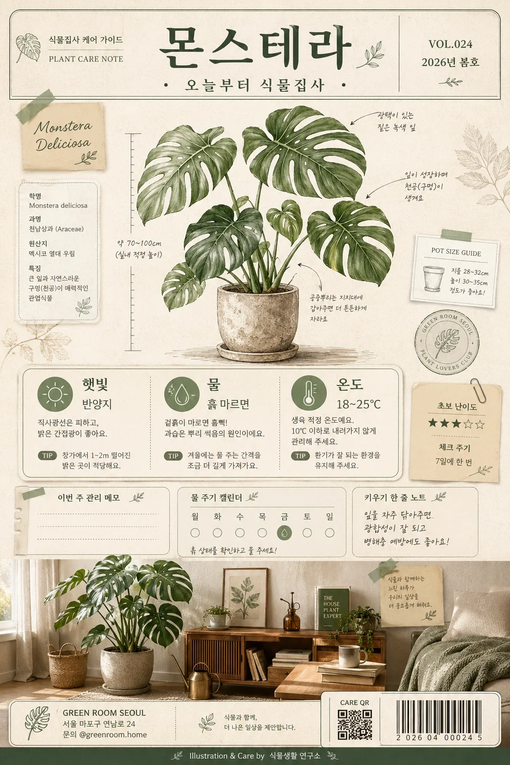
Korean plant home-gardening care guide poster, vertical editorial infographic for plant parents.
Designed like a real plant-shop care sheet that could be printed and displayed in a cozy Korean apartment or shared on social media, combining botanical illustration, practical care icons, small shop details, seasonal guide labels, and a realistic room mockup.

[Composition]
- Overall layout: a tall poster with top title band (18%), central hero plant illustration (42%), care-info card zone (20%), and bottom interior mockup strip (20%).
- Subject placement: {식물명} appears at the top as the main title; the plant illustration dominates the upper-middle area, slightly offset with layered paper tabs, botanical annotation marks, and small specimen-label details so the page feels designed and lived-in.
- Background treatment: warm off-white paper texture (#F6F1E7) with visible recycled-paper grain, faint pressed-leaf silhouettes, soft shadowed paper-card layers, subtle tape corners, and a realistic printed poster surface.
- Spacing and framing: clear hierarchy between title, illustration, care icons, and mockup; include rounded-corner info cards, thin botanical line dividers, small note stickers, a tiny QR/barcode-style contact area, and a footer credit line without overwhelming the care information.
- Use {식물명}, {케어 정보}, {일러스트 톤}, {인테리어 mockup}, {색감}, {핵심 카피}, {비율/사이즈} placeholders naturally throughout the layout.

[3. CORE STRUCTURE]
- Top header area (upper 18%): place {식물명} in large Korean lettering, with a compact subtitle-style placement for {핵심 카피} beneath it; add small editorial metadata such as “식물집사 케어 가이드”, “VOL.024”, “2026년 봄호”, and “PLANT CARE NOTE” like a premium plant-shop label.
- Hero illustration area (mid 42%): render {식물명} as the main botanical illustration in {일러스트 톤}, with clear leaf silhouettes, delicate vein detail, subtle watercolor wash, small handwritten-style Korean annotation labels, a tiny pot-size ruler mark, and faint soil/pot texture details that keep the linework readable.
- Care information area (lower-mid 20%): convert {케어 정보} into three icon-led blocks for sunlight, watering, and temperature; each block should be aligned in a neat grid with simple pictograms and short Korean labels. Add realistic micro details such as “체크 주기”, “초보 난이도 ★★★☆☆”, “이번 주 관리 메모”, and a small watering calendar strip.
- Interior mockup area (bottom 20%): show {인테리어 mockup} as a realistic home corner with the plant placed naturally in a ceramic or terracotta pot, styled like a cozy Korean apartment interior with a wood shelf, linen curtain, warm window light, a small watering can, plant mister, gardening book, and textured rug or floor detail.
- Footer and utility details: include a small shop/contact block reading “GREEN ROOM SEOUL”, “서울 마포구 연남로 24”, “문의 @greenroom.home”, a small QR/barcode area labeled “CARE QR”, and a tiny credit line “Illustration & Care by 식물생활 연구소”.
- Visual integration: use {색감} consistently across title accents, icon outlines, plant shadows, sticky-note tags, barcode/QR area, and divider lines so the whole composition feels unified, warm, and realistic.

[4. STYLE RULES]
- Typography: use Pretendard or Noto Sans KR for the care text in medium weight 500–600, and a more elegant serif-like Korean display for the title if needed; title size should feel bold and poster-like, with slightly expanded letter spacing.
- Color palette: base off-white #F6F1E7, sage #A8B69A, beige #DCCDB7, dark green #2F4A3A, and muted accent gray #7D7D73; incorporate {색감} as the main accent for labels, stickers, and botanical highlights.
- Border/shadow: use thin 1px dark-green rules, soft drop shadows with 4px y-offset, 12px blur, 15% opacity, rounded cards, paper-cut layering, subtle washi-tape shadows, and light print-registration texture.
- Graphic treatment: icons should be simple line icons with consistent stroke width; the watercolor illustration should keep edges crisp rather than painterly-blurry, while the room strip can include realistic textures such as ceramic glaze, woven fabric, plant soil, wood grain, and soft curtain folds.
- Poster content details: add short Korean callout blurbs such as “잎 끝 갈변 체크”, “흙이 마르면 듬뿍”, “빛 좋은 창가 추천”, plus a small page indicator “CARE SHEET 01 / 01” and a decorative botanical divider.

[5. VISUAL STYLE]
- Camera / lens: editorial product-poster look inspired by a Canon EOS R5 with 50mm f/1.8 standard lens for the interior strip and a flat botanical scan aesthetic for the illustration section; overall composition should feel like a professionally designed printed page with realistic paper and ink texture.
- Lighting: soft window light from upper-left with gentle fill from the right, creating faint natural shadows on the mockup area, paper cards, tape edges, pot rim, and small gardening props.
- Color grade: muted sage-beige botanical palette with deep forest green anchors, warm paper whites, natural terracotta and wood tones, and print-friendly contrast.

[6. MOOD]
A refined Korean plant-care editorial — like a Kinfolk-style houseplant spread mixed with a modern neighborhood plant-shop care poster, practical enough for beginners and visually rich enough to feel like a collectible botanical print.

[7. CRITICAL]
- Korean text accuracy: 반드시 아래 문구가 정확히 보여야 함:
  - {식물명}
  - {케어 정보}
  - {핵심 카피}
  - 햇빛
  - 물
  - 온도
- Additional readable Korean microcopy should appear naturally in the poster: “식물집사 케어 가이드”, “VOL.024”, “2026년 봄호”, “초보 난이도 ★★★☆☆”, “이번 주 관리 메모”, “빛 좋은 창가 추천”, “문의 @greenroom.home”.
- Layout invariants: the top title, center care info, and bottom mockup must all appear in one vertically stacked poster with clear hierarchy, matching {비율/사이즈}.
- Illustration requirements: the plant must look like {일러스트 톤}, with readable leaves, botanically correct proportions, and realistic home-gardening context.

[8. 🚫 PROHIBITED]
- Fake official seals / certifications
- Broken Korean characters
- Celebrity composites / unauthorized likeness