インフォグラフィック・案内
부업·N잡 가이드 카드 (스마트스토어·블로그·유튜브 시작)
부업·N잡 가이드 카드. 스마트스토어·블로그·유튜브·디자인 외주 등 시작 단계 시각화. 직장인·취준생·은퇴자.
부업·N잡 가이드 카드 (스마트스토어·블로그·유튜브 시작)の概要
インフォグラフィック・案内画像を作るためのChatGPT画像プロンプトです。主題、背景、スタイル、構図を整理し、すぐに試せるよう構成しています。
関連キーワード: 부업·N잡 가이드 카드 (스마트스토어·블로그·유튜브 시작), 부업·N잡 가이드 카드 (스마트스토어·블로그·유튜브 시작) 프롬프트, インフォグラフィック・案内 프롬프트, インフォグラフィック・案内 AI 이미지 프롬프트, ChatGPT 이미지 프롬프트, AI 이미지 생성 프롬프트, AI 프롬프트, 이미지 프롬프트
부업·N잡 가이드 카드 (스마트스토어·블로그·유튜브 시작)の活用方法
元の構造を保ちながら、被写体、背景、色、構図を変更して別案に展開できます。
- 主題を維持し、ブランドや季節、媒体に合わせて色と背景を変更してください。
- 結果が複雑な場合は背景要素を減らし、被写体、構図、照明を具体化してください。
- コピー後、ChatGPTに媒体、アスペクト比、文字の有無を追加で指定できます。
プロンプト原文
[Input]
- language: Korean
- output_size: {비율/사이즈}

[Purpose]
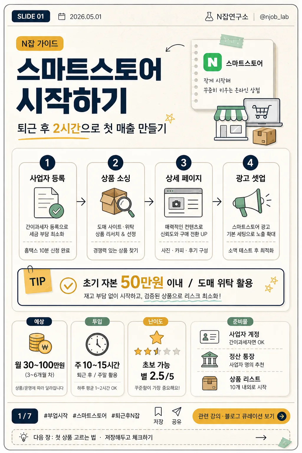
Korean side-hustle / N-job guide card news page for beginners, vertical infographic poster.
Designed for ebook, blog, newsletter, and social-sharing use with a polished editorial layout, practical startup-guide feeling, and realistic Korean card-news details.

[Composition]
- Top section (about 24%): card-news header with {카드 번호}, {발행일}, {채널명}, and {핸들}; large {부업 종류} headline with {부제목} underneath, aligned slightly left with a small category tag such as "N잡 가이드".
- Middle section (about 46%): {시작 단계} displayed as a 1–2–3–4 process flow with small commerce/blog/video-style info icons, short micro descriptions, and a highlighted tip box for {핵심 팁}.
- Lower section (about 22%): compact dashboard area containing {예상 수익}, {소요 시간}, {난이도}, and {준비물}, using stat cards, progress dots, and tiny checklist markers.
- Footer section (about 8%): social-card footer with page indicator {페이지 표시}, hashtag line {해시태그}, save/share micro icons, and a clear CTA pill/button for {CTA}.
- Background treatment: warm off-white editorial paper surface with subtle grain texture, layered rounded cards, thin dividers, sticky-note accents, small arrows, and practical workbook-style decoration.

[3. CORE STRUCTURE]
1. Header band: place {카드 번호} and {발행일} in a small top utility row; place {부업 종류} as the primary category label and large headline in the upper third; include {부제목}, {채널명}, and {핸들} as realistic publisher metadata.
2. Main process block: render {시작 단계} as four evenly spaced numbered steps (1, 2, 3, 4), each step inside a neat rounded card or vertical mini-column with small line icons, tiny captions, and connector arrows.
3. Tip highlight: set {핵심 팁} in a contrasting accent box in the center area, using mustard or gold emphasis with a thin navy outline; add a small "TIP" label and checkmark icon.
4. Metrics strip: show {예상 수익}, {소요 시간}, {난이도}, and {준비물} in bold, easy-to-scan stat cards with clear labels, numeric emphasis, and small supporting labels such as "예상", "투입", "준비".
5. CTA footer: add {CTA} in a button-like footer area with a small arrow icon; include {페이지 표시}, {해시태그}, save/share/bookmark micro icons, and a tiny end-card teaser line {저장 안내}.

[4. STYLE RULES]
- Typography: Pretendard or Noto Sans KR, bold weights for headlines, medium weights for labels, regular for descriptions; headline size large, supporting text compact and highly legible.
- Color palette: navy #1F2A44, mustard #D8A62A, warm off-white #F6F1E8, soft gray #D9DDE3, deep charcoal #222222, muted mint #9DBFAF for checklist accents.
- Border/shadow: thin 1px divider lines in muted gray, soft drop shadow 0 6px 18px rgba(31,42,68,0.10) on cards, rounded corners 16px, subtle paper grain, small sticker tabs, and dashboard-like labels.
- Graphic details: include line icons for shop, document, package, camera/video, megaphone, clock, coin, checklist, bookmark, and share; use arrows and numbered chips to guide the reading order.

[5. VISUAL STYLE]
- Camera / lens: editorial flat graphic layout, as if designed with a 50mm documentary-style product poster aesthetic translated into vector infographic form; no photoreal subject, clean poster composition.
- Lighting: simulated studio-like even illumination with no harsh contrast, subtle top-left brightness and gentle shadow separation between cards.
- Color grade: navy + mustard + warm paper beige with restrained, modern Korean ebook/blog aesthetic.

[6. MOOD]
Modern Korean side-hustle editorial — practical ebook cover meets blog infographic and Instagram card-news slide, with the feeling of a realistic beginner checklist that could be saved and shared.

[7. CRITICAL]
- Korean text accuracy: 반드시 아래 문구가 정확히 보여야 함:
  - {카드 번호}
  - {발행일}
  - {채널명}
  - {핸들}
  - {부업 종류}
  - {부제목}
  - {시작 단계}
  - {핵심 팁}
  - {예상 수익}
  - {소요 시간}
  - {난이도}
  - {준비물}
  - {CTA}
  - {페이지 표시}
  - {해시태그}
  - {저장 안내}
  - {비율/사이즈}
  - "N잡 가이드"
  - "TIP"
  - "저장"
  - "공유"
  - "1", "2", "3", "4" in the process steps
- Layout invariants: top = card-news metadata + category + headline, center = step flow + tip box, lower = profit/time/difficulty/preparation stats, footer = page indicator + hashtag + CTA.
- Canvas ratio/size must follow {비율/사이즈} while preserving the vertical card-news infographic composition.
- All Korean text must be fully legible, correctly spaced, and free of broken characters.

[8. 🚫 PROHIBITED]
- Fake official seals / certifications
- Broken Korean characters
- Celebrity composites or recognizable public figures
- Misleading government-agency certificate styling