資訊圖表/指南
부업·N잡 가이드 카드 (스마트스토어·블로그·유튜브 시작)
부업·N잡 가이드 카드. 스마트스토어·블로그·유튜브·디자인 외주 등 시작 단계 시각화. 직장인·취준생·은퇴자.
부업·N잡 가이드 카드 (스마트스토어·블로그·유튜브 시작)摘要
這是用來製作資訊圖表/指南內容的 ChatGPT 圖像提示詞,已整理主題、背景、風格與構圖,方便快速調整。
相關關鍵字: 부업·N잡 가이드 카드 (스마트스토어·블로그·유튜브 시작), 부업·N잡 가이드 카드 (스마트스토어·블로그·유튜브 시작) 프롬프트, 資訊圖表/指南 프롬프트, 資訊圖表/指南 AI 이미지 프롬프트, ChatGPT 이미지 프롬프트, AI 이미지 생성 프롬프트, AI 프롬프트, 이미지 프롬프트
부업·N잡 가이드 카드 (스마트스토어·블로그·유튜브 시작)使用方式
保留原始結構並替換主體、背景、色彩或構圖,即可延伸出不同版本。
- 保留核心主體,並依品牌、季節或平台調整色彩與背景。
- 如果畫面太複雜,請減少背景元素並具體描述主體、構圖與光線。
- 複製後可要求 ChatGPT 配合平台、長寬比或文字需求調整。
提示詞原文
[Input]
- language: Korean
- output_size: {비율/사이즈}

[Purpose]
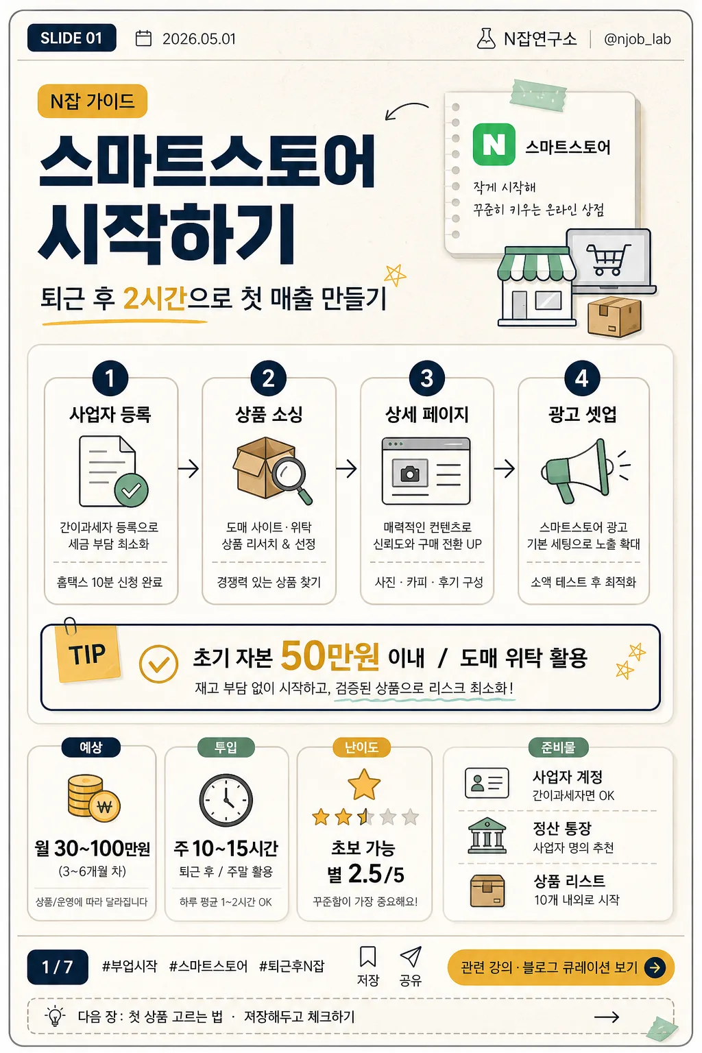
Korean side-hustle / N-job guide card news page for beginners, vertical infographic poster.
Designed for ebook, blog, newsletter, and social-sharing use with a polished editorial layout, practical startup-guide feeling, and realistic Korean card-news details.

[Composition]
- Top section (about 24%): card-news header with {카드 번호}, {발행일}, {채널명}, and {핸들}; large {부업 종류} headline with {부제목} underneath, aligned slightly left with a small category tag such as "N잡 가이드".
- Middle section (about 46%): {시작 단계} displayed as a 1–2–3–4 process flow with small commerce/blog/video-style info icons, short micro descriptions, and a highlighted tip box for {핵심 팁}.
- Lower section (about 22%): compact dashboard area containing {예상 수익}, {소요 시간}, {난이도}, and {준비물}, using stat cards, progress dots, and tiny checklist markers.
- Footer section (about 8%): social-card footer with page indicator {페이지 표시}, hashtag line {해시태그}, save/share micro icons, and a clear CTA pill/button for {CTA}.
- Background treatment: warm off-white editorial paper surface with subtle grain texture, layered rounded cards, thin dividers, sticky-note accents, small arrows, and practical workbook-style decoration.

[3. CORE STRUCTURE]
1. Header band: place {카드 번호} and {발행일} in a small top utility row; place {부업 종류} as the primary category label and large headline in the upper third; include {부제목}, {채널명}, and {핸들} as realistic publisher metadata.
2. Main process block: render {시작 단계} as four evenly spaced numbered steps (1, 2, 3, 4), each step inside a neat rounded card or vertical mini-column with small line icons, tiny captions, and connector arrows.
3. Tip highlight: set {핵심 팁} in a contrasting accent box in the center area, using mustard or gold emphasis with a thin navy outline; add a small "TIP" label and checkmark icon.
4. Metrics strip: show {예상 수익}, {소요 시간}, {난이도}, and {준비물} in bold, easy-to-scan stat cards with clear labels, numeric emphasis, and small supporting labels such as "예상", "투입", "준비".
5. CTA footer: add {CTA} in a button-like footer area with a small arrow icon; include {페이지 표시}, {해시태그}, save/share/bookmark micro icons, and a tiny end-card teaser line {저장 안내}.

[4. STYLE RULES]
- Typography: Pretendard or Noto Sans KR, bold weights for headlines, medium weights for labels, regular for descriptions; headline size large, supporting text compact and highly legible.
- Color palette: navy #1F2A44, mustard #D8A62A, warm off-white #F6F1E8, soft gray #D9DDE3, deep charcoal #222222, muted mint #9DBFAF for checklist accents.
- Border/shadow: thin 1px divider lines in muted gray, soft drop shadow 0 6px 18px rgba(31,42,68,0.10) on cards, rounded corners 16px, subtle paper grain, small sticker tabs, and dashboard-like labels.
- Graphic details: include line icons for shop, document, package, camera/video, megaphone, clock, coin, checklist, bookmark, and share; use arrows and numbered chips to guide the reading order.

[5. VISUAL STYLE]
- Camera / lens: editorial flat graphic layout, as if designed with a 50mm documentary-style product poster aesthetic translated into vector infographic form; no photoreal subject, clean poster composition.
- Lighting: simulated studio-like even illumination with no harsh contrast, subtle top-left brightness and gentle shadow separation between cards.
- Color grade: navy + mustard + warm paper beige with restrained, modern Korean ebook/blog aesthetic.

[6. MOOD]
Modern Korean side-hustle editorial — practical ebook cover meets blog infographic and Instagram card-news slide, with the feeling of a realistic beginner checklist that could be saved and shared.

[7. CRITICAL]
- Korean text accuracy: 반드시 아래 문구가 정확히 보여야 함:
  - {카드 번호}
  - {발행일}
  - {채널명}
  - {핸들}
  - {부업 종류}
  - {부제목}
  - {시작 단계}
  - {핵심 팁}
  - {예상 수익}
  - {소요 시간}
  - {난이도}
  - {준비물}
  - {CTA}
  - {페이지 표시}
  - {해시태그}
  - {저장 안내}
  - {비율/사이즈}
  - "N잡 가이드"
  - "TIP"
  - "저장"
  - "공유"
  - "1", "2", "3", "4" in the process steps
- Layout invariants: top = card-news metadata + category + headline, center = step flow + tip box, lower = profit/time/difficulty/preparation stats, footer = page indicator + hashtag + CTA.
- Canvas ratio/size must follow {비율/사이즈} while preserving the vertical card-news infographic composition.
- All Korean text must be fully legible, correctly spaced, and free of broken characters.

[8. 🚫 PROHIBITED]
- Fake official seals / certifications
- Broken Korean characters
- Celebrity composites or recognizable public figures
- Misleading government-agency certificate styling