周邊/模型
막걸리·전통주 라벨·패키지 디자인
막걸리·청주·약주 등 전통주 라벨 디자인. 한지 텍스처 + 한글 캘리그라피 + 전통 모티프 + 모던 미니멀. 병 mockup 같이.
막걸리·전통주 라벨·패키지 디자인摘要
這是用來製作周邊/模型內容的 ChatGPT 圖像提示詞,已整理主題、背景、風格與構圖,方便快速調整。
相關關鍵字: 막걸리·전통주 라벨·패키지 디자인, 막걸리·전통주 라벨·패키지 디자인 프롬프트, 周邊/模型 프롬프트, 周邊/模型 AI 이미지 프롬프트, ChatGPT 이미지 프롬프트, AI 이미지 생성 프롬프트, AI 프롬프트, 이미지 프롬프트
막걸리·전통주 라벨·패키지 디자인使用方式
保留原始結構並替換主體、背景、色彩或構圖,即可延伸出不同版本。
- 保留核心主體,並依品牌、季節或平台調整色彩與背景。
- 如果畫面太複雜,請減少背景元素並具體描述主體、構圖與光線。
- 複製後可要求 ChatGPT 配合平台、長寬比或文字需求調整。
提示詞原文
[Input]
- language: Korean
- output_size: 1024x1536

[Purpose]
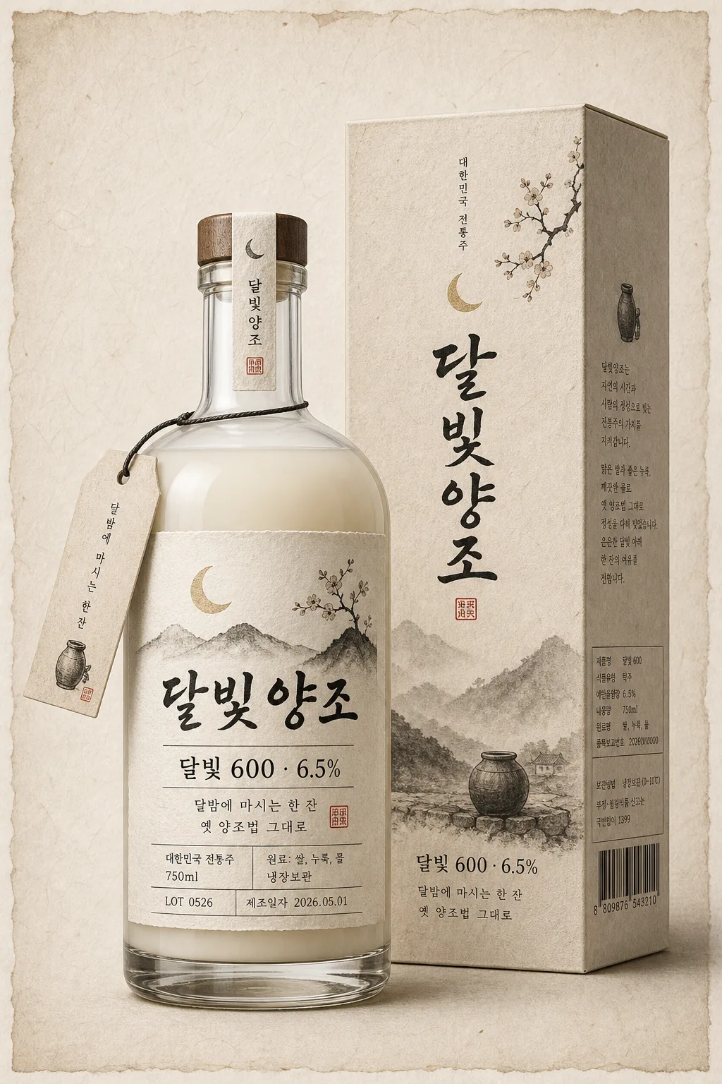
Korean traditional liquor label and packaging design mockup, front-facing bottle presentation for premium retail use.
Modernized hanji-and-ink aesthetic for a makgeolli / traditional liquor product, suitable for shelf display, online store product detail pages, and brand presentation with realistic retail packaging cues.

[Composition]
- Main subject: a single front-facing bottle mockup centered and occupying about 55% of the frame height, with the label fully readable and the cap aligned vertically.
- Composition: product hero in the middle with a matching paper carton or sleeve placed slightly behind the bottle, plus small realistic packaging details such as a neck tag, label edge texture, batch code, volume line, and a quiet lower information strip.
- Background treatment: warm off-white hanji paper surface with visible fibrous grain, subtle deckled paper edges, faint ink-wash staining, and a tactile premium craft-paper atmosphere.
- Framing direction: refined studio product layout with the full bottle silhouette visible, label edges sharp, and surrounding package elements supporting the premium traditional liquor identity.
- Use {술 종류}, {브랜드명}, {제품명·도수}, {라벨 톤}, {모티프}, {설명 카피 한 줄}, {병 형태} placeholders.

[3. CORE STRUCTURE]
1. Bottle hero area (center 55%): render a transparent glass bottle with a short neck, filled appropriately for {술 종류}, using {병 형태}; the bottle must be front-facing, crisp, and proportionally elegant, with realistic glass thickness, liquid meniscus, condensation-free clarity, and controlled studio reflections.
2. Label area (lower center on bottle): place {브랜드명} as the main brand mark and {제품명·도수} as the primary product title; build the label with {라벨 톤} and make the typography feel like a refined modern Korean craft liquor label.
3. Motif area (label ornament): integrate {모티프} as a restrained line illustration, hand-ink motif, or seal-inspired graphic aligned to the label geometry, supporting the text without becoming an official-looking certification mark.
4. Copy area (small secondary text): place {설명 카피 한 줄} below the main title in a smaller, quieter line; maintain generous tracking and clear hierarchy.
5. Retail information area: add realistic small label text blocks in Korean, including “대한민국 전통주”, “750ml”, “원료: 쌀, 누룩, 물”, “냉장보관”, “LOT 0526”, “제조일자 2026.05.01”, and a small barcode-style rectangle on the lower side label or carton panel.
6. Packaging feel area: suggest premium traditional packaging through paper grain, ink density, subtle label edge detail, a matching carton sleeve behind the bottle, a small hanging neck tag, and printed side-panel microcopy.
7. Surface/shadow area: add a soft realistic drop shadow beneath the bottle and carton, with slight contact darkening on the hanji surface and a natural product-photography tabletop feel.

[4. STYLE RULES]
- Typography: use a mixed system of bold hand-brushed Korean calligraphy for the brand headline, Noto Sans KR or Pretendard for secondary copy, and a restrained serif-like structure for product information; headline weight should feel strong but refined, with secondary text around 24–36px equivalent and product title around 42–64px equivalent.
- Color palette: hanji ivory #F4EFE5, ink black #111111, warm gray #B8B1A7, muted jade #7C8A78, soft charcoal #2B2B2B, and a faint rice-wine amber tint if needed.
- Border/shadow: thin ink rules, subtle label frame lines, hand-printed registration marks, light paper embossing, and a soft drop shadow with about 4px y-offset, 12px blur, 15% opacity; avoid harsh bevels or plastic-looking glossy sticker effects.
- Packaging details: include small vertical side text, fine ingredient microcopy, a simple barcode area, recycled-paper texture, tasteful ink bleed, and a matching carton/sleeve design that repeats {브랜드명} and {모티프} in a smaller scale.

[5. VISUAL STYLE]
- Camera / lens: studio product photography look, 85mm lens at f/8 for a clean front product mockup with crisp label edges and minimal distortion.
- Lighting: softbox key light from upper-left at about 45°, gentle fill from right, and a very subtle rear rim to define the glass edges; keep reflections controlled and realistic across curved glass, cap, paper label, and carton.
- Color grade: warm cream + ink black + muted stone gray with a restrained traditional-paper tone, similar to premium editorial product packaging photography.
- Material rendering: emphasize transparent glass, milky or amber liquor depending on {술 종류}, slightly porous hanji label stock, matte carton paper, printed ink absorption, and a finely textured tabletop surface.

[6. MOOD]
Premium Korean craft spirits editorial — like an Aesop-style packaging still with a traditional hanji print sensibility, museum-shop retail realism, and the quiet tactility of a contemporary artisan distillery.

[7. CRITICAL]
- Korean text accuracy: the following verbatim Korean strings must appear correctly in the rendered image: {브랜드명}, {제품명·도수}, {설명 카피 한 줄}.
- Additional Korean text must be clean and legible where visible: “대한민국 전통주”, “750ml”, “원료: 쌀, 누룩, 물”, “냉장보관”, “LOT 0526”, “제조일자 2026.05.01”.
- Label readability: all Hangul and any included Hanja-style details must be clean, correctly formed, and fully legible.
- Bottle layout: the bottle must remain front-facing with the label centered and not warped; preserve a single-product hero mockup presentation while allowing the carton, neck tag, barcode area, and paper texture to enrich the packaging context.

[8. 🚫 PROHIBITED]
- Fake official seals / certifications
- Broken Korean characters