周邊/模型
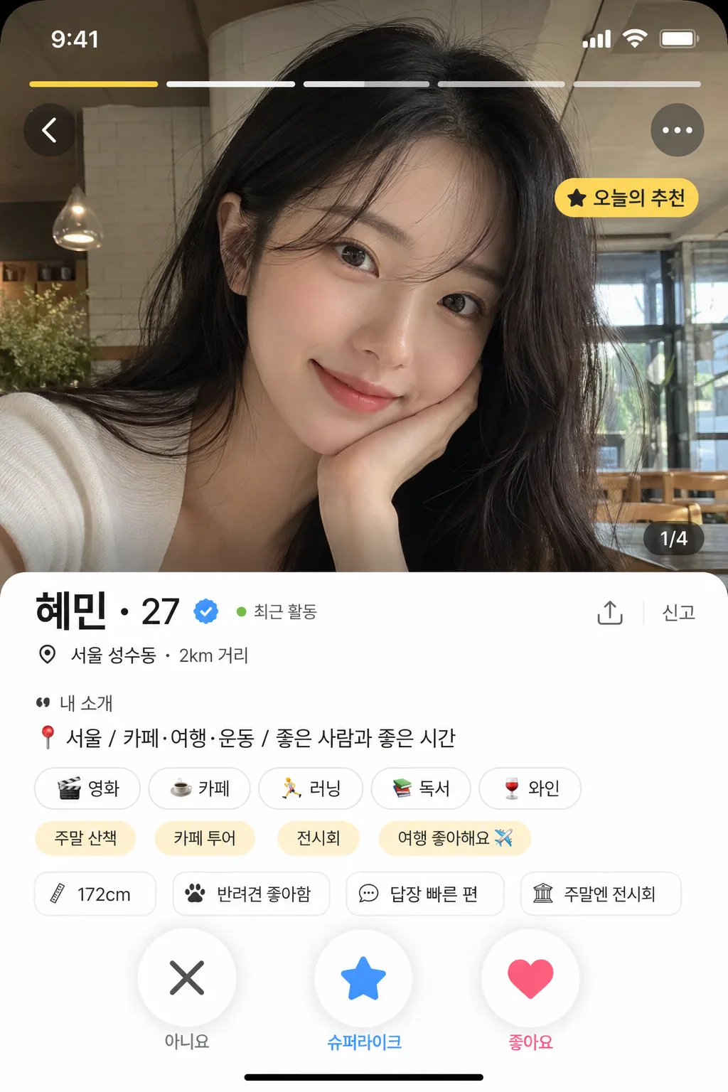
데이팅앱 프로필 목업 (Bumble·Tinder 가짜 카드)
데이팅앱 프로필 카드 mockup. 사진·이름·나이·자기소개·관심사 태그. 인스타 짤·바이럴 콘텐츠.
데이팅앱 프로필 목업 (Bumble·Tinder 가짜 카드)摘要
這是用來製作周邊/模型內容的 ChatGPT 圖像提示詞,已整理主題、背景、風格與構圖,方便快速調整。
相關關鍵字: 데이팅앱 프로필 목업 (Bumble·Tinder 가짜 카드), 데이팅앱 프로필 목업 (Bumble·Tinder 가짜 카드) 프롬프트, 周邊/模型 프롬프트, 周邊/模型 AI 이미지 프롬프트, ChatGPT 이미지 프롬프트, AI 이미지 생성 프롬프트, AI 프롬프트, 이미지 프롬프트
데이팅앱 프로필 목업 (Bumble·Tinder 가짜 카드)使用方式
保留原始結構並替換主體、背景、色彩或構圖,即可延伸出不同版本。
- 保留核心主體,並依品牌、季節或平台調整色彩與背景。
- 如果畫面太複雜,請減少背景元素並具體描述主體、構圖與光線。
- 複製後可要求 ChatGPT 配合平台、長寬比或文字需求調整。
提示詞原文
[Input]
- language: Korean
- output_size: 1024x1536

[Purpose]
Dating-app profile card mockup for a vertical phone screen, designed to look like a realistic Bumble/Tinder-style app profile screenshot.
Make it usable as a believable fake app screen preview with a main photo, profile details, interest tags, location/activity microcopy, photo navigation indicators, and action buttons.

[Composition]
- 9:16 phone portrait layout with the main profile image occupying the top 62% of the frame, and the card info panel stacked in the lower 38%.
- The main photo area should feel like an in-app profile hero image, with realistic UI framing, rounded corners, subtle safe-area status bar, and no visible device bezel.
- Place {배경 사진} as the main profile photo, cropped to fill the hero area naturally, with authentic social-profile framing and realistic depth.
- Overlay small app UI elements on the hero image: top status bar time/battery/wifi glyphs, photo carousel dots or segmented bars, a back chevron, a three-dot menu, and a small label such as “오늘의 추천”.
- Add a translucent lower gradient over the bottom of the photo only where needed so the UI remains legible while the image still looks natural.
- Profile name block should sit immediately below the photo, aligned left with comfortable mobile padding, including {이름·나이} plus a small verified-style check badge, “최근 활동” dot, or distance/location line.
- Interest tags should appear as pill-shaped chips in a one- to two-row cluster under the bio, mixed with one or two app-generated chips such as “주말 산책” or “카페 투어” only if space allows.
- The action area should reserve space at the bottom for X / super-like or star / like buttons, with realistic thumb-sized spacing, circular controls, shadows, and small icon labels.
- Include tiny mobile details such as a bottom gesture bar, section divider, “신고” or share micro icon, page indicator “1/4”, and a faint bottom navigation hint if it fits {레이아웃}.
- Keep the overall layout modern, screenshot-like, and content-rich, with realistic mobile app spacing and card hierarchy.

[Core Structure]
- Hero photo area (top 62%): {배경 사진} displayed as a polished dating-app profile image, full-bleed within a rounded card, with subtle top-safe-area spacing, natural lens depth, realistic exposure, and authentic in-app photo cropping.
- Photo UI overlay: add segmented photo progress bars near the top, a small “1/4” indicator, top-left navigation chevron, top-right overflow menu, and a small translucent badge reading “오늘의 추천” or “NEW”.
- Header block (below photo): show {이름·나이} in a bold app-style profile header, positioned left-aligned with strong hierarchy. Add a tiny check mark badge, a green active dot with “최근 활동”, and a location/distance line such as “서울 성수동 · 2km 거리”.
- Bio section: place {자기소개} beneath the name in smaller, readable UI text, wrapped across 1–3 lines with realistic app line spacing. Add a subtle prompt label above or beside it such as “내 소개” or “한 줄 소개”.
- Interest chip row: render {관심사 태그} as rounded tags with consistent padding, subtle border, soft shadow, and equal spacing like a real dating app interface. Chips may include tiny icons or emoji accents such as “☕”, “🎧”, “🏃” when visually appropriate.
- Detail snippets: include 2–3 small profile info rows or chips below the bio/tags, such as “키 172cm”, “반려견 좋아함”, “답장 빠른 편”, “주말엔 전시회”, styled as realistic app metadata without overpowering the main text.
- UI theme treatment: apply {UI 모드} consistently to accent color, button style, icon tint, progress bars, highlight labels, active dots, and selected chips.
- Layout framing: follow {레이아웃} precisely, keeping the screen vertical, profile-first, and visually close to an authentic mobile dating-app screenshot.
- Bottom controls: add circular X, star/spark, and heart buttons with realistic icon weight, touch-target sizing, soft drop shadows, and a small bottom gesture bar.
- Final realism pass: ensure the full composition reads like a genuine dating-app card preview, with natural UI density, varied microcopy, crisp alignment, and credible app-screen details.

[Style Rules]
- Typography: use Pretendard or Noto Sans KR for UI text, with bold 700–800 weight for the name and medium 500–600 weight for body text; size hierarchy should feel like a modern mobile app screenshot.
- Color palette: if {UI 모드} leans Bumble, use warm yellow #FFC629 with white, charcoal, honey beige, and soft gray surfaces; if Tinder, use pink #FD5068, orange #FF8A3D, white, blush highlights, and soft gray #F3F4F6.
- Borders/shadow: rounded card corners with a soft shadow 0px 10px 24px rgba(0,0,0,0.12), thin divider lines in #E7E7EA, translucent photo badges, and subtle button depth without glossy effects.
- UI surfaces should use clean off-white or light neutral panels, with crisp app-like contrast, layered cards, chip borders, small icons, and believable touch-interface spacing.
- Add realistic mobile interface details: status bar glyphs, segmented photo bars, micro labels, distance/activity metadata, bottom gesture bar, and tiny icon buttons sized like an actual phone screenshot.
- Keep all UI copy short and functional; avoid long marketing slogans. Korean microcopy should look like real dating-app labels rather than an ad.

[Visual Style]
- Camera / lens: 35mm full-frame smartphone-style portrait capture look, equivalent to an 85mm f/1.8 shallow-depth profile shot for the main image area.
- Lighting: soft window light from upper-left at 45°, gentle fill from the front-right, realistic indoor social-photo exposure with natural skin tones.
- Color grade: clean mobile app realism with slightly warm neutral skin tones, balanced whites, and mild saturation; if Tinder-style, shift highlights toward pink-orange accents; if Bumble-style, keep yellow accents crisp and bright.
- UI rendering: high-resolution app screenshot clarity, sharp vector-like icons, crisp Korean typography, subtle translucency on overlays, and realistic antialiasing.
- Photo treatment: natural skin texture, believable social-profile composition, authentic background context from {배경 사진}, and depth that looks captured rather than artificially generated.

[Mood]
Realistic modern dating-app UI mockup — feels like a polished app store preview or a high-fidelity product concept for Bumble/Tinder, with enough small interface details to resemble a real profile someone could swipe on.

[Critical]
- Korean text accuracy: "{이름·나이}", "{자기소개}", and "{관심사 태그}" must render clearly in Korean if present in the design.
- Include short Korean UI labels where appropriate, such as “오늘의 추천”, “최근 활동”, “서울 성수동 · 2km 거리”, “내 소개”, “관심사”, “1/4”, and “신고”, all crisp and legible.
- The profile card must read like a real mobile dating app interface, not a poster or advertisement.
- Keep the photo, name, bio, tags, metadata, photo indicators, and action controls in the correct mobile-app hierarchy.
- Text must remain crisp and fully legible; avoid broken Korean characters, distorted letters, or unreadable microcopy.
- The composition should preserve a believable app screenshot structure with clean alignment, realistic spacing, and content-rich UI details.

[8. 🚫 PROHIBITED]
- Fake official seals / certifications
- Broken Korean characters
- Celebrity composites / unauthorized likeness