グッズ・モックアップ
데이팅앱 프로필 목업 (Bumble·Tinder 가짜 카드)
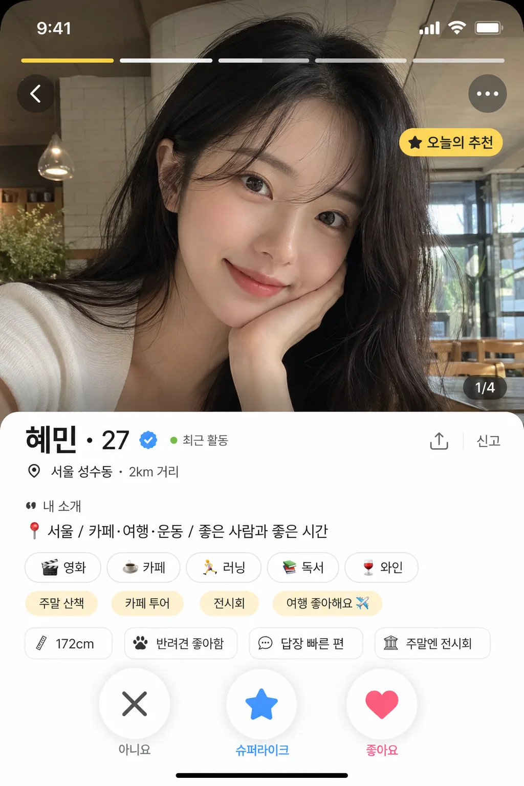
데이팅앱 프로필 카드 mockup. 사진·이름·나이·자기소개·관심사 태그. 인스타 짤·바이럴 콘텐츠.
데이팅앱 프로필 목업 (Bumble·Tinder 가짜 카드)の概要
グッズ・モックアップ画像を作るためのChatGPT画像プロンプトです。主題、背景、スタイル、構図を整理し、すぐに試せるよう構成しています。
関連キーワード: 데이팅앱 프로필 목업 (Bumble·Tinder 가짜 카드), 데이팅앱 프로필 목업 (Bumble·Tinder 가짜 카드) 프롬프트, グッズ・モックアップ 프롬프트, グッズ・モックアップ AI 이미지 프롬프트, ChatGPT 이미지 프롬프트, AI 이미지 생성 프롬프트, AI 프롬프트, 이미지 프롬프트
데이팅앱 프로필 목업 (Bumble·Tinder 가짜 카드)の活用方法
元の構造を保ちながら、被写体、背景、色、構図を変更して別案に展開できます。
- 主題を維持し、ブランドや季節、媒体に合わせて色と背景を変更してください。
- 結果が複雑な場合は背景要素を減らし、被写体、構図、照明を具体化してください。
- コピー後、ChatGPTに媒体、アスペクト比、文字の有無を追加で指定できます。
プロンプト原文
[Input]
- language: Korean
- output_size: 1024x1536

[Purpose]
Dating-app profile card mockup for a vertical phone screen, designed to look like a realistic Bumble/Tinder-style app profile screenshot.
Make it usable as a believable fake app screen preview with a main photo, profile details, interest tags, location/activity microcopy, photo navigation indicators, and action buttons.

[Composition]
- 9:16 phone portrait layout with the main profile image occupying the top 62% of the frame, and the card info panel stacked in the lower 38%.
- The main photo area should feel like an in-app profile hero image, with realistic UI framing, rounded corners, subtle safe-area status bar, and no visible device bezel.
- Place {배경 사진} as the main profile photo, cropped to fill the hero area naturally, with authentic social-profile framing and realistic depth.
- Overlay small app UI elements on the hero image: top status bar time/battery/wifi glyphs, photo carousel dots or segmented bars, a back chevron, a three-dot menu, and a small label such as “오늘의 추천”.
- Add a translucent lower gradient over the bottom of the photo only where needed so the UI remains legible while the image still looks natural.
- Profile name block should sit immediately below the photo, aligned left with comfortable mobile padding, including {이름·나이} plus a small verified-style check badge, “최근 활동” dot, or distance/location line.
- Interest tags should appear as pill-shaped chips in a one- to two-row cluster under the bio, mixed with one or two app-generated chips such as “주말 산책” or “카페 투어” only if space allows.
- The action area should reserve space at the bottom for X / super-like or star / like buttons, with realistic thumb-sized spacing, circular controls, shadows, and small icon labels.
- Include tiny mobile details such as a bottom gesture bar, section divider, “신고” or share micro icon, page indicator “1/4”, and a faint bottom navigation hint if it fits {레이아웃}.
- Keep the overall layout modern, screenshot-like, and content-rich, with realistic mobile app spacing and card hierarchy.

[Core Structure]
- Hero photo area (top 62%): {배경 사진} displayed as a polished dating-app profile image, full-bleed within a rounded card, with subtle top-safe-area spacing, natural lens depth, realistic exposure, and authentic in-app photo cropping.
- Photo UI overlay: add segmented photo progress bars near the top, a small “1/4” indicator, top-left navigation chevron, top-right overflow menu, and a small translucent badge reading “오늘의 추천” or “NEW”.
- Header block (below photo): show {이름·나이} in a bold app-style profile header, positioned left-aligned with strong hierarchy. Add a tiny check mark badge, a green active dot with “최근 활동”, and a location/distance line such as “서울 성수동 · 2km 거리”.
- Bio section: place {자기소개} beneath the name in smaller, readable UI text, wrapped across 1–3 lines with realistic app line spacing. Add a subtle prompt label above or beside it such as “내 소개” or “한 줄 소개”.
- Interest chip row: render {관심사 태그} as rounded tags with consistent padding, subtle border, soft shadow, and equal spacing like a real dating app interface. Chips may include tiny icons or emoji accents such as “☕”, “🎧”, “🏃” when visually appropriate.
- Detail snippets: include 2–3 small profile info rows or chips below the bio/tags, such as “키 172cm”, “반려견 좋아함”, “답장 빠른 편”, “주말엔 전시회”, styled as realistic app metadata without overpowering the main text.
- UI theme treatment: apply {UI 모드} consistently to accent color, button style, icon tint, progress bars, highlight labels, active dots, and selected chips.
- Layout framing: follow {레이아웃} precisely, keeping the screen vertical, profile-first, and visually close to an authentic mobile dating-app screenshot.
- Bottom controls: add circular X, star/spark, and heart buttons with realistic icon weight, touch-target sizing, soft drop shadows, and a small bottom gesture bar.
- Final realism pass: ensure the full composition reads like a genuine dating-app card preview, with natural UI density, varied microcopy, crisp alignment, and credible app-screen details.

[Style Rules]
- Typography: use Pretendard or Noto Sans KR for UI text, with bold 700–800 weight for the name and medium 500–600 weight for body text; size hierarchy should feel like a modern mobile app screenshot.
- Color palette: if {UI 모드} leans Bumble, use warm yellow #FFC629 with white, charcoal, honey beige, and soft gray surfaces; if Tinder, use pink #FD5068, orange #FF8A3D, white, blush highlights, and soft gray #F3F4F6.
- Borders/shadow: rounded card corners with a soft shadow 0px 10px 24px rgba(0,0,0,0.12), thin divider lines in #E7E7EA, translucent photo badges, and subtle button depth without glossy effects.
- UI surfaces should use clean off-white or light neutral panels, with crisp app-like contrast, layered cards, chip borders, small icons, and believable touch-interface spacing.
- Add realistic mobile interface details: status bar glyphs, segmented photo bars, micro labels, distance/activity metadata, bottom gesture bar, and tiny icon buttons sized like an actual phone screenshot.
- Keep all UI copy short and functional; avoid long marketing slogans. Korean microcopy should look like real dating-app labels rather than an ad.

[Visual Style]
- Camera / lens: 35mm full-frame smartphone-style portrait capture look, equivalent to an 85mm f/1.8 shallow-depth profile shot for the main image area.
- Lighting: soft window light from upper-left at 45°, gentle fill from the front-right, realistic indoor social-photo exposure with natural skin tones.
- Color grade: clean mobile app realism with slightly warm neutral skin tones, balanced whites, and mild saturation; if Tinder-style, shift highlights toward pink-orange accents; if Bumble-style, keep yellow accents crisp and bright.
- UI rendering: high-resolution app screenshot clarity, sharp vector-like icons, crisp Korean typography, subtle translucency on overlays, and realistic antialiasing.
- Photo treatment: natural skin texture, believable social-profile composition, authentic background context from {배경 사진}, and depth that looks captured rather than artificially generated.

[Mood]
Realistic modern dating-app UI mockup — feels like a polished app store preview or a high-fidelity product concept for Bumble/Tinder, with enough small interface details to resemble a real profile someone could swipe on.

[Critical]
- Korean text accuracy: "{이름·나이}", "{자기소개}", and "{관심사 태그}" must render clearly in Korean if present in the design.
- Include short Korean UI labels where appropriate, such as “오늘의 추천”, “최근 활동”, “서울 성수동 · 2km 거리”, “내 소개”, “관심사”, “1/4”, and “신고”, all crisp and legible.
- The profile card must read like a real mobile dating app interface, not a poster or advertisement.
- Keep the photo, name, bio, tags, metadata, photo indicators, and action controls in the correct mobile-app hierarchy.
- Text must remain crisp and fully legible; avoid broken Korean characters, distorted letters, or unreadable microcopy.
- The composition should preserve a believable app screenshot structure with clean alignment, realistic spacing, and content-rich UI details.

[8. 🚫 PROHIBITED]
- Fake official seals / certifications
- Broken Korean characters
- Celebrity composites / unauthorized likeness