Ads/Posters
사케 이자카야 메뉴·매장 비주얼
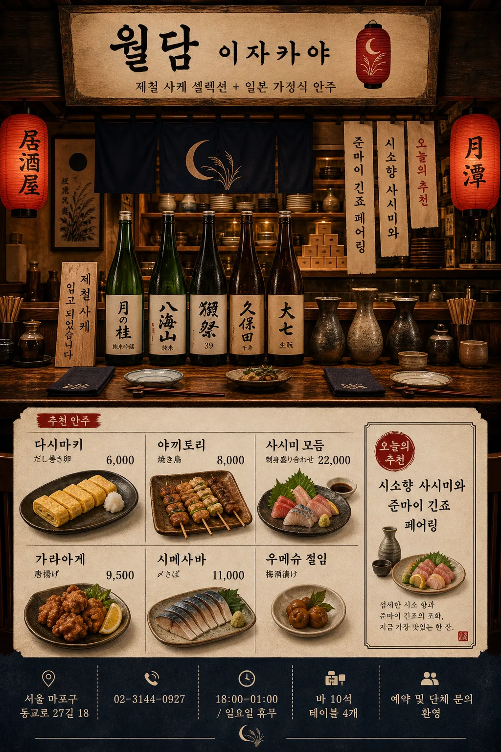
이자카야·사케 매장 분위기 + 메뉴판. 일본 미니멀 + 등롱 + 우드. 시그니처 사케 4~6종 + 안주 6~8종 + 매장명·인스타.
사케 이자카야 메뉴·매장 비주얼 summary
Copy this ChatGPT image prompt to create Ads/Posters results. Its subject, background, style, and composition are organized for quick iteration.
Related keywords: 사케 이자카야 메뉴·매장 비주얼, 사케 이자카야 메뉴·매장 비주얼 프롬프트, Ads/Posters 프롬프트, Ads/Posters AI 이미지 프롬프트, ChatGPT 이미지 프롬프트, AI 이미지 생성 프롬프트, AI 프롬프트, 이미지 프롬프트
How to use 사케 이자카야 메뉴·매장 비주얼
Keep the prompt structure and swap the subject, background, palette, or composition to create new variations.
- Keep the main subject and adjust the palette and background for your brand, season, or channel.
- If the result feels busy, simplify the background and make the subject, composition, and lighting more specific.
- After copying, ask ChatGPT to adapt it for your platform, aspect ratio, or text requirements.
Original prompt
[Input]
- language: Korean
- output_size: 1024x1536

[Purpose]
Japanese izakaya interior visual and menu-board poster for an adult sake bar, combining a refined store atmosphere with organized food and sake listings, store information, and reservation details.
Designed as a vertical brand/menu composition that feels like a premium Tokyo neighborhood izakaya editorial, suitable for storefront display, social promotion, and printed menu signage.

[Composition]
- Subject placement: {매장명} signage sits in the upper 16% as the visual anchor, counter and bottle display occupy the middle 50%, and the menu / store-info block fills the lower 34% with a readable price hierarchy.
- Background treatment: warm wood interior, indigo noren curtains, washi paper texture, handwritten reservation tags, small ceramic dishes, chopstick rests, soy sauce cruet, and red lantern accents; wall surfaces should feel matte, slightly weathered, and lived-in.
- Framing: front-facing vertical poster composition with a slight depth perspective into the counter area; include layered shelves, hanging menu slips, and a believable izakaya counter rhythm.
- The visual identity should balance store atmosphere and menu readability, with {컨셉} expressed through interior props, bottle arrangement, seasonal recommendation tags, and menu typography.
- Use {매장명}, {컨셉}, {사케 셀렉션}, {안주 메뉴}, {오늘추천}, {주소}, {연락처}, {영업시간}, {예약문구}, {좌석정보}, and {컬러 톤} placeholders as the exact content variables to be rendered.

[3. CORE STRUCTURE]
1) Top header zone: place {매장명} as a crisp Japanese-inspired signage area, pairing kanji/japanese-style lettering with Korean text directly beneath it; add a small subtitle line reading {컨셉} and a discreet red lantern icon-like graphic.
2) Hero interior zone: show a compact izakaya counter scene with wood grain, red lantern glow, noren curtains, washi paper screens, stacked masu cups, ceramic tokkuri, small appetizer plates, folded cloth napkins, and handwritten daily-special strips.
3) Sake display zone: on the counter and back shelf, place Japanese sake bottles and tokkuri vessels with clean labels matching {사케 셀렉션}; make each label legible and spaced like a curated seasonal shelf display.
4) Menu zone: compose {안주 메뉴} in a neat grid with Korean names, occasional Japanese-style side labels, clear won prices, small category dividers, and thin charcoal rules; include a highlighted box for {오늘추천}.
5) Store info zone: add a grounded footer panel with {주소}, {연락처}, {영업시간}, {좌석정보}, and {예약문구}; include small micro-icons for location, phone, clock, and reservation without overpowering the menu.
6) Accent zone: use the palette from {컬러 톤} for lanterns, shadows, trim, stamped-looking category labels, menu dividers, and subtle edge highlights; keep the contrast editorial and atmospheric.

[4. STYLE RULES]
- Typography: use Noto Sans KR for Korean body text, Pretendard SemiBold for menu headings, and a Japanese mincho-style serif for kanji labels; header size should feel like 42–56px equivalent, body text 22–28px equivalent, footer info 16–20px equivalent.
- Color palette: anchor with black ink, indigo navy, warm wood brown, vermilion red, and rice-paper ivory from {컬러 톤}; whites should feel warm like washi paper.
- Dividers / shadow: use thin charcoal divider lines, small red category tabs, stamped menu markers, and soft shadows with 4px y-offset, 12px blur, 15% opacity under bottles, plates, and menu blocks.
- Surface finish: matte paper menu texture, subtle fiber grain, lightly aged wood, brushed ceramic glaze, condensation on chilled glassware, and gentle lantern bloom.
- Menu realism: prices should align consistently, item spacing should feel like an actual shop menu, and footer details should read as practical storefront information.

[5. VISUAL STYLE]
- Camera / lens: 35mm full-frame look, f/4, front-facing interior editorial framing with mild depth of field separation between counter objects and background.
- Lighting: warm practical lantern light from the upper-right, soft ambient fill from the left, and a faint bounce off the wood counter; highlights remain gentle and controlled.
- Color grade: indigo shadows, warm amber lantern highlights, muted red accents, creamy paper whites, realistic wood browns, and restrained saturation.
- Rendering detail: sharp enough for menu legibility, with natural imperfections such as paper fibers, tiny wood scratches, bottle label texture, and ceramic reflections.

[6. MOOD]
Premium Japanese izakaya editorial — a Tokyo backstreet sake bar poster with the polished restraint of Kinfolk and the atmospheric warmth of a Nobu-style dining interior, but with practical Korean menu-board clarity.

[7. CRITICAL]
- Korean text accuracy: 반드시 정확히 렌더해야 할 문자열 — "월담 이자카야", "제철 사케 셀렉션 + 일본 가정식 안주", "月の桂 純米吟醸", "八海山 純米", "獺祭 39", "久保田 千寿", "大七 生酛", "다시마키 6,000", "야끼토리 8,000", "사시미 모듬 22,000", "가라아게 9,500", "시메사바 11,000", "우메슈 절임", "오늘의 추천: 시소향 사시미와 준마이 긴죠 페어링", "서울 마포구 동교로 27길 18", "02-3144-0927", "18:00–01:00 / 일요일 휴무", "바 10석 · 테이블 4개", "예약 및 단체 문의 환영".
- Layout invariants: menu text must remain aligned in rows and columns; prices should sit on the right side of each item; bottle labels must be readable; all listed sake items should appear as a curated set.
- Store realism: include address, contact, hours, seating note, recommendation callout, small dividers, and footer information as part of the designed menu poster.
- Adult-only presentation: keep the scene focused on refined dining, pairing culture, and venue atmosphere, with no intoxication-centered behavior.

[8. 🚫 PROHIBITED]
- Fake official seals / certifications
- Broken Korean characters
- Celebrity composites or recognizable real-person likenesses
- Underage-associated cues or youthful drinking imagery