Ads/Posters
자전거·로드바이크 광고
자전거·로드바이크·MTB·미니벨로 광고. 라이프 결.
자전거·로드바이크 광고 summary
Copy this ChatGPT image prompt to create Ads/Posters results. Its subject, background, style, and composition are organized for quick iteration.
Related keywords: 자전거·로드바이크 광고, 자전거·로드바이크 광고 프롬프트, Ads/Posters 프롬프트, Ads/Posters AI 이미지 프롬프트, ChatGPT 이미지 프롬프트, AI 이미지 생성 프롬프트, AI 프롬프트, 이미지 프롬프트
How to use 자전거·로드바이크 광고
Keep the prompt structure and swap the subject, background, palette, or composition to create new variations.
- Keep the main subject and adjust the palette and background for your brand, season, or channel.
- If the result feels busy, simplify the background and make the subject, composition, and lighting more specific.
- After copying, ask ChatGPT to adapt it for your platform, aspect ratio, or text requirements.
Original prompt
[Input]
- language: Korean
- output_size: 1536x1024

[Purpose]
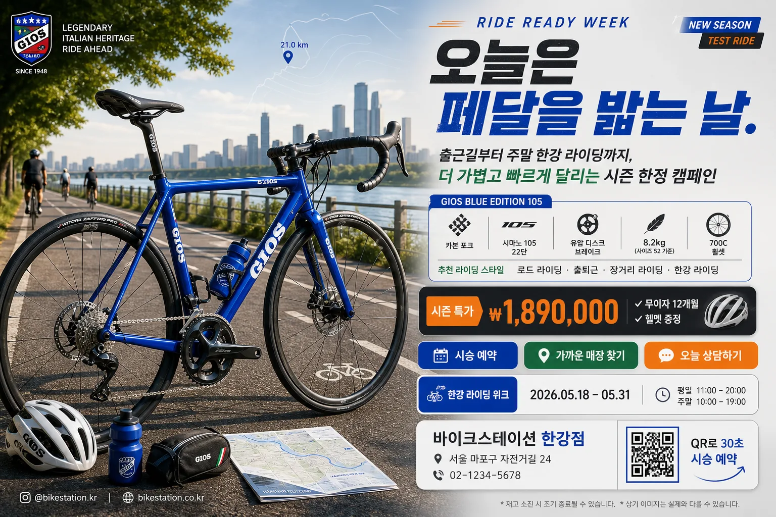
Korean bicycle advertisement key visual, landscape 3:2 banner for product promo, local bike shop campaign, and outdoor cycling event announcement.
High-impact cycling brand ad with a premium hero bicycle, real riding context, performance specs, promotion details, and a clear call-to-action.

[Composition]
- Hero composition: a single {자전거 종류·브랜드} bicycle dominates the left 55% of the frame in a sharp side-profile commercial product pose, slightly angled to reveal frame depth, drivetrain texture, tire tread, brake rotors, cable routing, bottle cage, saddle detail, and realistic reflections.
- Background treatment: layered outdoor cycling context using {배경 코스}, including road markings, riverside railing or trail edge, distant riders, trees, asphalt texture, sunlit dust, and atmospheric depth while keeping the bicycle visually dominant.
- Text hierarchy: {캠페인 헤드라인} at upper-right, {서브카피} beneath it, specs block and promotion badge in the middle-right, then CTA/store information anchored lower-right with a practical retail-ad structure.
- Brand treatment: use {컬러 팔레트} as the identity system across headline accents, thin rules, CTA buttons, model badge, small icons, and dealership information cards.
- Advertising details: include a small campaign label, event date, shop address/contact, web or social handle, QR-style reservation box, and fine-print retail note so the banner feels like a real Korean bicycle store promotion.

[3. CORE STRUCTURE]
1. Hero area (left 55%): place the {자전거 종류·브랜드} as a polished editorial product shot with realistic metal/carbon texture, chain, cassette, crank, spokes, brake calipers, tire sidewall lettering, and a believable contact shadow on the ground; add a helmet, water bottle, repair pouch, or folded route map as small supporting cycling accessories near the lower-left without competing with the main product.
2. Headline block (upper-right 20%): set {캠페인 헤드라인} in large bold Korean type with a compact English campaign kicker such as “RIDE READY WEEK”, using a strong two-line layout and tight line spacing for premium sports-ad impact.
3. Copy and specs panel (mid-right 22%): show {서브카피} and {스펙·특징} as a neat bullet-style cluster with icon-like separators for frame material, drivetrain, weight, wheel size, brake type, and recommended riding style.
4. Promotion and CTA zone (lower-right 18%): place {가격·프로모션}, {CTA·매장}, {행사 일정}, and {매장 정보} inside layered rounded rectangles or ticket-stub style panels; include {QR 안내} as a small QR-like square and {SNS·웹주소} as a micro footer line.
5. Decorative graphics: add subtle speed lines, route-map contour lines, small distance markers, kilometer-pin icons, thin divider rules, and a “NEW SEASON” or {배지 문구} badge to create a finished retail campaign layout.
6. Color balance: apply {컬러 팔레트} across headline accents, sponsor/dealer tags, thin rules, and CTA highlights while preserving natural outdoor tones, asphalt grain, and realistic daylight contrast.

[4. STYLE RULES]
- Typography: bold Korean sans-serif such as Pretendard ExtraBold or Noto Sans KR Black for the headline, Pretendard Medium for specs, and a clean condensed English companion style for small campaign labels; headline size should feel poster-scale, specs and store details smaller but fully legible.
- Color palette: use {컬러 팔레트} with planned contrast—dark charcoal text, vivid brand accent blocks, light neutral cards, and natural green/blue outdoor tones so the bicycle remains the strongest visual anchor.
- Layout system: use a premium sports retail grid with layered information cards, model badge, promo coupon strip, QR box, route-marker icons, micro captions, and realistic printed-ad spacing.
- Border/shadow: add soft realistic drop shadows under the bicycle and text cards, about 4px vertical offset, 12px blur, 15% opacity; use thin separator lines, rounded panels, and small tag shapes for hierarchy.
- Detail realism: show correct bicycle proportions, aligned wheels, accurate drivetrain placement, believable handlebar geometry, clear saddle/post angle, and realistic tire-ground contact.

[5. VISUAL STYLE]
- Camera / lens: professional commercial photography look, shot like a Canon EOS R5 with a 70-200mm f/2.8 at around 135mm, f/4 for crisp product separation and controlled background compression.
- Lighting: bright outdoor studio-style daylight with soft key light from upper-left at about 45°, gentle fill from front-right, subtle rim highlight on the frame edges, and small specular highlights on rims, spokes, chain, and brake components.
- Color grade: clean premium cycling promo grade with crisp blues, greens, and charcoal neutrals, moderate contrast, slightly cool daylight balance, and restrained saturation.
- Texture: retain visible asphalt grain, rubber tire texture, carbon or aluminum frame finish, metal drivetrain detail, handlebar tape texture, subtle dust, and realistic outdoor reflections.

[6. MOOD]
Premium sports-brand campaign aesthetic — like a Rapha / Trek / Giant catalog spread combined with a realistic Korean bike-shop event banner, energetic, polished, performance-focused, and ready for weekend riding.

[7. CRITICAL]
- Korean text accuracy: 반드시 정확히 표시되어야 하는 문자열: "오늘은 페달을 밟는 날."
- Korean rendered text must include: "시승 예약", "무이자 12개월", "한강 라이딩 위크", "2026.05.18–05.31", "가까운 매장에서 만나요".
- Korean text accuracy: {자전거 종류·브랜드}, {스펙·특징}, {가격·프로모션}, {CTA·매장}, {매장 정보}, {행사 일정}에 들어가는 한글과 숫자는 끊김 없이 자연스럽고 오타 없이 렌더링.
- Layout invariant: bicycle must remain the single primary hero object; supporting accessories and distant riders are secondary and smaller.
- Layout invariant: all headline, specs, event date, price, CTA, store information, QR 안내, and SNS text must be fully legible, with no warped letters, no partial cropping, and no broken Korean characters.

[8. 🚫 PROHIBITED]
- Fake official seals / certifications
- Broken Korean characters
- Celebrity composites or unauthorized celebrity likenesses
- Fake government safety marks or fabricated public-agency endorsements