광고/포스터
자전거·로드바이크 광고
자전거·로드바이크·MTB·미니벨로 광고. 라이프 결.
자전거·로드바이크 광고 검색 요약
자전거·로드바이크 광고은 광고/포스터 결과물을 만들 때 바로 복사해 활용할 수 있는 ChatGPT 이미지 프롬프트입니다. 주제, 배경, 스타일, 구도 조건을 함께 담아 빠르게 시안을 만들 수 있도록 구성했습니다.
관련 키워드: 자전거·로드바이크 광고, 자전거·로드바이크 광고 프롬프트, 광고/포스터 프롬프트, 광고/포스터 AI 이미지 프롬프트, ChatGPT 이미지 프롬프트, AI 이미지 생성 프롬프트, AI 프롬프트, 이미지 프롬프트
자전거·로드바이크 광고 활용 포인트
원본 구조를 유지하면서 피사체, 배경, 색감, 구도를 바꿔 다양한 시안으로 확장할 수 있습니다.
- 핵심 소재는 유지하고 브랜드, 계절, 채널 목적에 맞는 색감과 배경을 바꿔보세요.
- 결과가 산만하면 배경 요소를 줄이고 피사체, 구도, 조명 조건을 구체화하세요.
- 복사한 뒤 ChatGPT에서 플랫폼, 화면 비율, 텍스트 포함 여부를 추가로 요청할 수 있습니다.
프롬프트 원문
[Input]
- language: Korean
- output_size: 1536x1024

[Purpose]
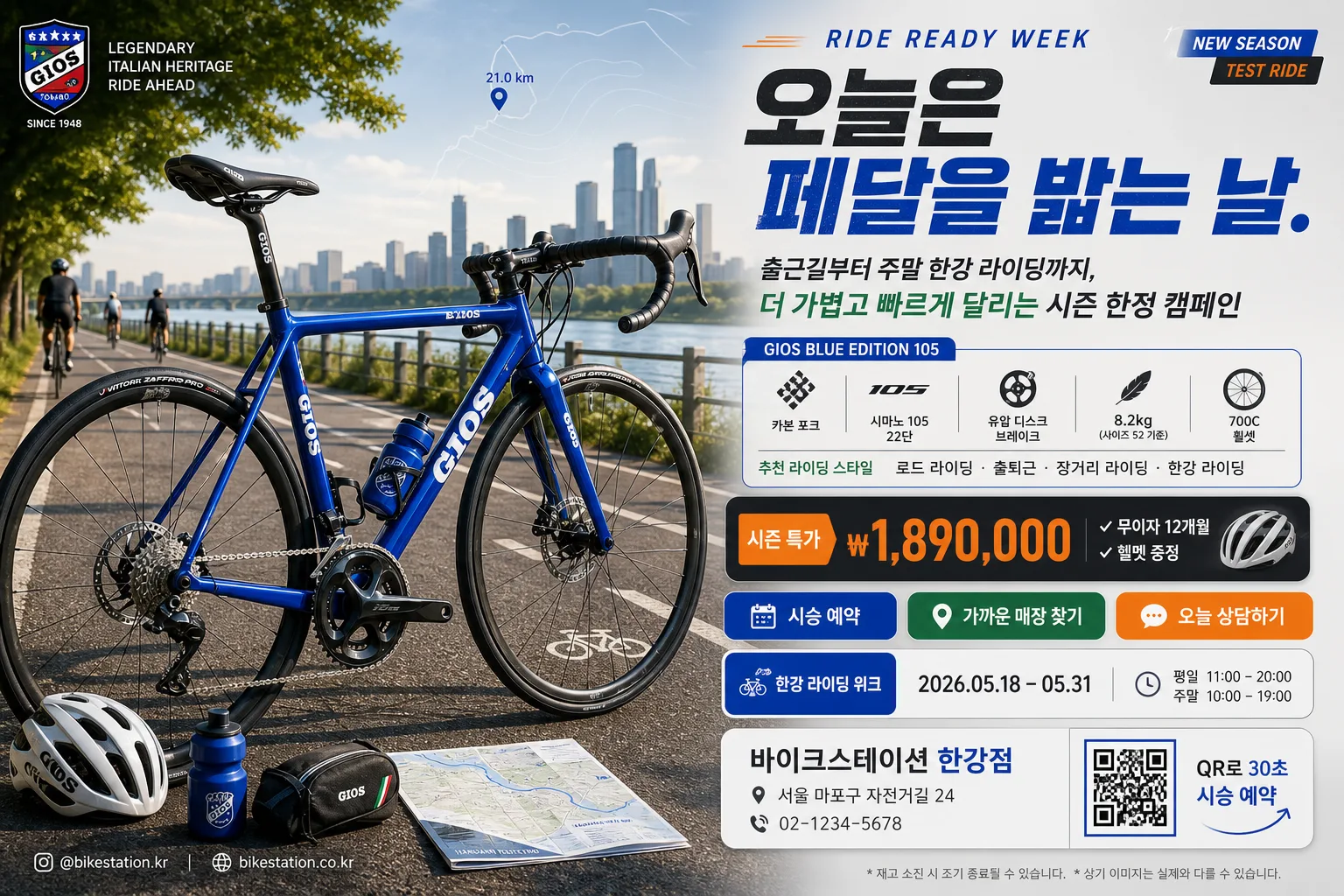
Korean bicycle advertisement key visual, landscape 3:2 banner for product promo, local bike shop campaign, and outdoor cycling event announcement.
High-impact cycling brand ad with a premium hero bicycle, real riding context, performance specs, promotion details, and a clear call-to-action.

[Composition]
- Hero composition: a single {자전거 종류·브랜드} bicycle dominates the left 55% of the frame in a sharp side-profile commercial product pose, slightly angled to reveal frame depth, drivetrain texture, tire tread, brake rotors, cable routing, bottle cage, saddle detail, and realistic reflections.
- Background treatment: layered outdoor cycling context using {배경 코스}, including road markings, riverside railing or trail edge, distant riders, trees, asphalt texture, sunlit dust, and atmospheric depth while keeping the bicycle visually dominant.
- Text hierarchy: {캠페인 헤드라인} at upper-right, {서브카피} beneath it, specs block and promotion badge in the middle-right, then CTA/store information anchored lower-right with a practical retail-ad structure.
- Brand treatment: use {컬러 팔레트} as the identity system across headline accents, thin rules, CTA buttons, model badge, small icons, and dealership information cards.
- Advertising details: include a small campaign label, event date, shop address/contact, web or social handle, QR-style reservation box, and fine-print retail note so the banner feels like a real Korean bicycle store promotion.

[3. CORE STRUCTURE]
1. Hero area (left 55%): place the {자전거 종류·브랜드} as a polished editorial product shot with realistic metal/carbon texture, chain, cassette, crank, spokes, brake calipers, tire sidewall lettering, and a believable contact shadow on the ground; add a helmet, water bottle, repair pouch, or folded route map as small supporting cycling accessories near the lower-left without competing with the main product.
2. Headline block (upper-right 20%): set {캠페인 헤드라인} in large bold Korean type with a compact English campaign kicker such as “RIDE READY WEEK”, using a strong two-line layout and tight line spacing for premium sports-ad impact.
3. Copy and specs panel (mid-right 22%): show {서브카피} and {스펙·특징} as a neat bullet-style cluster with icon-like separators for frame material, drivetrain, weight, wheel size, brake type, and recommended riding style.
4. Promotion and CTA zone (lower-right 18%): place {가격·프로모션}, {CTA·매장}, {행사 일정}, and {매장 정보} inside layered rounded rectangles or ticket-stub style panels; include {QR 안내} as a small QR-like square and {SNS·웹주소} as a micro footer line.
5. Decorative graphics: add subtle speed lines, route-map contour lines, small distance markers, kilometer-pin icons, thin divider rules, and a “NEW SEASON” or {배지 문구} badge to create a finished retail campaign layout.
6. Color balance: apply {컬러 팔레트} across headline accents, sponsor/dealer tags, thin rules, and CTA highlights while preserving natural outdoor tones, asphalt grain, and realistic daylight contrast.

[4. STYLE RULES]
- Typography: bold Korean sans-serif such as Pretendard ExtraBold or Noto Sans KR Black for the headline, Pretendard Medium for specs, and a clean condensed English companion style for small campaign labels; headline size should feel poster-scale, specs and store details smaller but fully legible.
- Color palette: use {컬러 팔레트} with planned contrast—dark charcoal text, vivid brand accent blocks, light neutral cards, and natural green/blue outdoor tones so the bicycle remains the strongest visual anchor.
- Layout system: use a premium sports retail grid with layered information cards, model badge, promo coupon strip, QR box, route-marker icons, micro captions, and realistic printed-ad spacing.
- Border/shadow: add soft realistic drop shadows under the bicycle and text cards, about 4px vertical offset, 12px blur, 15% opacity; use thin separator lines, rounded panels, and small tag shapes for hierarchy.
- Detail realism: show correct bicycle proportions, aligned wheels, accurate drivetrain placement, believable handlebar geometry, clear saddle/post angle, and realistic tire-ground contact.

[5. VISUAL STYLE]
- Camera / lens: professional commercial photography look, shot like a Canon EOS R5 with a 70-200mm f/2.8 at around 135mm, f/4 for crisp product separation and controlled background compression.
- Lighting: bright outdoor studio-style daylight with soft key light from upper-left at about 45°, gentle fill from front-right, subtle rim highlight on the frame edges, and small specular highlights on rims, spokes, chain, and brake components.
- Color grade: clean premium cycling promo grade with crisp blues, greens, and charcoal neutrals, moderate contrast, slightly cool daylight balance, and restrained saturation.
- Texture: retain visible asphalt grain, rubber tire texture, carbon or aluminum frame finish, metal drivetrain detail, handlebar tape texture, subtle dust, and realistic outdoor reflections.

[6. MOOD]
Premium sports-brand campaign aesthetic — like a Rapha / Trek / Giant catalog spread combined with a realistic Korean bike-shop event banner, energetic, polished, performance-focused, and ready for weekend riding.

[7. CRITICAL]
- Korean text accuracy: 반드시 정확히 표시되어야 하는 문자열: "오늘은 페달을 밟는 날."
- Korean rendered text must include: "시승 예약", "무이자 12개월", "한강 라이딩 위크", "2026.05.18–05.31", "가까운 매장에서 만나요".
- Korean text accuracy: {자전거 종류·브랜드}, {스펙·특징}, {가격·프로모션}, {CTA·매장}, {매장 정보}, {행사 일정}에 들어가는 한글과 숫자는 끊김 없이 자연스럽고 오타 없이 렌더링.
- Layout invariant: bicycle must remain the single primary hero object; supporting accessories and distant riders are secondary and smaller.
- Layout invariant: all headline, specs, event date, price, CTA, store information, QR 안내, and SNS text must be fully legible, with no warped letters, no partial cropping, and no broken Korean characters.

[8. 🚫 PROHIBITED]
- Fake official seals / certifications
- Broken Korean characters
- Celebrity composites or unauthorized celebrity likenesses
- Fake government safety marks or fabricated public-agency endorsements