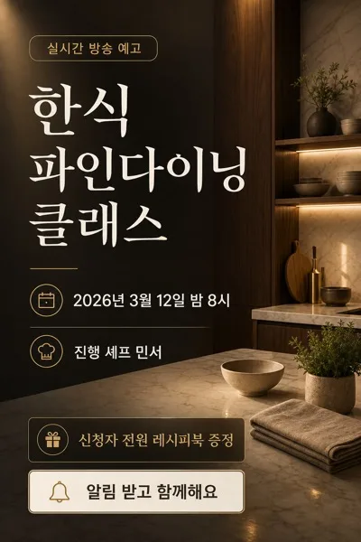
SNS/카드뉴스
와인 셀러·소믈리에 추천 카드
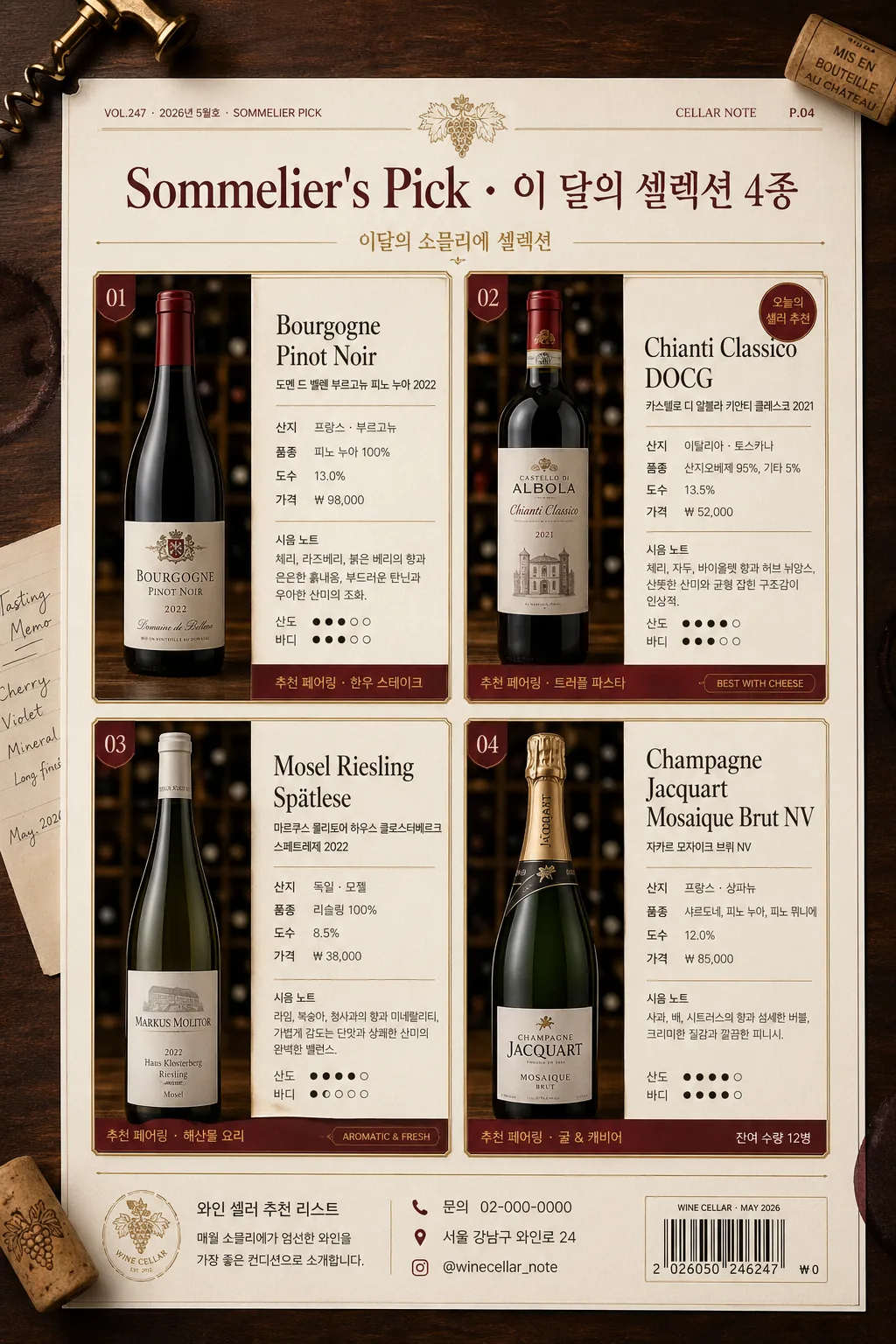
와인 셀렉션 추천 카드 — 보틀 사진 + 산지·품종·가격·시음 노트·페어링. 와인숍 인스타 또는 메뉴북 활용.
와인 셀러·소믈리에 추천 카드 검색 요약
와인 셀러·소믈리에 추천 카드은 SNS/카드뉴스 결과물을 만들 때 바로 복사해 활용할 수 있는 ChatGPT 이미지 프롬프트입니다. 주제, 배경, 스타일, 구도 조건을 함께 담아 빠르게 시안을 만들 수 있도록 구성했습니다.
관련 키워드: 와인 셀러·소믈리에 추천 카드, 와인 셀러·소믈리에 추천 카드 프롬프트, SNS/카드뉴스 프롬프트, SNS/카드뉴스 AI 이미지 프롬프트, ChatGPT 이미지 프롬프트, AI 이미지 생성 프롬프트, AI 프롬프트, 이미지 프롬프트
와인 셀러·소믈리에 추천 카드 활용 포인트
원본 구조를 유지하면서 피사체, 배경, 색감, 구도를 바꿔 다양한 시안으로 확장할 수 있습니다.
- 핵심 소재는 유지하고 브랜드, 계절, 채널 목적에 맞는 색감과 배경을 바꿔보세요.
- 결과가 산만하면 배경 요소를 줄이고 피사체, 구도, 조명 조건을 구체화하세요.
- 복사한 뒤 ChatGPT에서 플랫폼, 화면 비율, 텍스트 포함 여부를 추가로 요청할 수 있습니다.
프롬프트 원문
[Input]
- language: Korean
- output_size: 1024x1536

[Purpose]
Korean wine cellar / sommelier recommendation card series, magazine-style vertical poster for Instagram, wine bar menu book, or cellar tasting sheet.
Create a real-looking premium 4-card editorial layout that presents each wine bottle with concise tasting notes, origin details, pairing suggestions, and practical purchase information in a refined sommelier recommendation format.

[Composition]
- Overall layout: 4-card series arranged as a polished editorial 2x2 grid, with {레이아웃} guiding the main structure, consistent gutters, and a realistic printed-menu feel.
- Physical scene: show the vertical recommendation sheet as a premium matte paper page photographed on a dark walnut wine bar table, with subtle surrounding cellar details such as corks, a brass wine key, folded tasting memo, faint wine-ring marks, and soft shadows near the page edges.
- Each card: bottle photo occupies the left 42–48% of the card, while the detail text block occupies the right 52–58%, creating a balanced catalog feel with enough room for Korean tasting notes and price lines.
- Header zone: top 12–15% reserved for {브랜드·시리즈} as a prominent magazine-style masthead, with thin gold rules, a small issue/date line, and editorial metadata such as “VOL.247 · 2026년 5월호 · SOMMELIER PICK”.
- Footer zone: include a discreet store/contact strip with Korean microcopy such as “와인 셀러 추천 리스트”, “문의 02-000-0000”, “서울 강남구 와인로 24”, “@winecellar_note”, and a small barcode-style price label area.
- Background treatment: warm cream paper texture with visible subtle grain, deep wine-red accent blocks, fine gold linework, small divider ornaments, and tactile print texture for a refined cellar-inventory look.
- Keep all four cards visually aligned in rhythm, with identical bottle scale logic, framing direction, text hierarchy, and editorial spacing.

[3. CORE STRUCTURE]
- Card 1 (top-left): {와인 4종} 중 첫 번째 와인을 realistic bottle cutout or premium bottle photo, placed left; right side shows {카드 디테일} in 4–5 compact lines, plus one small highlight line for style and pairing such as “추천 페어링 · 한우 스테이크”.
- Card 2 (top-right): second wine in the same layout, matching scale and text density, so the series reads as a unified sommelier selection set; include a small tag like “오늘의 셀러 추천” or “BEST WITH CHEESE”.
- Card 3 (bottom-left): third wine, keep bottle height consistent with Card 1; use a small accent label and thin divider line to separate 산지, 품종, 도수, 가격, and 시음 노트.
- Card 4 (bottom-right): fourth wine, similar balance and spacing; include a short pairing suggestion line at the bottom of the text block and a small availability cue such as “잔여 수량 12병”.
- Title treatment: {브랜드·시리즈} appears above the 4-card grid in a premium editorial header, with the series name slightly larger than the body copy and supported by short Korean cover-line text: “이달의 소믈리에 셀렉션”.
- Typography hierarchy: apply {타이포}; each wine name in bold serif, secondary specs in small sans-serif, tasting notes in light-weight text with clear line breaks, and micro labels in small caps 느낌.
- Realistic printed details: include page number “P.04”, section marker “CELLAR NOTE”, small rating-style taste indicators such as “산도 ●●●○○”, “바디 ●●●●○”, and short price examples like “₩38,000”, “₩52,000” where appropriate.

[4. STYLE RULES]
- Typography: serif headline in Noto Serif KR or Nanum Myeongjo Bold 28–34px; body in Pretendard or Noto Sans KR Regular 14–18px; captions in 11–12px small caps 느낌; use {타이포} as the primary typographic direction.
- Color palette: {컬러 톤} as the primary palette, supported by off-white #F5F0E8, charcoal #2B2725, muted burgundy #5A1F2B, and metallic gold #B08D57.
- Border/shadow: thin 1px gold rules, soft drop shadow 4px y-offset, 12px blur, 14% opacity under each card, plus natural paper-page shadow on the tabletop.
- Card surface: matte paper texture, slightly warm, with crisp alignment, visible print grain, foil-like antique gold accents, and restrained luxury styling.
- Decorative editorial elements: include fine divider lines, small section labels, understated grape-vine line art, cellar inventory numbers, and a barcode/QR-style block rendered as decorative graphic texture rather than a scannable code.

[5. VISUAL STYLE]
- Camera / lens: Canon EOS R5 with 85mm f/1.8 lens look, studio product photography for the bottle cutouts, shallow depth of field on the surrounding table props, sharp label area, clean commercial detail.
- Lighting: softbox key light from upper-left at 45°, faint fill from right, controlled specular highlights on glass, realistic reflections on bottle shoulders, readable labels, warm ambient bounce from the wooden table.
- Color grade: deep burgundy + cream ivory + antique gold, with slightly desaturated shadows, polished editorial contrast, and warm cellar-bar atmosphere.
- Material realism: glass bottles should show subtle transparency, curved highlights, foil capsule reflections, paper label fibers, cork texture, and natural contact shadows.

[6. MOOD]
Premium Korean wine magazine spread — The New York Times Wine School meets Kinfolk editorial layout, photographed as a refined wine cellar tasting menu with mature sommelier catalog atmosphere.

[7. CRITICAL]
- Korean text accuracy: 반드시 아래 문구가 정확히 렌더되어야 함
  - {브랜드·시리즈}
  - {와인 4종}
  - {카드 디테일}
- Additional Korean text should be short and realistic, such as “이달의 소믈리에 셀렉션”, “와인 셀러 추천 리스트”, “산지”, “품종”, “도수”, “가격”, “시음 노트”, “추천 페어링”, “VOL.247”, “2026년 5월호”, “문의 02-000-0000”, “@winecellar_note”.
- Layout invariants: all 4 cards must remain in a consistent 2x2 series grid, each with bottle on the left and text on the right.
- Keep the tone strictly adult 20+ and editorial; the image should feel like a premium wine bar recommendation menu or sommelier catalog.

[8. 🚫 PROHIBITED]
- Fake official seals / certifications
- Broken Korean characters
- Celebrity composites or unauthorized likeness