SNS・カードニュース
와인 셀러·소믈리에 추천 카드
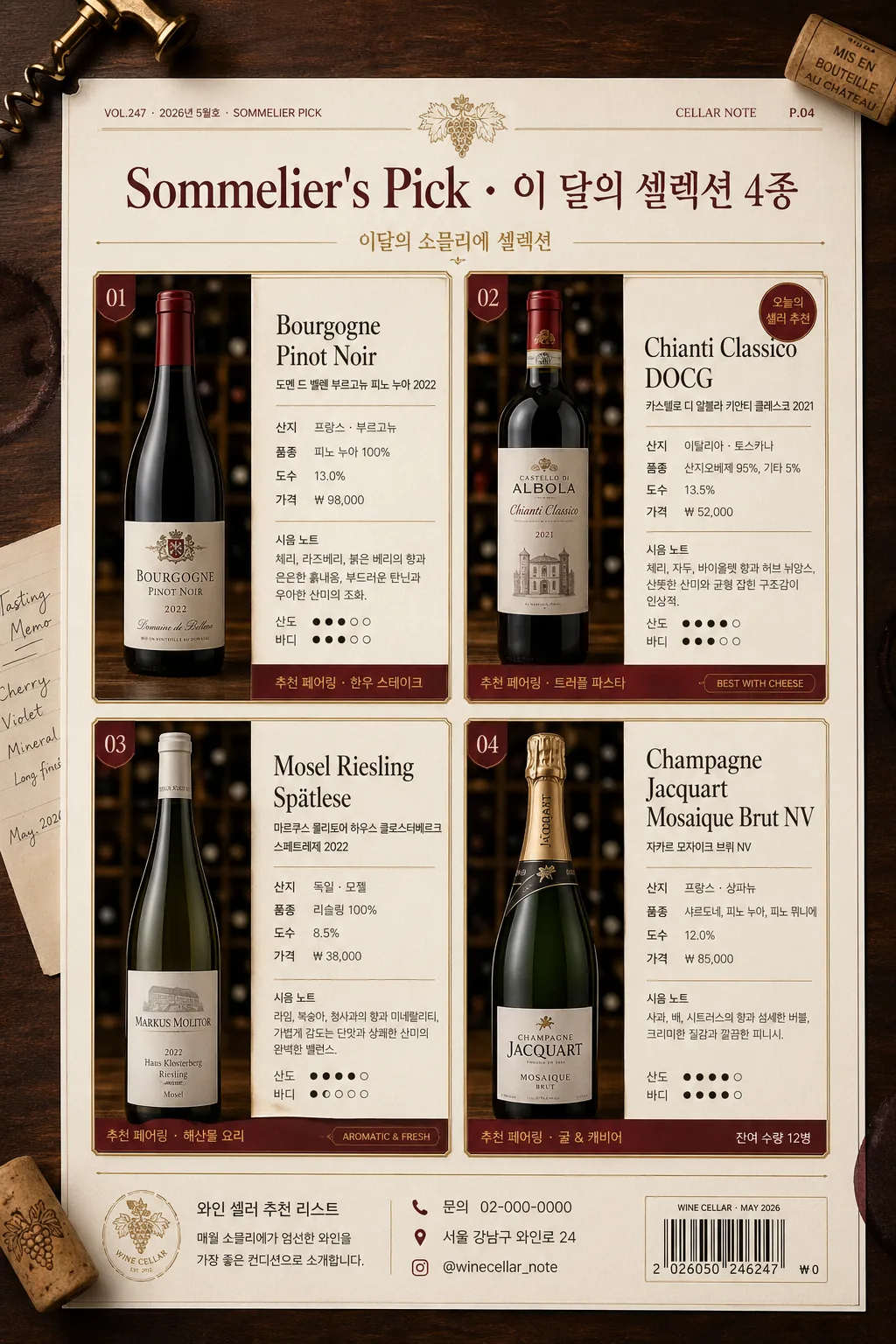
와인 셀렉션 추천 카드 — 보틀 사진 + 산지·품종·가격·시음 노트·페어링. 와인숍 인스타 또는 메뉴북 활용.
와인 셀러·소믈리에 추천 카드の概要
SNS・カードニュース画像を作るためのChatGPT画像プロンプトです。主題、背景、スタイル、構図を整理し、すぐに試せるよう構成しています。
関連キーワード: 와인 셀러·소믈리에 추천 카드, 와인 셀러·소믈리에 추천 카드 프롬프트, SNS・カードニュース 프롬프트, SNS・カードニュース AI 이미지 프롬프트, ChatGPT 이미지 프롬프트, AI 이미지 생성 프롬프트, AI 프롬프트, 이미지 프롬프트
와인 셀러·소믈리에 추천 카드の活用方法
元の構造を保ちながら、被写体、背景、色、構図を変更して別案に展開できます。
- 主題を維持し、ブランドや季節、媒体に合わせて色と背景を変更してください。
- 結果が複雑な場合は背景要素を減らし、被写体、構図、照明を具体化してください。
- コピー後、ChatGPTに媒体、アスペクト比、文字の有無を追加で指定できます。
プロンプト原文
[Input]
- language: Korean
- output_size: 1024x1536

[Purpose]
Korean wine cellar / sommelier recommendation card series, magazine-style vertical poster for Instagram, wine bar menu book, or cellar tasting sheet.
Create a real-looking premium 4-card editorial layout that presents each wine bottle with concise tasting notes, origin details, pairing suggestions, and practical purchase information in a refined sommelier recommendation format.

[Composition]
- Overall layout: 4-card series arranged as a polished editorial 2x2 grid, with {레이아웃} guiding the main structure, consistent gutters, and a realistic printed-menu feel.
- Physical scene: show the vertical recommendation sheet as a premium matte paper page photographed on a dark walnut wine bar table, with subtle surrounding cellar details such as corks, a brass wine key, folded tasting memo, faint wine-ring marks, and soft shadows near the page edges.
- Each card: bottle photo occupies the left 42–48% of the card, while the detail text block occupies the right 52–58%, creating a balanced catalog feel with enough room for Korean tasting notes and price lines.
- Header zone: top 12–15% reserved for {브랜드·시리즈} as a prominent magazine-style masthead, with thin gold rules, a small issue/date line, and editorial metadata such as “VOL.247 · 2026년 5월호 · SOMMELIER PICK”.
- Footer zone: include a discreet store/contact strip with Korean microcopy such as “와인 셀러 추천 리스트”, “문의 02-000-0000”, “서울 강남구 와인로 24”, “@winecellar_note”, and a small barcode-style price label area.
- Background treatment: warm cream paper texture with visible subtle grain, deep wine-red accent blocks, fine gold linework, small divider ornaments, and tactile print texture for a refined cellar-inventory look.
- Keep all four cards visually aligned in rhythm, with identical bottle scale logic, framing direction, text hierarchy, and editorial spacing.

[3. CORE STRUCTURE]
- Card 1 (top-left): {와인 4종} 중 첫 번째 와인을 realistic bottle cutout or premium bottle photo, placed left; right side shows {카드 디테일} in 4–5 compact lines, plus one small highlight line for style and pairing such as “추천 페어링 · 한우 스테이크”.
- Card 2 (top-right): second wine in the same layout, matching scale and text density, so the series reads as a unified sommelier selection set; include a small tag like “오늘의 셀러 추천” or “BEST WITH CHEESE”.
- Card 3 (bottom-left): third wine, keep bottle height consistent with Card 1; use a small accent label and thin divider line to separate 산지, 품종, 도수, 가격, and 시음 노트.
- Card 4 (bottom-right): fourth wine, similar balance and spacing; include a short pairing suggestion line at the bottom of the text block and a small availability cue such as “잔여 수량 12병”.
- Title treatment: {브랜드·시리즈} appears above the 4-card grid in a premium editorial header, with the series name slightly larger than the body copy and supported by short Korean cover-line text: “이달의 소믈리에 셀렉션”.
- Typography hierarchy: apply {타이포}; each wine name in bold serif, secondary specs in small sans-serif, tasting notes in light-weight text with clear line breaks, and micro labels in small caps 느낌.
- Realistic printed details: include page number “P.04”, section marker “CELLAR NOTE”, small rating-style taste indicators such as “산도 ●●●○○”, “바디 ●●●●○”, and short price examples like “₩38,000”, “₩52,000” where appropriate.

[4. STYLE RULES]
- Typography: serif headline in Noto Serif KR or Nanum Myeongjo Bold 28–34px; body in Pretendard or Noto Sans KR Regular 14–18px; captions in 11–12px small caps 느낌; use {타이포} as the primary typographic direction.
- Color palette: {컬러 톤} as the primary palette, supported by off-white #F5F0E8, charcoal #2B2725, muted burgundy #5A1F2B, and metallic gold #B08D57.
- Border/shadow: thin 1px gold rules, soft drop shadow 4px y-offset, 12px blur, 14% opacity under each card, plus natural paper-page shadow on the tabletop.
- Card surface: matte paper texture, slightly warm, with crisp alignment, visible print grain, foil-like antique gold accents, and restrained luxury styling.
- Decorative editorial elements: include fine divider lines, small section labels, understated grape-vine line art, cellar inventory numbers, and a barcode/QR-style block rendered as decorative graphic texture rather than a scannable code.

[5. VISUAL STYLE]
- Camera / lens: Canon EOS R5 with 85mm f/1.8 lens look, studio product photography for the bottle cutouts, shallow depth of field on the surrounding table props, sharp label area, clean commercial detail.
- Lighting: softbox key light from upper-left at 45°, faint fill from right, controlled specular highlights on glass, realistic reflections on bottle shoulders, readable labels, warm ambient bounce from the wooden table.
- Color grade: deep burgundy + cream ivory + antique gold, with slightly desaturated shadows, polished editorial contrast, and warm cellar-bar atmosphere.
- Material realism: glass bottles should show subtle transparency, curved highlights, foil capsule reflections, paper label fibers, cork texture, and natural contact shadows.

[6. MOOD]
Premium Korean wine magazine spread — The New York Times Wine School meets Kinfolk editorial layout, photographed as a refined wine cellar tasting menu with mature sommelier catalog atmosphere.

[7. CRITICAL]
- Korean text accuracy: 반드시 아래 문구가 정확히 렌더되어야 함
  - {브랜드·시리즈}
  - {와인 4종}
  - {카드 디테일}
- Additional Korean text should be short and realistic, such as “이달의 소믈리에 셀렉션”, “와인 셀러 추천 리스트”, “산지”, “품종”, “도수”, “가격”, “시음 노트”, “추천 페어링”, “VOL.247”, “2026년 5월호”, “문의 02-000-0000”, “@winecellar_note”.
- Layout invariants: all 4 cards must remain in a consistent 2x2 series grid, each with bottle on the left and text on the right.
- Keep the tone strictly adult 20+ and editorial; the image should feel like a premium wine bar recommendation menu or sommelier catalog.

[8. 🚫 PROHIBITED]
- Fake official seals / certifications
- Broken Korean characters
- Celebrity composites or unauthorized likeness