광고/포스터
사케 광고 포스터 (일본 미니멀)
사케 광고. 일본 미니멀 + 한자 캘리그라피 + 도자기 술병. 매끈한 매거진 톤.
사케 광고 포스터 (일본 미니멀) 검색 요약
사케 광고 포스터 (일본 미니멀)은 광고/포스터 결과물을 만들 때 바로 복사해 활용할 수 있는 ChatGPT 이미지 프롬프트입니다. 주제, 배경, 스타일, 구도 조건을 함께 담아 빠르게 시안을 만들 수 있도록 구성했습니다.
관련 키워드: 사케 광고 포스터 (일본 미니멀), 사케 광고 포스터 (일본 미니멀) 프롬프트, 광고/포스터 프롬프트, 광고/포스터 AI 이미지 프롬프트, ChatGPT 이미지 프롬프트, AI 이미지 생성 프롬프트, AI 프롬프트, 이미지 프롬프트
사케 광고 포스터 (일본 미니멀) 활용 포인트
원본 구조를 유지하면서 피사체, 배경, 색감, 구도를 바꿔 다양한 시안으로 확장할 수 있습니다.
- 핵심 소재는 유지하고 브랜드, 계절, 채널 목적에 맞는 색감과 배경을 바꿔보세요.
- 결과가 산만하면 배경 요소를 줄이고 피사체, 구도, 조명 조건을 구체화하세요.
- 복사한 뒤 ChatGPT에서 플랫폼, 화면 비율, 텍스트 포함 여부를 추가로 요청할 수 있습니다.
프롬프트 원문
[Input]
- language: Korean
- output_size: 1024x1536

[Purpose]
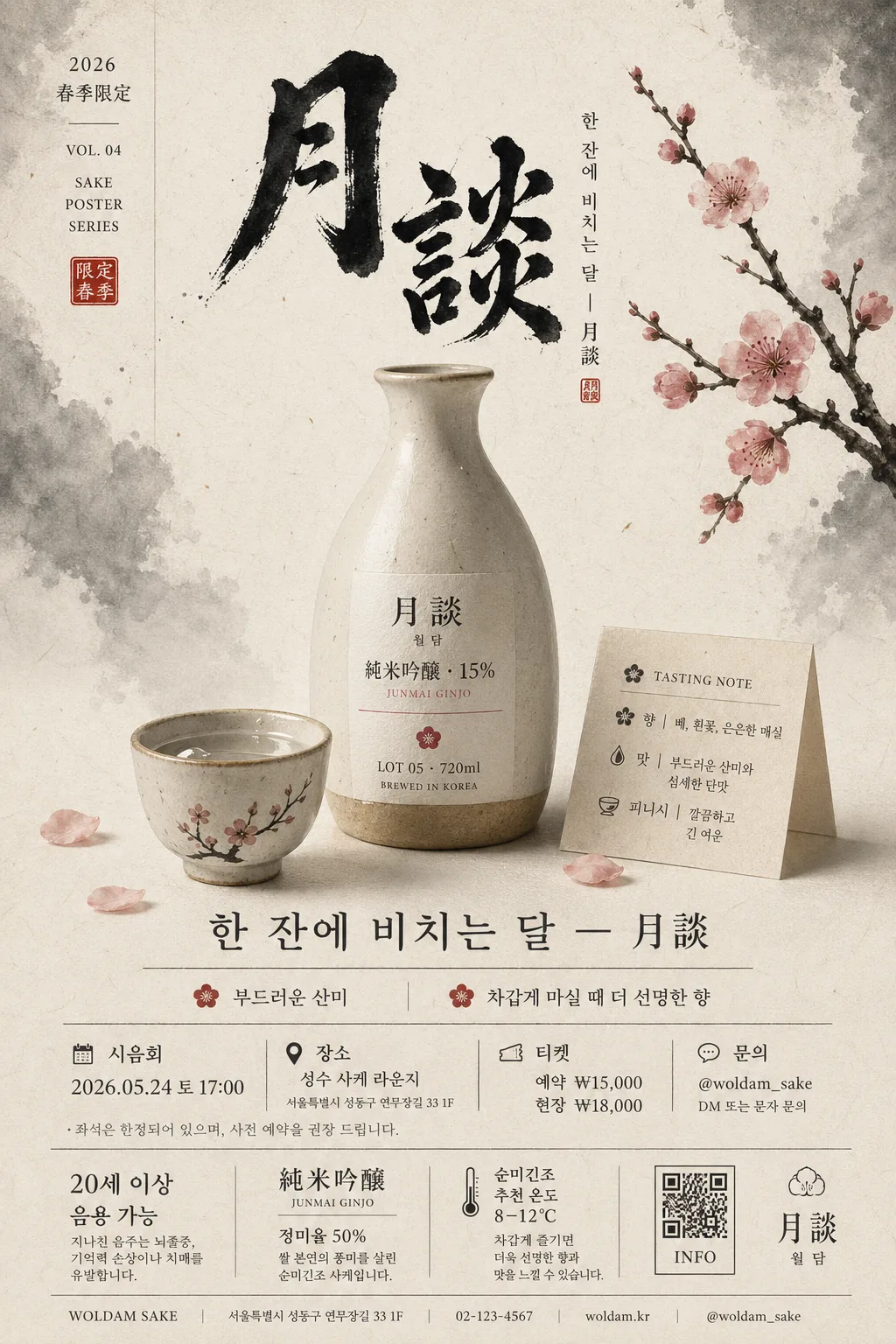
Japanese sake advertisement poster, vertical editorial key visual for a premium alcohol brand campaign.
Designed as a refined print-style poster that highlights the bottle, sakazuki cup, seasonal Japanese atmosphere, and authentic promotional information for a tasting event or product launch.

[Composition]
- Vertical poster format with an elegant editorial composition: upper 18% for expressive calligraphy and small campaign metadata, central 52% for the bottle and cup still life, lower 20% for product details, event information, and brand footer.
- Main hero placement: {브랜드명} bottle and a small sakazuki cup centered slightly below midline, occupying about 45–50% of the frame height, with the bottle slightly behind the cup for depth.
- Background treatment: cream-white matte washi paper surface with visible fiber grain, faint sumi ink wash gradients near the edges, a few natural paper speckles, and soft shadows from real studio lighting.
- Framing direction: balanced Japanese editorial poster layout with calm spacing, a plum branch accent entering from the upper-right or left edge, and subtle decorative details such as a small red hanko-style square mark, thin vertical rule lines, and a tasting-note card near the footer.
- Use {브랜드명}, {제품명·등급·도수}, {카피 한 줄}, {시각 컨셉}, {컬러 톤}, {구도}, {브랜드 정보} placeholders naturally in the layout.

[3. CORE STRUCTURE]
- Top header zone (upper 18%): render a large Japanese brush-calligraphy-style title in black ink, with visible brush texture, ink pooling, slightly irregular stroke edges, and a premium handmade feeling; add small vertical campaign text beside it such as “2026 春季限定”, “VOL. 04”, and “SAKE POSTER SERIES”.
- Main still life zone (middle 52%): place the ceramic sake bottle and the small sakazuki cup as the primary objects, with the bottle slightly taller and behind the cup; include a delicate plum blossom branch, a folded cream tasting note, a tiny pool of reflected light on the cup rim, and a few soft fallen petals on the paper surface.
- Product label zone: add clean, legible typography on the bottle label and nearby layout surfaces to show {제품명·등급·도수}; make the label feel printed on textured washi with fine black type, a muted plum accent line, and a small batch-style detail such as “LOT 05 · 720ml”.
- Copy zone: place {카피 한 줄} as a restrained headline beneath the still life, aligned to center or slightly left, using a refined serif or brush-inspired type treatment; add two short Korean feature blurbs nearby, such as “부드러운 산미” and “차갑게 마실 때 더 선명한 향”.
- Event and ticket zone: include realistic poster details in small Korean text, for example “시음회 2026.05.24 토 17:00”, “장소: 성수 사케 라운지”, “예약 ₩15,000 / 현장 ₩18,000”, and “문의 @woldam_sake”, arranged with thin dividers and careful typographic hierarchy.
- Brand info zone (lower 20%): set {브랜드 정보} in small, crisp text with strong hierarchy separation; include “20세 이상 음용 가능”, “순미긴조 추천 온도 8–12°C”, address/contact-style microcopy, and a small barcode/QR placeholder area labeled “INFO” without implying official certification.
- Overall rhythm: maintain a calm Japanese premium poster feel while allowing authentic print details, seasonal cues, product information, and realistic promotional micro-elements to make the poster feel like a real alcohol campaign.

[4. STYLE RULES]
- Typography: combine Noto Sans KR for small informational text, Nanum Myeongjo for refined Korean lines, and a Japanese brush-calligraphy look for the top title; use bold weight for the main calligraphy and medium/regular weight for footer, tasting notes, event details, and microcopy.
- Color palette: cream white #F5F0E6, ink black #111111, muted plum pink #D8A0A8, warm ceramic beige #D8C7B2, soft gray #B9B3AA.
- Poster graphics: use thin ink-gray divider lines, small vertical annotation text, muted plum petal accents, a subtle red hanko-style square graphic, and natural washi paper grain to create an authentic printed advertisement.
- Border/shadow: very soft drop shadow under the bottle and cup, 3px y-offset, 10px blur, 12% opacity; no hard outline and no glossy UI effects.

[5. VISUAL STYLE]
- Camera / lens: studio product photography look, Canon EOS R5 with 85mm prime at f/5.6 for a clean editorial still-life rendering with controlled depth and crisp object separation.
- Lighting: soft diffused studio key light from upper-left at 45°, gentle fill from front-right, faint rim light on the bottle edge to define the silhouette, and realistic contact shadows on textured paper.
- Color grade: muted ivory + black ink + blush plum, with low saturation and restrained contrast, inspired by contemporary Japanese design posters, premium sake editorials, printed tasting-event posters, and boutique liquor campaign photography.

[6. MOOD]
Premium Japanese sake advertisement poster — quiet Muji x Kinfolk editorial still-life sensibility with richer print realism, tactile washi texture, seasonal plum details, and believable tasting-event information.

[7. CRITICAL]
- Korean text accuracy: must render exactly these strings:
  - 월담
  - 月談 純米吟醸 · 15%
  - 한 잔에 비치는 달 — 月談
  - 20세 이상 / 純米吟醸 / 정미율 50%
- Additional Korean poster text may include short realistic details such as “시음회 2026.05.24 토 17:00”, “장소: 성수 사케 라운지”, “예약 ₩15,000”, “부드러운 산미”, and “차갑게 마실 때 더 선명한 향”.
- Japanese/Chinese character accuracy: keep 月談 and 純米吟醸 clean, correctly shaped, and fully legible.
- Layout invariant: bottle and cup must remain the central product focus, with the top calligraphy, middle still life, and bottom brand/event information clearly separated.
- The composition must read as a premium 20+ alcohol advertisement and refined tasting-event poster, not a bar scene or drinking party.

[8. 🚫 PROHIBITED]
- Fake official seals / certifications
- Broken Korean characters
- Celebrity composites or unauthorized likeness