Social/Card News
음식 사진 미니멀 푸드 카드
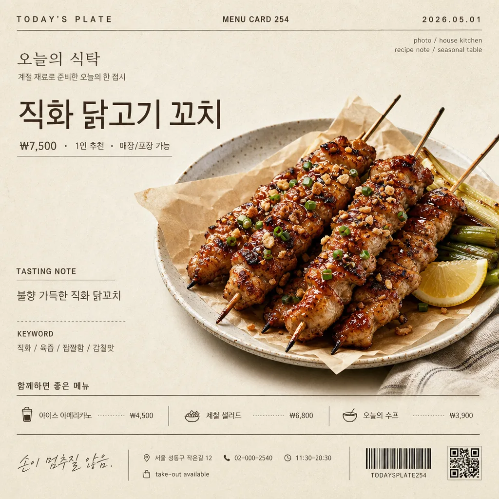
음식 사진 첨부하면 Kinfolk 매거진 한 페이지 톤의 미니멀 푸드 디스크립션 카드로 변환. 베이지·아이보리 배경 + 영문 카테고리 라벨 + 한글 음식 이름 (Pretendard) + 큰 음식 사진 + 한 줄 정의 + 키워드 3 + 위트 한 줄. 레시피·메뉴판 X.
음식 사진 미니멀 푸드 카드 summary
Copy this ChatGPT image prompt to create Social/Card News results. Its subject, background, style, and composition are organized for quick iteration.
Related keywords: 음식 사진 미니멀 푸드 카드, 음식 사진 미니멀 푸드 카드 프롬프트, Social/Card News 프롬프트, Social/Card News AI 이미지 프롬프트, ChatGPT 이미지 프롬프트, AI 이미지 생성 프롬프트, AI 프롬프트, 이미지 프롬프트
How to use 음식 사진 미니멀 푸드 카드
Keep the prompt structure and swap the subject, background, palette, or composition to create new variations.
- Keep the main subject and adjust the palette and background for your brand, season, or channel.
- If the result feels busy, simplify the background and make the subject, composition, and lighting more specific.
- After copying, ask ChatGPT to adapt it for your platform, aspect ratio, or text requirements.
Original prompt
[Input]
- reference_image: {참고 이미지}
- language: Korean
- output_size: 1024x1024

[Purpose]
Create a photorealistic editorial food descriptor card with the attached food photo as the hero subject. The result should feel like a real café menu feature, Instagram feed card, blog header, storefront sign insert, or menu-book page: calm, refined, appetizing, and filled with believable printed details.

[Composition]
- Square 1:1 editorial menu-card layout for {출력 비율}, using a balanced magazine grid with visible hierarchy and practical printed-card information.
- Hero food subject from {참고 이미지} placed prominently at the center or slightly above center on a warm ivory-beige paper surface from {배경 톤}, with realistic paper grain, faint print texture, and natural surface shadows.
- Use a left-led editorial layout with supporting microcopy arranged in neat columns, small labels, dividers, price lines, and menu-card metadata.
- Add realistic café/menu details around the main content: store name “오늘의 식탁”, date label “2026.05.01”, card number “MENU CARD 254”, price “₩7,500”, serving note “1인 추천”, address line “서울 성동구 작은길 12”, contact “02-000-2540”, and small hours text “11:30–20:30”.
- Use {음식 이름}, {한 줄 정의}, {핵심 키워드 3개}, {위트 한 줄}, {한글 폰트}, {영문 폰트}, {배경 톤}, {출력 비율} as customizable values.

[3. CORE STRUCTURE]
1) Top header band: place a small English category label in all caps with wide tracking, such as “TODAY’S PLATE”, alongside “MENU CARD 254” and the date label “2026.05.01”. Add tiny credit text such as “photo / house kitchen” and “recipe note / seasonal table”.
2) Store identity area: add the Korean store name “오늘의 식탁” in small refined type, with a short subline “계절 재료로 준비한 오늘의 한 접시”. Keep it printed-card realistic rather than logo-like.
3) Title area: place {음식 이름} as the main headline, large and calm, with regular weight and slightly tightened tracking. Add a small price and serving row nearby: “₩7,500 · 1인 추천 · 매장/포장 가능”.
4) Hero image area: extract the food from {참고 이미지} as a photorealistic cutout or naturally plated subject, placed prominently in the center, occupying roughly 58–68% of the frame width. Preserve the food’s original texture, sauce sheen, crumbs, steam cues, garnish, plate edge, and material feel. Add a soft natural contact shadow beneath and allow a subtle ceramic plate rim, parchment sheet, linen napkin corner, or wooden tray edge if it supports realism.
5) Description block: beneath or beside the hero food, place {한 줄 정의} in a light gray tone, smaller than the title, with a short caption label “TASTING NOTE”.
6) Keyword line: place {핵심 키워드 3개} as small caps or compact Korean caption text separated by slashes, using a restrained magazine/menu caption style.
7) Companion menu strip: add a small “함께하면 좋은 메뉴” section with 2–3 believable items and prices, such as “아이스 아메리카노 ₩4,500”, “제철 샐러드 ₩6,800”, “오늘의 수프 ₩3,900”. Use thin dividers, dotted leaders, or small alignment marks like a real printed menu.
8) Footer information: place {위트 한 줄} near the bottom as an italic or lighter caption. Add realistic footer details: “서울 성동구 작은길 12 · 02-000-2540 · 11:30–20:30”, a tiny order note “take-out available”, and a small barcode/receipt-like block or QR-placeholder pattern that looks printed but not official.
9) Overall finish: keep the food visually dominant and appetizing while the surrounding information feels like a thoughtfully designed café menu card printed on warm textured paper.

[4. STYLE RULES]
- Typography: {한글 폰트} for Korean text, {영문 폰트} for English text; use regular to light weights for captions and a confident larger scale for {음식 이름}. Combine main headline, small metadata, price row, tasting note, companion menu, and footer information with clear hierarchy.
- Color palette: warm ivory and beige from {배경 톤}, plus charcoal and soft gray for text. Use very subtle warm brown or muted olive only for tiny section marks, dividers, or price emphasis if needed.
- Printed details: use hairline dividers, dotted leaders, tiny registration-like marks, small barcode/receipt area, and natural paper fibers to make the card feel tangible and professionally printed.
- Shadows and surface: use a realistic contact shadow under the food and slight paper depth; keep edges natural, tactile, and photographic.

[5. VISUAL STYLE]
- Camera / lens: high-end editorial food photography, 85mm macro at f/4 or 100mm macro at f/4, clean product-style framing.
- Lighting: soft diffused window light from upper-left with a gentle fill from the right, creating realistic surface volume, appetizing highlights, and a light shadow under the food.
- Color grade: muted cream, beige, charcoal, and soft paper-white; low saturation, controlled contrast, natural food color, no HDR look.
- Material realism: visible paper grain, slight ink impression, real food texture, believable plate/napkin/tray surfaces, and subtle imperfections that make the card feel photographed rather than digitally sterile.

[6. MOOD]
Kinfolk × MUJI × Cereal Magazine first-page editorial with a real neighborhood café menu feeling — calm, refined, tactile, appetizing, and lightly witty.

[7. CRITICAL]
- Korean text accuracy: the following Korean strings must appear correctly if rendered from the provided values: {음식 이름}, {한 줄 정의}, {핵심 키워드 3개}, {위트 한 줄}.
- All visible Korean text must remain clean Korean without broken characters or jamo separation, including added labels such as “오늘의 식탁”, “계절 재료로 준비한 오늘의 한 접시”, “함께하면 좋은 메뉴”, “매장/포장 가능”, and “서울 성동구 작은길 12”.
- Set believable menu text in Korean where appropriate: “₩7,500”, “1인 추천”, “아이스 아메리카노 ₩4,500”, “제철 샐러드 ₩6,800”, “오늘의 수프 ₩3,900”.
- Keep the food large enough to feel like the main subject; it should remain appetizing, sharply rendered, and naturally integrated with the printed card environment.

[8. 🚫 PROHIBITED]
- Fake official seals / certifications
- Broken Korean characters
- Jamo-separated Korean text