社群/圖卡
음식 사진 미니멀 푸드 카드
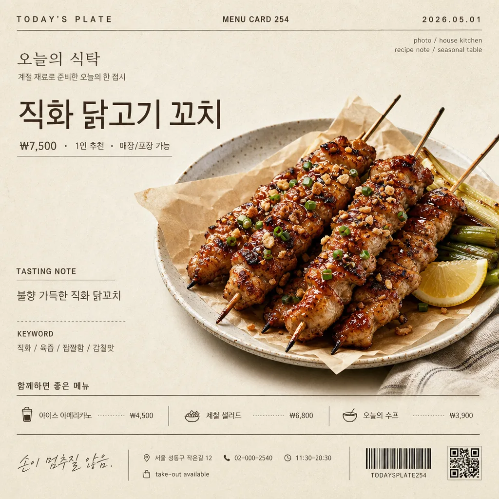
음식 사진 첨부하면 Kinfolk 매거진 한 페이지 톤의 미니멀 푸드 디스크립션 카드로 변환. 베이지·아이보리 배경 + 영문 카테고리 라벨 + 한글 음식 이름 (Pretendard) + 큰 음식 사진 + 한 줄 정의 + 키워드 3 + 위트 한 줄. 레시피·메뉴판 X.
음식 사진 미니멀 푸드 카드摘要
這是用來製作社群/圖卡內容的 ChatGPT 圖像提示詞,已整理主題、背景、風格與構圖,方便快速調整。
相關關鍵字: 음식 사진 미니멀 푸드 카드, 음식 사진 미니멀 푸드 카드 프롬프트, 社群/圖卡 프롬프트, 社群/圖卡 AI 이미지 프롬프트, ChatGPT 이미지 프롬프트, AI 이미지 생성 프롬프트, AI 프롬프트, 이미지 프롬프트
음식 사진 미니멀 푸드 카드使用方式
保留原始結構並替換主體、背景、色彩或構圖,即可延伸出不同版本。
- 保留核心主體,並依品牌、季節或平台調整色彩與背景。
- 如果畫面太複雜,請減少背景元素並具體描述主體、構圖與光線。
- 複製後可要求 ChatGPT 配合平台、長寬比或文字需求調整。
提示詞原文
[Input]
- reference_image: {참고 이미지}
- language: Korean
- output_size: 1024x1024

[Purpose]
Create a photorealistic editorial food descriptor card with the attached food photo as the hero subject. The result should feel like a real café menu feature, Instagram feed card, blog header, storefront sign insert, or menu-book page: calm, refined, appetizing, and filled with believable printed details.

[Composition]
- Square 1:1 editorial menu-card layout for {출력 비율}, using a balanced magazine grid with visible hierarchy and practical printed-card information.
- Hero food subject from {참고 이미지} placed prominently at the center or slightly above center on a warm ivory-beige paper surface from {배경 톤}, with realistic paper grain, faint print texture, and natural surface shadows.
- Use a left-led editorial layout with supporting microcopy arranged in neat columns, small labels, dividers, price lines, and menu-card metadata.
- Add realistic café/menu details around the main content: store name “오늘의 식탁”, date label “2026.05.01”, card number “MENU CARD 254”, price “₩7,500”, serving note “1인 추천”, address line “서울 성동구 작은길 12”, contact “02-000-2540”, and small hours text “11:30–20:30”.
- Use {음식 이름}, {한 줄 정의}, {핵심 키워드 3개}, {위트 한 줄}, {한글 폰트}, {영문 폰트}, {배경 톤}, {출력 비율} as customizable values.

[3. CORE STRUCTURE]
1) Top header band: place a small English category label in all caps with wide tracking, such as “TODAY’S PLATE”, alongside “MENU CARD 254” and the date label “2026.05.01”. Add tiny credit text such as “photo / house kitchen” and “recipe note / seasonal table”.
2) Store identity area: add the Korean store name “오늘의 식탁” in small refined type, with a short subline “계절 재료로 준비한 오늘의 한 접시”. Keep it printed-card realistic rather than logo-like.
3) Title area: place {음식 이름} as the main headline, large and calm, with regular weight and slightly tightened tracking. Add a small price and serving row nearby: “₩7,500 · 1인 추천 · 매장/포장 가능”.
4) Hero image area: extract the food from {참고 이미지} as a photorealistic cutout or naturally plated subject, placed prominently in the center, occupying roughly 58–68% of the frame width. Preserve the food’s original texture, sauce sheen, crumbs, steam cues, garnish, plate edge, and material feel. Add a soft natural contact shadow beneath and allow a subtle ceramic plate rim, parchment sheet, linen napkin corner, or wooden tray edge if it supports realism.
5) Description block: beneath or beside the hero food, place {한 줄 정의} in a light gray tone, smaller than the title, with a short caption label “TASTING NOTE”.
6) Keyword line: place {핵심 키워드 3개} as small caps or compact Korean caption text separated by slashes, using a restrained magazine/menu caption style.
7) Companion menu strip: add a small “함께하면 좋은 메뉴” section with 2–3 believable items and prices, such as “아이스 아메리카노 ₩4,500”, “제철 샐러드 ₩6,800”, “오늘의 수프 ₩3,900”. Use thin dividers, dotted leaders, or small alignment marks like a real printed menu.
8) Footer information: place {위트 한 줄} near the bottom as an italic or lighter caption. Add realistic footer details: “서울 성동구 작은길 12 · 02-000-2540 · 11:30–20:30”, a tiny order note “take-out available”, and a small barcode/receipt-like block or QR-placeholder pattern that looks printed but not official.
9) Overall finish: keep the food visually dominant and appetizing while the surrounding information feels like a thoughtfully designed café menu card printed on warm textured paper.

[4. STYLE RULES]
- Typography: {한글 폰트} for Korean text, {영문 폰트} for English text; use regular to light weights for captions and a confident larger scale for {음식 이름}. Combine main headline, small metadata, price row, tasting note, companion menu, and footer information with clear hierarchy.
- Color palette: warm ivory and beige from {배경 톤}, plus charcoal and soft gray for text. Use very subtle warm brown or muted olive only for tiny section marks, dividers, or price emphasis if needed.
- Printed details: use hairline dividers, dotted leaders, tiny registration-like marks, small barcode/receipt area, and natural paper fibers to make the card feel tangible and professionally printed.
- Shadows and surface: use a realistic contact shadow under the food and slight paper depth; keep edges natural, tactile, and photographic.

[5. VISUAL STYLE]
- Camera / lens: high-end editorial food photography, 85mm macro at f/4 or 100mm macro at f/4, clean product-style framing.
- Lighting: soft diffused window light from upper-left with a gentle fill from the right, creating realistic surface volume, appetizing highlights, and a light shadow under the food.
- Color grade: muted cream, beige, charcoal, and soft paper-white; low saturation, controlled contrast, natural food color, no HDR look.
- Material realism: visible paper grain, slight ink impression, real food texture, believable plate/napkin/tray surfaces, and subtle imperfections that make the card feel photographed rather than digitally sterile.

[6. MOOD]
Kinfolk × MUJI × Cereal Magazine first-page editorial with a real neighborhood café menu feeling — calm, refined, tactile, appetizing, and lightly witty.

[7. CRITICAL]
- Korean text accuracy: the following Korean strings must appear correctly if rendered from the provided values: {음식 이름}, {한 줄 정의}, {핵심 키워드 3개}, {위트 한 줄}.
- All visible Korean text must remain clean Korean without broken characters or jamo separation, including added labels such as “오늘의 식탁”, “계절 재료로 준비한 오늘의 한 접시”, “함께하면 좋은 메뉴”, “매장/포장 가능”, and “서울 성동구 작은길 12”.
- Set believable menu text in Korean where appropriate: “₩7,500”, “1인 추천”, “아이스 아메리카노 ₩4,500”, “제철 샐러드 ₩6,800”, “오늘의 수프 ₩3,900”.
- Keep the food large enough to feel like the main subject; it should remain appetizing, sharply rendered, and naturally integrated with the printed card environment.

[8. 🚫 PROHIBITED]
- Fake official seals / certifications
- Broken Korean characters
- Jamo-separated Korean text