広告・ポスター
버터떡 SNS 광고 캠페인 카드
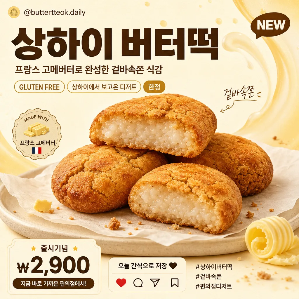
버터떡 사진 첨부하면 한국 편의점·디저트 광고 캠페인 톤의 SNS 카드로 변환. 큰 한글 카피 + 단면 음식 photoreal + 크림·버터 옐로우 배경. GS25·이마트24·CU 등 캠페인 결.
버터떡 SNS 광고 캠페인 카드の概要
広告・ポスター画像を作るためのChatGPT画像プロンプトです。主題、背景、スタイル、構図を整理し、すぐに試せるよう構成しています。
関連キーワード: 버터떡 SNS 광고 캠페인 카드, 버터떡 SNS 광고 캠페인 카드 프롬프트, 広告・ポスター 프롬프트, 広告・ポスター AI 이미지 프롬프트, ChatGPT 이미지 프롬프트, AI 이미지 생성 프롬프트, AI 프롬프트, 이미지 프롬프트
버터떡 SNS 광고 캠페인 카드の活用方法
元の構造を保ちながら、被写体、背景、色、構図を変更して別案に展開できます。
- 主題を維持し、ブランドや季節、媒体に合わせて色と背景を変更してください。
- 結果が複雑な場合は背景要素を減らし、被写体、構図、照明を具体化してください。
- コピー後、ChatGPTに媒体、アスペクト比、文字の有無を追加で指定できます。
プロンプト原文
[Input]
- reference_image: {참고 이미지}
- language: Korean
- output_size: 1024x1024

[Purpose]
Korean convenience-store dessert campaign SNS card, photoreal food composite, 1:1 square ad for Instagram feed, blog thumbnail, and mobile commerce promotion.
Create a realistic retail dessert advertisement with a delicious buttertteok hero, bold Korean headline, supportive campaign details, small social-media UI cues, and warm butter-themed graphics that feel like an actual Korean convenience-store launch card.

[Composition]
- Center the {원본 보존} food subject as the hero at 55–65% of frame width, angled slightly toward the viewer so the golden-brown baked surface, cracks, and chewy rice texture are clearly visible.
- Use a warm cream / ivory / butter-yellow background based on {배경 톤}, enriched with soft milk-and-butter swirl graphics, faint grainy paper texture, caramel-colored accent strokes, and gentle studio shadow separation from the subject.
- Follow {구도}: place the main copy in the upper-left or upper-center 20–25% of the canvas, with the food hero occupying the center/lower-center and small campaign details arranged around it like a real SNS retail ad.
- Place {메인 카피 (큰 글씨)} as the dominant headline, {서브 카피 (작은 글씨)} beneath it in smaller scale, and {태그·말풍선 (선택)} as small sticker-like accents near the food or card edge.
- Add realistic Instagram-card details: a tiny handle line “@buttertteok.daily”, hashtags “#상하이버터떡 #겉바속쫀 #편의점디저트”, small save/share/heart micro icons, a compact “NEW” tag, and a price or CTA area such as “출시기념 ₩2,900” and “오늘 간식으로 저장”.
- Add tasteful food-ad surroundings that naturally support the product: a small parchment sheet or cream ceramic plate under the buttertteok, a tiny butter curl, a few toasted crumb specks, and subtle golden highlights, without changing the original food count or shape.

[3. CORE STRUCTURE]
1. Hero food area: Extract the buttertteok from {참고 이미지} and render it photorealistically with the exact golden-brown baked surface, surface cracks, chewy glutinous rice interior texture, and original count/shape preserved from {원본 보존}. Place it on a warm parchment sheet or low cream plate with soft contact shadows.
2. Background field: Fill the canvas with {배경 톤}, using a cream-to-ivory or butter-yellow base, layered with faint dairy-wave graphics, tiny caramel dots, subtle paper texture, and soft studio shadows for depth.
3. Headline zone: Set {메인 카피 (큰 글씨)} large and bold in the upper area, using strong Korean sans-serif typography with clear spacing, high legibility, and the selected {텍스트 톤}.
4. Subcopy zone: Place {서브 카피 (작은 글씨)} directly under the headline or along one side, sized to feel like a real retail campaign message; include a small supporting line such as “프랑스 고메버터로 완성한 겉바속쫀 식감”.
5. Tag/accent zone: Add {태그·말풍선 (선택)} in sticker-like, pill-like, or speech-bubble accents, plus short Korean promo labels such as “NEW”, “한정”, “GLUTEN FREE”, “상하이에서 보고온 디저트”, and “겉바속쫀”.
6. Social commerce details: Include a bottom or side micro-info strip with “@buttertteok.daily”, “출시기념 ₩2,900”, “저장하고 오늘 간식 픽”, tiny heart/comment/share/save icons, and 2–3 hashtag-style words in Korean.
7. Finishing pass: Ensure all ad elements feel integrated into a polished square SNS campaign card, with realistic food texture, readable typography, warm retail color grading, and layered visual details that make the image feel produced for an actual dessert launch.

[4. STYLE RULES]
- Typography: Pretendard Black, Sandoll Gothic Bold, or Cafe24-style Korean sans-serif; headline very heavy, subcopy medium to regular weight, micro-info small but readable, with crisp anti-aliased edges and large mobile-friendly sizing.
- Color palette: butter cream, ivory, warm beige, soft milk white, golden brown, caramel, and dark charcoal text; emphasize the background range from {배경 톤} while keeping all accents appetizing and warm.
- Border/shadow: use a soft drop shadow with about 4px y-offset, 12px blur, and 15% opacity; add subtle rounded sticker edges, thin cream outlines, small sparkle dots, and semi-transparent label panels where useful.
- Graphic details: include a small Instagram-style top handle or bottom action row, subtle decorative arcs, butter-swipe shapes, dotted dividers, and short Korean promo badges that reinforce a convenience-store dessert campaign.

[5. VISUAL STYLE]
- Camera / lens: 50mm product-photography look or 85mm f/1.8 close product framing, optimized for a square commercial food ad with shallow but natural separation.
- Lighting: soft studio softbox from upper-left at 45° with gentle fill from the right, enough to reveal the baked cracks and rice texture without glossy glare.
- Color grade: warm cream + butter yellow + caramel brown with controlled contrast, clean highlights, realistic shadows, and a polished convenience-store dessert campaign finish.

[6. MOOD]
Commercial Korean dessert campaign card — warm, appetizing, launch-day SNS promo energy with a photoreal buttertteok hero, bold Korean typography, playful micro stickers, social-commerce cues, and a modern convenience-store dessert advertisement feel.

[7. CRITICAL]
- Korean text accuracy: “상하이 버터떡”, “프랑스 고메버터로 완성한 겉바속쫀 식감”, “GLUTEN FREE”, “상하이에서 보고온 디저트”, “한정”, “NEW”, “출시기념 ₩2,900”, “@buttertteok.daily”, “#상하이버터떡 #겉바속쫀 #편의점디저트”.
- Preserve the buttertteok identity exactly: golden-brown baked surface, surface cracks, chewy glutinous rice interior texture, and original number/shape from the reference image.
- Food must remain photoreal and recognizable as buttertteok; do not alter it into another pastry shape.
- Layout must remain square SNS-card ready with clear Korean headline hierarchy, readable micro details, and a realistic retail-ad finish.

[8. 🚫 PROHIBITED]
- Fake official seals / certifications
- Broken Korean characters
- Celebrity composites or unauthorized likeness