廣告/海報
버터떡 SNS 광고 캠페인 카드
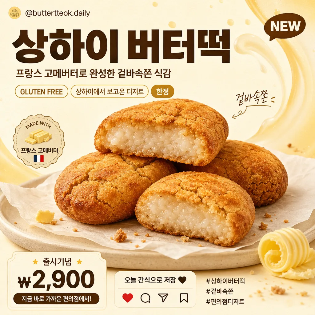
버터떡 사진 첨부하면 한국 편의점·디저트 광고 캠페인 톤의 SNS 카드로 변환. 큰 한글 카피 + 단면 음식 photoreal + 크림·버터 옐로우 배경. GS25·이마트24·CU 등 캠페인 결.
버터떡 SNS 광고 캠페인 카드摘要
這是用來製作廣告/海報內容的 ChatGPT 圖像提示詞,已整理主題、背景、風格與構圖,方便快速調整。
相關關鍵字: 버터떡 SNS 광고 캠페인 카드, 버터떡 SNS 광고 캠페인 카드 프롬프트, 廣告/海報 프롬프트, 廣告/海報 AI 이미지 프롬프트, ChatGPT 이미지 프롬프트, AI 이미지 생성 프롬프트, AI 프롬프트, 이미지 프롬프트
버터떡 SNS 광고 캠페인 카드使用方式
保留原始結構並替換主體、背景、色彩或構圖,即可延伸出不同版本。
- 保留核心主體,並依品牌、季節或平台調整色彩與背景。
- 如果畫面太複雜,請減少背景元素並具體描述主體、構圖與光線。
- 複製後可要求 ChatGPT 配合平台、長寬比或文字需求調整。
提示詞原文
[Input]
- reference_image: {참고 이미지}
- language: Korean
- output_size: 1024x1024

[Purpose]
Korean convenience-store dessert campaign SNS card, photoreal food composite, 1:1 square ad for Instagram feed, blog thumbnail, and mobile commerce promotion.
Create a realistic retail dessert advertisement with a delicious buttertteok hero, bold Korean headline, supportive campaign details, small social-media UI cues, and warm butter-themed graphics that feel like an actual Korean convenience-store launch card.

[Composition]
- Center the {원본 보존} food subject as the hero at 55–65% of frame width, angled slightly toward the viewer so the golden-brown baked surface, cracks, and chewy rice texture are clearly visible.
- Use a warm cream / ivory / butter-yellow background based on {배경 톤}, enriched with soft milk-and-butter swirl graphics, faint grainy paper texture, caramel-colored accent strokes, and gentle studio shadow separation from the subject.
- Follow {구도}: place the main copy in the upper-left or upper-center 20–25% of the canvas, with the food hero occupying the center/lower-center and small campaign details arranged around it like a real SNS retail ad.
- Place {메인 카피 (큰 글씨)} as the dominant headline, {서브 카피 (작은 글씨)} beneath it in smaller scale, and {태그·말풍선 (선택)} as small sticker-like accents near the food or card edge.
- Add realistic Instagram-card details: a tiny handle line “@buttertteok.daily”, hashtags “#상하이버터떡 #겉바속쫀 #편의점디저트”, small save/share/heart micro icons, a compact “NEW” tag, and a price or CTA area such as “출시기념 ₩2,900” and “오늘 간식으로 저장”.
- Add tasteful food-ad surroundings that naturally support the product: a small parchment sheet or cream ceramic plate under the buttertteok, a tiny butter curl, a few toasted crumb specks, and subtle golden highlights, without changing the original food count or shape.

[3. CORE STRUCTURE]
1. Hero food area: Extract the buttertteok from {참고 이미지} and render it photorealistically with the exact golden-brown baked surface, surface cracks, chewy glutinous rice interior texture, and original count/shape preserved from {원본 보존}. Place it on a warm parchment sheet or low cream plate with soft contact shadows.
2. Background field: Fill the canvas with {배경 톤}, using a cream-to-ivory or butter-yellow base, layered with faint dairy-wave graphics, tiny caramel dots, subtle paper texture, and soft studio shadows for depth.
3. Headline zone: Set {메인 카피 (큰 글씨)} large and bold in the upper area, using strong Korean sans-serif typography with clear spacing, high legibility, and the selected {텍스트 톤}.
4. Subcopy zone: Place {서브 카피 (작은 글씨)} directly under the headline or along one side, sized to feel like a real retail campaign message; include a small supporting line such as “프랑스 고메버터로 완성한 겉바속쫀 식감”.
5. Tag/accent zone: Add {태그·말풍선 (선택)} in sticker-like, pill-like, or speech-bubble accents, plus short Korean promo labels such as “NEW”, “한정”, “GLUTEN FREE”, “상하이에서 보고온 디저트”, and “겉바속쫀”.
6. Social commerce details: Include a bottom or side micro-info strip with “@buttertteok.daily”, “출시기념 ₩2,900”, “저장하고 오늘 간식 픽”, tiny heart/comment/share/save icons, and 2–3 hashtag-style words in Korean.
7. Finishing pass: Ensure all ad elements feel integrated into a polished square SNS campaign card, with realistic food texture, readable typography, warm retail color grading, and layered visual details that make the image feel produced for an actual dessert launch.

[4. STYLE RULES]
- Typography: Pretendard Black, Sandoll Gothic Bold, or Cafe24-style Korean sans-serif; headline very heavy, subcopy medium to regular weight, micro-info small but readable, with crisp anti-aliased edges and large mobile-friendly sizing.
- Color palette: butter cream, ivory, warm beige, soft milk white, golden brown, caramel, and dark charcoal text; emphasize the background range from {배경 톤} while keeping all accents appetizing and warm.
- Border/shadow: use a soft drop shadow with about 4px y-offset, 12px blur, and 15% opacity; add subtle rounded sticker edges, thin cream outlines, small sparkle dots, and semi-transparent label panels where useful.
- Graphic details: include a small Instagram-style top handle or bottom action row, subtle decorative arcs, butter-swipe shapes, dotted dividers, and short Korean promo badges that reinforce a convenience-store dessert campaign.

[5. VISUAL STYLE]
- Camera / lens: 50mm product-photography look or 85mm f/1.8 close product framing, optimized for a square commercial food ad with shallow but natural separation.
- Lighting: soft studio softbox from upper-left at 45° with gentle fill from the right, enough to reveal the baked cracks and rice texture without glossy glare.
- Color grade: warm cream + butter yellow + caramel brown with controlled contrast, clean highlights, realistic shadows, and a polished convenience-store dessert campaign finish.

[6. MOOD]
Commercial Korean dessert campaign card — warm, appetizing, launch-day SNS promo energy with a photoreal buttertteok hero, bold Korean typography, playful micro stickers, social-commerce cues, and a modern convenience-store dessert advertisement feel.

[7. CRITICAL]
- Korean text accuracy: “상하이 버터떡”, “프랑스 고메버터로 완성한 겉바속쫀 식감”, “GLUTEN FREE”, “상하이에서 보고온 디저트”, “한정”, “NEW”, “출시기념 ₩2,900”, “@buttertteok.daily”, “#상하이버터떡 #겉바속쫀 #편의점디저트”.
- Preserve the buttertteok identity exactly: golden-brown baked surface, surface cracks, chewy glutinous rice interior texture, and original number/shape from the reference image.
- Food must remain photoreal and recognizable as buttertteok; do not alter it into another pastry shape.
- Layout must remain square SNS-card ready with clear Korean headline hierarchy, readable micro details, and a realistic retail-ad finish.

[8. 🚫 PROHIBITED]
- Fake official seals / certifications
- Broken Korean characters
- Celebrity composites or unauthorized likeness