廣告/海報
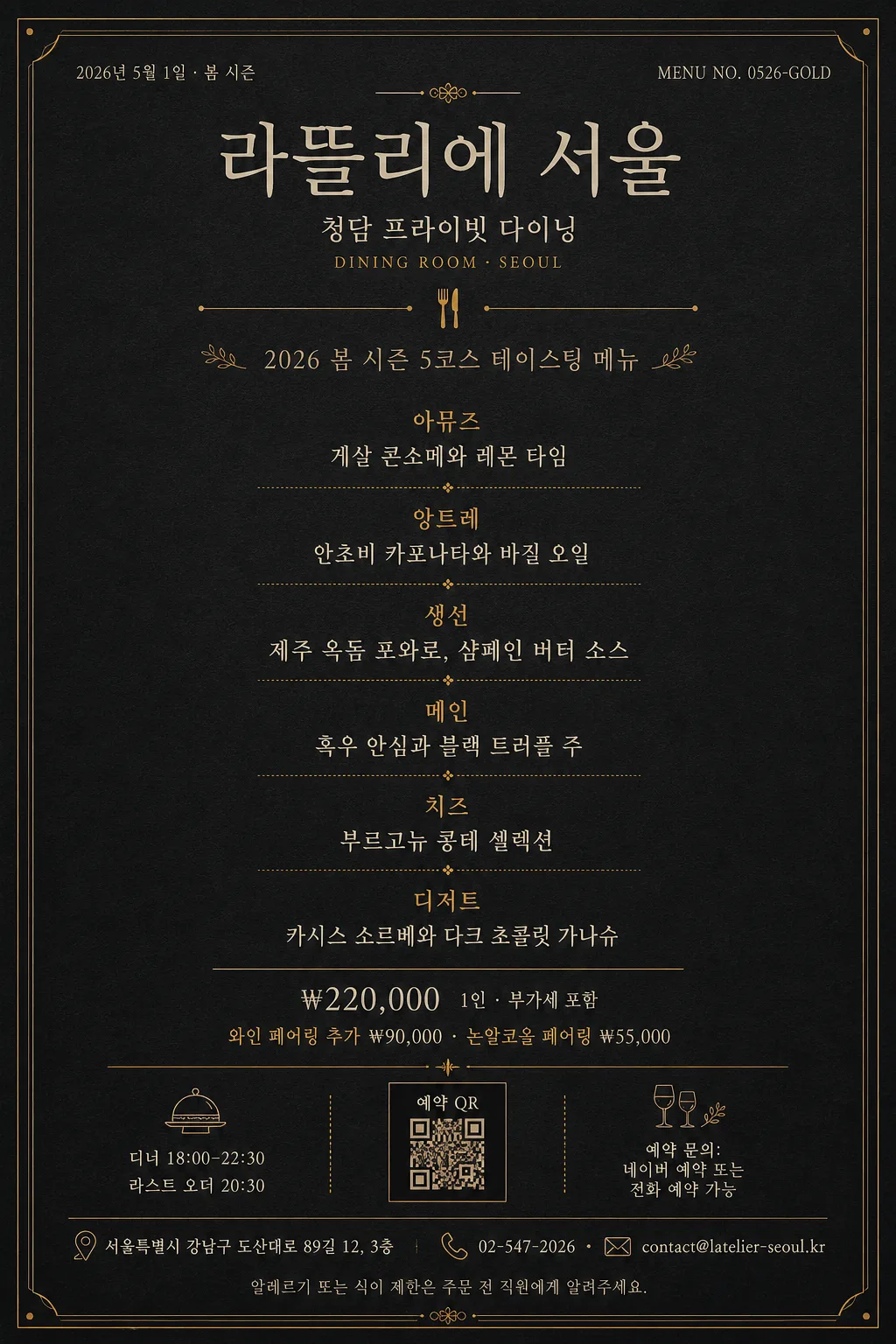
다크 골드 미슐랭 코스 메뉴 카드
미슐랭 가이드·파인다이닝 톤의 럭셔리 코스 메뉴 카드. 딥 차콜 배경 + 머스타드 골드 라인 + 본명조·Trajan 세리프 + 5코스 메뉴 리스트 + 가격·페어링. 인쇄·인스타·웰컴카드 활용.
다크 골드 미슐랭 코스 메뉴 카드摘要
這是用來製作廣告/海報內容的 ChatGPT 圖像提示詞,已整理主題、背景、風格與構圖,方便快速調整。
相關關鍵字: 다크 골드 미슐랭 코스 메뉴 카드, 다크 골드 미슐랭 코스 메뉴 카드 프롬프트, 廣告/海報 프롬프트, 廣告/海報 AI 이미지 프롬프트, ChatGPT 이미지 프롬프트, AI 이미지 생성 프롬프트, AI 프롬프트, 이미지 프롬프트
다크 골드 미슐랭 코스 메뉴 카드使用方式
保留原始結構並替換主體、背景、色彩或構圖,即可延伸出不同版本。
- 保留核心主體,並依品牌、季節或平台調整色彩與背景。
- 如果畫面太複雜,請減少背景元素並具體描述主體、構圖與光線。
- 複製後可要求 ChatGPT 配合平台、長寬比或文字需求調整。
提示詞原文
[Input]
- language: Korean
- output_size: 1024x1536

[Purpose]
Create a dark-gold luxury course menu card for fine dining hospitality, designed as a premium printed menu, Instagram portrait card, menu booklet insert, and table welcome card.
The design should feel like a Michelin-guide-inspired tasting menu without using fake awards or official seals: deep charcoal paper, antique-gold dividers, cream typography, realistic restaurant information, and refined editorial pacing.

[Composition]
- Portrait composition with {레스토랑 이름} as the main masthead in the top 16%–18%, {지점명} and {메뉴 날짜} placed as small supporting information near the header, and {메뉴 컨셉} positioned below as the seasonal descriptor.
- Use a dark charcoal matte-paper background with subtle pressed paper grain, very faint ink absorption at the edges, and a warm premium print finish.
- The central 55% should contain {코스 메뉴 리스트} as a structured tasting-course sequence, divided by thin mustard-gold rules and small course labels.
- The lower 22% should include {가격}, {와인 페어링}, {운영시간}, {예약 안내}, {주소}, {연락처}, and {알레르기 안내} in a realistic menu-footer layout.
- Add restrained fine-dining details such as tiny gold corner ticks, small tableware line icons, a reservation QR placeholder box, menu code {메뉴 코드}, and certificate-like hairline ornaments that support the restaurant-card feeling without implying official certification.
- Keep the composition centered, elegant, and print-realistic, with a balanced restaurant menu hierarchy rather than a loud promotional poster.

[3. CORE STRUCTURE]
- Header area: set {레스토랑 이름} as the dominant title in a classic serif masthead treatment, centered, with {지점명} beneath in smaller cream text and a tiny gold uppercase-style dining label such as “DINING ROOM · SEOUL” as part of the typographic texture.
- Date and menu code: place {메뉴 날짜} on the upper left or right and {메뉴 코드} on the opposite side in very small cream text, aligned to the same invisible top baseline.
- Primary divider: add one thin mustard-gold rule spanning about 28%–36% of the width, with a tiny centered dot or fork-and-knife line icon in gold.
- Seasonal concept area: place {메뉴 컨셉} in small tracked typography or restrained italic serif, with a refined editorial rhythm and clear separation from the courses.
- Main course block: list {코스 메뉴 리스트} as stacked course entries; show course names first, followed by dish details on the next line, and use short gold separators or delicate dotted leaders between sections.
- Pricing and pairing: place {가격} and {와인 페어링} below the course list as two calm centered lines, readable and premium, using gold emphasis only for labels or tiny divider marks.
- Restaurant footer: include {운영시간}, {예약 안내}, {주소}, and {연락처} in two compact columns or a centered stacked footer, separated by hairline dividers.
- Practical details: add {알레르기 안내} as a small footnote, and include a small square “예약 QR” placeholder or monogram box near the bottom without overpowering the text.

[4. STYLE RULES]
- Typography: use Trajan Pro, Bodoni, or Playfair Display for English-style headings; use 본명조, Spoqa Han Sans Neo Light, or Noto Serif KR for Korean text; keep weights light to regular, with masthead sizing around 6%–7% of canvas width and body around 1.6%–2.5%.
- Korean text must look professionally typeset, with correct spacing around slashes, middle dots, won prices, course dashes, and parentheses.
- Color palette: deep charcoal #1a1a1a, blackened graphite #111111, mustard gold #c9a55c, antique gold #b8944f, and cream white #F4EEDD.
- Texture and print finish: use a subtle matte card-stock grain, faint gold-foil impression on divider lines, and slight ink softness around cream text to make the card feel physically printed.
- Border/shadow: allow delicate hairline corner ornaments, thin double rules, small monogram marks, and very soft printed depth; avoid heavy drop shadows or glossy plastic effects.
- Letter spacing: apply generous tracking to the title and small labels; keep course descriptions tighter and highly legible.

[5. VISUAL STYLE]
- Camera / lens: studio flat-art composition, equivalent to a Hasselblad X2D 100C top-down editorial layout with a 50mm normal-view look, no perspective distortion.
- Lighting: even diffuse studio lighting from above with zero harsh hotspots, as if photographed under large softboxes and then converted into a clean typographic poster.
- Color grade: restrained charcoal, antique gold, and cream-white print palette with a slight warm paper tint and no saturation spikes.

[6. MOOD]
Michelin-star tasting menu card atmosphere — luxury hotel dining editorial, quiet Seoul fine-dining confidence, dark gold evening service, with the calm restraint of a modern Kinfolk x The New Yorker layout.

[7. CRITICAL]
- Korean text accuracy: 반드시 정확히 렌더링되어야 하는 문자열은 {레스토랑 이름}, {지점명}, {메뉴 날짜}, {메뉴 컨셉}, {코스 메뉴 리스트}, {가격}, {와인 페어링}, {운영시간}, {예약 안내}, {주소}, {연락처}, {알레르기 안내}, {메뉴 코드}.
- Recommended visible Korean footer examples: “예약 QR”, “디너 18:00–22:30”, “라스트 오더 20:30”, “알레르기 또는 식이 제한은 직원에게 알려주세요”.
- Typography hierarchy must remain intact: title, location/date, concept line, course list, pricing, pairing, and restaurant footer must be clearly separated and readable.
- All course entries must remain readable as distinct menu items with no broken Korean characters, no merged lines, and no random punctuation changes.
- Decorative ornaments, tableware icons, dividers, and QR placeholder should look like premium menu-card production details, not fake awards or official certification marks.

[8. 🚫 PROHIBITED]
- Fake official seals / certifications
- Broken Korean characters
- Celebrity composites
- Fake Michelin stars, fake guide badges, or official-looking award emblems