광고/포스터
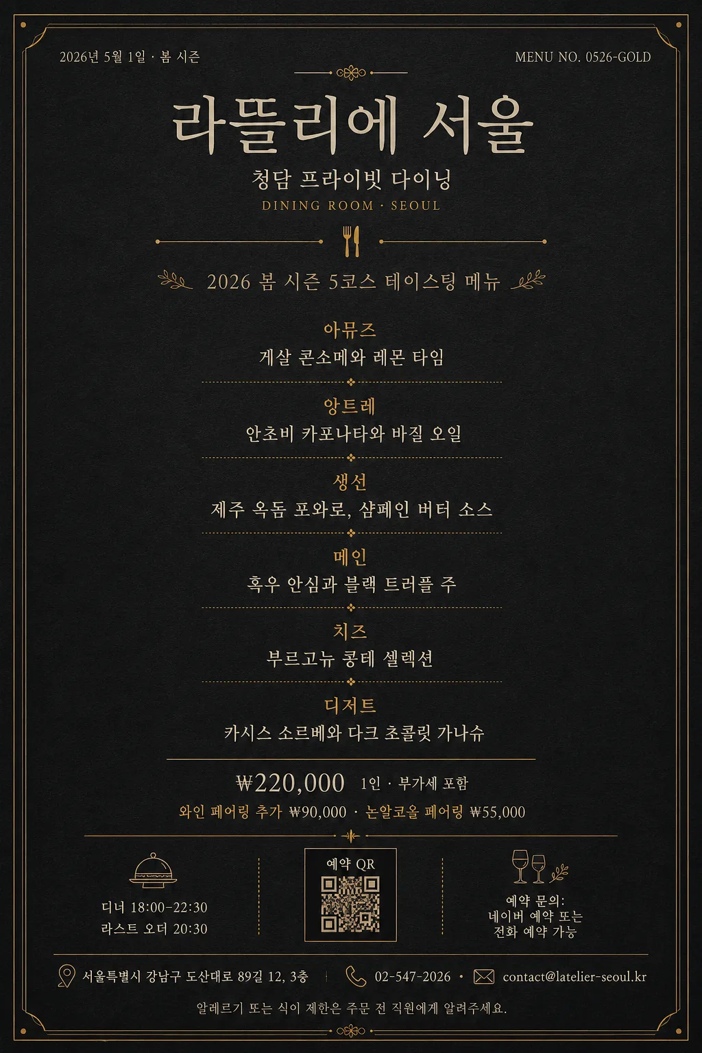
다크 골드 미슐랭 코스 메뉴 카드
미슐랭 가이드·파인다이닝 톤의 럭셔리 코스 메뉴 카드. 딥 차콜 배경 + 머스타드 골드 라인 + 본명조·Trajan 세리프 + 5코스 메뉴 리스트 + 가격·페어링. 인쇄·인스타·웰컴카드 활용.
다크 골드 미슐랭 코스 메뉴 카드 검색 요약
다크 골드 미슐랭 코스 메뉴 카드은 광고/포스터 결과물을 만들 때 바로 복사해 활용할 수 있는 ChatGPT 이미지 프롬프트입니다. 주제, 배경, 스타일, 구도 조건을 함께 담아 빠르게 시안을 만들 수 있도록 구성했습니다.
관련 키워드: 다크 골드 미슐랭 코스 메뉴 카드, 다크 골드 미슐랭 코스 메뉴 카드 프롬프트, 광고/포스터 프롬프트, 광고/포스터 AI 이미지 프롬프트, ChatGPT 이미지 프롬프트, AI 이미지 생성 프롬프트, AI 프롬프트, 이미지 프롬프트
다크 골드 미슐랭 코스 메뉴 카드 활용 포인트
원본 구조를 유지하면서 피사체, 배경, 색감, 구도를 바꿔 다양한 시안으로 확장할 수 있습니다.
- 핵심 소재는 유지하고 브랜드, 계절, 채널 목적에 맞는 색감과 배경을 바꿔보세요.
- 결과가 산만하면 배경 요소를 줄이고 피사체, 구도, 조명 조건을 구체화하세요.
- 복사한 뒤 ChatGPT에서 플랫폼, 화면 비율, 텍스트 포함 여부를 추가로 요청할 수 있습니다.
프롬프트 원문
[Input]
- language: Korean
- output_size: 1024x1536

[Purpose]
Create a dark-gold luxury course menu card for fine dining hospitality, designed as a premium printed menu, Instagram portrait card, menu booklet insert, and table welcome card.
The design should feel like a Michelin-guide-inspired tasting menu without using fake awards or official seals: deep charcoal paper, antique-gold dividers, cream typography, realistic restaurant information, and refined editorial pacing.

[Composition]
- Portrait composition with {레스토랑 이름} as the main masthead in the top 16%–18%, {지점명} and {메뉴 날짜} placed as small supporting information near the header, and {메뉴 컨셉} positioned below as the seasonal descriptor.
- Use a dark charcoal matte-paper background with subtle pressed paper grain, very faint ink absorption at the edges, and a warm premium print finish.
- The central 55% should contain {코스 메뉴 리스트} as a structured tasting-course sequence, divided by thin mustard-gold rules and small course labels.
- The lower 22% should include {가격}, {와인 페어링}, {운영시간}, {예약 안내}, {주소}, {연락처}, and {알레르기 안내} in a realistic menu-footer layout.
- Add restrained fine-dining details such as tiny gold corner ticks, small tableware line icons, a reservation QR placeholder box, menu code {메뉴 코드}, and certificate-like hairline ornaments that support the restaurant-card feeling without implying official certification.
- Keep the composition centered, elegant, and print-realistic, with a balanced restaurant menu hierarchy rather than a loud promotional poster.

[3. CORE STRUCTURE]
- Header area: set {레스토랑 이름} as the dominant title in a classic serif masthead treatment, centered, with {지점명} beneath in smaller cream text and a tiny gold uppercase-style dining label such as “DINING ROOM · SEOUL” as part of the typographic texture.
- Date and menu code: place {메뉴 날짜} on the upper left or right and {메뉴 코드} on the opposite side in very small cream text, aligned to the same invisible top baseline.
- Primary divider: add one thin mustard-gold rule spanning about 28%–36% of the width, with a tiny centered dot or fork-and-knife line icon in gold.
- Seasonal concept area: place {메뉴 컨셉} in small tracked typography or restrained italic serif, with a refined editorial rhythm and clear separation from the courses.
- Main course block: list {코스 메뉴 리스트} as stacked course entries; show course names first, followed by dish details on the next line, and use short gold separators or delicate dotted leaders between sections.
- Pricing and pairing: place {가격} and {와인 페어링} below the course list as two calm centered lines, readable and premium, using gold emphasis only for labels or tiny divider marks.
- Restaurant footer: include {운영시간}, {예약 안내}, {주소}, and {연락처} in two compact columns or a centered stacked footer, separated by hairline dividers.
- Practical details: add {알레르기 안내} as a small footnote, and include a small square “예약 QR” placeholder or monogram box near the bottom without overpowering the text.

[4. STYLE RULES]
- Typography: use Trajan Pro, Bodoni, or Playfair Display for English-style headings; use 본명조, Spoqa Han Sans Neo Light, or Noto Serif KR for Korean text; keep weights light to regular, with masthead sizing around 6%–7% of canvas width and body around 1.6%–2.5%.
- Korean text must look professionally typeset, with correct spacing around slashes, middle dots, won prices, course dashes, and parentheses.
- Color palette: deep charcoal #1a1a1a, blackened graphite #111111, mustard gold #c9a55c, antique gold #b8944f, and cream white #F4EEDD.
- Texture and print finish: use a subtle matte card-stock grain, faint gold-foil impression on divider lines, and slight ink softness around cream text to make the card feel physically printed.
- Border/shadow: allow delicate hairline corner ornaments, thin double rules, small monogram marks, and very soft printed depth; avoid heavy drop shadows or glossy plastic effects.
- Letter spacing: apply generous tracking to the title and small labels; keep course descriptions tighter and highly legible.

[5. VISUAL STYLE]
- Camera / lens: studio flat-art composition, equivalent to a Hasselblad X2D 100C top-down editorial layout with a 50mm normal-view look, no perspective distortion.
- Lighting: even diffuse studio lighting from above with zero harsh hotspots, as if photographed under large softboxes and then converted into a clean typographic poster.
- Color grade: restrained charcoal, antique gold, and cream-white print palette with a slight warm paper tint and no saturation spikes.

[6. MOOD]
Michelin-star tasting menu card atmosphere — luxury hotel dining editorial, quiet Seoul fine-dining confidence, dark gold evening service, with the calm restraint of a modern Kinfolk x The New Yorker layout.

[7. CRITICAL]
- Korean text accuracy: 반드시 정확히 렌더링되어야 하는 문자열은 {레스토랑 이름}, {지점명}, {메뉴 날짜}, {메뉴 컨셉}, {코스 메뉴 리스트}, {가격}, {와인 페어링}, {운영시간}, {예약 안내}, {주소}, {연락처}, {알레르기 안내}, {메뉴 코드}.
- Recommended visible Korean footer examples: “예약 QR”, “디너 18:00–22:30”, “라스트 오더 20:30”, “알레르기 또는 식이 제한은 직원에게 알려주세요”.
- Typography hierarchy must remain intact: title, location/date, concept line, course list, pricing, pairing, and restaurant footer must be clearly separated and readable.
- All course entries must remain readable as distinct menu items with no broken Korean characters, no merged lines, and no random punctuation changes.
- Decorative ornaments, tableware icons, dividers, and QR placeholder should look like premium menu-card production details, not fake awards or official certification marks.

[8. 🚫 PROHIBITED]
- Fake official seals / certifications
- Broken Korean characters
- Celebrity composites
- Fake Michelin stars, fake guide badges, or official-looking award emblems