広告・ポスター
미슐랭 와인 리스트 카드 (다크·페어링)
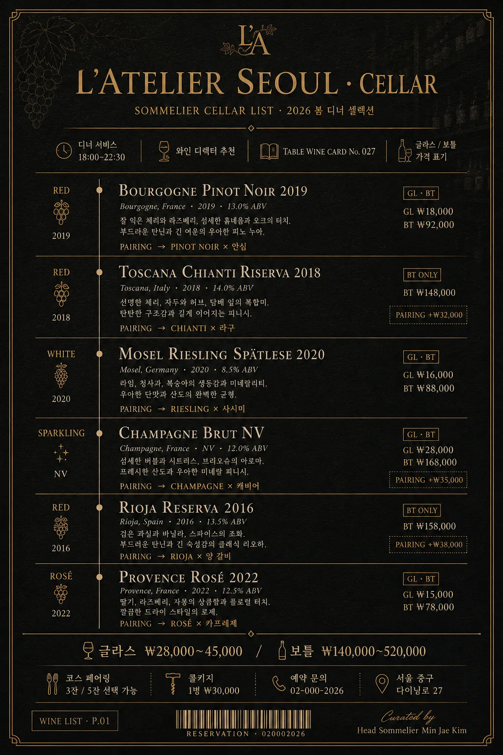
파인다이닝 와인 리스트 카드. 딥 차콜 배경 + 머스타드 골드 라인 + 세리프 와인 이름 + 페어링 가이드 한 줄씩. 5~7종 와인 + 산지·빈티지·도수. 메뉴북·셀러 룸·인스타 활용.
미슐랭 와인 리스트 카드 (다크·페어링)の概要
広告・ポスター画像を作るためのChatGPT画像プロンプトです。主題、背景、スタイル、構図を整理し、すぐに試せるよう構成しています。
関連キーワード: 미슐랭 와인 리스트 카드 (다크·페어링), 미슐랭 와인 리스트 카드 (다크·페어링) 프롬프트, 広告・ポスター 프롬프트, 広告・ポスター AI 이미지 프롬프트, ChatGPT 이미지 프롬프트, AI 이미지 생성 프롬프트, AI 프롬프트, 이미지 프롬프트
미슐랭 와인 리스트 카드 (다크·페어링)の活用方法
元の構造を保ちながら、被写体、背景、色、構図を変更して別案に展開できます。
- 主題を維持し、ブランドや季節、媒体に合わせて色と背景を変更してください。
- 結果が複雑な場合は背景要素を減らし、被写体、構図、照明を具体化してください。
- コピー後、ChatGPTに媒体、アスペクト比、文字の有無を追加で指定できます。
プロンプト原文
[Input]
- language: Korean
- output_size: 1024x1536

[Purpose]
Michelin restaurant-style wine list card, dark cellar editorial page for fine dining menu presentation.
Elegant vertical menu layout with bilingual serif typography, designed as a real guest-facing wine selection card with pairing guidance, glass/bottle pricing, sommelier notes, and venue utility details.

[Composition]
- Top header band (14-16%): {레스토랑·바 이름} set as the main title area, centered with refined serif hierarchy, a small cellar label, date/service line, and thin mustard-gold divider rules.
- Main content field (68-72%): structured wine entries stacked in a polished column, each entry aligned to the same left edge with strong vertical rhythm, including wine name, region, vintage, glass/bottle price cue, and pairing note.
- Bottom utility band (12-14%): {가격대}, tasting-course note, address/contact line, corkage/service information, and a tiny barcode-style reservation block, separated by a thin gold line.
- Background should be a deep charcoal-to-black matte premium stock paper with visible fine paper grain, faint cellar shelf texture, subtle debossed grapevine contour lines, and warm foil-like gold details.
- Use {한글 폰트}, {영문 폰트}, {컬러 톤}, and {비율} consistently across the entire page.

[3. CORE STRUCTURE]
- Header area: Set {레스토랑·바 이름} at the top in large elegant serif, with wide tracking and a small secondary line below reading “SOMMELIER CELLAR LIST · 2026 봄 디너 셀렉션”; add a thin gold rule beneath for Michelin-like restraint.
- Service metadata: Add compact Korean microtext near the header such as “디너 서비스 18:00–22:30”, “와인 디렉터 추천”, “TABLE WINE CARD No. 027”, and “글라스 / 보틀 가격 표기”.
- Wine list block: Render {와인 리스트} as 5-7 stacked entries, each entry broken into four sub-lines: wine name in English serif small caps, origin/vintage/ABV in light italic microtext, Korean tasting note, and pairing text from {페어링 가이드} as a compact line with a subtle arrow cue.
- Entry details: For realism, include small price markers beside each entry such as “GL ₩18,000 · BT ₩92,000”, “BT ₩148,000”, “PAIRING +₩32,000”, while keeping {가격대} as the official bottom price range reference.
- Entry separators: Place thin horizontal gold dividers between wine entries, with tiny vintage-dot markers, understated section labels like “WHITE”, “RED”, “SPARKLING”, or “DESSERT”, and a faint vertical alignment guide in antique gold.
- Price and pairing footer: Place {가격대} and a short footer note in small sans-serif at the bottom, aligned cleanly: “코스 페어링 3잔 / 5잔 선택 가능”, “콜키지 1병 ₩30,000”, “예약 문의 02-000-2026”, and “서울 중구 다이닝로 27”.
- Utility finishing: Add a small reservation barcode area, page code “WINE LIST · P.01”, and micro credit line “Curated by Head Sommelier Min Jae Kim” in the lower margin.
- Typography hierarchy: Make the wine names the most prominent text after the title, while origin, vintage, pairing guidance, prices, and venue details remain smaller and quieter.

[4. STYLE RULES]
- Typography: Use Noto Serif KR or 본명조 for Korean text, and Trajan / Bodoni / Playfair Display for English serif headings; pair with a small clean sans-serif such as Inter or Noto Sans KR for secondary details.
- Color palette: Use {컬러 톤} strictly, centered on deep charcoal #1a1410 to black background, mustard gold #c9a55c lines and headers, and cream #f0e8d6 body text.
- Border/shadow: Use hairline gold rules, delicate corner ticks, faint foil-stamped monogram details, and an ultra-soft paper shadow only if needed, around 2px y-offset, 8px blur, 10% opacity.
- Decorative texture: Add subtle matte paper grain, very faint cellar-map contour marks, tiny gold registration dots, and low-contrast debossed vine-line details so the card feels printed and handled in a luxury restaurant.
- Letter spacing: Slight tracking on English headers and small caps; tighter tracking on Korean body text to preserve editorial elegance.

[5. VISUAL STYLE]
- Camera / lens: flat editorial poster composition, simulated as a printed luxury menu page, 50mm standard lens look with minimal perspective distortion, front-on orthographic presentation.
- Lighting: soft studio top-light with very subtle side fill, producing a faint paper sheen, tactile foil highlights, and readable cream typography against the dark stock.
- Color grade: dark espresso, black, muted antique gold, and warm cream, with restrained contrast and polished fine-dining warmth.
- Material realism: The final image should feel like a photographed premium menu card on thick black paper, with crisp ink edges, slight foil impression, and believable print density.

[6. MOOD]
Michelin-star cellar menu — inspired by a Kinfolk x luxury hotel wine list spread, with the understated precision of a fine-dining sommelier booklet, enriched by realistic restaurant service information and tactile dark paper luxury.

[7. CRITICAL]
- Korean text accuracy: 반드시 정확히 보여야 하는 문자열: {레스토랑·바 이름}, {와인 리스트}, {페어링 가이드}, {가격대}, {한글 폰트}, {영문 폰트}, {컬러 톤}, {비율}.
- Include realistic Korean menu text such as “와인 디렉터 추천”, “코스 페어링”, “글라스 / 보틀”, “예약 문의”, “콜키지”, “디너 서비스”, and short pairing notes that match the fine-dining wine theme.
- Layout invariants: exactly one page, vertical orientation, dark background, luxury wine-list card structure, readable bilingual typography, and coherent menu pricing details.
- All wine entries should remain legible, evenly spaced, and aligned into a refined list structure suitable for a Michelin-style cellar card.

[8. 🚫 PROHIBITED]
- Fake official seals / certifications
- Broken Korean characters