廣告/海報
미슐랭 와인 리스트 카드 (다크·페어링)
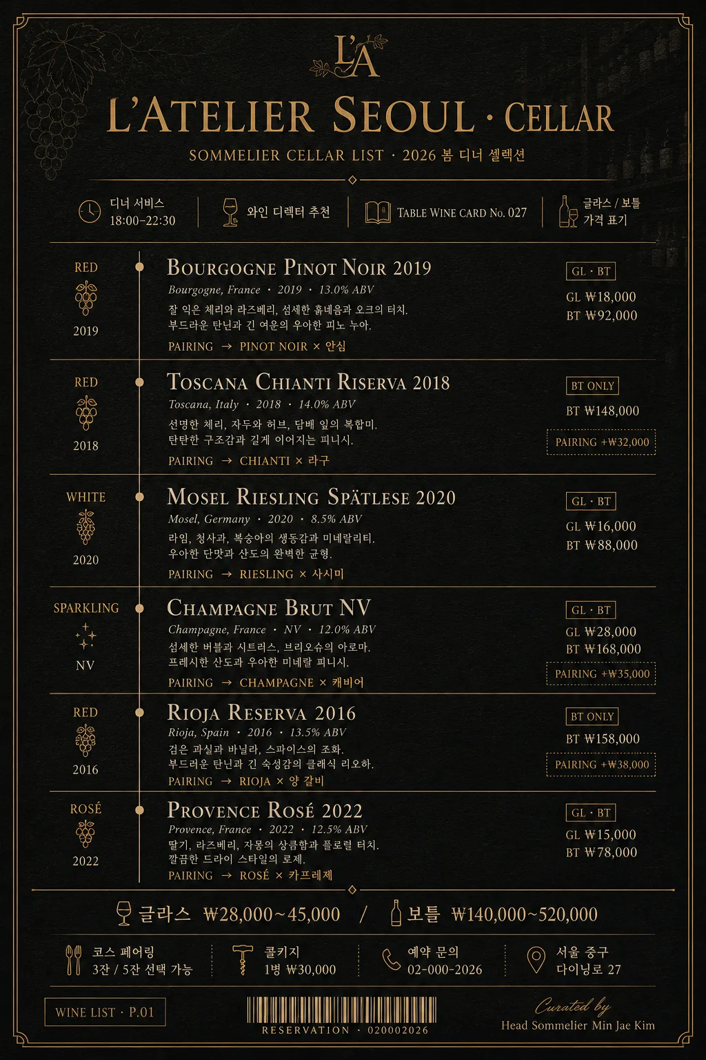
파인다이닝 와인 리스트 카드. 딥 차콜 배경 + 머스타드 골드 라인 + 세리프 와인 이름 + 페어링 가이드 한 줄씩. 5~7종 와인 + 산지·빈티지·도수. 메뉴북·셀러 룸·인스타 활용.
미슐랭 와인 리스트 카드 (다크·페어링)摘要
這是用來製作廣告/海報內容的 ChatGPT 圖像提示詞,已整理主題、背景、風格與構圖,方便快速調整。
相關關鍵字: 미슐랭 와인 리스트 카드 (다크·페어링), 미슐랭 와인 리스트 카드 (다크·페어링) 프롬프트, 廣告/海報 프롬프트, 廣告/海報 AI 이미지 프롬프트, ChatGPT 이미지 프롬프트, AI 이미지 생성 프롬프트, AI 프롬프트, 이미지 프롬프트
미슐랭 와인 리스트 카드 (다크·페어링)使用方式
保留原始結構並替換主體、背景、色彩或構圖,即可延伸出不同版本。
- 保留核心主體,並依品牌、季節或平台調整色彩與背景。
- 如果畫面太複雜,請減少背景元素並具體描述主體、構圖與光線。
- 複製後可要求 ChatGPT 配合平台、長寬比或文字需求調整。
提示詞原文
[Input]
- language: Korean
- output_size: 1024x1536

[Purpose]
Michelin restaurant-style wine list card, dark cellar editorial page for fine dining menu presentation.
Elegant vertical menu layout with bilingual serif typography, designed as a real guest-facing wine selection card with pairing guidance, glass/bottle pricing, sommelier notes, and venue utility details.

[Composition]
- Top header band (14-16%): {레스토랑·바 이름} set as the main title area, centered with refined serif hierarchy, a small cellar label, date/service line, and thin mustard-gold divider rules.
- Main content field (68-72%): structured wine entries stacked in a polished column, each entry aligned to the same left edge with strong vertical rhythm, including wine name, region, vintage, glass/bottle price cue, and pairing note.
- Bottom utility band (12-14%): {가격대}, tasting-course note, address/contact line, corkage/service information, and a tiny barcode-style reservation block, separated by a thin gold line.
- Background should be a deep charcoal-to-black matte premium stock paper with visible fine paper grain, faint cellar shelf texture, subtle debossed grapevine contour lines, and warm foil-like gold details.
- Use {한글 폰트}, {영문 폰트}, {컬러 톤}, and {비율} consistently across the entire page.

[3. CORE STRUCTURE]
- Header area: Set {레스토랑·바 이름} at the top in large elegant serif, with wide tracking and a small secondary line below reading “SOMMELIER CELLAR LIST · 2026 봄 디너 셀렉션”; add a thin gold rule beneath for Michelin-like restraint.
- Service metadata: Add compact Korean microtext near the header such as “디너 서비스 18:00–22:30”, “와인 디렉터 추천”, “TABLE WINE CARD No. 027”, and “글라스 / 보틀 가격 표기”.
- Wine list block: Render {와인 리스트} as 5-7 stacked entries, each entry broken into four sub-lines: wine name in English serif small caps, origin/vintage/ABV in light italic microtext, Korean tasting note, and pairing text from {페어링 가이드} as a compact line with a subtle arrow cue.
- Entry details: For realism, include small price markers beside each entry such as “GL ₩18,000 · BT ₩92,000”, “BT ₩148,000”, “PAIRING +₩32,000”, while keeping {가격대} as the official bottom price range reference.
- Entry separators: Place thin horizontal gold dividers between wine entries, with tiny vintage-dot markers, understated section labels like “WHITE”, “RED”, “SPARKLING”, or “DESSERT”, and a faint vertical alignment guide in antique gold.
- Price and pairing footer: Place {가격대} and a short footer note in small sans-serif at the bottom, aligned cleanly: “코스 페어링 3잔 / 5잔 선택 가능”, “콜키지 1병 ₩30,000”, “예약 문의 02-000-2026”, and “서울 중구 다이닝로 27”.
- Utility finishing: Add a small reservation barcode area, page code “WINE LIST · P.01”, and micro credit line “Curated by Head Sommelier Min Jae Kim” in the lower margin.
- Typography hierarchy: Make the wine names the most prominent text after the title, while origin, vintage, pairing guidance, prices, and venue details remain smaller and quieter.

[4. STYLE RULES]
- Typography: Use Noto Serif KR or 본명조 for Korean text, and Trajan / Bodoni / Playfair Display for English serif headings; pair with a small clean sans-serif such as Inter or Noto Sans KR for secondary details.
- Color palette: Use {컬러 톤} strictly, centered on deep charcoal #1a1410 to black background, mustard gold #c9a55c lines and headers, and cream #f0e8d6 body text.
- Border/shadow: Use hairline gold rules, delicate corner ticks, faint foil-stamped monogram details, and an ultra-soft paper shadow only if needed, around 2px y-offset, 8px blur, 10% opacity.
- Decorative texture: Add subtle matte paper grain, very faint cellar-map contour marks, tiny gold registration dots, and low-contrast debossed vine-line details so the card feels printed and handled in a luxury restaurant.
- Letter spacing: Slight tracking on English headers and small caps; tighter tracking on Korean body text to preserve editorial elegance.

[5. VISUAL STYLE]
- Camera / lens: flat editorial poster composition, simulated as a printed luxury menu page, 50mm standard lens look with minimal perspective distortion, front-on orthographic presentation.
- Lighting: soft studio top-light with very subtle side fill, producing a faint paper sheen, tactile foil highlights, and readable cream typography against the dark stock.
- Color grade: dark espresso, black, muted antique gold, and warm cream, with restrained contrast and polished fine-dining warmth.
- Material realism: The final image should feel like a photographed premium menu card on thick black paper, with crisp ink edges, slight foil impression, and believable print density.

[6. MOOD]
Michelin-star cellar menu — inspired by a Kinfolk x luxury hotel wine list spread, with the understated precision of a fine-dining sommelier booklet, enriched by realistic restaurant service information and tactile dark paper luxury.

[7. CRITICAL]
- Korean text accuracy: 반드시 정확히 보여야 하는 문자열: {레스토랑·바 이름}, {와인 리스트}, {페어링 가이드}, {가격대}, {한글 폰트}, {영문 폰트}, {컬러 톤}, {비율}.
- Include realistic Korean menu text such as “와인 디렉터 추천”, “코스 페어링”, “글라스 / 보틀”, “예약 문의”, “콜키지”, “디너 서비스”, and short pairing notes that match the fine-dining wine theme.
- Layout invariants: exactly one page, vertical orientation, dark background, luxury wine-list card structure, readable bilingual typography, and coherent menu pricing details.
- All wine entries should remain legible, evenly spaced, and aligned into a refined list structure suitable for a Michelin-style cellar card.

[8. 🚫 PROHIBITED]
- Fake official seals / certifications
- Broken Korean characters