광고/포스터
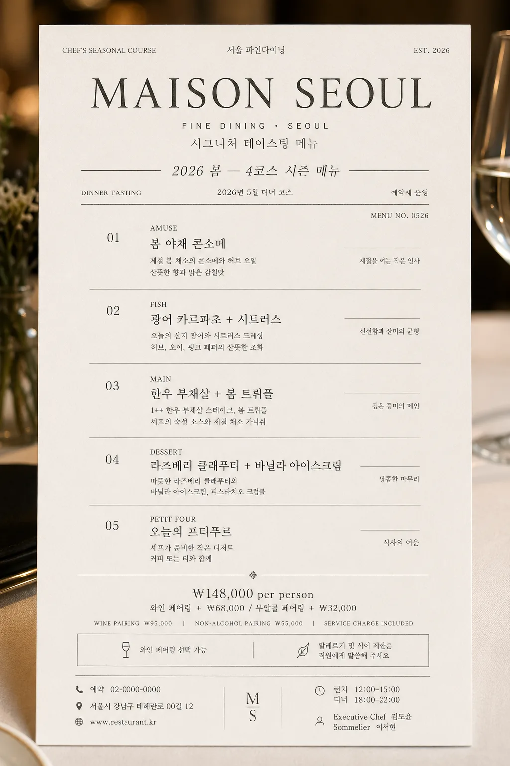
모던 미슐랭 코스 메뉴 카드
미슐랭 톤이지만 모던하고 깔끔한 코스 메뉴 카드. 아이보리 배경 + 차콜 텍스트 + 미세 그레이 라인 + 본명조·Trajan·Inter 믹스. 4~6코스 + 페어링·가격. 다이닝룸·뉴스레터·인스타 활용.
모던 미슐랭 코스 메뉴 카드 검색 요약
모던 미슐랭 코스 메뉴 카드은 광고/포스터 결과물을 만들 때 바로 복사해 활용할 수 있는 ChatGPT 이미지 프롬프트입니다. 주제, 배경, 스타일, 구도 조건을 함께 담아 빠르게 시안을 만들 수 있도록 구성했습니다.
관련 키워드: 모던 미슐랭 코스 메뉴 카드, 모던 미슐랭 코스 메뉴 카드 프롬프트, 광고/포스터 프롬프트, 광고/포스터 AI 이미지 프롬프트, ChatGPT 이미지 프롬프트, AI 이미지 생성 프롬프트, AI 프롬프트, 이미지 프롬프트
모던 미슐랭 코스 메뉴 카드 활용 포인트
원본 구조를 유지하면서 피사체, 배경, 색감, 구도를 바꿔 다양한 시안으로 확장할 수 있습니다.
- 핵심 소재는 유지하고 브랜드, 계절, 채널 목적에 맞는 색감과 배경을 바꿔보세요.
- 결과가 산만하면 배경 요소를 줄이고 피사체, 구도, 조명 조건을 구체화하세요.
- 복사한 뒤 ChatGPT에서 플랫폼, 화면 비율, 텍스트 포함 여부를 추가로 요청할 수 있습니다.
프롬프트 원문
[Input]
- language: Korean
- output_size: 1024x1536

[Purpose]
Modern Michelin-style course menu card for a fine-dining restaurant, designed as a premium editorial print piece for menu books, social posts, reservation pages, and table presentation.
The image should feel like a real photographed menu card placed in an upscale dining room: refined typography, tactile paper, believable restaurant details, and a polished luxury hospitality atmosphere.

[Composition]
- Vertical menu-card layout with {비율}, shown as a premium printed card on warm ivory stock, front-facing with a subtle real-paper texture and refined table-service context.
- {레스토랑 이름} sits in the upper zone as the primary masthead, with a smaller bilingual subtitle treatment beneath it such as “FINE DINING · SEOUL” and “시그니처 테이스팅 메뉴”.
- {메뉴 컨셉·시즌} appears near the top as a compact seasonal line, separated by thin charcoal rules, with small service details nearby: “DINNER TASTING”, “2026 SPRING”, “예약제 운영”.
- The core menu block occupies the middle portion of the card, with each course aligned in a disciplined grid and clearly spaced like an actual tasting menu.
- Bottom zone holds {가격·페어링} as a concise pricing and pairing footer, supported by realistic restaurant information: “와인 페어링 선택 가능”, “알레르기 및 식이 제한은 직원에게 말씀해 주세요”.
- Add restaurant-card details that make the design feel authentic: address line, reservation phone, website, service hours, small menu code, table number line, chef credit, sommelier note, and subtle decorative dividers.
- Use {한글 폰트}, {영문 폰트}, and {컬러 톤} consistently, with elegant hierarchy and refined editorial spacing.

[3. CORE STRUCTURE]
- Header area (top 16%): set {레스토랑 이름} as the dominant title, with elegant serif presence and subtle contrast between English and Korean where applicable; include small supporting text such as “CHEF’S SEASONAL COURSE”, “서울 파인다이닝”, and “EST. 2026”.
- Seasonal line (top 10% below header): place {메뉴 컨셉·시즌} in a small italic or light sans-serif style, with thin charcoal divider lines above and below; include a date label such as “2026년 5월 디너 코스” and a tiny issue-style menu code like “MENU NO. 0526”.
- Menu body (middle 56%): list {코스 메뉴} as 4 to 6 distinct course entries; each entry should be arranged as course number, course name line, and a short description line, with consistent vertical rhythm and fine gray separators between items.
- Course formatting: each course should read like a refined fine-dining menu, with English small caps or uppercase emphasis followed by Korean support text, then a 1–2 line descriptive note; add realistic Korean microcopy such as “제철 허브”, “숙성 소스”, “오늘의 산지”, “셰프 추천 구성”.
- Include small side annotations beside the course list where appropriate: “AMUSE”, “FISH”, “MAIN”, “DESSERT”, “PETIT FOUR”, plus concise Korean notes in smaller type.
- Pricing footer (bottom 18%): set {가격·페어링} in a smaller sans-serif style aligned with the menu column width; add “WINE PAIRING ₩95,000”, “NON-ALCOHOL PAIRING ₩55,000”, “SERVICE CHARGE INCLUDED” if it complements the placeholder.
- Footer information: include “예약 02-0000-0000”, “서울시 강남구 테헤란로 00길 12”, “www.restaurant.kr”, “런치 12:00–15:00 · 디너 18:00–22:00”, and a small credit line “Executive Chef 김도윤 · Sommelier 이서현”.

[4. STYLE RULES]
- Typography: use a mix of Pretendard, Noto Serif KR, Noto Sans KR, Trajan, Garamond, and Inter; masthead weight around 600–700, body text 300–400, small caps or uppercase at 12–18px equivalent, footer at 18–24px equivalent.
- Color palette: pure white / ivory #FAFAF6 background, charcoal #2A2A2A text, soft gray #888888 dividers and secondary text, optional warmer ivory highlight within the same restrained family from {컬러 톤}.
- Print details: use hairline rules, tiny section markers, subtle letterpress-like impression, embossed-looking restaurant name, fine paper grain, and a faint soft shadow at 5% opacity to lift the card from the surface.
- Decorative elements should stay premium and restaurant-appropriate: small divider dots, understated corner registration marks, refined rule lines, tiny menu-code text, and delicate table-card numbering.
- The card may be presented on a realistic fine-dining surface such as pale linen, matte stone, or warm oak, with very subtle hints of a folded napkin edge, silver cutlery glint, or glass reflection near the outer edge without obscuring the text.

[5. VISUAL STYLE]
- Camera / lens: editorial flat-lay print look simulated as if captured on a Phase One IQ4 with an 80mm lens at f/8, perfectly front-facing and distortion-free.
- Lighting: bright diffused daylight from upper-left, soft shadow falloff to lower-right, resembling a quiet Michelin dining room at late morning.
- Color grade: neutral cream and charcoal monochrome with restrained cool-gray accents, no saturated hues, no warm color spill.
- Material realism: crisp ink edges, slight paper fiber, gentle debossed title texture, realistic print registration, and soft ambient reflections from a luxury dining table setting.

[6. MOOD]
A quiet Michelin dining-room editorial — like a modern luxury menu page from a Kinfolk-meets-French-gastronomy print spread, but with enough real restaurant information, pricing, service notes, and tactile paper detail to feel genuinely photographed and usable.

[7. CRITICAL]
- Korean text accuracy: the following strings must appear exactly as written: {레스토랑 이름}, {메뉴 컨셉·시즌}, {코스 메뉴}, {가격·페어링}.
- Include readable Korean restaurant details: “2026년 5월 디너 코스”, “예약 02-0000-0000”, “서울시 강남구 테헤란로 00길 12”, “런치 12:00–15:00 · 디너 18:00–22:00”, “Executive Chef 김도윤”.
- Ensure all menu lines remain legible, evenly spaced, and aligned with a strict editorial grid.
- The final image must look like a real premium printed fine-dining course menu card, not a blank template.

[8. 🚫 PROHIBITED]
- Fake official seals / certifications
- Broken Korean characters