廣告/海報
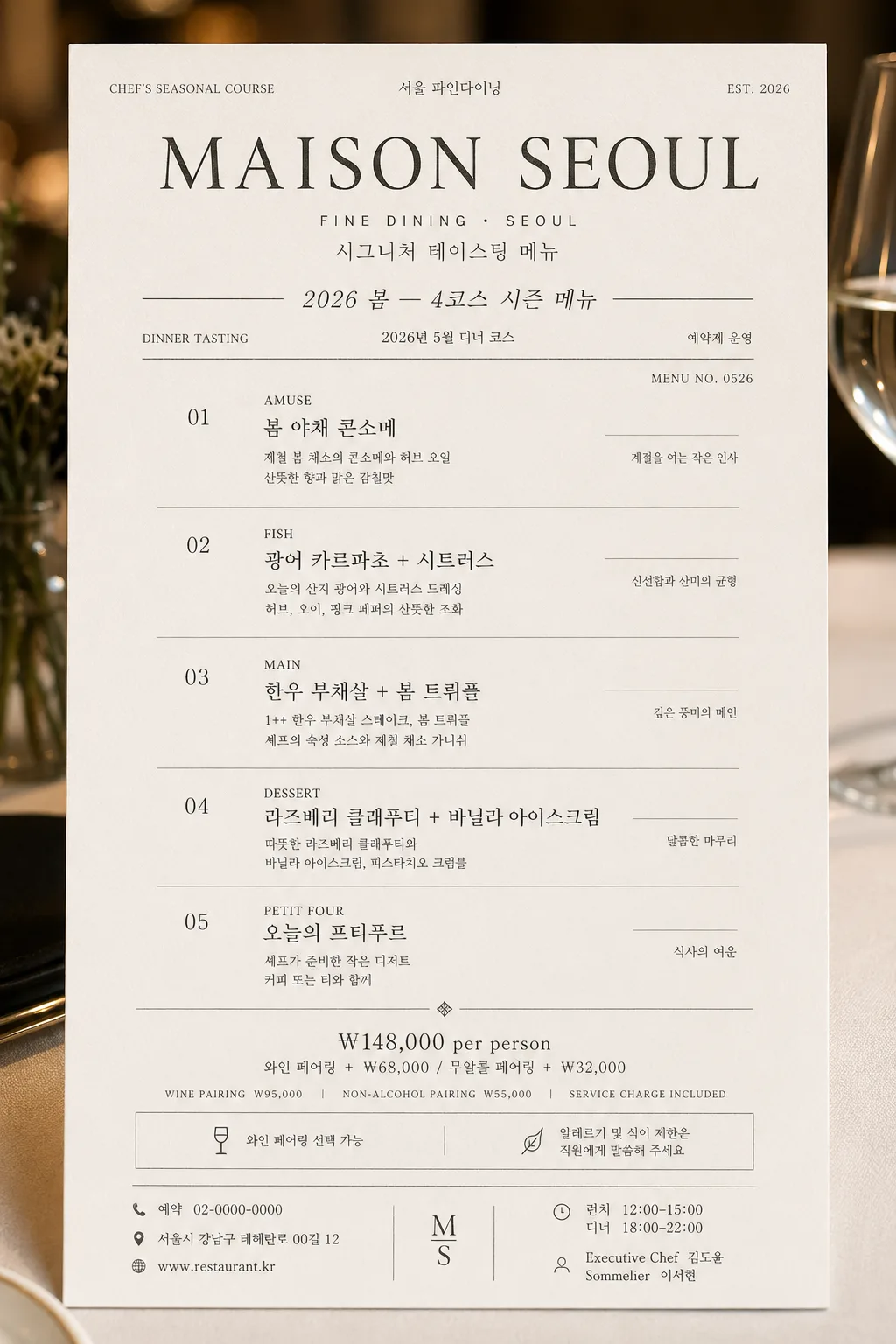
모던 미슐랭 코스 메뉴 카드
미슐랭 톤이지만 모던하고 깔끔한 코스 메뉴 카드. 아이보리 배경 + 차콜 텍스트 + 미세 그레이 라인 + 본명조·Trajan·Inter 믹스. 4~6코스 + 페어링·가격. 다이닝룸·뉴스레터·인스타 활용.
모던 미슐랭 코스 메뉴 카드摘要
這是用來製作廣告/海報內容的 ChatGPT 圖像提示詞,已整理主題、背景、風格與構圖,方便快速調整。
相關關鍵字: 모던 미슐랭 코스 메뉴 카드, 모던 미슐랭 코스 메뉴 카드 프롬프트, 廣告/海報 프롬프트, 廣告/海報 AI 이미지 프롬프트, ChatGPT 이미지 프롬프트, AI 이미지 생성 프롬프트, AI 프롬프트, 이미지 프롬프트
모던 미슐랭 코스 메뉴 카드使用方式
保留原始結構並替換主體、背景、色彩或構圖,即可延伸出不同版本。
- 保留核心主體,並依品牌、季節或平台調整色彩與背景。
- 如果畫面太複雜,請減少背景元素並具體描述主體、構圖與光線。
- 複製後可要求 ChatGPT 配合平台、長寬比或文字需求調整。
提示詞原文
[Input]
- language: Korean
- output_size: 1024x1536

[Purpose]
Modern Michelin-style course menu card for a fine-dining restaurant, designed as a premium editorial print piece for menu books, social posts, reservation pages, and table presentation.
The image should feel like a real photographed menu card placed in an upscale dining room: refined typography, tactile paper, believable restaurant details, and a polished luxury hospitality atmosphere.

[Composition]
- Vertical menu-card layout with {비율}, shown as a premium printed card on warm ivory stock, front-facing with a subtle real-paper texture and refined table-service context.
- {레스토랑 이름} sits in the upper zone as the primary masthead, with a smaller bilingual subtitle treatment beneath it such as “FINE DINING · SEOUL” and “시그니처 테이스팅 메뉴”.
- {메뉴 컨셉·시즌} appears near the top as a compact seasonal line, separated by thin charcoal rules, with small service details nearby: “DINNER TASTING”, “2026 SPRING”, “예약제 운영”.
- The core menu block occupies the middle portion of the card, with each course aligned in a disciplined grid and clearly spaced like an actual tasting menu.
- Bottom zone holds {가격·페어링} as a concise pricing and pairing footer, supported by realistic restaurant information: “와인 페어링 선택 가능”, “알레르기 및 식이 제한은 직원에게 말씀해 주세요”.
- Add restaurant-card details that make the design feel authentic: address line, reservation phone, website, service hours, small menu code, table number line, chef credit, sommelier note, and subtle decorative dividers.
- Use {한글 폰트}, {영문 폰트}, and {컬러 톤} consistently, with elegant hierarchy and refined editorial spacing.

[3. CORE STRUCTURE]
- Header area (top 16%): set {레스토랑 이름} as the dominant title, with elegant serif presence and subtle contrast between English and Korean where applicable; include small supporting text such as “CHEF’S SEASONAL COURSE”, “서울 파인다이닝”, and “EST. 2026”.
- Seasonal line (top 10% below header): place {메뉴 컨셉·시즌} in a small italic or light sans-serif style, with thin charcoal divider lines above and below; include a date label such as “2026년 5월 디너 코스” and a tiny issue-style menu code like “MENU NO. 0526”.
- Menu body (middle 56%): list {코스 메뉴} as 4 to 6 distinct course entries; each entry should be arranged as course number, course name line, and a short description line, with consistent vertical rhythm and fine gray separators between items.
- Course formatting: each course should read like a refined fine-dining menu, with English small caps or uppercase emphasis followed by Korean support text, then a 1–2 line descriptive note; add realistic Korean microcopy such as “제철 허브”, “숙성 소스”, “오늘의 산지”, “셰프 추천 구성”.
- Include small side annotations beside the course list where appropriate: “AMUSE”, “FISH”, “MAIN”, “DESSERT”, “PETIT FOUR”, plus concise Korean notes in smaller type.
- Pricing footer (bottom 18%): set {가격·페어링} in a smaller sans-serif style aligned with the menu column width; add “WINE PAIRING ₩95,000”, “NON-ALCOHOL PAIRING ₩55,000”, “SERVICE CHARGE INCLUDED” if it complements the placeholder.
- Footer information: include “예약 02-0000-0000”, “서울시 강남구 테헤란로 00길 12”, “www.restaurant.kr”, “런치 12:00–15:00 · 디너 18:00–22:00”, and a small credit line “Executive Chef 김도윤 · Sommelier 이서현”.

[4. STYLE RULES]
- Typography: use a mix of Pretendard, Noto Serif KR, Noto Sans KR, Trajan, Garamond, and Inter; masthead weight around 600–700, body text 300–400, small caps or uppercase at 12–18px equivalent, footer at 18–24px equivalent.
- Color palette: pure white / ivory #FAFAF6 background, charcoal #2A2A2A text, soft gray #888888 dividers and secondary text, optional warmer ivory highlight within the same restrained family from {컬러 톤}.
- Print details: use hairline rules, tiny section markers, subtle letterpress-like impression, embossed-looking restaurant name, fine paper grain, and a faint soft shadow at 5% opacity to lift the card from the surface.
- Decorative elements should stay premium and restaurant-appropriate: small divider dots, understated corner registration marks, refined rule lines, tiny menu-code text, and delicate table-card numbering.
- The card may be presented on a realistic fine-dining surface such as pale linen, matte stone, or warm oak, with very subtle hints of a folded napkin edge, silver cutlery glint, or glass reflection near the outer edge without obscuring the text.

[5. VISUAL STYLE]
- Camera / lens: editorial flat-lay print look simulated as if captured on a Phase One IQ4 with an 80mm lens at f/8, perfectly front-facing and distortion-free.
- Lighting: bright diffused daylight from upper-left, soft shadow falloff to lower-right, resembling a quiet Michelin dining room at late morning.
- Color grade: neutral cream and charcoal monochrome with restrained cool-gray accents, no saturated hues, no warm color spill.
- Material realism: crisp ink edges, slight paper fiber, gentle debossed title texture, realistic print registration, and soft ambient reflections from a luxury dining table setting.

[6. MOOD]
A quiet Michelin dining-room editorial — like a modern luxury menu page from a Kinfolk-meets-French-gastronomy print spread, but with enough real restaurant information, pricing, service notes, and tactile paper detail to feel genuinely photographed and usable.

[7. CRITICAL]
- Korean text accuracy: the following strings must appear exactly as written: {레스토랑 이름}, {메뉴 컨셉·시즌}, {코스 메뉴}, {가격·페어링}.
- Include readable Korean restaurant details: “2026년 5월 디너 코스”, “예약 02-0000-0000”, “서울시 강남구 테헤란로 00길 12”, “런치 12:00–15:00 · 디너 18:00–22:00”, “Executive Chef 김도윤”.
- Ensure all menu lines remain legible, evenly spaced, and aligned with a strict editorial grid.
- The final image must look like a real premium printed fine-dining course menu card, not a blank template.

[8. 🚫 PROHIBITED]
- Fake official seals / certifications
- Broken Korean characters