Hobbies/Lifestyle
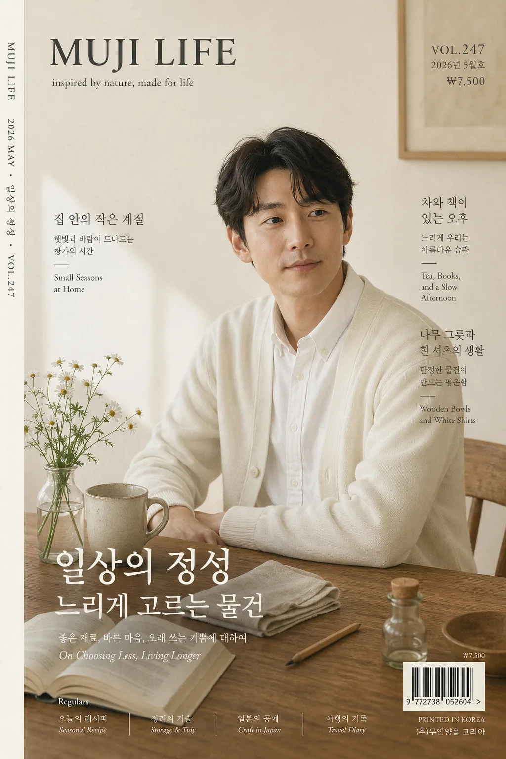
일본 라이프 잡지 표지
MUJI LIFE / Bonjour Japan 같은 일본 라이프 잡지 표지 톤. 우드 테이블 자연광 + 미니멀 타이포 + 시즌 이슈. 본인 사진 첨부 시 표지 인물로 변환 (i2i 가능).
일본 라이프 잡지 표지 summary
Copy this ChatGPT image prompt to create Hobbies/Lifestyle results. Its subject, background, style, and composition are organized for quick iteration.
Related keywords: 일본 라이프 잡지 표지, 일본 라이프 잡지 표지 프롬프트, Hobbies/Lifestyle 프롬프트, Hobbies/Lifestyle AI 이미지 프롬프트, ChatGPT 이미지 프롬프트, AI 이미지 생성 프롬프트, AI 프롬프트, 이미지 프롬프트
How to use 일본 라이프 잡지 표지
Keep the prompt structure and swap the subject, background, palette, or composition to create new variations.
- Keep the main subject and adjust the palette and background for your brand, season, or channel.
- If the result feels busy, simplify the background and make the subject, composition, and lighting more specific.
- After copying, ask ChatGPT to adapt it for your platform, aspect ratio, or text requirements.
Original prompt
[Input]
- language: Korean
- output_size: 1024x1536

[Purpose]
Japanese lifestyle magazine cover, A4 vertical editorial front page for a calm living-and-design publication. Photoreal magazine cover suitable for i2i portrait substitution, with a premium printed-paper layout, realistic editorial cover information, and a restrained tonal palette.

[Composition]
- Main subject: {표지 인물} placed slightly right of center, occupying about 42% of the frame height, with the gaze directed just past camera for a quiet editorial feel.
- Cover masthead: {잡지 이름} at the top-left in a compact serif treatment, clearly legible and integrated with the editorial grid.
- Issue metadata: {이슈 번호}, {발행일}, {가격} positioned around the masthead and upper-right, like a real monthly lifestyle magazine.
- Main feature title: {특집 제목} and {메인 헤드라인} placed across the lower-middle or lower-left area, sized as the primary cover story without hiding the face.
- Feature headlines: {서브 헤드라인 1}, {서브 헤드라인 2}, {서브 헤드라인 3} arranged in two slim editorial text groups on the left and right edges of the portrait.
- Background scene: {배경·소품} arranged on a warm wood surface, with lived-in domestic details that naturally belong in a Japanese lifestyle cover.
- Barcode and print details: place a small barcode block with {바코드 번호} near the lower-right corner, plus a tiny printer note and page-style micro text for magazine realism.
- Spine credit: {스파인 크레딧} set vertically along the far left edge like a real printed magazine spine marker.
- Color atmosphere: {컬러 톤} across the paper, props, and shadows, with subtle depth rather than strong contrast.
- Typography system: {타이포} applied as a refined magazine hierarchy with Japanese-lifestyle editorial balance.

[3. CORE STRUCTURE]
1. Header zone (top 14%): place {잡지 이름} as the masthead in a compact serif style; add {이슈 번호}, {발행일}, and {가격} as small publication metadata nearby with careful tracking.
2. Portrait zone (center 58%): render {표지 인물} as the primary cover subject, cropped from mid-torso upward, with natural skin texture, relaxed posture, and a believable magazine-photo finish.
3. Still-life layer (lower-left and lower-mid): arrange {배경·소품} so the wood table, flower vase, ceramic mug, open book, folded linen, and small household objects form a quiet diagonal leading line toward the subject.
4. Cover-story zone (middle-lower 28%): typeset {특집 제목}, {메인 헤드라인}, and the three feature headlines as real cover blurbs, mixing Korean serif text with tiny English support notes.
5. Print-commerce zone (bottom 8%): include the barcode with {바코드 번호}, tiny issue price {가격}, printer registration micro-marks, and a small publisher line; keep these elements realistic and secondary.
6. Spine and edge detail: add {스파인 크레딧} vertically along the left edge, with a faint paper-edge tone and slight offset-print softness.
7. Print realism: include subtle paper grain, faint ink softness, tiny halftone texture in shadow areas, and slight tonal variation like a real offset-printed cover, not a digitally over-sharpened composite.

[4. STYLE RULES]
- Typography: use Noto Serif KR or 본명조 for Korean editorial copy, Garamond or Playfair Display for English support text, and a small serif masthead style for the magazine name; keep weights medium to regular with clear editorial hierarchy.
- Cover text hierarchy: masthead first, issue metadata second, main feature third, supporting headlines fourth, barcode and spine credit fifth.
- Color palette: use {컬러 톤} with concrete tones such as ivory #f3ece0, warm oak brown, mist gray, tea beige, and soft charcoal for text.
- Editorial details: include issue number, publication date, price, barcode, two to three Korean feature headlines, a tiny publisher note, and vertical spine credit to make the cover feel physically printed.
- Border/shadow: add a barely visible soft drop shadow under the subject, about 4px y-offset, 14px blur, 12% opacity, plus a faint paper-edge vignette for print realism.

[5. VISUAL STYLE]
- Camera / lens: Hasselblad X2D 100c with 80mm f/4, medium-format editorial portrait framing, crisp but gentle detail.
- Lighting: soft north-facing window light from upper-left at roughly 45°, with a weak bounce fill from lower-right and no hard specular highlights.
- Color grade: muted ivory, oak, tea beige, and cool gray with slightly lifted blacks and low saturation, matching a restrained Japanese lifestyle editorial look.

[6. MOOD]
Quiet Japanese lifestyle editorial — calm living, handmade objects, morning-window light, thoughtful domestic rituals, and a premium printed-paper atmosphere.

[7. CRITICAL]
- Korean text accuracy: 표지에 반드시 아래 문구가 정확히 렌더되어야 함: "일상의 정성", "느리게 고르는 물건", "집 안의 작은 계절", "차와 책이 있는 오후".
- Issue realism: "{이슈 번호}", "{발행일}", "{가격}", "{바코드 번호}"가 실제 잡지 표지처럼 작게 포함되어야 함.
- Cover layout invariants: magazine cover must remain vertical A4 proportion, the portrait must be the dominant focal point, and the overall design must look like a real printed magazine rather than an advertisement.
- No identity drift if using i2i: keep the source person’s facial identity and natural expression consistent.

[8. 🚫 PROHIBITED]
- Fake official seals / certifications
- Broken Korean characters
- Fake celebrity composites or unauthorized public-figure likeness mixing
- Illegible barcode numbers when a barcode is present