興趣/生活
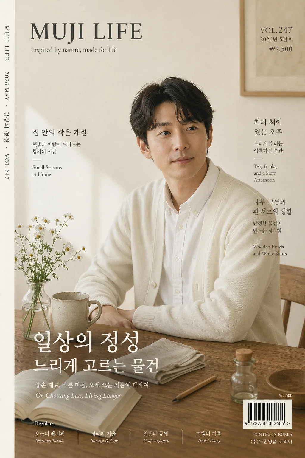
일본 라이프 잡지 표지
MUJI LIFE / Bonjour Japan 같은 일본 라이프 잡지 표지 톤. 우드 테이블 자연광 + 미니멀 타이포 + 시즌 이슈. 본인 사진 첨부 시 표지 인물로 변환 (i2i 가능).
일본 라이프 잡지 표지摘要
這是用來製作興趣/生活內容的 ChatGPT 圖像提示詞,已整理主題、背景、風格與構圖,方便快速調整。
相關關鍵字: 일본 라이프 잡지 표지, 일본 라이프 잡지 표지 프롬프트, 興趣/生活 프롬프트, 興趣/生活 AI 이미지 프롬프트, ChatGPT 이미지 프롬프트, AI 이미지 생성 프롬프트, AI 프롬프트, 이미지 프롬프트
일본 라이프 잡지 표지使用方式
保留原始結構並替換主體、背景、色彩或構圖,即可延伸出不同版本。
- 保留核心主體,並依品牌、季節或平台調整色彩與背景。
- 如果畫面太複雜,請減少背景元素並具體描述主體、構圖與光線。
- 複製後可要求 ChatGPT 配合平台、長寬比或文字需求調整。
提示詞原文
[Input]
- language: Korean
- output_size: 1024x1536

[Purpose]
Japanese lifestyle magazine cover, A4 vertical editorial front page for a calm living-and-design publication. Photoreal magazine cover suitable for i2i portrait substitution, with a premium printed-paper layout, realistic editorial cover information, and a restrained tonal palette.

[Composition]
- Main subject: {표지 인물} placed slightly right of center, occupying about 42% of the frame height, with the gaze directed just past camera for a quiet editorial feel.
- Cover masthead: {잡지 이름} at the top-left in a compact serif treatment, clearly legible and integrated with the editorial grid.
- Issue metadata: {이슈 번호}, {발행일}, {가격} positioned around the masthead and upper-right, like a real monthly lifestyle magazine.
- Main feature title: {특집 제목} and {메인 헤드라인} placed across the lower-middle or lower-left area, sized as the primary cover story without hiding the face.
- Feature headlines: {서브 헤드라인 1}, {서브 헤드라인 2}, {서브 헤드라인 3} arranged in two slim editorial text groups on the left and right edges of the portrait.
- Background scene: {배경·소품} arranged on a warm wood surface, with lived-in domestic details that naturally belong in a Japanese lifestyle cover.
- Barcode and print details: place a small barcode block with {바코드 번호} near the lower-right corner, plus a tiny printer note and page-style micro text for magazine realism.
- Spine credit: {스파인 크레딧} set vertically along the far left edge like a real printed magazine spine marker.
- Color atmosphere: {컬러 톤} across the paper, props, and shadows, with subtle depth rather than strong contrast.
- Typography system: {타이포} applied as a refined magazine hierarchy with Japanese-lifestyle editorial balance.

[3. CORE STRUCTURE]
1. Header zone (top 14%): place {잡지 이름} as the masthead in a compact serif style; add {이슈 번호}, {발행일}, and {가격} as small publication metadata nearby with careful tracking.
2. Portrait zone (center 58%): render {표지 인물} as the primary cover subject, cropped from mid-torso upward, with natural skin texture, relaxed posture, and a believable magazine-photo finish.
3. Still-life layer (lower-left and lower-mid): arrange {배경·소품} so the wood table, flower vase, ceramic mug, open book, folded linen, and small household objects form a quiet diagonal leading line toward the subject.
4. Cover-story zone (middle-lower 28%): typeset {특집 제목}, {메인 헤드라인}, and the three feature headlines as real cover blurbs, mixing Korean serif text with tiny English support notes.
5. Print-commerce zone (bottom 8%): include the barcode with {바코드 번호}, tiny issue price {가격}, printer registration micro-marks, and a small publisher line; keep these elements realistic and secondary.
6. Spine and edge detail: add {스파인 크레딧} vertically along the left edge, with a faint paper-edge tone and slight offset-print softness.
7. Print realism: include subtle paper grain, faint ink softness, tiny halftone texture in shadow areas, and slight tonal variation like a real offset-printed cover, not a digitally over-sharpened composite.

[4. STYLE RULES]
- Typography: use Noto Serif KR or 본명조 for Korean editorial copy, Garamond or Playfair Display for English support text, and a small serif masthead style for the magazine name; keep weights medium to regular with clear editorial hierarchy.
- Cover text hierarchy: masthead first, issue metadata second, main feature third, supporting headlines fourth, barcode and spine credit fifth.
- Color palette: use {컬러 톤} with concrete tones such as ivory #f3ece0, warm oak brown, mist gray, tea beige, and soft charcoal for text.
- Editorial details: include issue number, publication date, price, barcode, two to three Korean feature headlines, a tiny publisher note, and vertical spine credit to make the cover feel physically printed.
- Border/shadow: add a barely visible soft drop shadow under the subject, about 4px y-offset, 14px blur, 12% opacity, plus a faint paper-edge vignette for print realism.

[5. VISUAL STYLE]
- Camera / lens: Hasselblad X2D 100c with 80mm f/4, medium-format editorial portrait framing, crisp but gentle detail.
- Lighting: soft north-facing window light from upper-left at roughly 45°, with a weak bounce fill from lower-right and no hard specular highlights.
- Color grade: muted ivory, oak, tea beige, and cool gray with slightly lifted blacks and low saturation, matching a restrained Japanese lifestyle editorial look.

[6. MOOD]
Quiet Japanese lifestyle editorial — calm living, handmade objects, morning-window light, thoughtful domestic rituals, and a premium printed-paper atmosphere.

[7. CRITICAL]
- Korean text accuracy: 표지에 반드시 아래 문구가 정확히 렌더되어야 함: "일상의 정성", "느리게 고르는 물건", "집 안의 작은 계절", "차와 책이 있는 오후".
- Issue realism: "{이슈 번호}", "{발행일}", "{가격}", "{바코드 번호}"가 실제 잡지 표지처럼 작게 포함되어야 함.
- Cover layout invariants: magazine cover must remain vertical A4 proportion, the portrait must be the dominant focal point, and the overall design must look like a real printed magazine rather than an advertisement.
- No identity drift if using i2i: keep the source person’s facial identity and natural expression consistent.

[8. 🚫 PROHIBITED]
- Fake official seals / certifications
- Broken Korean characters
- Fake celebrity composites or unauthorized public-figure likeness mixing
- Illegible barcode numbers when a barcode is present