興趣/生活
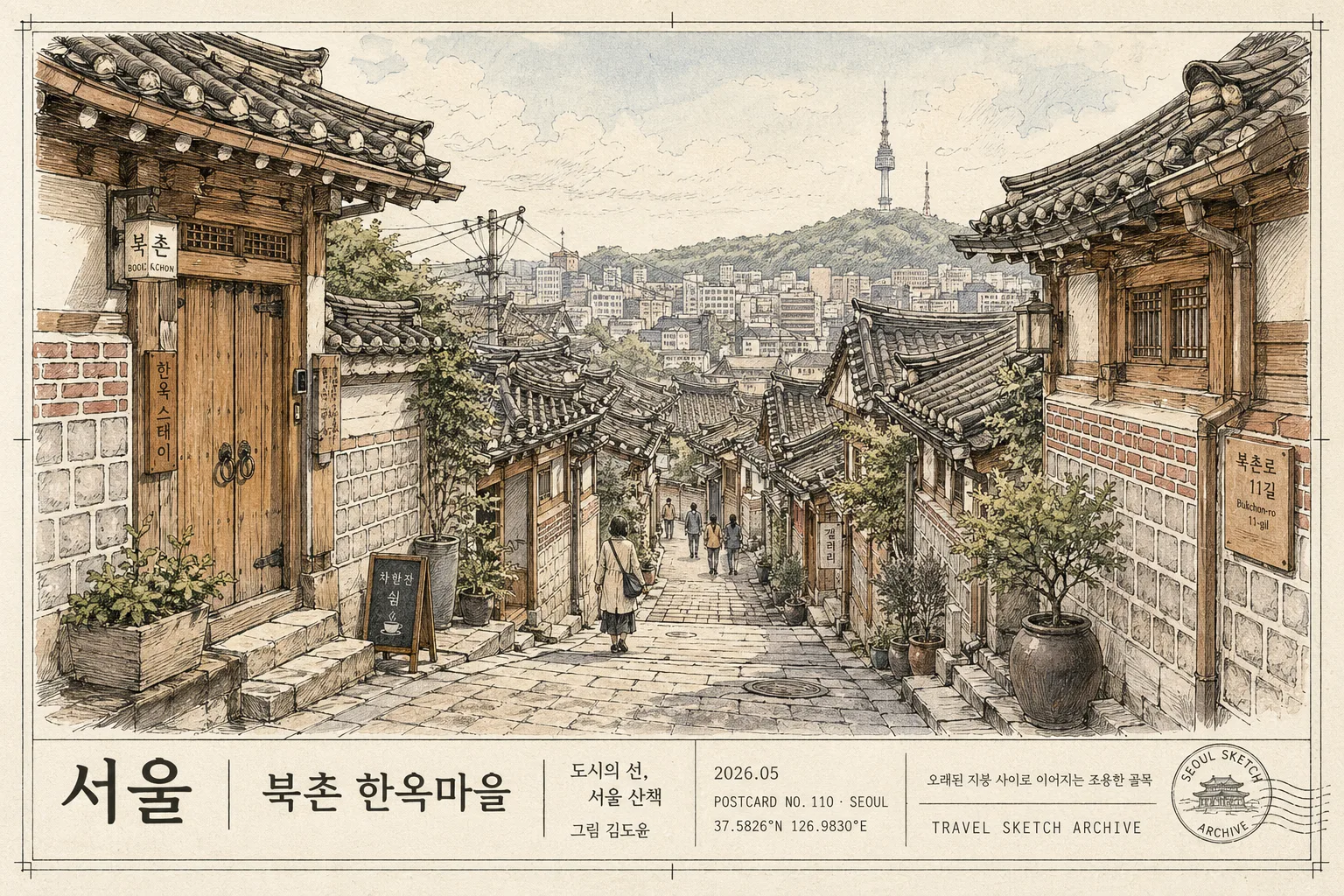
펜화 한국 도시 풍경 (엽서·전시 톤)
서울·부산·전주 등 한국 도시 풍경을 정교한 펜화 톤으로. 도시·장소 입력하면 엽서·전시·블로그용 펜화 일러스트로 변환.
펜화 한국 도시 풍경 (엽서·전시 톤)摘要
這是用來製作興趣/生活內容的 ChatGPT 圖像提示詞,已整理主題、背景、風格與構圖,方便快速調整。
相關關鍵字: 펜화 한국 도시 풍경 (엽서·전시 톤), 펜화 한국 도시 풍경 (엽서·전시 톤) 프롬프트, 興趣/生活 프롬프트, 興趣/生活 AI 이미지 프롬프트, ChatGPT 이미지 프롬프트, AI 이미지 생성 프롬프트, AI 프롬프트, 이미지 프롬프트
펜화 한국 도시 풍경 (엽서·전시 톤)使用方式
保留原始結構並替換主體、背景、色彩或構圖,即可延伸出不同版本。
- 保留核心主體,並依品牌、季節或平台調整色彩與背景。
- 如果畫面太複雜,請減少背景元素並具體描述主體、構圖與光線。
- 複製後可要求 ChatGPT 配合平台、長寬比或文字需求調整。
提示詞原文
[Input]
- language: Korean
- output_size: 1536x1024

[Purpose]
Postcard-style Korean cityscape illustration for exhibition graphics, travel-blog visuals, and souvenir print goods, rendered as a refined pen-and-ink drawing with restrained watercolor accents.
Specific: detailed urban landscape art of {주요 장소}, balancing architectural accuracy, hand-drawn atmosphere, and print-friendly caption readability with authentic postcard metadata.

[Composition]
- Main scene: {주요 장소} fills the full width with a layered street view; foreground alley and building edges occupy about 35% of the frame, midground rooftops 40%, and distant landmark 25%.
- Subject framing: the composition should feel like an editorial postcard, with a stable horizon line, slightly elevated viewpoint, and a clear left-to-right visual path through the alley.
- Background treatment: warm off-white paper surface with visible fiber grain, faint sky wash, soft cloud traces, subtle ink bleed, and postcard-stock printing texture.
- Use {장소의 핵심 요소} as the primary visual anchor, enriched with everyday street details such as small signboards, potted plants, utility lines, steps, stone paving, and quiet pedestrian silhouettes.
- Bottom caption band: integrate a tasteful exhibition-postcard label zone containing {도시명}, {장소명}, {전시명}, {작가명}, {제작 날짜}, {엽서 코드}, {좌표 라벨}, {하단 캡션}, and {보조 문구}.

[3. CORE STRUCTURE]
1. Foreground: draw the nearest alley edges, low walls, roof eaves, paving stones, doorway thresholds, planters, and a few small human silhouettes as scale references within the street scene.
2. Midground: render the main cluster of houses and roofs in {그림 기법}, with {세부 묘사 요소} articulated in crisp linework and controlled cross-hatching.
3. Landmark layer: place the distant landmark subtly above the roofline so it is recognizable and integrated into the city silhouette, with atmospheric line fading toward the horizon.
4. Color wash: apply {색상 팔레트} selectively across roof planes, foliage, plaster walls, wooden doors, paper lantern hints, and stone surfaces while keeping the ink drawing dominant.
5. Texture pass: overlay {질감 및 분위기}, light paper fiber, faint vintage print impression, tiny registration specks, and gentle uneven ink density as if printed on archival postcard stock.
6. Caption and postcard details: create a curated label area with a hairline charcoal frame, small crop marks, postcard serial text, exhibition credit, date, coordinate-style location line, and a tiny non-official stamp-like travel mark.
7. Printed text placement: set the largest Korean label as {도시명} / {장소명}; place {전시명} and {작가명} as gallery-credit text; use {제작 날짜}, {엽서 코드}, and {좌표 라벨} as small metadata; add {하단 캡션} and {보조 문구} as short travel-note copy.

[4. STYLE RULES]
- Typography: Korean label set in Noto Sans KR or Pretendard, regular to medium weight, 16–28 px equivalent, with neat spacing; postcard metadata can use smaller 11–14 px equivalent text.
- Color palette: black ink, off-white paper #F4F0E6, beige wash #D8C7A7, sage wash #A7B8A0, muted warm gray #8C857D, faded brick #A77D67, dusty blue-gray #8795A1.
- Linework: combine thin architectural outlines, hatch shading, stippled shadow patches, and delicate ink pooling at roof tile edges, window frames, tree branches, and stone joints.
- Decorative print system: use a 1px charcoal hairline frame, faint shadow with 4px y-offset and 10px blur at 12% opacity, small corner ticks, and understated postcard crop marks that support the exhibition-print feeling.

[5. VISUAL STYLE]
- Camera / lens: simulated architectural illustration look inspired by a 35mm documentary frame with a slightly elevated perspective, as if referenced from a Canon TS-E 24mm f/3.5L II tilt-shift composition.
- Lighting: soft overcast daylight with even contrast, gentle tonal separation between roof tiles, walls, foliage, stone paving, and distant skyline.
- Color grade: monochrome ink base with muted beige, sage, faded brick, and dusty blue-gray watercolor accents, warm paper-white highlights, and low-saturation vintage editorial tonality.

[6. MOOD]
Exhibition postcard illustration — a refined Monocle travel feature meets museum catalog print aesthetic, with quiet Korean street life, archival paper warmth, and collectible souvenir realism.

[7. CRITICAL]
- Korean text accuracy: 반드시 정확히 렌더링할 한글은 {도시명}, {장소명}, {전시명}, {작가명}, {제작 날짜}, {엽서 코드}, {좌표 라벨}, {하단 캡션}, {보조 문구}이다.
- The illustration must keep architecture lines crisp, perspective stable, and the caption band readable over the textured paper surface.
- Small silhouettes should be anatomically plausible and secondary to the architecture, matching the quiet scale of the street.
- All postcard metadata must look like printed editorial text, not a government certificate or official seal.

[8. 🚫 PROHIBITED]
- Fake official seals / certifications
- Broken Korean characters or misspelled Korean text
- Celebrity composites or unauthorized portrait likenesses