Social/Card News
인물 위로 쿠폰 4컷 세트
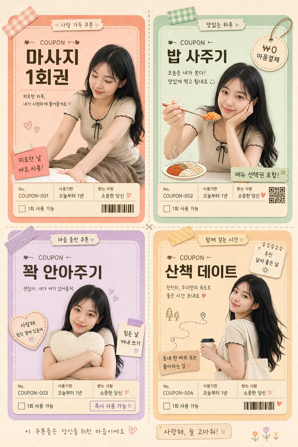
인물 사진 첨부하면 위로 쿠폰 세트 4컷 2x2 그리드로 변환. 마사지권·밥사주기·꽉 안아주기·꽃 한 송이 등 따뜻한 쿠폰. 얼굴·정체성 100% 유지.
인물 위로 쿠폰 4컷 세트 summary
Copy this ChatGPT image prompt to create Social/Card News results. Its subject, background, style, and composition are organized for quick iteration.
Related keywords: 인물 위로 쿠폰 4컷 세트, 인물 위로 쿠폰 4컷 세트 프롬프트, Social/Card News 프롬프트, Social/Card News AI 이미지 프롬프트, ChatGPT 이미지 프롬프트, AI 이미지 생성 프롬프트, AI 프롬프트, 이미지 프롬프트
How to use 인물 위로 쿠폰 4컷 세트
Keep the prompt structure and swap the subject, background, palette, or composition to create new variations.
- Keep the main subject and adjust the palette and background for your brand, season, or channel.
- If the result feels busy, simplify the background and make the subject, composition, and lighting more specific.
- After copying, ask ChatGPT to adapt it for your platform, aspect ratio, or text requirements.
Original prompt
[Input]
- reference_image: {참고 이미지}
- language: Korean
- output_size: 1024x1536

[Purpose]
Korean encouragement coupon set for personal gifting, 4-panel 2x2 grid, using the attached portrait as the same person across every panel.
Designed as a warm anniversary / birthday / consolation card that feels like a handmade keepsake, but with realistic printed-coupon details such as serial numbers, date labels, tiny usage notes, stickers, perforation marks, and tactile paper texture.
The final image should feel like a finished personal gift sheet photographed on premium stationery, suitable for {용도}, with {텍스트 톤} kept affectionate, sincere, and natural.

[Composition]
- The canvas is a vertical 2x2 grid with four equal coupon panels, following {레이아웃}; each panel occupies roughly 48% of the width/height with narrow cream gutters between cards.
- Keep {원본 보존} as the top priority: the face, body type, hair, and overall identity must remain consistent across all four panels.
- Each panel should contain one realistic printed coupon card with a warm pastel background, a clear person image or illustration cutout, and a coupon title + short explanation + small coupon metadata.
- Use {쿠폰 4종} as the four coupon themes, arranged so each card feels distinct but visually unified.
- Background outside the cards should be a soft cream-beige paper field with visible premium stationery grain, faint fibers, gentle shadows, and a few subtle handmade details such as washi tape corners, tiny heart stickers, clipped paper tabs, or pencil-like doodle marks.
- Add realistic coupon features: small serial number, “사용기한”, “받는 사람”, “1회 사용 가능”, tiny barcode/QR-like decorative block, dotted cut line, and a small check box area.
- Keep the person visually dominant in each panel, integrated with the coupon design through shadows, cutout edges, and overlapping text plaques.

[3. CORE STRUCTURE]
- Panel 1 (top-left): massage coupon card, with the same person shown in a relaxed massage / care-giving pose; card background in coral pastel. Place the title near the top, add a small caption below, and include details such as “No. COUPON-001”, “사용기한: 오늘부터 1년”, and “피로한 날 바로 사용”.
- Panel 2 (top-right): meal-treat coupon card, with the same person in a friendly eating or serving pose; use mint pastel background and keep the text layout consistent with panel 1. Add a small illustrated plate, spoon, steam doodle, price-tag style label “₩0 마음결제”, and detail line “메뉴 선택권 포함”.
- Panel 3 (bottom-left): hug coupon card, with the same person in a gentle embrace pose; use lilac pastel background, soft shadowing, and centered visual balance. Add a small heart sticker, dotted border accent, “즉시 사용 가능”, and a tiny note area reading “힘든 날 꺼내 쓰기”.
- Panel 4 (bottom-right): walk-date coupon card, with the same person in a light walking pose; use warm beige or pale peach background, with the title aligned to match the other cards. Add small walking-route doodles, a mini calendar tag, venue-style line “동네 한 바퀴 또는 좋아하는 길”, and “날씨 좋은 날 추천”.
- Make all four panels feel like they belong to one set through matched corner radius, identical margin rhythm, repeated typography placement, shared micro-label system, and consistent print shadows.
- If text is layered on top of the person image, keep it separated by clear spacing and use semi-opaque cream or pastel text plaques for readability.

[4. STYLE RULES]
- Typography: use Pretendard SemiBold for coupon titles, 30–36px; Pretendard Regular or Noto Sans KR for descriptions and metadata, 16–22px; optional hand-drawn accent font only for tiny decorative marks and affectionate sticker labels.
- Color palette: use {컬러 톤} while preserving cream beige #F4EBDD, coral #F4A79B, mint #BFE7D3, lilac #D9C7F0, pale peach #F8D9C6, charcoal text #2F2A28, off-white paper #FFF8EF, muted rose #D87973.
- Border/shadow: each card with rounded corners, 18–24px radius, soft drop shadow 0 8px 20px rgba(0,0,0,0.10), thin off-white border for separation, subtle paper edge thickness, and faint printed ink texture.
- Keep all visible main text in Korean, with simple personal gift-card styling rather than commercial ad-copy styling.
- Add small realistic stationery elements inside the design: dotted perforation lines, tiny checkboxes, micro barcode area, circular date stamp graphic without implying official certification, hand-drawn hearts, stars, food steam lines, walking route dots, and small corner tapes.

[5. VISUAL STYLE]
- Camera / lens: natural portrait photography feel, Canon EOS R5 with 85mm f/1.2 lens look, shallow depth of field, realistic subject cutout edges, gentle contact shadows where the portrait overlaps coupon graphics.
- Lighting: soft window light from upper-left at about 45°, gentle fill from front-right, no harsh highlights, even skin tone preservation, realistic paper shadows in card gutters.
- Color grade: pastel stationery palette with creamy whites, muted coral, mint, and lilac; low contrast, slightly desaturated, print-friendly, warm personal keepsake finish.
- Surface realism: matte paper, faint grain, subtle printed halftone/ink absorption, soft raised sticker edges, slight curl or thickness on coupon cards.

[6. MOOD]
A handmade personal gift-card set with the polished warmth of a Korean stationery brand and the gentle editorial feel of Kinfolk-style layout design, enriched with sincere everyday details that make the coupons feel actually usable and personally prepared.

[7. CRITICAL]
- Korean text accuracy: 반드시 아래 문구가 정확하게 보여야 함:
  - 마사지 1회권
  - 밥 사주기
  - 꽉 안아주기
  - 산책 데이트
- Additional Korean text should be readable and realistic, such as “받는 사람: 당신”, “발행일: 2026.05.01”, “사용기한: 오늘부터 1년”, “1회 사용 가능”, “마음이 필요할 때 꺼내 쓰기”, “No. COUPON-001”.
- Identity consistency: all four panels must show the same person based on {원본 보존}; do not change face shape, hairstyle, or body proportions.
- All 4 panels must remain a consistent 2x2 coupon grid with matching card structure and readable Korean typography.
- The result must look like a real printed personal coupon sheet photographed or rendered with tactile paper, sticker, shadow, and ink detail, not a sterile flat mockup.

[8. 🚫 PROHIBITED]
- Fake official seals / certifications
- Broken Korean characters
- Celebrity composites / unauthorized likeness