SNS/카드뉴스
카페 투어 손글씨 메모
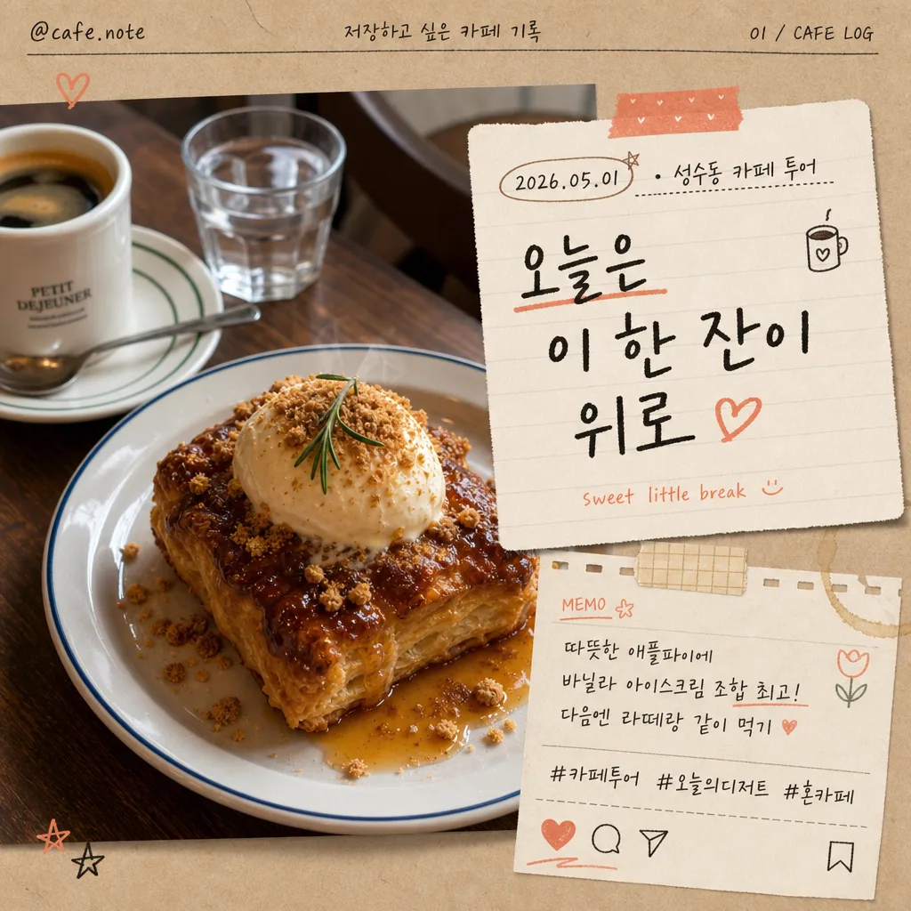
음식 사진 + 인스타 스토리·잡지 카페 투어 톤의 손글씨 메모 합성. 따뜻한 감성, 한글 손글씨 + 작은 일러스트.
카페 투어 손글씨 메모 검색 요약
카페 투어 손글씨 메모은 SNS/카드뉴스 결과물을 만들 때 바로 복사해 활용할 수 있는 ChatGPT 이미지 프롬프트입니다. 주제, 배경, 스타일, 구도 조건을 함께 담아 빠르게 시안을 만들 수 있도록 구성했습니다.
관련 키워드: 카페 투어 손글씨 메모, 카페 투어 손글씨 메모 프롬프트, SNS/카드뉴스 프롬프트, SNS/카드뉴스 AI 이미지 프롬프트, ChatGPT 이미지 프롬프트, AI 이미지 생성 프롬프트, AI 프롬프트, 이미지 프롬프트
카페 투어 손글씨 메모 활용 포인트
원본 구조를 유지하면서 피사체, 배경, 색감, 구도를 바꿔 다양한 시안으로 확장할 수 있습니다.
- 핵심 소재는 유지하고 브랜드, 계절, 채널 목적에 맞는 색감과 배경을 바꿔보세요.
- 결과가 산만하면 배경 요소를 줄이고 피사체, 구도, 조명 조건을 구체화하세요.
- 복사한 뒤 ChatGPT에서 플랫폼, 화면 비율, 텍스트 포함 여부를 추가로 요청할 수 있습니다.
프롬프트 원문
[Input]
- reference_image: {참고 이미지}
- language: Korean
- output_size: 1024x1024

[Purpose]
Instagram-style handwritten cafe tour journal card composited over a real food photo. Keep the original dish photo photoreal and appetizing while adding a believable physical memo, date/location label, subtle social-post details, and cafe diary decorations that make the image feel like a saved personal recommendation post.

[Composition]
- The attached food photo stays as the main hero, occupying about 72% of the frame, with the memo layered naturally on one side or slightly overlapping the top edge depending on the photo composition.
- Preserve the original image exactly with {원본 보존}, including color, texture, plating, crumbs, glaze, steam, cup reflections, and realistic lighting; avoid repainting the food itself.
- The memo area should feel like a physical note pasted on top of the photo, with soft paper edges, slight rotation of 2–4 degrees, a believable contact shadow, and visible paper grain around {메모 내용}.
- Handwritten text should read clearly at a glance, with {손글씨 톤} as the primary style and a small secondary English note integrated subtly.
- Add realistic cafe-journal details: a small date/location label such as “2026.05.01 · 성수동 카페 투어”, a tiny handle “@cafe.note”, 2–3 hashtag-style Korean captions like “#카페투어 #오늘의디저트 #혼카페”, and tiny save/share/heart micro icons near the lower edge.
- Decorative doodles from {장식 일러스트} should appear as hand-drawn accents near corners, along the memo border, or on a tiny sticker/tape piece, while the food remains the appetizing focal point.
- Background paper treatment should use {배경·종이 톤}, with translucent washi tape, a receipt-strip detail, a faint coffee-ring mark, or a notebook-fiber texture so the overlay feels naturally placed in a real cafe journal.

[3. CORE STRUCTURE]
- Hero layer: Keep the original food photo intact as the full visual base; retain the exact dish shape, plating, surface texture, sauce shine, pastry flakes, cup rim, garnish, and natural highlights from {원본 보존}.
- Memo overlay: Place a note card, receipt scrap, or torn notebook-paper shape over the photo, sized to roughly 28–38% of the canvas, with a soft shadow and lightly worn edge so it looks physically placed on the image.
- Main handwritten line: Set {메모 내용} in the center of the note, using bold but casual Korean handwriting; the main phrase should be the most legible element on the page.
- Secondary text balance: Add a tiny English helper phrase beneath or beside the main line in a smaller, lighter handwritten script, such as “sweet little break” or “cafe tour memo”, keeping it subordinate to the Korean memo.
- Social card details: Add a slim top or bottom metadata strip with “@cafe.note”, “저장하고 싶은 카페 기록”, “2026년 5월”, and a small page-like indicator “01 / CAFE LOG”. Use micro icons for heart, comment, share, and save in a hand-drawn Instagram-card style.
- Caption details: Include one short Korean review line in small writing, for example “다음엔 라떼랑 같이 먹기” or “창가 자리 추천”, plus hashtag-like text “#카페투어 #디저트기록 #오늘의메모”.
- Decorative accents: Add 2–4 doodles from {장식 일러스트}, plus optional tiny sticker tabs, washi tape corners, a pencil underline, star marks, or a small coffee-bean sketch, using uneven hand-drawn strokes and light ink fill.
- Paper/background integration: Use {배경·종이 톤} with subtle paper grain, notebook texture, receipt fiber, and slight edge shadow; ensure the note visually separates from the food while still feeling naturally composited.
- Color emphasis: Apply {컬러 톤} to ink, doodles, sticker tabs, icon marks, and minor accent underlines only; keep the original food tones natural with a gentle cohesive cafe-journal grade.

[4. STYLE RULES]
- Typography: Handwritten Korean in a marker-pen or pencil-note look, closest to a casual Pretendard-like clean structure but visibly hand-drawn; primary text bold 34–44px equivalent, secondary English 14–18px equivalent, metadata and hashtags 10–13px equivalent.
- Korean text elements should feel like real cafe diary writing: “오늘의 카페 기록”, “성수동 카페 투어”, “창가 자리 추천”, “다음엔 또 오기”, “#카페투어 #오늘의디저트”.
- Color palette: Use warm beige, charcoal ink, and coral accent from {컬러 톤}; paper can stay kraft brown, cream, or off-white with slight desaturation.
- Border/shadow: Add a soft drop shadow with 4px y-offset, 12px blur, 15% opacity; memo edges can have a torn-paper, receipt-paper, or rounded-corner feel, with realistic fiber texture and slight edge curl.
- Realistic embellishments: Add translucent tape, a tiny folded corner, faint pencil guide marks, a small coffee stain, and hand-drawn sticker-like tags in a way that supports the cafe-tour story.

[5. VISUAL STYLE]
- Camera / lens: Realistic food-photo look, like an 85mm f/1.8 editorial close-up or 50mm f/2.8 casual cafe snapshot, with shallow depth of field if the source image supports it.
- Lighting: Preserve the original photo lighting; if the memo needs its own feel, match it with soft diffused window light from upper-left and a faint fill from the lower-right to avoid cutout seams.
- Color grade: Warm cream, beige, charcoal, and muted coral with a gentle cafe-journal tint; keep food tones natural and photoreal.
- Material realism: Paper fibers, ink bleed, tape gloss, slight shadow falloff, and uneven hand pressure should be visible enough to make the overlay feel photographed rather than digitally pasted.

[6. MOOD]
Indie cafe journal aesthetic — like a stylish handwritten page from a Kinfolk-style café diary spread, mixed with a warm saved Instagram recommendation post from a real neighborhood cafe tour.

[7. CRITICAL]
- Korean text accuracy: “오늘은 이 한 잔이 위로” must appear exactly if that memo option is used; any food name, date label, hashtag, handle, or short review text in {메모 내용} must be rendered with broken-character-free Korean.
- Include realistic small Korean text details such as “2026.05.01 · 성수동 카페 투어”, “@cafe.note”, “#카페투어 #오늘의디저트”, or “창가 자리 추천” when they fit the layout.
- The original food photo must remain photoreal and recognizable; do not distort the dish, plate, cup, garnish, surface texture, or original lighting direction.
- The memo, stickers, icons, and doodles should support the cafe tour story and never cover the key identifying part of the food or the main phrase.

[8. 🚫 PROHIBITED]
- Fake official seals / certifications
- Broken Korean characters