社群/圖卡
카페 투어 손글씨 메모
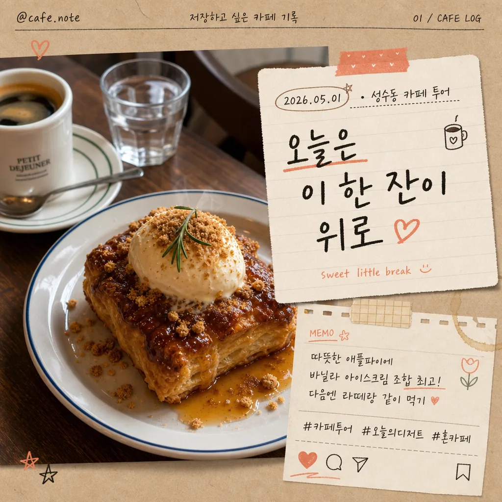
음식 사진 + 인스타 스토리·잡지 카페 투어 톤의 손글씨 메모 합성. 따뜻한 감성, 한글 손글씨 + 작은 일러스트.
카페 투어 손글씨 메모摘要
這是用來製作社群/圖卡內容的 ChatGPT 圖像提示詞,已整理主題、背景、風格與構圖,方便快速調整。
相關關鍵字: 카페 투어 손글씨 메모, 카페 투어 손글씨 메모 프롬프트, 社群/圖卡 프롬프트, 社群/圖卡 AI 이미지 프롬프트, ChatGPT 이미지 프롬프트, AI 이미지 생성 프롬프트, AI 프롬프트, 이미지 프롬프트
카페 투어 손글씨 메모使用方式
保留原始結構並替換主體、背景、色彩或構圖,即可延伸出不同版本。
- 保留核心主體,並依品牌、季節或平台調整色彩與背景。
- 如果畫面太複雜,請減少背景元素並具體描述主體、構圖與光線。
- 複製後可要求 ChatGPT 配合平台、長寬比或文字需求調整。
提示詞原文
[Input]
- reference_image: {참고 이미지}
- language: Korean
- output_size: 1024x1024

[Purpose]
Instagram-style handwritten cafe tour journal card composited over a real food photo. Keep the original dish photo photoreal and appetizing while adding a believable physical memo, date/location label, subtle social-post details, and cafe diary decorations that make the image feel like a saved personal recommendation post.

[Composition]
- The attached food photo stays as the main hero, occupying about 72% of the frame, with the memo layered naturally on one side or slightly overlapping the top edge depending on the photo composition.
- Preserve the original image exactly with {원본 보존}, including color, texture, plating, crumbs, glaze, steam, cup reflections, and realistic lighting; avoid repainting the food itself.
- The memo area should feel like a physical note pasted on top of the photo, with soft paper edges, slight rotation of 2–4 degrees, a believable contact shadow, and visible paper grain around {메모 내용}.
- Handwritten text should read clearly at a glance, with {손글씨 톤} as the primary style and a small secondary English note integrated subtly.
- Add realistic cafe-journal details: a small date/location label such as “2026.05.01 · 성수동 카페 투어”, a tiny handle “@cafe.note”, 2–3 hashtag-style Korean captions like “#카페투어 #오늘의디저트 #혼카페”, and tiny save/share/heart micro icons near the lower edge.
- Decorative doodles from {장식 일러스트} should appear as hand-drawn accents near corners, along the memo border, or on a tiny sticker/tape piece, while the food remains the appetizing focal point.
- Background paper treatment should use {배경·종이 톤}, with translucent washi tape, a receipt-strip detail, a faint coffee-ring mark, or a notebook-fiber texture so the overlay feels naturally placed in a real cafe journal.

[3. CORE STRUCTURE]
- Hero layer: Keep the original food photo intact as the full visual base; retain the exact dish shape, plating, surface texture, sauce shine, pastry flakes, cup rim, garnish, and natural highlights from {원본 보존}.
- Memo overlay: Place a note card, receipt scrap, or torn notebook-paper shape over the photo, sized to roughly 28–38% of the canvas, with a soft shadow and lightly worn edge so it looks physically placed on the image.
- Main handwritten line: Set {메모 내용} in the center of the note, using bold but casual Korean handwriting; the main phrase should be the most legible element on the page.
- Secondary text balance: Add a tiny English helper phrase beneath or beside the main line in a smaller, lighter handwritten script, such as “sweet little break” or “cafe tour memo”, keeping it subordinate to the Korean memo.
- Social card details: Add a slim top or bottom metadata strip with “@cafe.note”, “저장하고 싶은 카페 기록”, “2026년 5월”, and a small page-like indicator “01 / CAFE LOG”. Use micro icons for heart, comment, share, and save in a hand-drawn Instagram-card style.
- Caption details: Include one short Korean review line in small writing, for example “다음엔 라떼랑 같이 먹기” or “창가 자리 추천”, plus hashtag-like text “#카페투어 #디저트기록 #오늘의메모”.
- Decorative accents: Add 2–4 doodles from {장식 일러스트}, plus optional tiny sticker tabs, washi tape corners, a pencil underline, star marks, or a small coffee-bean sketch, using uneven hand-drawn strokes and light ink fill.
- Paper/background integration: Use {배경·종이 톤} with subtle paper grain, notebook texture, receipt fiber, and slight edge shadow; ensure the note visually separates from the food while still feeling naturally composited.
- Color emphasis: Apply {컬러 톤} to ink, doodles, sticker tabs, icon marks, and minor accent underlines only; keep the original food tones natural with a gentle cohesive cafe-journal grade.

[4. STYLE RULES]
- Typography: Handwritten Korean in a marker-pen or pencil-note look, closest to a casual Pretendard-like clean structure but visibly hand-drawn; primary text bold 34–44px equivalent, secondary English 14–18px equivalent, metadata and hashtags 10–13px equivalent.
- Korean text elements should feel like real cafe diary writing: “오늘의 카페 기록”, “성수동 카페 투어”, “창가 자리 추천”, “다음엔 또 오기”, “#카페투어 #오늘의디저트”.
- Color palette: Use warm beige, charcoal ink, and coral accent from {컬러 톤}; paper can stay kraft brown, cream, or off-white with slight desaturation.
- Border/shadow: Add a soft drop shadow with 4px y-offset, 12px blur, 15% opacity; memo edges can have a torn-paper, receipt-paper, or rounded-corner feel, with realistic fiber texture and slight edge curl.
- Realistic embellishments: Add translucent tape, a tiny folded corner, faint pencil guide marks, a small coffee stain, and hand-drawn sticker-like tags in a way that supports the cafe-tour story.

[5. VISUAL STYLE]
- Camera / lens: Realistic food-photo look, like an 85mm f/1.8 editorial close-up or 50mm f/2.8 casual cafe snapshot, with shallow depth of field if the source image supports it.
- Lighting: Preserve the original photo lighting; if the memo needs its own feel, match it with soft diffused window light from upper-left and a faint fill from the lower-right to avoid cutout seams.
- Color grade: Warm cream, beige, charcoal, and muted coral with a gentle cafe-journal tint; keep food tones natural and photoreal.
- Material realism: Paper fibers, ink bleed, tape gloss, slight shadow falloff, and uneven hand pressure should be visible enough to make the overlay feel photographed rather than digitally pasted.

[6. MOOD]
Indie cafe journal aesthetic — like a stylish handwritten page from a Kinfolk-style café diary spread, mixed with a warm saved Instagram recommendation post from a real neighborhood cafe tour.

[7. CRITICAL]
- Korean text accuracy: “오늘은 이 한 잔이 위로” must appear exactly if that memo option is used; any food name, date label, hashtag, handle, or short review text in {메모 내용} must be rendered with broken-character-free Korean.
- Include realistic small Korean text details such as “2026.05.01 · 성수동 카페 투어”, “@cafe.note”, “#카페투어 #오늘의디저트”, or “창가 자리 추천” when they fit the layout.
- The original food photo must remain photoreal and recognizable; do not distort the dish, plate, cup, garnish, surface texture, or original lighting direction.
- The memo, stickers, icons, and doodles should support the cafe tour story and never cover the key identifying part of the food or the main phrase.

[8. 🚫 PROHIBITED]
- Fake official seals / certifications
- Broken Korean characters