광고/포스터
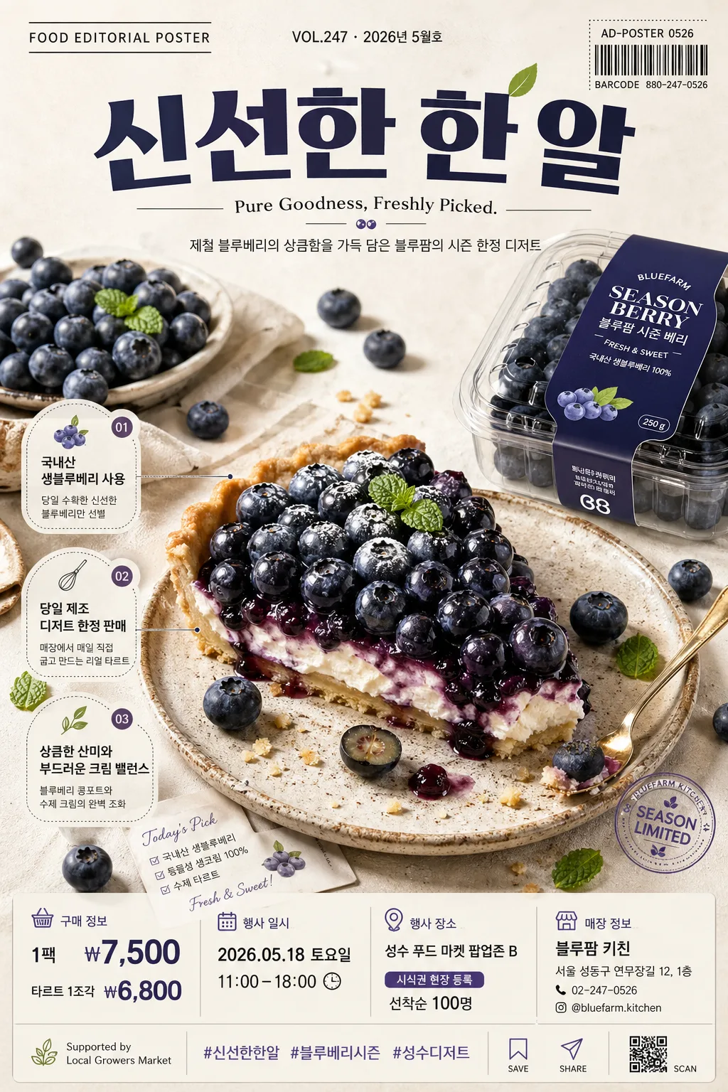
푸드 에디토리얼 광고 포스터
8K hyper-realistic food editorial infographic 광고 포스터. 3:4 vertical, 식품 한 가지 (블루베리·과자·디저트 등) 클로즈업 + 매거진 톤 카피·태그.
푸드 에디토리얼 광고 포스터 검색 요약
푸드 에디토리얼 광고 포스터은 광고/포스터 결과물을 만들 때 바로 복사해 활용할 수 있는 ChatGPT 이미지 프롬프트입니다. 주제, 배경, 스타일, 구도 조건을 함께 담아 빠르게 시안을 만들 수 있도록 구성했습니다.
관련 키워드: 푸드 에디토리얼 광고 포스터, 푸드 에디토리얼 광고 포스터 프롬프트, 광고/포스터 프롬프트, 광고/포스터 AI 이미지 프롬프트, ChatGPT 이미지 프롬프트, AI 이미지 생성 프롬프트, AI 프롬프트, 이미지 프롬프트
푸드 에디토리얼 광고 포스터 활용 포인트
원본 구조를 유지하면서 피사체, 배경, 색감, 구도를 바꿔 다양한 시안으로 확장할 수 있습니다.
- 핵심 소재는 유지하고 브랜드, 계절, 채널 목적에 맞는 색감과 배경을 바꿔보세요.
- 결과가 산만하면 배경 요소를 줄이고 피사체, 구도, 조명 조건을 구체화하세요.
- 복사한 뒤 ChatGPT에서 플랫폼, 화면 비율, 텍스트 포함 여부를 추가로 요청할 수 있습니다.
프롬프트 원문
[Input]
- language: Korean
- output_size: 1024x1536

[Purpose]
8K hyper-real food editorial advertising poster, vertical 3:4 format for social media, store display, and digital campaign use.
Create a premium food feature page that combines magazine-cover polish with practical advertising information: product hero, seasonal campaign copy, price, event details, store contact, and small editorial callouts.

[Composition]
- The main hero subject occupies the center 55–60% of the frame, with {식품} styled as the dominant focal point and {제품브랜드} treated as supporting packaging, label, or brand presentation.
- Composition should follow a refined vertical editorial poster layout: top masthead and headline band, central food hero zone, side caption tags, and bottom information strip with price, date, venue, and contact details.
- Background treatment: warm white or soft beige seamless surface with subtle natural paper, matte ceramic, linen, or stone texture, plus realistic shadow falloff that makes the food feel physically present.
- Add natural food-ad details around the hero: ingredient fragments, crumbs, droplets, seeds, garnish, a small spoon, folded linen, sample card, barcode sticker, or tiny tasting note card that supports the product story.
- Use {구도} as the structural composition guide, but keep the layout polished, commercial, and easy to read at mobile poster scale.
- Use {레이아웃} as the text zoning guide, with visible separation between headline, tagline, editorial feature bullets, and lower purchase/event blocks.

[3. CORE STRUCTURE]
1. Top zone (top 15–20%): place a magazine-style masthead label reading {상단라벨}, issue/date text reading {발행정보}, a bold main Korean campaign headline reading {메인카피}, and a compact English tagline reading {영문태그라인}. Add a small barcode-style block or campaign code reading {캠페인코드} near the top-right or lower-right edge.
2. Hero zone (middle 55–60%): render {식품} with crisp surface detail, vivid natural texture, realistic moisture, powder, sugar, skin, crumb, or juice details depending on the food. If {제품브랜드} is a package, show it as a secondary object with realistic label placement, folds, reflections, and accurate perspective.
3. Editorial callout zone: integrate 2–3 small feature headlines in Korean, such as {특징카피1}, {특징카피2}, and {특징카피3}, placed as small caption cards, circular sticker tabs, or thin-line annotation labels pointing toward the food.
4. Lower information zone (bottom 15–20%): place {가격}, {행사일시}, {장소}, {티켓정보}, {매장명}, {주소}, and {연락처} in a tidy infographic row or stacked micro-card system, using thin dividers, small icons, and clear alignment.
5. Sponsor and social zone: include a small sponsor/support line reading {스폰서문구}, hashtag text reading {해시태그}, and micro social icons for save/share/scan as printed graphic elements.
6. Text layering: use {텍스트톤} for the main typography style, with Korean micro-copy integrated as supporting captions, ingredient notes, price tags, and event labels.

[4. STYLE RULES]
- Typography: use Pretendard Bold or Inter Bold for the headline, Noto Sans KR Medium for Korean subtext, and a strong size hierarchy that clearly favors the hero image while keeping campaign information readable.
- Color palette: use the natural tones of {컬러톤}, with off-white #F4F0E6, warm beige #E9DDC8, soft shadow gray #B9B1A4, and product-specific accent colors derived from the food.
- Graphic system: add refined editorial dividers, small sticker labels, barcode/campaign-code typography, price tags, ingredient callout cards, and a compact sponsor area that feels like a premium printed advertising poster.
- Border/shadow: apply soft poster-card depth with 4px y-offset, 12px blur, and 15% opacity, plus tactile paper grain and subtle ink-like typography edges.
- Layout polish: align all text blocks to a consistent grid, use generous line spacing for Korean captions, and make every price, date, and contact line legible.

[5. VISUAL STYLE]
- Camera / lens: medium-format studio food photography look, Phase One IQ4 with 80mm lens at f/8 for sharp texture and controlled depth, or a 100mm macro look for close detail.
- Lighting: softbox key light from upper-left at 45°, gentle fill from the front-right, subtle rim light on the far edge, creating clean realistic shadows on the background.
- Color grade: premium editorial grade with warm cream highlights, rich natural product saturation, and slightly muted beige shadows; maintain clean contrast with appetizing food color and realistic print-ready tones.

[6. MOOD]
Premium food magazine editorial — like a Kinfolk meets Bon Appétit campaign spread, with refined studio styling, appetizing realism, market-poster usefulness, and high-end commercial polish.

[7. CRITICAL]
- Korean text accuracy: the following Korean strings must appear exactly as rendered text when used in the design: "{메인카피}", "{한글보조카피}", "{특징카피1}", "{특징카피2}", "{특징카피3}".
- Practical poster information must remain legible and correctly spelled in Korean: "{가격}", "{행사일시}", "{장소}", "{티켓정보}", "{매장명}", "{주소}", "{연락처}".
- Any ingredient, packaging, barcode-style campaign code, sponsor line, and hashtag text must remain clean, readable, and visually integrated with the food editorial layout.

[8. 🚫 PROHIBITED]
- Fake official seals / certifications
- Broken Korean characters
- Celebrity composites or face swaps