広告・ポスター
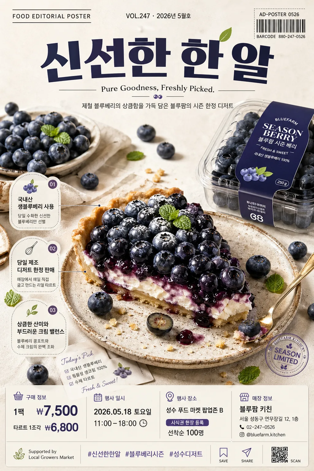
푸드 에디토리얼 광고 포스터
8K hyper-realistic food editorial infographic 광고 포스터. 3:4 vertical, 식품 한 가지 (블루베리·과자·디저트 등) 클로즈업 + 매거진 톤 카피·태그.
푸드 에디토리얼 광고 포스터の概要
広告・ポスター画像を作るためのChatGPT画像プロンプトです。主題、背景、スタイル、構図を整理し、すぐに試せるよう構成しています。
関連キーワード: 푸드 에디토리얼 광고 포스터, 푸드 에디토리얼 광고 포스터 프롬프트, 広告・ポスター 프롬프트, 広告・ポスター AI 이미지 프롬프트, ChatGPT 이미지 프롬프트, AI 이미지 생성 프롬프트, AI 프롬프트, 이미지 프롬프트
푸드 에디토리얼 광고 포스터の活用方法
元の構造を保ちながら、被写体、背景、色、構図を変更して別案に展開できます。
- 主題を維持し、ブランドや季節、媒体に合わせて色と背景を変更してください。
- 結果が複雑な場合は背景要素を減らし、被写体、構図、照明を具体化してください。
- コピー後、ChatGPTに媒体、アスペクト比、文字の有無を追加で指定できます。
プロンプト原文
[Input]
- language: Korean
- output_size: 1024x1536

[Purpose]
8K hyper-real food editorial advertising poster, vertical 3:4 format for social media, store display, and digital campaign use.
Create a premium food feature page that combines magazine-cover polish with practical advertising information: product hero, seasonal campaign copy, price, event details, store contact, and small editorial callouts.

[Composition]
- The main hero subject occupies the center 55–60% of the frame, with {식품} styled as the dominant focal point and {제품브랜드} treated as supporting packaging, label, or brand presentation.
- Composition should follow a refined vertical editorial poster layout: top masthead and headline band, central food hero zone, side caption tags, and bottom information strip with price, date, venue, and contact details.
- Background treatment: warm white or soft beige seamless surface with subtle natural paper, matte ceramic, linen, or stone texture, plus realistic shadow falloff that makes the food feel physically present.
- Add natural food-ad details around the hero: ingredient fragments, crumbs, droplets, seeds, garnish, a small spoon, folded linen, sample card, barcode sticker, or tiny tasting note card that supports the product story.
- Use {구도} as the structural composition guide, but keep the layout polished, commercial, and easy to read at mobile poster scale.
- Use {레이아웃} as the text zoning guide, with visible separation between headline, tagline, editorial feature bullets, and lower purchase/event blocks.

[3. CORE STRUCTURE]
1. Top zone (top 15–20%): place a magazine-style masthead label reading {상단라벨}, issue/date text reading {발행정보}, a bold main Korean campaign headline reading {메인카피}, and a compact English tagline reading {영문태그라인}. Add a small barcode-style block or campaign code reading {캠페인코드} near the top-right or lower-right edge.
2. Hero zone (middle 55–60%): render {식품} with crisp surface detail, vivid natural texture, realistic moisture, powder, sugar, skin, crumb, or juice details depending on the food. If {제품브랜드} is a package, show it as a secondary object with realistic label placement, folds, reflections, and accurate perspective.
3. Editorial callout zone: integrate 2–3 small feature headlines in Korean, such as {특징카피1}, {특징카피2}, and {특징카피3}, placed as small caption cards, circular sticker tabs, or thin-line annotation labels pointing toward the food.
4. Lower information zone (bottom 15–20%): place {가격}, {행사일시}, {장소}, {티켓정보}, {매장명}, {주소}, and {연락처} in a tidy infographic row or stacked micro-card system, using thin dividers, small icons, and clear alignment.
5. Sponsor and social zone: include a small sponsor/support line reading {스폰서문구}, hashtag text reading {해시태그}, and micro social icons for save/share/scan as printed graphic elements.
6. Text layering: use {텍스트톤} for the main typography style, with Korean micro-copy integrated as supporting captions, ingredient notes, price tags, and event labels.

[4. STYLE RULES]
- Typography: use Pretendard Bold or Inter Bold for the headline, Noto Sans KR Medium for Korean subtext, and a strong size hierarchy that clearly favors the hero image while keeping campaign information readable.
- Color palette: use the natural tones of {컬러톤}, with off-white #F4F0E6, warm beige #E9DDC8, soft shadow gray #B9B1A4, and product-specific accent colors derived from the food.
- Graphic system: add refined editorial dividers, small sticker labels, barcode/campaign-code typography, price tags, ingredient callout cards, and a compact sponsor area that feels like a premium printed advertising poster.
- Border/shadow: apply soft poster-card depth with 4px y-offset, 12px blur, and 15% opacity, plus tactile paper grain and subtle ink-like typography edges.
- Layout polish: align all text blocks to a consistent grid, use generous line spacing for Korean captions, and make every price, date, and contact line legible.

[5. VISUAL STYLE]
- Camera / lens: medium-format studio food photography look, Phase One IQ4 with 80mm lens at f/8 for sharp texture and controlled depth, or a 100mm macro look for close detail.
- Lighting: softbox key light from upper-left at 45°, gentle fill from the front-right, subtle rim light on the far edge, creating clean realistic shadows on the background.
- Color grade: premium editorial grade with warm cream highlights, rich natural product saturation, and slightly muted beige shadows; maintain clean contrast with appetizing food color and realistic print-ready tones.

[6. MOOD]
Premium food magazine editorial — like a Kinfolk meets Bon Appétit campaign spread, with refined studio styling, appetizing realism, market-poster usefulness, and high-end commercial polish.

[7. CRITICAL]
- Korean text accuracy: the following Korean strings must appear exactly as rendered text when used in the design: "{메인카피}", "{한글보조카피}", "{특징카피1}", "{특징카피2}", "{특징카피3}".
- Practical poster information must remain legible and correctly spelled in Korean: "{가격}", "{행사일시}", "{장소}", "{티켓정보}", "{매장명}", "{주소}", "{연락처}".
- Any ingredient, packaging, barcode-style campaign code, sponsor line, and hashtag text must remain clean, readable, and visually integrated with the food editorial layout.

[8. 🚫 PROHIBITED]
- Fake official seals / certifications
- Broken Korean characters
- Celebrity composites or face swaps