広告・ポスター
음료 시즌 화보 광고 포스터
음료 브랜드 광고 포스터. K-pop 여자 아이돌 모델 + 시즌 화보 (여름/겨울) + 다크 또는 화려 버전. 코카콜라·펩시·핫초코 등 응용.
음료 시즌 화보 광고 포스터の概要
広告・ポスター画像を作るためのChatGPT画像プロンプトです。主題、背景、スタイル、構図を整理し、すぐに試せるよう構成しています。
関連キーワード: 음료 시즌 화보 광고 포스터, 음료 시즌 화보 광고 포스터 프롬프트, 広告・ポスター 프롬프트, 広告・ポスター AI 이미지 프롬프트, ChatGPT 이미지 프롬프트, AI 이미지 생성 프롬프트, AI 프롬프트, 이미지 프롬프트
음료 시즌 화보 광고 포스터の活用方法
元の構造を保ちながら、被写体、背景、色、構図を変更して別案に展開できます。
- 主題を維持し、ブランドや季節、媒体に合わせて色と背景を変更してください。
- 結果が複雑な場合は背景要素を減らし、被写体、構図、照明を具体化してください。
- コピー後、ChatGPTに媒体、アスペクト比、文字の有無を追加で指定できます。
プロンプト原文
[Input]
- language: Korean
- output_size: 1024x1536

[Purpose]
Seasonal beverage campaign advertising poster, premium K-pop-inspired commercial key visual for social media, retail display, and outdoor-style promo.
Vertical 3:4 poster that combines a stylish model, clear product heroing, realistic campaign details, and a headline copy system with polished Korean advertising typography.

[Composition]
- Main subject: {모델 묘사} occupies the central 55–60% of the frame, with the product integrated beside or in hand as a secondary hero.
- Layout: {비율·구도} with strong vertical hierarchy; headline/campaign masthead at the upper 18%, model mid-frame, product hero, launch details, and sponsor strip in the lower 22%.
- Background treatment: {시즌·무드} rendered as a cinematic lifestyle set with season-specific props, tactile surfaces, fabric movement, condensation, light reflections, and realistic depth cues that support ad readability.
- Product handling: {제품 배치} with the label facing camera, crisp condensation highlights, accurate can/bottle geometry, edge highlights preserved, and packaging silhouette clearly visible.
- Add realistic poster information: small campaign date label, limited edition note, launch event details, venue/time line, ticket or QR-style block, sponsor/retail partner area, and fine-print credit text.
- Use {브랜드·제품}, {시즌·무드}, {모델 묘사}, {버전}, {제품 배치}, {시그니처 카피}, {비율·구도} as user-configurable content anchors.

[3. CORE STRUCTURE]
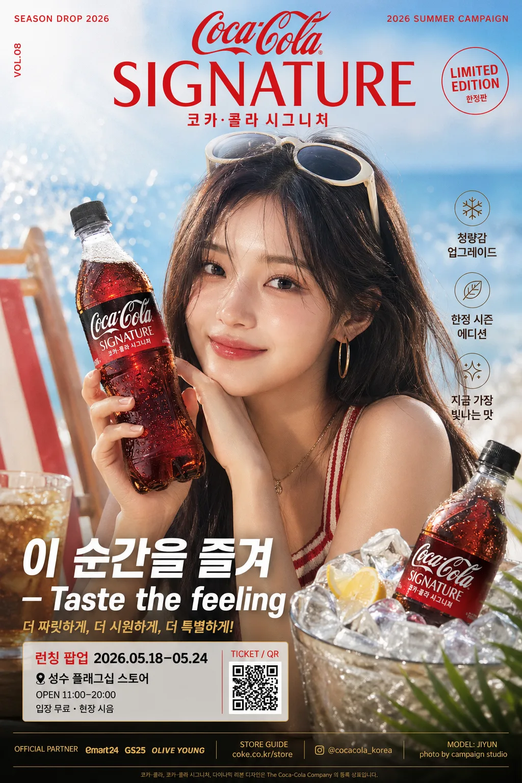
1. Header zone (top 18%): place the brand/product identity as a strong campaign title treatment, aligned center or slightly left depending on composition balance. Include a small issue-like campaign label such as "SEASON DROP 2026", "VOL.08", and "2026 SUMMER CAMPAIGN" near the title.
2. Hero zone (mid 55–60%): position {모델 묘사} as the dominant figure with fashion-editorial posture, natural facial expression, clean skin detail, styled hair, accessories, and clear separation from the background.
3. Product zone (lower-mid or side hero): place {브랜드·제품} as a crisp commercial packshot or handheld product element, ensuring the label is fully legible and front-facing. Add realistic beverage cues such as condensation beads, ice glints, splash highlights, fruit/herb garnish, or reflective tray surfaces when suitable for {시즌·무드}.
4. Seasonal styling zone: build the environment from {시즌·무드} cues, using props, fabrics, lighting accents, surface materials, seasonal color accents, and background set pieces that reinforce the chosen seasonal identity.
5. Copy zone (lower 18–22%): set the main slogan "{시그니처 카피}" in a bold, high-contrast advertising lockup. Add 2–3 short Korean supporting blurbs that do not overpower the slogan, such as "청량감 업그레이드", "한정 시즌 에디션", "지금 가장 빛나는 맛".
6. Event / retail detail zone: include compact poster-style information in Korean: "런칭 팝업 2026.05.18–05.24", "성수 플래그십 스토어", "OPEN 11:00–20:00", "입장 무료 · 현장 시음", plus a small QR/barcode-like ticket block labeled "TICKET / QR".
7. Sponsor / credit zone: add a narrow bottom strip with tiny sponsor-style text such as "OFFICIAL PARTNER", "STORE GUIDE", "@brand_korea", "photo by campaign studio", and model-name credit "MODEL: JIYUN" while keeping it visually secondary.
8. Finishing zone: apply {버전} look through contrast, tonal separation, highlight control, realistic reflections, and print-ad finishing so the image reads as a polished global beverage campaign poster.

[4. STYLE RULES]
- Typography: use Pretendard Bold or Noto Sans KR Bold for the main copy, with 44–72px headline scale, tight leading, and slightly expanded tracking for premium ad clarity.
- Supporting text style: Pretendard Medium or Nanum Gothic at 18–28px for campaign details, event lines, sponsor strip, QR label, and secondary brand lines, using a clear editorial grid.
- Korean text hierarchy: largest text should be "{시그니처 카피}" or the product campaign title; supporting blurbs must be short, realistic, and readable.
- Color palette: derive from {버전} and {시즌·무드}; for dark campaigns use black #0B0B0D, deep gold #B8944A, and charcoal #2A2A2E; for light campaigns use ivory #F7F3EA, sky blue #BFE8FF, and cool white #FFFFFF.
- Graphic elements: include tasteful seasonal decorative marks such as thin diagonal rules, small sparkle icons, splash shapes, rounded ticket boxes, QR/barcode block, sponsor strip, and subtle product glow effects.
- Border/shadow: subtle soft drop shadow, 4px y-offset, 14px blur, 18% opacity; product edges may use a thin rim light instead of a hard outline.

[5. VISUAL STYLE]
- Camera / lens: editorial commercial photography, full-frame 85mm f/1.4 portrait look for the model and product, with controlled background compression and sharp packshot detail.
- Lighting: studio key light at 45° from upper-left, soft fill from front-right, and a gentle rim light separating hair, shoulders, product edges, condensation droplets, and glass/metal highlights.
- Color grade: choose either high-contrast noir gold for the dark version or bright clean aqua-cream for the light version, with premium beverage-ad colors, crisp skin tones, glossy product reflections, and realistic print-poster contrast.
- Surface realism: show believable fabric texture, cool condensation, wet highlights, ice or splash reflections, acrylic/glass surfaces, paper-poster grain, and depth-of-field falloff appropriate to the campaign set.

[6. MOOD]
Global beverage campaign editorial — somewhere between a Vogue Korea beauty spread and a high-end Pepsi/Cola-style commercial poster, with fashion-forward polish, retail launch energy, seasonal freshness, and broadcast-grade finish.

[7. CRITICAL]
- Korean text accuracy: the following Korean string must appear exactly and cleanly in the rendered image: "이 순간을 즐겨".
- Korean text accuracy: supporting Korean poster text may include "청량감 업그레이드", "한정 시즌 에디션", "런칭 팝업 2026.05.18–05.24", "성수 플래그십 스토어", "입장 무료 · 현장 시음", and "지금 가장 빛나는 맛"; render all Korean characters cleanly and naturally.
- Korean text accuracy: preserve the chosen visible brand/product wording, season wording, model description cues, version label cues, product placement cues, and ratio/composition cues only as layout guidance; do not render placeholder braces.
- Product anatomy/layout invariants: product label must be readable, straight, and not warped; model hands must look natural with anatomically correct fingers.
- If multiple product elements appear, keep the same brand identity and consistent packaging design across the whole poster.

[8. 🚫 PROHIBITED]
- Fake official seals / certifications
- Broken Korean characters
- Celebrity composites / unauthorized likeness