광고/포스터
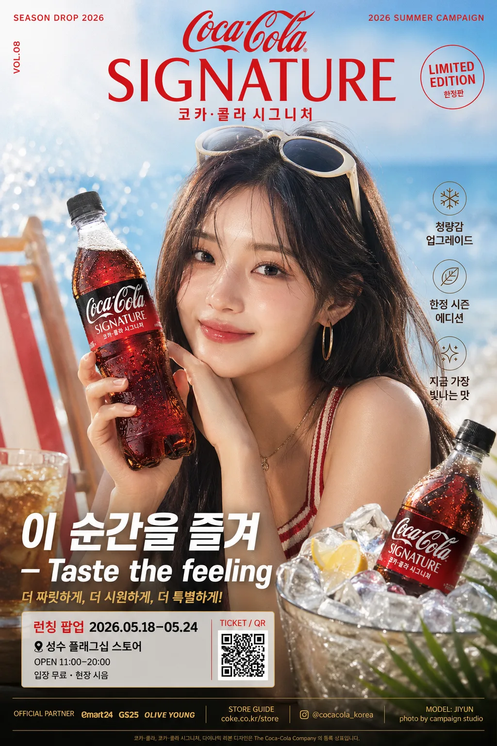
음료 시즌 화보 광고 포스터
음료 브랜드 광고 포스터. K-pop 여자 아이돌 모델 + 시즌 화보 (여름/겨울) + 다크 또는 화려 버전. 코카콜라·펩시·핫초코 등 응용.
음료 시즌 화보 광고 포스터 검색 요약
음료 시즌 화보 광고 포스터은 광고/포스터 결과물을 만들 때 바로 복사해 활용할 수 있는 ChatGPT 이미지 프롬프트입니다. 주제, 배경, 스타일, 구도 조건을 함께 담아 빠르게 시안을 만들 수 있도록 구성했습니다.
관련 키워드: 음료 시즌 화보 광고 포스터, 음료 시즌 화보 광고 포스터 프롬프트, 광고/포스터 프롬프트, 광고/포스터 AI 이미지 프롬프트, ChatGPT 이미지 프롬프트, AI 이미지 생성 프롬프트, AI 프롬프트, 이미지 프롬프트
음료 시즌 화보 광고 포스터 활용 포인트
원본 구조를 유지하면서 피사체, 배경, 색감, 구도를 바꿔 다양한 시안으로 확장할 수 있습니다.
- 핵심 소재는 유지하고 브랜드, 계절, 채널 목적에 맞는 색감과 배경을 바꿔보세요.
- 결과가 산만하면 배경 요소를 줄이고 피사체, 구도, 조명 조건을 구체화하세요.
- 복사한 뒤 ChatGPT에서 플랫폼, 화면 비율, 텍스트 포함 여부를 추가로 요청할 수 있습니다.
프롬프트 원문
[Input]
- language: Korean
- output_size: 1024x1536

[Purpose]
Seasonal beverage campaign advertising poster, premium K-pop-inspired commercial key visual for social media, retail display, and outdoor-style promo.
Vertical 3:4 poster that combines a stylish model, clear product heroing, realistic campaign details, and a headline copy system with polished Korean advertising typography.

[Composition]
- Main subject: {모델 묘사} occupies the central 55–60% of the frame, with the product integrated beside or in hand as a secondary hero.
- Layout: {비율·구도} with strong vertical hierarchy; headline/campaign masthead at the upper 18%, model mid-frame, product hero, launch details, and sponsor strip in the lower 22%.
- Background treatment: {시즌·무드} rendered as a cinematic lifestyle set with season-specific props, tactile surfaces, fabric movement, condensation, light reflections, and realistic depth cues that support ad readability.
- Product handling: {제품 배치} with the label facing camera, crisp condensation highlights, accurate can/bottle geometry, edge highlights preserved, and packaging silhouette clearly visible.
- Add realistic poster information: small campaign date label, limited edition note, launch event details, venue/time line, ticket or QR-style block, sponsor/retail partner area, and fine-print credit text.
- Use {브랜드·제품}, {시즌·무드}, {모델 묘사}, {버전}, {제품 배치}, {시그니처 카피}, {비율·구도} as user-configurable content anchors.

[3. CORE STRUCTURE]
1. Header zone (top 18%): place the brand/product identity as a strong campaign title treatment, aligned center or slightly left depending on composition balance. Include a small issue-like campaign label such as "SEASON DROP 2026", "VOL.08", and "2026 SUMMER CAMPAIGN" near the title.
2. Hero zone (mid 55–60%): position {모델 묘사} as the dominant figure with fashion-editorial posture, natural facial expression, clean skin detail, styled hair, accessories, and clear separation from the background.
3. Product zone (lower-mid or side hero): place {브랜드·제품} as a crisp commercial packshot or handheld product element, ensuring the label is fully legible and front-facing. Add realistic beverage cues such as condensation beads, ice glints, splash highlights, fruit/herb garnish, or reflective tray surfaces when suitable for {시즌·무드}.
4. Seasonal styling zone: build the environment from {시즌·무드} cues, using props, fabrics, lighting accents, surface materials, seasonal color accents, and background set pieces that reinforce the chosen seasonal identity.
5. Copy zone (lower 18–22%): set the main slogan "{시그니처 카피}" in a bold, high-contrast advertising lockup. Add 2–3 short Korean supporting blurbs that do not overpower the slogan, such as "청량감 업그레이드", "한정 시즌 에디션", "지금 가장 빛나는 맛".
6. Event / retail detail zone: include compact poster-style information in Korean: "런칭 팝업 2026.05.18–05.24", "성수 플래그십 스토어", "OPEN 11:00–20:00", "입장 무료 · 현장 시음", plus a small QR/barcode-like ticket block labeled "TICKET / QR".
7. Sponsor / credit zone: add a narrow bottom strip with tiny sponsor-style text such as "OFFICIAL PARTNER", "STORE GUIDE", "@brand_korea", "photo by campaign studio", and model-name credit "MODEL: JIYUN" while keeping it visually secondary.
8. Finishing zone: apply {버전} look through contrast, tonal separation, highlight control, realistic reflections, and print-ad finishing so the image reads as a polished global beverage campaign poster.

[4. STYLE RULES]
- Typography: use Pretendard Bold or Noto Sans KR Bold for the main copy, with 44–72px headline scale, tight leading, and slightly expanded tracking for premium ad clarity.
- Supporting text style: Pretendard Medium or Nanum Gothic at 18–28px for campaign details, event lines, sponsor strip, QR label, and secondary brand lines, using a clear editorial grid.
- Korean text hierarchy: largest text should be "{시그니처 카피}" or the product campaign title; supporting blurbs must be short, realistic, and readable.
- Color palette: derive from {버전} and {시즌·무드}; for dark campaigns use black #0B0B0D, deep gold #B8944A, and charcoal #2A2A2E; for light campaigns use ivory #F7F3EA, sky blue #BFE8FF, and cool white #FFFFFF.
- Graphic elements: include tasteful seasonal decorative marks such as thin diagonal rules, small sparkle icons, splash shapes, rounded ticket boxes, QR/barcode block, sponsor strip, and subtle product glow effects.
- Border/shadow: subtle soft drop shadow, 4px y-offset, 14px blur, 18% opacity; product edges may use a thin rim light instead of a hard outline.

[5. VISUAL STYLE]
- Camera / lens: editorial commercial photography, full-frame 85mm f/1.4 portrait look for the model and product, with controlled background compression and sharp packshot detail.
- Lighting: studio key light at 45° from upper-left, soft fill from front-right, and a gentle rim light separating hair, shoulders, product edges, condensation droplets, and glass/metal highlights.
- Color grade: choose either high-contrast noir gold for the dark version or bright clean aqua-cream for the light version, with premium beverage-ad colors, crisp skin tones, glossy product reflections, and realistic print-poster contrast.
- Surface realism: show believable fabric texture, cool condensation, wet highlights, ice or splash reflections, acrylic/glass surfaces, paper-poster grain, and depth-of-field falloff appropriate to the campaign set.

[6. MOOD]
Global beverage campaign editorial — somewhere between a Vogue Korea beauty spread and a high-end Pepsi/Cola-style commercial poster, with fashion-forward polish, retail launch energy, seasonal freshness, and broadcast-grade finish.

[7. CRITICAL]
- Korean text accuracy: the following Korean string must appear exactly and cleanly in the rendered image: "이 순간을 즐겨".
- Korean text accuracy: supporting Korean poster text may include "청량감 업그레이드", "한정 시즌 에디션", "런칭 팝업 2026.05.18–05.24", "성수 플래그십 스토어", "입장 무료 · 현장 시음", and "지금 가장 빛나는 맛"; render all Korean characters cleanly and naturally.
- Korean text accuracy: preserve the chosen visible brand/product wording, season wording, model description cues, version label cues, product placement cues, and ratio/composition cues only as layout guidance; do not render placeholder braces.
- Product anatomy/layout invariants: product label must be readable, straight, and not warped; model hands must look natural with anatomically correct fingers.
- If multiple product elements appear, keep the same brand identity and consistent packaging design across the whole poster.

[8. 🚫 PROHIBITED]
- Fake official seals / certifications
- Broken Korean characters
- Celebrity composites / unauthorized likeness