興趣/生活
여행 다이어리 손글씨 메모
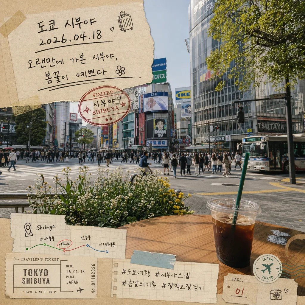
여행 사진 + 다이어리 페이지 손글씨 합성. 도시·관광지 + 도장 스탬프·티켓·작은 일러스트 + 한 줄 후기.
여행 다이어리 손글씨 메모摘要
這是用來製作興趣/生活內容的 ChatGPT 圖像提示詞,已整理主題、背景、風格與構圖,方便快速調整。
相關關鍵字: 여행 다이어리 손글씨 메모, 여행 다이어리 손글씨 메모 프롬프트, 興趣/生活 프롬프트, 興趣/生活 AI 이미지 프롬프트, ChatGPT 이미지 프롬프트, AI 이미지 생성 프롬프트, AI 프롬프트, 이미지 프롬프트
여행 다이어리 손글씨 메모使用方式
保留原始結構並替換主體、背景、色彩或構圖,即可延伸出不同版本。
- 保留核心主體,並依品牌、季節或平台調整色彩與背景。
- 如果畫面太複雜,請減少背景元素並具體描述主體、構圖與光線。
- 複製後可要求 ChatGPT 配合平台、長寬比或文字需求調整。
提示詞原文
[Input]
- reference_image: {참고 이미지}
- language: Korean
- output_size: 1024x1024

[Purpose]
Travel diary memo composite over an attached trip photo, styled like a real handwritten scrapbook page for Instagram, blog, or personal diary use.
Korean travel note layout with stamped date, doodles, ticket-stub details, washi tape, small captions, and kraft-paper stationery aesthetics.

[Composition]
- The attached photo fills the main canvas as the base layer, with a handwritten diary overlay occupying about 25% of the frame on natural paper areas, sky, pavement, table surface, or visually calm parts of the image.
- Keep the travel scene clearly visible; handwritten elements should feel physically placed on top like paper scraps, transparent memo tape, ink stamps, and gel-pen marks interacting with the photo.
- Use {원본 보존} as the underlying photo content, with the memo arranged in a casual but readable notebook composition.
- Background paper treatment should mimic {배경 종이}, blended into the photo like a scrapbook insert with torn edges, tape corners, and slight paper curl rather than a full rigid frame.
- Spacing should feel uneven and human-made: slightly tilted lines, varied margins, overlapping paper scraps, little correction marks, and a relaxed handwritten placement style.
- Add a small travel-log cluster near the lower edge: tiny ticket stub, route line, page number, location pin doodle, and hashtag-style diary tags that support the trip story.

[3. CORE STRUCTURE]
- Base layer: preserve {원본 보존} as the full-color travel photo, with faithful cropping and no artificial blur or heavy vignette.
- Upper memo zone: place {여행지·날짜} near the top or upper-left area in clear handwritten script, sized larger than the body note for instant recognition.
- Body note zone: place {후기 한 줄} below the title/date line, written like a casual diary sentence with slightly irregular pen pressure and one natural underline stroke.
- Stamp area: add {도장·스탬프} near the lower-right or beside the title, with realistic ink texture, slight offset printing, uneven pressure, and subtle smudge variation.
- Decoration layer: scatter {장식} around corners, tape seams, and small paper overlaps: hand-drawn arrows, tiny flower doodles, metro-line marks, a map pin, film-frame ticks, and a small coffee-ring stain.
- Paper integration: let {배경 종이} appear as layered partial overlays: one kraft memo slip, one translucent tracing-paper label, and a small torn receipt-style strip with visible notebook ruling or grid where it does not conflict with the photo.
- Color application: render everything using {컬러 톤} so the handwriting, stamp, stickers, tape, paper fibers, and doodles harmonize with the travel photo.
- Add realistic scrapbook details: semi-transparent masking tape at two corners, a tiny printed travel label, a small diary page indicator, and subtle paper grain that catches the same light direction as the photo.

[4. STYLE RULES]
- Typography: handwritten Korean script style, uneven marker pen and gel pen mix; title/date at about 28–36 px equivalent, body note at 18–24 px equivalent, with natural line breaks.
- Supporting micro text: combine tiny printed sans-serif labels and hand-lettered Korean notes; keep micro text plausible like a personal diary, ticket memo, or photo caption.
- Color palette: craft beige, matte black ink, vintage red stamp, tiny cyan accents; keep saturation muted and paper-friendly.
- Paper/shadow: use faint paper-edge shadows, 2–4 px y-offset, 8–12 px blur, around 10–15% opacity; add soft torn-paper fibers, tape translucency, and realistic ink absorption.
- Layout texture: allow slight overlaps between tape, paper, stamp, and doodles so the page feels assembled by hand after the trip.

[5. VISUAL STYLE]
- Camera / lens: documentary travel photo look, 35mm or 50mm equivalent, natural perspective, no exaggerated wide-angle distortion.
- Lighting: preserve the original photo lighting; add only subtle overlay lightness from a soft top-left daylight feel, as if written on a notebook placed near a window.
- Color grade: kraft beige + black ink + vintage red + micro cyan, with slightly faded analog postcard tones and restrained contrast.
- Material realism: visible paper fibers, slight ink feathering, stamped ink grain, transparent tape sheen, tiny scratches on the photo surface, and a gentle scanned-diary quality.

[6. MOOD]
Personal travel journal snapshot — like a Kinfolk-style scrapbook page mixed with a real handwritten memo in a Moleskine notebook, including the lived-in charm of tickets, stamps, tape, and small after-trip notes.

[7. CRITICAL]
- Korean text accuracy: the following strings must appear exactly as written:
  - "도쿄 시부야 / 2026.04.18"
  - "오랜만에 가본 시부야, 봄꽃이 예쁘다"
  - "VISITED"
- Add small supporting diary text exactly as written where space allows:
  - "TRAVEL NOTE 03"
  - "시부야역 8번 출구"
  - "봄 산책 기록"
  - "#도쿄여행 #시부야산책"
- The stamp must include both Korean and English city labeling as part of the vintage stamp treatment.
- Handwriting must remain legible, with no broken Korean characters, no scrambled line order, and no text clipping.
- Keep the original travel photo recognizable and unobscured by the memo overlay.

[8. 🚫 PROHIBITED]
- Fake official seals / certifications
- Broken Korean characters