SNS/카드뉴스
영수증 후기 손글씨 메모
영수증·식당 계산서·티켓 위에 손글씨 별점·메모·만족도. 푸드 블로그·맛집 후기 인스타.
영수증 후기 손글씨 메모 검색 요약
영수증 후기 손글씨 메모은 SNS/카드뉴스 결과물을 만들 때 바로 복사해 활용할 수 있는 ChatGPT 이미지 프롬프트입니다. 주제, 배경, 스타일, 구도 조건을 함께 담아 빠르게 시안을 만들 수 있도록 구성했습니다.
관련 키워드: 영수증 후기 손글씨 메모, 영수증 후기 손글씨 메모 프롬프트, SNS/카드뉴스 프롬프트, SNS/카드뉴스 AI 이미지 프롬프트, ChatGPT 이미지 프롬프트, AI 이미지 생성 프롬프트, AI 프롬프트, 이미지 프롬프트
영수증 후기 손글씨 메모 활용 포인트
원본 구조를 유지하면서 피사체, 배경, 색감, 구도를 바꿔 다양한 시안으로 확장할 수 있습니다.
- 핵심 소재는 유지하고 브랜드, 계절, 채널 목적에 맞는 색감과 배경을 바꿔보세요.
- 결과가 산만하면 배경 요소를 줄이고 피사체, 구도, 조명 조건을 구체화하세요.
- 복사한 뒤 ChatGPT에서 플랫폼, 화면 비율, 텍스트 포함 여부를 추가로 요청할 수 있습니다.
프롬프트 원문
[Input]
- reference_image: {참고 이미지}
- language: Korean
- output_size: 1024x1024

[Purpose]
Create an i2i receipt-review composite where handwritten Korean feedback is naturally written over a real receipt, bill, or ticket photo for Instagram, blog, or diary use.
Keep the result as an authentic personal food-review memo: a photographed receipt with practical transaction details, quick pen marks, and believable everyday context rather than a promotional ad.

[Composition]
- Base document fills the square frame: {원본 보존} is preserved as the underlying photographed paper, with receipt edges, folds, curled corners, thermal-print texture, small stains, and slight perspective remaining visible.
- Keep realistic receipt content visible: store name, order number, table or takeout label, itemized menu rows, prices, tax/total area, payment line, approval number, and a small barcode or QR-style payment block may remain or be reconstructed from the original reference if appropriate.
- Main annotation zone: the center and lower-middle area carry the handwritten review, while original item lines remain readable enough to feel like a real food receipt.
- Location/date line: place {가게·날짜} near the upper third or a naturally blank area of the receipt, aligned as if written quickly by hand with a real pen.
- Rating and short comment: {별점·메모} sits beside or slightly below the date line, sized larger than the rest so it reads as the emotional anchor.
- Recommendation marks: {추천 메뉴 표시} should appear directly on specific menu lines in the receipt, with circles, stars, arrows, check marks, or underlines drawn in pen ink only.
- Add small realistic review-memo details: a tiny handwritten “재방문 의사 있음”, “혼밥 추천”, or “다음엔 매운맛” note may be placed in the margin if it fits the receipt, without covering the required strings.
- Handwriting treatment: {손글씨 톤} should follow the paper perspective and real ink pressure, including slight stroke variation, tiny pen skips, uneven ink pooling, and natural hesitation marks.

[3. CORE STRUCTURE]
1. Background layer — keep the photographed receipt, bill, or ticket intact, with visible paper fiber, thermal print density, fold shadows, thumb-smoothed creases, and natural contact shadows from the original capture.
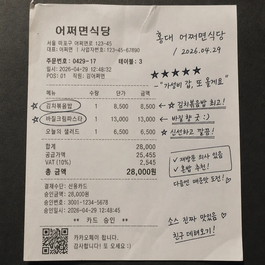
2. Receipt information layer — maintain or enrich believable printed receipt details such as “어쩌면식당”, “주문번호 0429-17”, “테이블 3”, “김치볶음밥 8,500”, “바질크림파스타 13,000”, “오늘의 샐러드 6,500”, “합계 28,000원”, “카드 승인”, “VAT 포함”, and a small barcode/QR area near the bottom if the original layout supports it.
3. Header note area — write {가게·날짜} in a compact handwritten style near the top section, using a slight rightward slant and realistic pen start/stop marks.
4. Rating line — place {별점·메모} in the most readable open space, with the stars drawn as handwritten marks rather than typed glyphs.
5. Item emphasis layer — apply {추천 메뉴 표시} directly over the relevant printed menu rows, using hand-drawn circles, asterisks, arrows, or underline strokes that follow the receipt’s printed alignment and paper perspective.
6. Margin memo layer — include one or two tiny diary-like Korean side notes, such as “소스 진짜 맛있음”, “친구 데려오기”, or “점심 웨이팅 10분”, written smaller than the main rating to add realism.
7. Ink integration — render {손글씨 톤} as if written on the original paper, with subtle transparency variation where the paper is textured, folded, glossy, or shadowed.
8. Final composite check — ensure the handwritten elements feel physically attached to the document, not floating above it, and keep original receipt details legible enough to support authenticity.

[4. STYLE RULES]
- Typography: handwritten Korean only for added notes; emulate casual pen writing with medium stroke weight, irregular baseline, slight pressure variation, and human inconsistency rather than font-like perfection.
- Printed receipt text: monospaced thermal-receipt style with imperfect ink density, slight fading, tiny alignment shifts, and plausible Korean menu/price formatting.
- Color palette: paper whites and creams from {컬러 톤}, with black, deep blue, and small red receipt-print accents; keep ink saturated but naturally absorbed into the paper.
- Paper and environment: allow natural receipt aging, tabletop grain, faint food smudges, tiny oil spots, coffee-ring traces, clipped paper corners, and realistic edge shadows when present or visually appropriate.
- Composition polish: preserve the casual phone-photo feel, including slight skew, uneven paper flatness, and believable document texture.

[5. VISUAL STYLE]
- Camera / lens: realistic smartphone document photo aesthetic, equivalent to a 26mm wide smartphone lens at f/1.8 with minimal distortion correction.
- Lighting: soft ambient indoor light from above-left, low contrast, with gentle shadow falloff and no harsh flash hotspot.
- Color grade: neutral paper white with slightly warm cream highlights, black ink, subdued red print accents, realistic blue or black pen marks, and restrained overall saturation.
- Detail rendering: high-resolution paper fibers, thermal print grain, subtle compression from a real phone image, and readable handwritten strokes at square social-media size.

[6. MOOD]
Everyday diary snapshot — feels like a real handwritten note made right after eating, photographed on a casual cafe or restaurant table, similar to a personal scrapbook food review rather than a commercial graphic.

[7. CRITICAL]
- Korean text accuracy: 반드시 정확히 보여야 하는 문자열: "홍대 어쩌면식당", "2026.04.29", "★★★★★", "가성비 갑, 또 올게요".
- The required strings should appear as handwritten review text, naturally arranged as {가게·날짜} and {별점·메모}, with the star rating clearly readable.
- Optional printed receipt microtext may include realistic Korean details such as “주문번호 0429-17”, “테이블 3”, “합계 28,000원”, “카드 승인”, and menu item names, but it must not conflict with the required strings.
- Handwriting must remain readable and naturally imperfect, but the required Korean text strings must not be misspelled, duplicated incorrectly, or turned into broken characters.
- The handwritten marks must sit on top of the original receipt content in a physically plausible way, matching paper perspective, fold shadows, ink absorption, and pen contact.

[8. 🚫 PROHIBITED]
- Fake official seals / certifications
- Broken Korean characters