社群/圖卡
영수증 후기 손글씨 메모
영수증·식당 계산서·티켓 위에 손글씨 별점·메모·만족도. 푸드 블로그·맛집 후기 인스타.
영수증 후기 손글씨 메모摘要
這是用來製作社群/圖卡內容的 ChatGPT 圖像提示詞,已整理主題、背景、風格與構圖,方便快速調整。
相關關鍵字: 영수증 후기 손글씨 메모, 영수증 후기 손글씨 메모 프롬프트, 社群/圖卡 프롬프트, 社群/圖卡 AI 이미지 프롬프트, ChatGPT 이미지 프롬프트, AI 이미지 생성 프롬프트, AI 프롬프트, 이미지 프롬프트
영수증 후기 손글씨 메모使用方式
保留原始結構並替換主體、背景、色彩或構圖,即可延伸出不同版本。
- 保留核心主體,並依品牌、季節或平台調整色彩與背景。
- 如果畫面太複雜,請減少背景元素並具體描述主體、構圖與光線。
- 複製後可要求 ChatGPT 配合平台、長寬比或文字需求調整。
提示詞原文
[Input]
- reference_image: {참고 이미지}
- language: Korean
- output_size: 1024x1024

[Purpose]
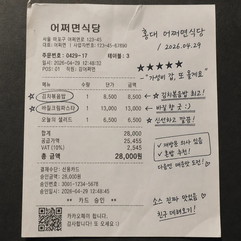
Create an i2i receipt-review composite where handwritten Korean feedback is naturally written over a real receipt, bill, or ticket photo for Instagram, blog, or diary use.
Keep the result as an authentic personal food-review memo: a photographed receipt with practical transaction details, quick pen marks, and believable everyday context rather than a promotional ad.

[Composition]
- Base document fills the square frame: {원본 보존} is preserved as the underlying photographed paper, with receipt edges, folds, curled corners, thermal-print texture, small stains, and slight perspective remaining visible.
- Keep realistic receipt content visible: store name, order number, table or takeout label, itemized menu rows, prices, tax/total area, payment line, approval number, and a small barcode or QR-style payment block may remain or be reconstructed from the original reference if appropriate.
- Main annotation zone: the center and lower-middle area carry the handwritten review, while original item lines remain readable enough to feel like a real food receipt.
- Location/date line: place {가게·날짜} near the upper third or a naturally blank area of the receipt, aligned as if written quickly by hand with a real pen.
- Rating and short comment: {별점·메모} sits beside or slightly below the date line, sized larger than the rest so it reads as the emotional anchor.
- Recommendation marks: {추천 메뉴 표시} should appear directly on specific menu lines in the receipt, with circles, stars, arrows, check marks, or underlines drawn in pen ink only.
- Add small realistic review-memo details: a tiny handwritten “재방문 의사 있음”, “혼밥 추천”, or “다음엔 매운맛” note may be placed in the margin if it fits the receipt, without covering the required strings.
- Handwriting treatment: {손글씨 톤} should follow the paper perspective and real ink pressure, including slight stroke variation, tiny pen skips, uneven ink pooling, and natural hesitation marks.

[3. CORE STRUCTURE]
1. Background layer — keep the photographed receipt, bill, or ticket intact, with visible paper fiber, thermal print density, fold shadows, thumb-smoothed creases, and natural contact shadows from the original capture.
2. Receipt information layer — maintain or enrich believable printed receipt details such as “어쩌면식당”, “주문번호 0429-17”, “테이블 3”, “김치볶음밥 8,500”, “바질크림파스타 13,000”, “오늘의 샐러드 6,500”, “합계 28,000원”, “카드 승인”, “VAT 포함”, and a small barcode/QR area near the bottom if the original layout supports it.
3. Header note area — write {가게·날짜} in a compact handwritten style near the top section, using a slight rightward slant and realistic pen start/stop marks.
4. Rating line — place {별점·메모} in the most readable open space, with the stars drawn as handwritten marks rather than typed glyphs.
5. Item emphasis layer — apply {추천 메뉴 표시} directly over the relevant printed menu rows, using hand-drawn circles, asterisks, arrows, or underline strokes that follow the receipt’s printed alignment and paper perspective.
6. Margin memo layer — include one or two tiny diary-like Korean side notes, such as “소스 진짜 맛있음”, “친구 데려오기”, or “점심 웨이팅 10분”, written smaller than the main rating to add realism.
7. Ink integration — render {손글씨 톤} as if written on the original paper, with subtle transparency variation where the paper is textured, folded, glossy, or shadowed.
8. Final composite check — ensure the handwritten elements feel physically attached to the document, not floating above it, and keep original receipt details legible enough to support authenticity.

[4. STYLE RULES]
- Typography: handwritten Korean only for added notes; emulate casual pen writing with medium stroke weight, irregular baseline, slight pressure variation, and human inconsistency rather than font-like perfection.
- Printed receipt text: monospaced thermal-receipt style with imperfect ink density, slight fading, tiny alignment shifts, and plausible Korean menu/price formatting.
- Color palette: paper whites and creams from {컬러 톤}, with black, deep blue, and small red receipt-print accents; keep ink saturated but naturally absorbed into the paper.
- Paper and environment: allow natural receipt aging, tabletop grain, faint food smudges, tiny oil spots, coffee-ring traces, clipped paper corners, and realistic edge shadows when present or visually appropriate.
- Composition polish: preserve the casual phone-photo feel, including slight skew, uneven paper flatness, and believable document texture.

[5. VISUAL STYLE]
- Camera / lens: realistic smartphone document photo aesthetic, equivalent to a 26mm wide smartphone lens at f/1.8 with minimal distortion correction.
- Lighting: soft ambient indoor light from above-left, low contrast, with gentle shadow falloff and no harsh flash hotspot.
- Color grade: neutral paper white with slightly warm cream highlights, black ink, subdued red print accents, realistic blue or black pen marks, and restrained overall saturation.
- Detail rendering: high-resolution paper fibers, thermal print grain, subtle compression from a real phone image, and readable handwritten strokes at square social-media size.

[6. MOOD]
Everyday diary snapshot — feels like a real handwritten note made right after eating, photographed on a casual cafe or restaurant table, similar to a personal scrapbook food review rather than a commercial graphic.

[7. CRITICAL]
- Korean text accuracy: 반드시 정확히 보여야 하는 문자열: "홍대 어쩌면식당", "2026.04.29", "★★★★★", "가성비 갑, 또 올게요".
- The required strings should appear as handwritten review text, naturally arranged as {가게·날짜} and {별점·메모}, with the star rating clearly readable.
- Optional printed receipt microtext may include realistic Korean details such as “주문번호 0429-17”, “테이블 3”, “합계 28,000원”, “카드 승인”, and menu item names, but it must not conflict with the required strings.
- Handwriting must remain readable and naturally imperfect, but the required Korean text strings must not be misspelled, duplicated incorrectly, or turned into broken characters.
- The handwritten marks must sit on top of the original receipt content in a physically plausible way, matching paper perspective, fold shadows, ink absorption, and pen contact.

[8. 🚫 PROHIBITED]
- Fake official seals / certifications
- Broken Korean characters