社群/圖卡
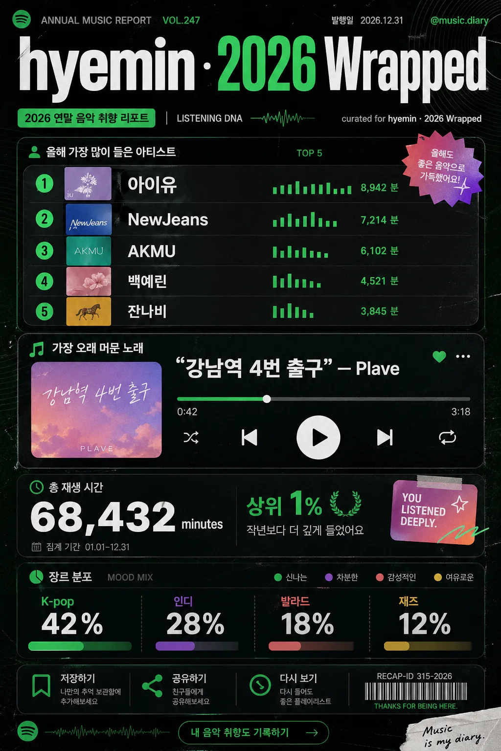
연말 음악 취향 리포트 카드
Spotify Wrapped 갬성 카드. Top Artist·Top Song·총 재생 시간·장르 분포. SNS 공유용 시즌 컨텐츠.
연말 음악 취향 리포트 카드摘要
這是用來製作社群/圖卡內容的 ChatGPT 圖像提示詞,已整理主題、背景、風格與構圖,方便快速調整。
相關關鍵字: 연말 음악 취향 리포트 카드, 연말 음악 취향 리포트 카드 프롬프트, 社群/圖卡 프롬프트, 社群/圖卡 AI 이미지 프롬프트, ChatGPT 이미지 프롬프트, AI 이미지 생성 프롬프트, AI 프롬프트, 이미지 프롬프트
연말 음악 취향 리포트 카드使用方式
保留原始結構並替換主體、背景、色彩或構圖,即可延伸出不同版本。
- 保留核心主體,並依品牌、季節或平台調整色彩與背景。
- 如果畫面太複雜,請減少背景元素並具體描述主體、構圖與光線。
- 複製後可要求 ChatGPT 配合平台、長寬比或文字需求調整。
提示詞原文
[Input]
- language: Korean
- output_size: 1024x1536

[Purpose]
Spotify Wrapped-style yearly music taste report card for social sharing, designed as a bold vertical infographic with playful editorial energy and realistic app-recap details.
Korean-first social media card that summarizes top artists, top song, listening time, and genre split with strong typographic hierarchy, small metadata, share-card UI details, and music-culture graphic accents.

[Composition]
- Vertical 9:16 poster composition, with the main stats stack occupying about 70% of the frame and a compact editorial title band at the top 15%.
- Place {이름·년도} as the hero masthead, centered or slightly left-aligned, paired with small realistic metadata such as "ANNUAL MUSIC REPORT", "VOL.247", "2026.12.31", and "@music.diary".
- Background should feel like a polished music-app recap screen printed as a premium digital poster: deep black base with subtle dark-green fabric-like grain, faint waveform texture, translucent album-sleeve silhouettes, and restrained gradient accents.
- Organize the artist list, song highlight, listening time, and genre distribution on a clear mobile-first grid, enriched with small dividers, micro labels, progress bars, tiny play/pause icons, save/share icons, and a recap ID strip.
- Use {레이아웃} as the structural direction while keeping the overall layout readable on mobile screens and visually rich enough to feel like a real year-end share card.

[3. CORE STRUCTURE]
- Top header band (upper 15%): place {이름·년도} in oversized bold type with a small secondary cover-label system: "2026 연말 음악 취향 리포트", "LISTENING DNA", "발행일 2026.12.31", and a tiny credit line "curated for {이름·년도}".
- Main artist block (mid-upper 23%): show {Top Artist} as a ranked list with numeric emphasis, small circular rank badges, short Korean label "올해 가장 많이 들은 아티스트", tiny equalizer bars beside each row, and subtle thumbnail-placeholder color tiles that look like album art without replacing the provided text.
- Featured song block (center 18%): highlight {Top Song} in a larger quotation-style music-player module with a faux progress bar, timestamp marks "0:42" and "3:18", a small play icon, and Korean caption "가장 오래 머문 노래".
- Listening stats block (mid-lower 14%): set {총 재생 시간} as a strong numeric statement with smaller descriptor text such as "총 재생 시간", "작년보다 더 깊게 들었어요", and a small date stamp "집계 기간 01.01–12.31".
- Genre section (lower 16%): present {장르 분포} as a compact segmented infographic with percentage chips, stacked color bars, small labels "장르 분포", "MOOD MIX", and tiny dot legends, making every value clearly readable.
- Bottom social footer (lowest 8%): add realistic share-card details including "저장하기", "공유하기", "다시 보기", tiny bookmark/share/message icons, a small barcode-like recap ID area reading "RECAP-ID 315-2026", and a short Korean CTA "내 음악 취향도 기록하기".
- Accent system: echo the music-app identity with green highlight bars, black-and-white contrast, coral-violet gradient stickers, waveform curves, small star/spark tags, and subtle record-groove rings as visual punctuation.

[4. STYLE RULES]
- Typography: use Pretendard ExtraBold for headline hierarchy, Pretendard Medium or Noto Sans KR for body stats, and a condensed sans style for small labels; headline size should feel like 78–110 px equivalent, body stats 24–42 px equivalent, micro metadata 12–18 px equivalent.
- Color palette: {컬러 톤} with #1ED760 green, #0B0B0B black, #FFFFFF white, plus controlled coral #FF6B6B and violet #8B5CF6 gradient accents.
- Border/shadow: use layered rounded panels, thin muted green-white separator lines, soft shadows with 4px y-offset, 14px blur, 12% opacity, and occasional translucent glass-card overlays for depth.
- Add realistic tactile details: faint paper grain, screen-glow edges, halftone dots, small scuffs, sticker tabs, waveform ornaments, and tiny UI indicators while keeping the key stats dominant.
- Spacing may be asymmetrical and energetic, like a premium app summary card adapted into an editorial music report poster.

[5. VISUAL STYLE]
- Camera / lens: modern digital poster design with a 50mm equivalent editorial framing feel, crisp UI-like typography, realistic high-resolution social-card rendering, and tactile printed-screen texture.
- Lighting: simulated screen glow with soft edge highlights from upper-left, faint contrast lift around the title and featured song module, gentle reflections on glossy sticker elements, no harsh spotlighting.
- Color grade: deep black + Spotify green base with white text, then restrained coral and violet gradient accents for energy and variety.

[6. MOOD]
Premium music-app recap editorial — Spotify Wrapped meets high-end kinetic infographic poster design, with the lived-in feel of a real year-end share card saved from a music app.

[7. CRITICAL]
- Korean text accuracy: 반드시 정확히 보여야 하는 문자열 — {이름·년도}, {Top Artist}, {Top Song}, {총 재생 시간}, {장르 분포}.
- Render added Korean UI text clearly, including "2026 연말 음악 취향 리포트", "올해 가장 많이 들은 아티스트", "가장 오래 머문 노래", "총 재생 시간", "장르 분포", "저장하기", "공유하기".
- English text accuracy: keep the exact labels "Top Artist" and "Top Song" legible and correctly spelled if included in the layout.
- All percentage values, rank numbers, time values, and ranking order must remain readable and cleanly separated.
- Do not distort Korean characters, and do not convert the stats into vague decorative shapes.

[8. 🚫 PROHIBITED]
- Fake official seals / certifications
- Broken Korean characters
- Unauthorized celebrity likeness composites