プロフィール・アバター
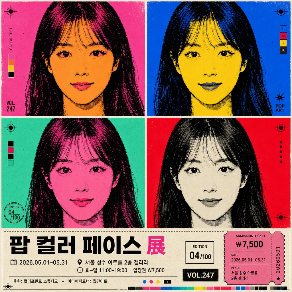
팝아트 4분할 얼굴 변형
Andy Warhol Pop Art 톤. 본인 얼굴을 4분할 (또는 9분할) 컬러 그리드로 변형. 시그니처 비비드 컬러 페어링.
팝아트 4분할 얼굴 변형の概要
プロフィール・アバター画像を作るためのChatGPT画像プロンプトです。主題、背景、スタイル、構図を整理し、すぐに試せるよう構成しています。
関連キーワード: 팝아트 4분할 얼굴 변형, 팝아트 4분할 얼굴 변형 프롬프트, プロフィール・アバター 프롬프트, プロフィール・アバター AI 이미지 프롬프트, ChatGPT 이미지 프롬프트, AI 이미지 생성 프롬프트, AI 프롬프트, 이미지 프롬프트
팝아트 4분할 얼굴 변형の活用方法
元の構造を保ちながら、被写体、背景、色、構図を変更して別案に展開できます。
- 主題を維持し、ブランドや季節、媒体に合わせて色と背景を変更してください。
- 結果が複雑な場合は背景要素を減らし、被写体、構図、照明を具体化してください。
- コピー後、ChatGPTに媒体、アスペクト比、文字の有無を追加で指定できます。
プロンプト原文
[Input]
- reference_image: {참고 이미지}
- language: Korean
- output_size: 1024x1024

[Purpose]
Convert an attached portrait into a Warhol-inspired pop-art face transformation grid, suitable for a square exhibition poster, album-cover style profile graphic, or social-share artwork.
Create a bold multi-panel image where each panel preserves identity but changes palette, ink treatment, and poster typography for a vivid editorial gallery look.

[Composition]
- The source face from {참고 이미지} should occupy the center of each cell with consistent crop and face scale, keeping the head silhouette readable across the full grid.
- Grid structure uses {그리드} with equal gutters; thin white dividing lines separate panels cleanly while allowing the artwork to feel like a printed silkscreen sheet.
- Preserve facial shape and identity through {원본 보존}, while swapping color relationships per panel using {컬러 페어링}.
- Use {배경} behind each face, including flat color fields, halftone dots, ink misregistration marks, and small screenprint texture accents that support the pop-art mood.
- Maintain {비율} framing as a square poster layout with the portrait grid as the dominant element, plus a compact exhibition information band integrated along the bottom or one outer edge.
- Add small decorative print details such as registration crosses, edition numbering, tiny color swatches, and a subtle ticket-stub graphic so the piece feels like a real pop-art event poster.

[3. CORE STRUCTURE]
- Panel layout: arrange the image as a precise grid of identical portrait crops, with each cell aligned to the same eye-line and head position for a poster-like rhythm.
- Face treatment: apply {처리} to simplify skin, hair, lips, and shadows into bold graphic planes while preserving recognizable likeness.
- Color variation: assign {컬러 페어링} across cells so each panel feels distinct but still part of one cohesive pop-art set.
- Separation rules: use thin white lines between cells and keep the gutters even, while allowing small print marks or caption strips outside the facial areas.
- Poster information band: include {포스터 제목}, {전시 날짜}, {장소}, {관람 정보}, {스폰서}, and {에디션 표기} in a clean Korean exhibition-poster layout.
- Poster finish: keep the entire composition flat, high-contrast, print-ready, and screenprint-like, with visible ink texture rather than photographic depth.

[4. STYLE RULES]
- Typography: use bold sans-serif typography such as Helvetica Neue, Pretendard Bold, or Sandoll Gothic Neo; main title around 44–72 px equivalent, info text around 18–28 px equivalent, small edition notes around 12–16 px equivalent.
- Korean text should be sharp, readable, and intentionally placed as exhibition-poster text, not random background filler.
- Color palette: use saturated pop-art colors inspired by Marilyn Monroe-era Andy Warhol tones, including hot pink, tangerine orange, cobalt blue, lemon yellow, mint green, magenta, black, and white.
- Graphic details: allow halftone patterns, risograph grain, offset-print imperfections, ink bleed, registration crosses, small starbursts, price/ticket blocks, and color-test bars.
- Border/shadow: use thin 2–4 px white grid dividers, crisp black outlines, and subtle ink-edge separation where needed for facial clarity.

[5. VISUAL STYLE]
- Camera / lens: source-photo look should feel like a straight-on studio portrait, 85mm f/2.0 equivalent framing, cropped tightly to the face for a classic headshot source.
- Lighting: even frontal studio light with low contrast, similar to a clean portrait reference used for silkscreen conversion; avoid dramatic side shadows.
- Color grade: vivid primary-and-secondary pop-art grading with flat ink-like fills, crisp black accents, bright posterized saturation, and screenprint paper texture.
- Material feel: matte exhibition-poster paper, slightly imperfect ink registration, tactile halftone dots, and clean vector-like facial outlines.

[6. MOOD]
Andy Warhol screenprint exhibition print — high-impact Pop Art gallery wall aesthetic with a classic Marilyn Monroe homage, updated as a contemporary Korean pop-art poster with playful event details.

[7. CRITICAL]
- Korean text accuracy: render the poster title exactly as “{포스터 제목}”.
- Render event details clearly: “{전시 날짜}”, “{장소}”, “{관람 정보}”, “{스폰서}”, and “{에디션 표기}”.
- Optional small caption text may read “오늘의 얼굴, 네 가지 색으로 다시 보기” if it fits naturally.
- The same person’s identity must remain recognizable in every panel.
- Each panel should show the face with consistent crop, perspective, and alignment.
- Keep the grid structure exact and evenly spaced.

[8. 🚫 PROHIBITED]
- Fake official seals / certifications
- Broken Korean characters
- Celebrity composites or misleading famous-person face swaps unless explicitly provided