個人檔案/頭像
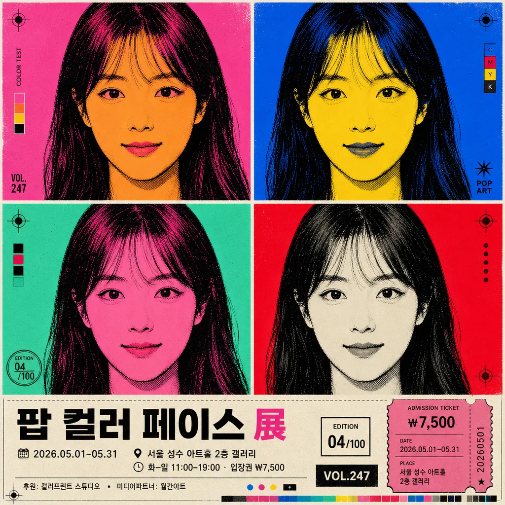
팝아트 4분할 얼굴 변형
Andy Warhol Pop Art 톤. 본인 얼굴을 4분할 (또는 9분할) 컬러 그리드로 변형. 시그니처 비비드 컬러 페어링.
팝아트 4분할 얼굴 변형摘要
這是用來製作個人檔案/頭像內容的 ChatGPT 圖像提示詞,已整理主題、背景、風格與構圖,方便快速調整。
相關關鍵字: 팝아트 4분할 얼굴 변형, 팝아트 4분할 얼굴 변형 프롬프트, 個人檔案/頭像 프롬프트, 個人檔案/頭像 AI 이미지 프롬프트, ChatGPT 이미지 프롬프트, AI 이미지 생성 프롬프트, AI 프롬프트, 이미지 프롬프트
팝아트 4분할 얼굴 변형使用方式
保留原始結構並替換主體、背景、色彩或構圖,即可延伸出不同版本。
- 保留核心主體,並依品牌、季節或平台調整色彩與背景。
- 如果畫面太複雜,請減少背景元素並具體描述主體、構圖與光線。
- 複製後可要求 ChatGPT 配合平台、長寬比或文字需求調整。
提示詞原文
[Input]
- reference_image: {참고 이미지}
- language: Korean
- output_size: 1024x1024

[Purpose]
Convert an attached portrait into a Warhol-inspired pop-art face transformation grid, suitable for a square exhibition poster, album-cover style profile graphic, or social-share artwork.
Create a bold multi-panel image where each panel preserves identity but changes palette, ink treatment, and poster typography for a vivid editorial gallery look.

[Composition]
- The source face from {참고 이미지} should occupy the center of each cell with consistent crop and face scale, keeping the head silhouette readable across the full grid.
- Grid structure uses {그리드} with equal gutters; thin white dividing lines separate panels cleanly while allowing the artwork to feel like a printed silkscreen sheet.
- Preserve facial shape and identity through {원본 보존}, while swapping color relationships per panel using {컬러 페어링}.
- Use {배경} behind each face, including flat color fields, halftone dots, ink misregistration marks, and small screenprint texture accents that support the pop-art mood.
- Maintain {비율} framing as a square poster layout with the portrait grid as the dominant element, plus a compact exhibition information band integrated along the bottom or one outer edge.
- Add small decorative print details such as registration crosses, edition numbering, tiny color swatches, and a subtle ticket-stub graphic so the piece feels like a real pop-art event poster.

[3. CORE STRUCTURE]
- Panel layout: arrange the image as a precise grid of identical portrait crops, with each cell aligned to the same eye-line and head position for a poster-like rhythm.
- Face treatment: apply {처리} to simplify skin, hair, lips, and shadows into bold graphic planes while preserving recognizable likeness.
- Color variation: assign {컬러 페어링} across cells so each panel feels distinct but still part of one cohesive pop-art set.
- Separation rules: use thin white lines between cells and keep the gutters even, while allowing small print marks or caption strips outside the facial areas.
- Poster information band: include {포스터 제목}, {전시 날짜}, {장소}, {관람 정보}, {스폰서}, and {에디션 표기} in a clean Korean exhibition-poster layout.
- Poster finish: keep the entire composition flat, high-contrast, print-ready, and screenprint-like, with visible ink texture rather than photographic depth.

[4. STYLE RULES]
- Typography: use bold sans-serif typography such as Helvetica Neue, Pretendard Bold, or Sandoll Gothic Neo; main title around 44–72 px equivalent, info text around 18–28 px equivalent, small edition notes around 12–16 px equivalent.
- Korean text should be sharp, readable, and intentionally placed as exhibition-poster text, not random background filler.
- Color palette: use saturated pop-art colors inspired by Marilyn Monroe-era Andy Warhol tones, including hot pink, tangerine orange, cobalt blue, lemon yellow, mint green, magenta, black, and white.
- Graphic details: allow halftone patterns, risograph grain, offset-print imperfections, ink bleed, registration crosses, small starbursts, price/ticket blocks, and color-test bars.
- Border/shadow: use thin 2–4 px white grid dividers, crisp black outlines, and subtle ink-edge separation where needed for facial clarity.

[5. VISUAL STYLE]
- Camera / lens: source-photo look should feel like a straight-on studio portrait, 85mm f/2.0 equivalent framing, cropped tightly to the face for a classic headshot source.
- Lighting: even frontal studio light with low contrast, similar to a clean portrait reference used for silkscreen conversion; avoid dramatic side shadows.
- Color grade: vivid primary-and-secondary pop-art grading with flat ink-like fills, crisp black accents, bright posterized saturation, and screenprint paper texture.
- Material feel: matte exhibition-poster paper, slightly imperfect ink registration, tactile halftone dots, and clean vector-like facial outlines.

[6. MOOD]
Andy Warhol screenprint exhibition print — high-impact Pop Art gallery wall aesthetic with a classic Marilyn Monroe homage, updated as a contemporary Korean pop-art poster with playful event details.

[7. CRITICAL]
- Korean text accuracy: render the poster title exactly as “{포스터 제목}”.
- Render event details clearly: “{전시 날짜}”, “{장소}”, “{관람 정보}”, “{스폰서}”, and “{에디션 표기}”.
- Optional small caption text may read “오늘의 얼굴, 네 가지 색으로 다시 보기” if it fits naturally.
- The same person’s identity must remain recognizable in every panel.
- Each panel should show the face with consistent crop, perspective, and alignment.
- Keep the grid structure exact and evenly spaced.

[8. 🚫 PROHIBITED]
- Fake official seals / certifications
- Broken Korean characters
- Celebrity composites or misleading famous-person face swaps unless explicitly provided