資訊圖表/指南
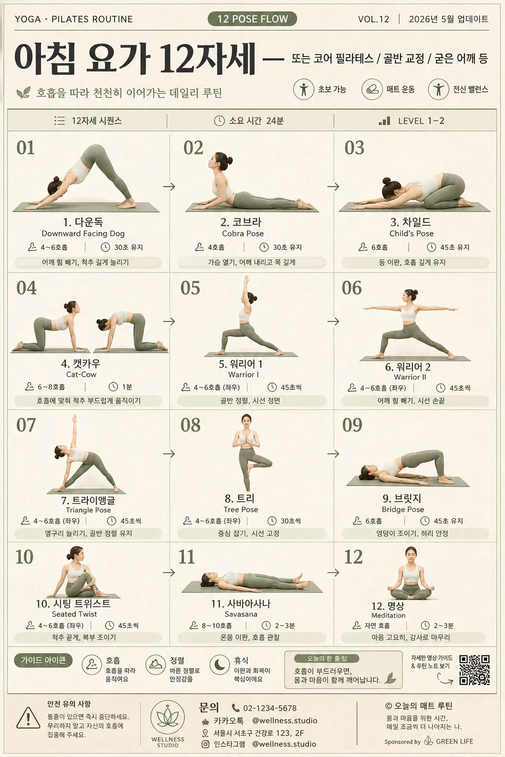
요가·필라테스 자세 인포그래픽 (12자세 시퀀스)
요가·필라테스 12자세 시퀀스 인포그래픽. 자세명·호흡·시간·난이도 + 인물 일러스트. 헬스 SNS·홈트 가이드.
요가·필라테스 자세 인포그래픽 (12자세 시퀀스)摘要
這是用來製作資訊圖表/指南內容的 ChatGPT 圖像提示詞,已整理主題、背景、風格與構圖,方便快速調整。
相關關鍵字: 요가·필라테스 자세 인포그래픽 (12자세 시퀀스), 요가·필라테스 자세 인포그래픽 (12자세 시퀀스) 프롬프트, 資訊圖表/指南 프롬프트, 資訊圖表/指南 AI 이미지 프롬프트, ChatGPT 이미지 프롬프트, AI 이미지 생성 프롬프트, AI 프롬프트, 이미지 프롬프트
요가·필라테스 자세 인포그래픽 (12자세 시퀀스)使用方式
保留原始結構並替換主體、背景、色彩或構圖,即可延伸出不同版本。
- 保留核心主體,並依品牌、季節或平台調整色彩與背景。
- 如果畫面太複雜,請減少背景元素並具體描述主體、構圖與光線。
- 複製後可要求 ChatGPT 配合平台、長寬比或文字需求調整。
提示詞原文
[Input]
- language: Korean
- output_size: 1024x1536

[Purpose]
Yoga and Pilates pose infographic poster, 12-step sequence, designed for health/wellness social sharing and printable guide use.
Polished editorial layout that teaches a full routine at a glance with clear progression, readable pose labels, and realistic printed-poster details such as guide metadata, footer notes, studio contact text, and small wellness icons.

[Composition]
- Main composition: a vertical 3x4 or 4x3 grid with 12 evenly sized panels, each panel containing one pose illustration, pose name, breathing cue, and hold timing details.
- Overall poster should feel like a real yoga studio handout: full-frame vertical sheet, warm matte paper texture, faint ink grain, subtle sage-green dividers, charcoal typography, and small editorial annotations.
- Sequence title area at the top should span the full width and include {시퀀스 종류} as the primary Korean title, plus compact supporting metadata such as "12자세 시퀀스", "총 24분", "LEVEL 1–2", "VOL.12", and "2026.05 가이드".
- Grid block should sit below the header with a precise, readable structure; each cell should include a small pose number 01–12, a pose illustration, Korean pose name from {자세 리스트}, English pose name when appropriate, and timing/breathing notes from {자세 정보}.
- Background should be a calm matte paper texture in warm beige, with sage-green accents, muted olive section tags, charcoal text, and soft cream panel surfaces.
- Add realistic guide elements around the layout: small line icons for breath / alignment / rest, tiny arrow markers showing flow direction, a footer reminder strip, a QR-code-style square, studio contact line, and a small sponsor/credit area.
- Use {시퀀스 종류}, {자세 리스트}, {자세 정보}, {레이아웃}, {컬러 톤}, {인물 톤}, {비율} placeholders throughout the infographic content.

[3. CORE STRUCTURE]
- Header band: place the sequence title at the top in a strong editorial headline area. Set main Korean title using {시퀀스 종류}; include small labels such as "YOGA · PILATES ROUTINE", "12 POSE FLOW", "VOL.12", "2026년 5월 업데이트", and "소요 시간 24분".
- Header details: add a slim divider line beneath the title, a small subtitle such as "호흡을 따라 천천히 이어가는 데일리 루틴", and compact category chips like "초보 가능", "매트 운동", "전신 밸런스".
- Grid block: render 12 pose panels in strict sequence order, reading left-to-right, top-to-bottom according to {레이아웃}, with consistent visual rhythm and clear spacing between cells.
- Each pose panel: show the pose illustration centered in the upper portion, with the Korean pose name and English pose name below, followed by breathing cycle and hold time in smaller type. Use {인물 톤} and {비율} for the figure style and body proportions.
- Sequence labels: make numbering clear and compact, e.g. 01–12, placed near the top-left or top-center of each cell for fast scanning. Add tiny flow arrows between selected panels so the sequence feels guided.
- Timing details: keep duration and breathing notes in a smaller secondary line so the pose name remains dominant; include realistic examples such as "4호흡", "30초 유지", "좌우 3회", or content from {자세 정보}.
- Micro guidance: include one short alignment cue per row or small side note such as "어깨 힘 빼기", "골반 정렬", "목 긴장 완화", "호흡 유지" without crowding the pose names.
- Footer strip: use a visually lighter bottom band for a routine note, safety reminder, page metadata, and credit text. Include Korean footer strings such as "통증이 있으면 즉시 중단하세요", "© 오늘의 매트 루틴", "@wellness.studio", "문의 02-1234-5678", and a QR-code-style block labeled "루틴 영상 보기".

[4. STYLE RULES]
- Typography: use Pretendard or Noto Sans KR for Korean labels, with Bold 700 for headings and Medium 500 / Regular 400 for body text; size hierarchy should be clear, with the title roughly 2.5–3x larger than panel text.
- If English pose names appear, use a clean sans-serif such as Inter or Montserrat in small caps or regular weight.
- Color palette: warm beige #F3EBDD, sage green #A9B89A, muted olive #7E8B6A, charcoal #2F3432, soft cream #FAF7F1. Apply {컬러 톤} as the guiding palette direction.
- Use thin 1px separators, soft panel boundaries, subtle paper fibers, faint ink misregistration, tiny editorial symbols, and a gentle 4px y-offset, 10px blur shadow at 10% opacity where panels need separation.
- Pose illustrations may be refined flat editorial figures or soft semi-realistic fitness illustrations; keep anatomy believable, joints aligned, and the same drawing style across all 12 panels.
- Decorative details should support the guide: small breath icons, alignment dots, leaf-like line ornaments, calm geometric markers, and muted section labels that make the poster feel printed and practical.

[5. VISUAL STYLE]
- Camera / lens: if using photoreal model references, present them like an 85mm f/1.8 portrait setup or a 50mm f/2 studio reference; if illustrated, keep the figure proportions clean and consistent with editorial fitness graphics.
- Lighting: soft diffused studio light from upper-left with gentle fill from the right, natural paper shadows, mild surface texture, and no harsh specular highlights.
- Color grade: muted wellness palette with beige paper, sage green accents, charcoal typography, soft cream panels, and slightly desaturated skin or line-art tones for a calm premium magazine spread feel.
- Realism details: include tactile printed-poster texture, slight paper grain, crisp Korean typography, carefully aligned grid columns, subtle ink density variation, and believable small-print footer information.

[6. MOOD]
Premium wellness magazine editorial — like a modern yoga studio handout designed with the clarity of Kinfolk and the polish of Monocle, but with enough real guide information to feel usable, printed, and content-rich.

[7. CRITICAL]
- Korean text accuracy: 반드시 정확히 표시되어야 하는 문자열 — "시퀀스 종류", "자세 리스트", "자세 정보", "레이아웃", "컬러 톤", "인물 톤", "비율".
- Render Korean guide text clearly and naturally, including examples such as "12자세 시퀀스", "총 24분", "4호흡", "30초 유지", "어깨 힘 빼기", "골반 정렬", "통증이 있으면 즉시 중단하세요", "루틴 영상 보기", "2026년 5월 업데이트".
- If pose names are rendered, they must be legible, correctly spelled Korean, and aligned consistently across all 12 panels.
- All 12 panels must follow the same layout logic and visual hierarchy; do not vary panel structure randomly.
- Keep the poster vertical at 1024x1536, with the 12-pose grid as the dominant visual subject and all added metadata serving the yoga/Pilates guide concept.

[8. 🚫 PROHIBITED]
- Fake official seals / certifications
- Broken Korean characters